
 Order today for delivery by
 How to Mix Vintage and Modern Art on One Wall (Without It Looking Random)
A practical framework for combining art from different eras into a wall display that looks curated, not chaotic.


You have a botanical print from the 1890s and a bold abstract from last year, and you're worried they'll look like they fell out of two different houses. They won't, if you follow a few rules. This guide gives you the framework that separates a curated wall from a chaotic one.
Why mixing eras works better than matching them
A wall of art from a single era can look like a museum display or a hotel corridor. It's safe, but it rarely feels personal. Mixing periods does something matching can't: it tells the viewer this collection was assembled by someone with a point of view, not bought as a set.
There's a real design principle behind this. Contrast creates visual interest, and time period is one of the strongest forms of contrast available. A 17th century botanical engraving next to a minimalist line drawing makes both pieces look more interesting than either would alone. The old piece feels fresher; the new piece feels grounded.
The catch is that contrast without cohesion just looks like noise. The rest of this guide is about creating cohesion deliberately, so the contrast can do its job.

The colour-thread rule: finding a palette that ties everything together
Here's the rule: every piece on your wall should share at least one colour with at least one other piece. That shared colour is the thread that runs through the display, even if no one consciously notices it.
You don't need every piece to share the same colour. You need a chain. The vintage map shares mustard yellow with the abstract; the abstract shares dusty pink with the photograph; the photograph shares charcoal with the line drawing. The eye follows that chain around the wall and reads the whole thing as one composition.
To find your thread, lay your contenders out on the floor and squint. The colours that survive squinting are the dominant ones. Pick two or three that appear across multiple pieces and treat those as your palette. Anything that doesn't contain at least one of those colours either gets reframed with a coloured mat that introduces the palette, or it goes on a different wall.
A useful shortcut: warm neutrals (cream, ochre, terracotta, sepia) tend to bridge vintage pieces beautifully, while cooler neutrals (charcoal, slate, off-white) often pull modern work together. If you're mixing both, pick one warm and one cool accent and let them play off each other.
Choosing your anchor piece and building outward
Every successful mixed-era wall has one piece doing the heavy lifting. That's your anchor. Everything else is in conversation with it.
There are three ways to pick your anchor, and the right one depends on what you're working with:
Pick the piece you love most if you're building from scratch and have an emotional favourite. The wall will feel personal because the centre of gravity is something you actually care about.
Pick the largest piece if you already own several works of varying sizes. Scale wins on a wall, so the biggest piece will become the anchor whether you want it to or not. Better to plan around it.
Pick the most visually striking piece if your collection is fairly uniform in size. The anchor should be the one with the most contrast, the boldest colour, or the most unusual subject. Quiet pieces don't anchor well.
Place the anchor slightly off-centre, not dead middle. Then build outward, alternating eras as you go. A vintage piece next to a modern one, then another vintage, then another modern. Avoid clustering all the old pieces on one side and the new on the other, which reads as two collections forced to share a wall.
If you're starting fresh and want help finding pieces designed to work together across periods, our mixed eras collection is built specifically around this idea.
Frame consistency: the single biggest factor in making it work
This is the part most people get wrong, and it's the difference between a wall that looks intentional and one that looks like a junk drawer.
When you mix eras in the artwork, you must unify the frames. Not match them exactly, but unify them. That means the frames should belong to the same family: same wood tone, same profile width, same finish.
The reason is simple. The frame is the bridge between the art and the wall. If your frames are also from different eras (an ornate gilt frame next to a chunky black contemporary one next to a thin white modern one), you've got chaos at every level. Unifying the frames lets the artwork do the era-mixing on its own terms.
Three approaches that work:
- All black, slim profile: the most versatile. Works with vintage botanical, modern abstract, photography, and everything in between.
- All natural oak: warmer, slightly more vintage-leaning, beautiful with earth-toned palettes.
- All white, slim profile: cleanest, most modern. Best when your art skews more contemporary than vintage.
Avoid mixing frame colours unless you really know what you're doing. Avoid ornate frames entirely unless the entire wall is committed to that aesthetic. And avoid the temptation to "match each frame to its era," which is the single most common mistake on mixed-era walls.
One practical note: a lot of the disasters in this category come from frames that arrive separately from the print, or that warp because they're made from MDF or veneer. If you're ordering framed prints, look for solid wood and check that the print and frame ship together, properly fitted. Our framed prints use FSC-certified solid wood and arrive ready to hang, which removes the most common point of failure.
The matting trick is worth knowing too. A consistent mat colour (usually off-white or a warm cream) and a consistent mat width (5 to 8cm works for most pieces) can unify pieces that would otherwise feel disconnected. The mat acts as a second, softer frame inside the actual frame, and it gives your eye somewhere to rest between very different artworks.

Size ratios that actually look balanced (the 60/40 approach)
Most advice on gallery walls says "vary your sizes," which is true but useless. Here's what actually works: roughly 60% of your wall area should be one or two large statement pieces, and the remaining 40% should be smaller supporting pieces.
If you're working with a wall that's about 200x150cm (the space above a typical sofa), that means one large piece around 70x100cm doing most of the work, with three or four smaller pieces around 30x40cm filling in around it. The proportions should feel weighted, not evenly distributed.
Even distribution is the trap. Six pieces of identical size in a perfect grid looks like a hotel. The 60/40 split creates hierarchy, and hierarchy is what tells the viewer where to look first.
A few practical rules within the ratio:
- The anchor piece should be at least 1.5 times larger than the next biggest piece on the wall.
- No more than two large pieces on a single wall, even a big one.
- Smaller pieces should cluster, not float in isolation. Three small pieces grouped reads as one shape; one small piece floating reads as an afterthought.
Lay everything out on the floor first. Cut paper templates the size of each piece and tape them to the wall before you commit to nail holes. This sounds tedious. It will save you from forty wrong holes.
Three common mistakes that make mixed-era walls look chaotic
Mistake one: no anchor, or two competing anchors. When every piece is roughly the same size and weight, the eye has nowhere to land. Equally bad: two large, equally striking pieces fighting for attention. Pick one anchor. Let the others support it.
Mistake two: no colour thread. The pieces are individually beautiful but share no palette. The wall looks like a stack of magazine clippings. Fix this by removing pieces that don't contain at least one of your two or three thread colours, or by reframing them with a mat in a thread colour.
Mistake three: matching frame to era. Vintage piece in an ornate gilt frame, modern piece in a slim black frame, mid-century piece in a teak frame. Each frame "matches" its art, and together they look like a flea market stall. Unify the frames. Always.
A bonus mistake worth flagging: hanging too high. Centre of the display should sit around 145 to 150cm from the floor (gallery standard), not at eye level for a standing adult. Most rooms are viewed sitting down, and high hanging is what makes art feel disconnected from the room.
Room-by-room recommendations
Living room
Living rooms can take the most ambitious mixed-era walls because they're the rooms you spend the most time in and you want them to feel layered. Pair a large modern abstract (anchor, 70x100cm) above the sofa with two or three smaller vintage pieces flanking it. Botanical illustrations, vintage travel posters, and old maps work beautifully against contemporary abstracts.
Lighting matters here. Vintage pieces with darker palettes need more light than modern pieces with lots of white space. A picture light or a lamp angled toward the wall makes vintage pieces sing.
Hallway
Hallways reward verticality. A column of three to five pieces stacked vertically, all in identical frames, lets you mix eras dramatically because the frame consistency does so much work. This is also the easiest place to start if you're nervous, since the format is forgiving and the viewing distance is short.
A vintage portrait, a modern line drawing, and a black and white photograph stacked vertically in matching slim oak frames is one of the most reliable mixed-era combinations there is.
Bedroom
Bedrooms benefit from softer, quieter mixed-era walls. Save the bold abstracts for the living room. Above the bed, try a horizontal pairing: one vintage botanical or landscape next to one modern minimalist piece, both in the same frame, with a shared dusty palette (faded greens, soft pinks, warm creams).
Restraint is the rule. Two pieces well chosen will outperform six pieces crammed in. The bedroom is where less almost always wins.

Our favourite mixed-era combinations right now
A few pairings we keep coming back to:
Vintage botanical + modern geometric abstract. The organic line work of antique botanical prints (think hand-drawn leaves and flowers from 19th century natural history books) plays beautifully against hard-edged geometric abstracts. They share nothing visually, which is exactly why they work.
Old master portrait + contemporary photography. A reproduction of a Dutch Golden Age portrait next to a moody contemporary black and white photograph creates a conversation across 400 years. Use a shared dark palette (charcoal, deep umber, ivory) to thread them together.
Vintage map + modern typography or text-based art. Maps are inherently graphic, and they pair surprisingly well with modern word-based prints. Both are about communication and orientation, and they share a flat, designed quality that bridges the eras.
1960s pop art reproduction + 1850s scientific illustration. Bold, flat colour against fine, detailed line work. Unexpected and excellent in a study or hallway.
If you're looking to add vintage pieces to a more modern collection, the vintage art prints collection is a good place to find work that's been chosen specifically because it bridges eras well. And if you want to start with a coordinated set rather than building piece by piece, wall art sets take a lot of the guesswork out.

A note on breaking the rules
Once you've done this once, you can break the rules deliberately. Maximalist collectors mismatch frames on purpose, hang at unusual heights, and ignore colour threads in favour of pure intuition. Those walls can be glorious.
But intuition that looks effortless almost always rests on a foundation of having done it the structured way first. Build the wall using the framework, live with it for a few months, and then start breaking the rules one at a time when you can see exactly what each rule was doing.
Start with the frames. Get those right and almost everything else falls into place.

Fab products featured in this blog
-

Flea Market Furniture Poster Canvas Print
Sale price From £49.95£74.95 -
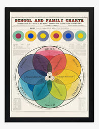
The Chromatic Scale of Colors Art Print
Sale price From £11.95£19.95 -

Magnolia in Terracotta Pot Canvas Print
Sale price From £49.95£74.95 -

Modern Balance Shapes Canvas Print
Sale price From £49.95£74.95 -

Earthy Modern Geometry Canvas Print
Sale price From £49.95£74.95 -
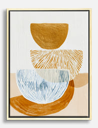
Sunlit Stack Shapes Canvas Print
Sale price From £49.95£74.95 -
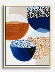
Bowl Study in Navy and Rust Canvas Print
Sale price From £49.95£74.95 -

Modern Shapes Harmony Canvas Print
Sale price From £49.95£74.95 -

Pink Red and Teal Colour Block Art Print
Sale price From £11.95£19.95 -
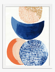
Stacked Shapes in Navy and Orange Art Print
Sale price From £11.95£19.95 -

Modern Balance Shapes Art Print
Sale price From £11.95£19.95 -
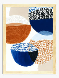
Bowl Study in Navy and Rust Art Print
Sale price From £11.95£19.95 -

Quiet Curve in Green and Teal Art Print
Sale price From £11.95£19.95 -

Flea Market Furniture Poster Art Print
Sale price From £11.95£19.95 -

Retro Vinyl Vibes Canvas Print
Sale price From £49.95£74.95 -

Quiet Forms in Black and Stone Art Print
Sale price From £11.95£19.95 -

Modern Shadows Collage Canvas Print
Sale price From £49.95£74.95 -

Earthy Overlap Abstract Art Print
Sale price From £11.95£19.95 -

Three Records in Pink and Beige Art Print
Sale price From £11.95£19.95 -

Earth Tones Harmony Canvas Print
Sale price From £49.95£74.95


More from The Frame

Best Floral Prints for a Bedroom: A Room-by-Roo...
Bedrooms are the one room in the house where you look at your art from six inches away, half asleep, every single morning. That changes the rules. This guide covers...

You're Overthinking Floral Wall Art: A Room-by-...
You want florals on your walls. You also don't want your flat to look like a Cotswolds tearoom circa 1997. That tension is the entire reason this guide exists. Why...

Vintage Lemon Prints: From 18th Century Botanic...
Lemons have been showing up in Western art for nearly 400 years, and the visual language we still use today, glossy fruit floating against pale paper with a curl of...