
 Order today for delivery by
 Living Room Botanical Prints: The Right Way to Frame Them
The framing failures that quietly ruin botanical prints, and how to avoid throwing money at the same mistake twice.


Botanical prints are one of the most forgiving categories of wall art to choose, and one of the easiest to ruin with bad framing. A warped frame, the wrong glazing, or a backing board that turns acidic will undo the print within a year or two. This guide is for anyone who's been burned by a cheap frame before, or is trying to decide whether to DIY or buy ready-framed.
Why framing makes or breaks a botanical print
Botanical art lives or dies on detail. The fine veining in a fern frond, the gradient inside a poppy petal, the dusty bloom on a eucalyptus stem. These are the details that giclée printing captures beautifully and that bad framing destroys within months.
A cheap frame doesn't just look cheap. It introduces three slow-acting problems: UV light bleaches the inks, humidity warps the paper, and acidic backing materials chemically attack the print from behind. None of this is visible on day one. All of it is visible by month six.
This matters more for botanicals than for, say, a bold graphic poster. Botanical prints rely on subtle tonal range. When colours shift even slightly, sage greens turn grey, soft pinks turn beige, and the whole composition flattens. The print stops looking like a window into a garden and starts looking like a tired photocopy.

The three most common framing failures (and how to spot them)
If you've ever pulled a framed print off the wall and felt disappointed, it was almost certainly one of these three failures. Knowing what they look like helps you spot a bad frame before you buy and diagnose a tired one already on your wall.
UV fading
The most common failure and the hardest to notice in real time, because it happens gradually. Standard window glass blocks some UV but not enough. Within months, reds shift to orange, blues drift to grey, and dark greens lose depth. Hold the print up against an unfaded area (often the strip hidden under the frame edge) and you'll see the difference instantly.
Botanical prints suffer especially because their palette is built on greens and earth tones that depend on layered pigment. Once the top notes fade, the whole image loses dimension.
Warping and bubbling
You'll see this as visible waves running across the print surface, or the paper lifting away from the backing board in soft pockets. It's caused by moisture, either from humid rooms or from the print not being properly mounted in the first place. Cheap frames often use a thin cardboard backing that absorbs ambient moisture and pushes it into the paper.
Run your finger lightly across the glass. If you can feel ridges underneath, the print is warping. It rarely flattens out again.
Acid burn
The slowest of the three but the most permanent. Non-archival backing boards and mats contain acidic compounds that migrate into the paper over time. You'll see it as yellowing across the print or, more commonly, brown spots and a tan halo around the inside edge of the mat. Sometimes called "foxing" when it appears as small rust-coloured speckles.
Once acid burn sets in, it's irreversible. The print is done.
Frame materials: solid wood vs MDF vs metal
The frame itself does more than hold the print. It protects against moisture, distributes pressure evenly across the glazing, and either survives or warps under the weight of its own contents. Material matters.
Solid wood
The benchmark. Solid wood (oak, ash, walnut) is stable, holds its shape over decades, and ages well. It also handles humidity changes without bowing, which matters if your living room gets seasonal swings. Our framed botanical prints use FSC-certified solid wood specifically because it's the only material we trust at sizes above 40x50cm. Larger frames in cheaper materials almost always warp at the corners.
The trade-off: solid wood is heavier and more expensive than the alternatives. For prints you actually want to keep, it's worth it.
MDF and veneer
MDF (medium-density fibreboard) is the default for cheap pre-framed prints. It looks fine on day one, often with a wood-effect veneer wrapped around it. The problems start when moisture gets in. MDF swells, the veneer lifts at the corners, and the whole frame starts to look tatty within a couple of years. In a humid room it can happen much faster.
Avoid anything described as "engineered wood", "composite", "wood-effect" or simply unspecified. These are MDF or worse.
Metal
Metal frames (usually aluminium) are light, thin-profile, and don't warp. They work well for modern, minimal interiors and for very large prints where weight is a concern. They also dent easily, can feel cold next to organic botanical imagery, and don't tend to suit the softness of a botanical palette. Fine for graphic art, less natural for ferns and florals.

Glass vs acrylic glazing: why UV protection isn't optional
Glazing is the thing sitting between your print and the room. Most shoppers don't think about it. They should.
Standard glass
Heavy, breakable, and offers minimal UV protection. If your print is anywhere that gets sunlight, even reflected light through a north-facing window, standard glass will let through enough UV to fade the inks over time. It also adds significant weight, which matters for hanging and shipping (frames with regular glass arrive damaged far more often than acrylic-glazed ones).
UV-protective acrylic
Lighter, shatter-resistant, and engineered to block the wavelengths that cause fading. The acrylic we use on our framed prints blocks UV across the spectrum that damages pigment, which is why we can honestly say the inks last for hundreds of years even in direct sunlight. Standard glass can't do this without an expensive coating upgrade.
The other advantage is glare. Matte-finish acrylic over a matte giclée print gives you a viewing experience close to looking at the original paper. No reflections, no fluorescent-light bounce, no awkward angles.
The trade-off: acrylic can scratch if you clean it with the wrong cloth. A soft microfibre, no abrasive sprays, and you'll never have a problem.
For botanical prints specifically, UV-protective glazing isn't optional. The whole point of the genre is colour fidelity. Skip the protection and you're paying for art that will look noticeably worse in 18 months.
Choosing frame colours for botanical window scenes
Frame colour is where most people overthink and end up with something safe and slightly wrong. The principle is simple: the frame should support the print, not compete with it.
Natural oak
The default for botanicals, and for good reason. Warm but neutral, it echoes the organic subject without trying to match it. Works with almost any interior, from off-white modern to layered traditional. Particularly good for botanical window art prints where the print itself is framing a view, because the wooden frame becomes a second window sill.
Black
Sharper, more graphic, and more formal. Black frames suit dense botanical illustrations with strong line work (think old-school botanical engravings) and pull the eye in. They can feel heavy with soft watercolour-style botanicals, where the contrast fights the gentleness of the image.
White
Clean and contemporary. White works in bright, airy rooms with white or pale walls, where you want the frame to almost disappear. The risk is that white frames yellow over time if they're not high-quality, so they're a worse choice for cheap pre-framed prints.
Walnut and dark wood
Richer and more traditional. Suits saturated botanicals (deep greens, burgundies, mustard yellows) and works beautifully in rooms with wood furniture or warm-toned walls. Less versatile than oak but more characterful when it fits.
A useful rule: if your living room has a lot of wood already, pick a frame that's either a clear match or a clear contrast. The almost-match is the version that always looks wrong.
Mounted vs flush: which finish suits botanical art
A mount (sometimes called a mat) is the border of card sitting between the print and the frame. A flush finish has no mount, with the print sitting right up to the frame edge.
Mounted
The traditional choice for botanical art, and almost always the right one. A mount does three things: it gives the print breathing room visually, it creates physical separation between the print surface and the glazing (which prevents moisture transfer and the print sticking to the glass), and it focuses the eye inward.
For botanical prints, a cream or off-white mount works better than pure white. The slight warmth complements the natural palette and avoids the clinical contrast of bright white against soft organic colour. Mount width should scale with the print: roughly 5cm for prints up to 40x50cm, 7-8cm for larger sizes. Wider mounts feel gallery-like, narrower mounts feel cramped.
Flush
A flush finish, with the image running right to the frame, suits bold, edge-to-edge botanical photography or contemporary illustration where the composition is meant to fill the frame. It's also the standard look for canvas prints, where there's no glazing at all and the image wraps around the stretcher.
For traditional pressed-flower, herbarium, or window-style botanicals, mounted is almost always more flattering. The print needs the visual pause.

Why pre-framed, ready-to-hang prints save you money and headaches
Here's the honest cost comparison most articles skip. A "cheap" DIY framing job that actually protects your print properly involves: a solid wood frame (not MDF), an archival acid-free mount cut to size, UV-protective glazing (not standard glass), an archival backing board, mounting hinges or corners, and the hardware to hang it. Plus your time, plus a trip to a framer if you can't cut the mount yourself, plus the risk of getting any of those steps wrong.
By the time you've assembled all of that properly for a single 50x70cm print, you're often at or above the cost of a pre-framed equivalent, with none of the guarantees. And that's assuming you've done the research to know what acid-free, UV-protective, and archival actually mean in practice.
The version that actually saves money is buying pre-framed from somewhere that does all of this as standard. Our framed botanical art prints ship with the print, mount, UV-protective acrylic glazing, FSC solid wood frame, archival backing, and hanging hardware all properly fitted in one box. No warping in transit, no glazing shipped separately, no figuring out which hooks your wall takes.
The other thing pre-framed solves is the failure rate. Cheap pre-framed prints (the ones with MDF frames and standard glass) fail in all the ways covered earlier. Properly made pre-framed prints don't. The difference isn't the format, it's whether the maker has bothered to use materials that survive.
A few signs of cheap pre-framed work to look out for: frames described in vague terms ("wood-effect", "premium finish", "engineered"), no mention of UV protection, no mention of acid-free or archival materials, cardboard backing, glass instead of acrylic, suspiciously low prices for the size. If a 70x100cm framed print costs less than the materials would cost you to buy separately, the materials aren't real.
The takeaway
Frame quality is the difference between a botanical print that looks better in three years than it did on day one, and one that's quietly browning behind your sofa. The decisions that matter most are solid wood over MDF, UV-protective acrylic over standard glass, archival mounts over generic card, and a cream mount with a 5-8cm border for traditional botanicals.
If you're framing yourself, source each of those properly and don't compromise on the glazing. If you'd rather skip the research, buy pre-framed from somewhere that names its materials specifically. Either way, the rule is the same: protect the print, or don't bother printing it.


Fab products featured in this blog
-

Big Cream Bloom on Green Art Print
Sale price From £11.95£19.95 -

Desert Oasis Bench Art Print
Sale price From £11.95£19.95 -

Houseplants on a Step Stool Art Print
Sale price From £11.95£19.95 -

Spring Botanical Medley Art Print
Sale price From £11.95£19.95 -

Mustard Botanical Cut-Out Art Print
Sale price From £11.95£19.95 -
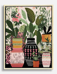
Boho Botanical Vases Canvas Print
Sale price From £49.95£74.95 -

The Botanical House Canvas Print
Sale price From £49.95£74.95 -

Modern Green Botanical Burst Art Print
Sale price From £11.95£19.95 -

Window Blooms Art Print
Sale price From £11.95£19.95 -

Kew Gardens Arboretum Botanical Poster Canvas Print
Sale price From £49.95£74.95 -

Boho Botanical Vases Art Print
Sale price From £11.95£19.95 -

British Botanical View Art Print
Sale price From £11.95£19.95 -

Les Formes Botaniques Canvas Print
Sale price From £49.95£74.95 -

Kew Gardens Botanical Travel Poster Canvas Print
Sale price From £49.95£74.95 -
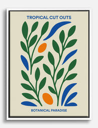
Tropical Cut Outs Botanical Paradise Canvas Print
Sale price From £49.95£74.95 -

Playful Potted Blooms Canvas Print
Sale price From £49.95£74.95 -

Bold Botanical Vases Art Print
Sale price From £11.95£19.95 -

Boho Botanical Haven Art Print
Sale price From £11.95£19.95 -

Botanical Muse Canvas Print
Sale price From £49.95£74.95 -

Vintage Botanical Medley Canvas Print
Sale price From £49.95£74.95


More from The Frame

From Chintz to Contemporary: Every Type of Flor...
"Floral" is one of the least useful words in interiors. It covers everything from a delicate pressed fern to a wall-sized peony in neon pink. If you've ever said "I...

Best Floral Prints for a Bedroom: A Room-by-Roo...
Bedrooms are the one room in the house where you look at your art from six inches away, half asleep, every single morning. That changes the rules. This guide covers...

You're Overthinking Floral Wall Art: A Room-by-...
You want florals on your walls. You also don't want your flat to look like a Cotswolds tearoom circa 1997. That tension is the entire reason this guide exists. Why...