How to Build a London Gallery Wall That Doesn't Look Like a Tourist Shop
The difference between a curated London tribute and a Piccadilly Circus gift shop comes down to a few rules.

You love London. You also have a big blank wall. The risk is that your love for the city ends up looking like the inside of a souvenir kiosk near Leicester Square. This guide is how you avoid that.
The Golden Rule: One Anchor Print, Then Build Around It
Every good gallery wall starts with a single anchor. This is the largest piece, the one your eye lands on first, and the print that sets the tone for everything else. Without it, you end up with a scatter of similarly-sized prints fighting for attention, which is exactly how walls start looking chaotic.
Choose your anchor based on what you actually want the wall to feel like. A moody black and white photograph of the Thames at dawn says something completely different from a 1920s Underground poster in mustard and red. Pick one mood and let the anchor lead.
Hang your anchor first, with its centre at roughly 145 to 152cm from the floor (gallery standard eye level). Then build outward from there, adding smaller pieces that orbit it without competing for the same attention. The anchor should be at least 60x80cm, and on a larger wall, push it to 70x100cm or even a 100x150cm canvas if you want real presence.
The mistake people make is starting with five medium prints of equal size and hoping a focal point emerges. It never does. You need a clear hierarchy, and the anchor is how you create one.
Mixing London Subjects Without Creating Visual Chaos
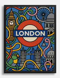
Here is where most London walls go wrong. Someone buys a Big Ben print, then a Tower Bridge print, then a red phone box print, then a Beefeater, then a black cab. Five obvious landmarks side by side reads as gift shop, not gallery.
The fix is to limit your "obvious" landmarks to one or two pieces maximum. Then surround them with subjects that aren't on every postcard rack: a vintage Tube map, Victorian shop typography from Spitalfields, a Georgian doorway in Bloomsbury, a detail of the tilework at Russell Square station, or street photography from Shoreditch or Brixton.
A good London gallery wall feels like it was curated by someone who actually lives there, not someone who visited for a long weekend. Mix your subjects across four loose categories:
- Iconic (one or two max): Parliament, the Shard, St Paul's
- Cartographic: vintage maps, transport diagrams, hand-drawn neighbourhood plans
- Architectural details: doorways, ironwork, brickwork, signage
- Street life: photography of markets, graffiti, pub fronts, commuters
If three out of four of those categories are represented, your wall will read as considered rather than touristy. Browse london art prints with this framework in mind and you'll start filtering instinctively.

How Many Prints You Actually Need
Print quantity is where most online advice gets vague. Here are real numbers for real walls.
Small wall (up to 1.5m wide)
Three to five prints. One anchor at 50x70cm, surrounded by two or four smaller prints at 30x40cm. This is your typical above-the-sofa or above-the-console arrangement.
Medium wall (1.5m to 2.4m wide)
Six to nine prints. Anchor at 60x80cm or 70x100cm, supported by a mix of 40x50cm and 30x40cm pieces. This works for a feature wall in a lounge or above a dining table.
Large wall (2.4m+ wide)
Nine to twelve prints, sometimes more. You need real range here: a 70x100cm or 100x150cm anchor, two or three medium prints around 50x70cm, and a scatter of 30x40cm pieces to fill in.
Staircase or hallway
Three to six vertical prints following the diagonal of the stairs, or a horizontal run of four to six prints along a hallway at consistent eye level. Keep these tighter in subject matter (a single theme like vintage Underground posters works beautifully).
A good rule for any wall: your gallery wall should fill roughly two thirds of the available wall width, and sit centred above whatever furniture is below it. Anything smaller looks like a postage stamp on a billboard.
Choosing a Consistent Frame Finish
Frame consistency is the single biggest lever you have for making a mixed gallery wall look intentional. The content can vary wildly (a 1908 map next to a modern street photograph next to a typographic print), but if every frame matches, the wall reads as one composition.
Black is the safest and most versatile choice. It anchors colourful imagery, sharpens black and white photography, and doesn't compete with the prints themselves. If your room is heavy on warm woods and cream tones, natural oak frames are the alternative. White frames work in very minimal, all-white interiors but tend to disappear on coloured walls.
What you should not do is mix black, white, oak, and gold across the same wall. That is the fastest way to make a thoughtfully chosen set of prints look like a jumble sale.
A note on frame quality: cheap frames warp, especially when prints aren't fitted properly at the factory. Look for solid wood (not MDF or veneer) and prints that ship pre-fitted in the frame, ready to hang. UV-protective glazing matters too if any part of your wall catches sun, otherwise reds and yellows in vintage poster reproductions will fade within a few years.
Layout Templates: Grid vs. Organic Salon Hang
There are two layouts that actually work. Everything else is a variation.
The Classic Grid
Three rows of three, or two rows of four, all the same size, all the same frame, with consistent 5cm gaps between every piece. The grid is calm, architectural, and works brilliantly for a single-subject collection: nine black and white London skyline photographs, or six vintage Underground posters, or a 2x4 set of Georgian doorways.
Use a grid when your prints share a strong visual language. The repetition becomes the point.
The Organic Salon Hang
A mix of sizes and orientations arranged around a central anchor. Pieces are different shapes but spaced consistently (always that 5cm gap, no exceptions) and aligned along invisible top, bottom, or centre lines so the whole arrangement holds together.
The salon hang suits mixed content: maps next to photography next to typography. It allows for a richer, more layered story but requires more planning to avoid looking random.
For minimalist black and white London imagery, go grid. For mixed vintage and modern, go salon. Don't try to do both on the same wall.

Colour Palette Strategy
Here is where the 60/30/10 rule earns its keep. Across your whole gallery wall, aim for roughly 60% in your dominant tone (usually neutrals: black, white, cream, charcoal), 30% in a secondary colour pulled from your room (sage, navy, terracotta, mustard), and 10% in a true accent (a pop of red on a Routemaster, the orange of a vintage Penguin book cover).
When your prints all sit within this palette, the wall feels coherent even with completely different subjects. When they don't, no amount of frame matching will save you.
When to Go Fully Black and White
If you're nervous about clashing colours, or your London imagery is on the touristy side (you really do want that Big Ben print), go entirely black and white. Monochrome immediately elevates obvious subjects. A black and white photograph of a red phone box reads as documentary; a colour version reads as fridge magnet.
A full black and white art prints collection also lets you mix eras freely. A 1920s street scene sits comfortably next to a 2020s Shoreditch photograph when both are monochrome.
When to Embrace Colour
If your room already has a clear palette and your prints can echo it, colour is wonderful. Vintage transport posters in particular were designed with bold, restricted palettes that mix beautifully. Pull two or three colours from your sofa, rug, or curtains and choose prints that feature those tones.
The vintage art prints collection is where this gets fun, particularly for early 20th-century travel and transport designs that defined London's visual identity.
Common Gallery Wall Mistakes
A few patterns come up again and again. Avoid them and you're already ahead.
Tiny prints on a huge wall. Five 30x40cm prints on a three-metre wall look like postage stamps. Scale up your anchor and add larger supporting pieces.
Inconsistent spacing. Some gaps at 3cm, others at 8cm. The eye reads this as sloppy even if it can't tell you why. Use 5cm between every frame, every time.
Hanging too high. People consistently hang art too high. The centre of the arrangement should sit at 145 to 152cm from the floor, not at the top of your eye line.
Mismatched frames. Black, white, and natural oak in the same wall. Pick one finish and commit.
Five Big Bens. Or five red phone boxes, or five Tower Bridges. One iconic landmark per wall, maximum.
Skipping the floor layout. Trying to plan the arrangement directly on the wall with a hammer in hand. Always lay everything out on the floor first, or trace each frame onto kraft paper, tape the paper to the wall, and adjust until it's right. No nails wasted.
Buying everything from different sources in different styles. Your prints don't need to match in subject, but they should match in production quality. Mixing cheap glossy posters with proper giclée prints on matte paper is immediately obvious, even from across the room.

Our Recommended London Gallery Wall Starter Sets
If you want a shortcut, here are three combinations we'd build ourselves.
The Curator (medium wall, mixed subjects)
Seven prints, all in matching black frames:
- One 70x100cm anchor: a black and white Thames or skyline photograph
- Two 50x70cm: a vintage Underground map and a Georgian architectural detail
- Four 30x40cm: street photography from two different neighbourhoods, plus two typographic prints (Victorian shop signs work beautifully)
Reads as personal, layered, and lived-in.
The Minimalist (any wall size, monochrome only)
A 2x3 or 3x3 grid of black and white architectural photography. Same size, same frame, equal spacing. Subjects can include St Paul's, Brutalist Barbican details, the Lloyds Building, Tower Bridge from below, the Shard reflected in glass.
The discipline of the grid makes obvious subjects feel intentional.
The Vintage Traveller (medium to large wall, colour)
Six to nine vintage transport and travel posters, all in matching black or natural oak frames. Pull a consistent palette across the set (cream backgrounds, deep reds, mustard yellows, navy blues) and arrange in a salon hang around one anchor poster.
This works particularly well in studies, hallways, and dining rooms with warm-toned furniture.
For pre-curated combinations sized to common wall dimensions, the wall art sets are designed exactly around these principles.
A Final Thought
The difference between a London wall that looks tacky and one that looks gallery-worthy is almost never the prints themselves. It's the editing. Choose less, frame consistently, hang at the right height, and leave your fifth Big Ben in the basket.
Lay it all out on the floor before you pick up a hammer. Adjust until you stop wanting to adjust. Then commit.


Fab products featured in this blog
-

London, England Travel Illustration Art Print
Translation missing: en.products.product.sale_price From £11.95£19.95 -

London City Landmarks Canvas Print
Translation missing: en.products.product.sale_price From £49.95£74.95 -

London, England Travel Illustration Canvas Print
Translation missing: en.products.product.sale_price From £49.95£74.95 -
London Icons Reimagined Canvas Print
Translation missing: en.products.product.sale_price From £49.95£74.95 -

London, England — Illustrated Cityscape Canvas Print
Translation missing: en.products.product.sale_price From £49.95£74.95 -

London City Stroll Art Print
Translation missing: en.products.product.sale_price From £11.95£19.95 -

London Landmarks Watercolour Canvas Print
Translation missing: en.products.product.sale_price From £49.95£74.95 -

London Townhouse Row Art Print
Translation missing: en.products.product.sale_price From £11.95£19.95 -

London Charm Art Print
Translation missing: en.products.product.sale_price From £11.95£19.95 -

Pastel London Street Scene Art Print
Translation missing: en.products.product.sale_price From £11.95£19.95 -

Pink London Townhouse at Christmas Art Print
Translation missing: en.products.product.sale_price From £11.95£19.95 -

London Garden Square Canvas Print
Translation missing: en.products.product.sale_price From £49.95£74.95 -

Pastel London Streetscape Canvas Print
Translation missing: en.products.product.sale_price From £49.95£74.95 -

London City Landmarks Art Print
Translation missing: en.products.product.sale_price From £11.95£19.95 -

London Townhouse Row Canvas Print
Translation missing: en.products.product.sale_price From £49.95£74.95 -

London Big Ben Travel Poster Canvas Print
Translation missing: en.products.product.sale_price From £49.95£74.95 -

London Skyline Watercolour Canvas Print
Translation missing: en.products.product.sale_price From £49.95£74.95 -

London Landmarks Watercolour Art Print
Translation missing: en.products.product.sale_price From £11.95£19.95 -

Pastel London Rowhouses Canvas Print
Translation missing: en.products.product.sale_price From £49.95£74.95


More from The Frame

Every Animal in William Morris's Designs: The C...
Most people know the thrush in Strawberry Thief and stop there. But Morris's wider body of work contains foxes, hares, peacocks, ravens, lions, herons, woodpeckers, deer, and doves, often half-buried...

Countryside Decor Ideas: How to Bring Rural Cal...
Countryside art has quietly become one of the most versatile choices in modern interiors. Not the chintz-and-bunting version, but the kind of soft, considered pastoral scenes that bring the outside...

Arts and Crafts Animal Prints: The Victorian De...
The Arts and Crafts revival: why Victorian animal prints are trending again Scroll through any interior design hashtag right now and you'll see them everywhere: hares peering through curling foliage,...