Mediterranean Escape: Terracotta, Sage, and the Warm White Wall
The exact colour formula behind every Mediterranean room you've ever saved, decoded for your walls.

There's a reason the same three colours keep showing up in every Mediterranean room you've pinned. Terracotta, sage green, and warm white aren't just pretty together. They're a coded language for sun, stone, and shade that's been refined across Greek islands, Italian hill towns, Provençal villages, and Andalusian courtyards for centuries. This guide shows you exactly how to use that palette on your walls, including the ratios, the subjects, the frames, and the mistakes that turn "modern Mediterranean" into "dated Tuscan villa".
Why this specific palette works
The terracotta-sage-warm white trio isn't arbitrary. Each colour maps directly to something you'd actually see in a Mediterranean landscape.
Terracotta is baked clay roof tiles, sun-warmed brick, the inside of a split pomegranate. It's a colour that holds heat. Sage green is the dusty, silvery foliage of olive trees, rosemary bushes, and wild thyme growing between rocks. It's a green that's been bleached by sun rather than fed by rain. Warm white is limewashed stucco, the chalky walls of a whitewashed village, the inside of a hollowed-out lemon.
Put them together and your brain reads "warm climate" before it consciously identifies a single object. This is why the palette feels instantly evocative even when applied to a flat in Manchester or a terraced house in Bristol.
The psychological pull is real too. Terracotta is grounding and appetite-stimulating, which is why it works so hard in kitchens and dining rooms. Sage green is associated with calm, restoration, and the parasympathetic nervous system slowing down. Warm white expands a space without the clinical chill of pure white. Together they create rooms that feel both energised and restful, which is the actual definition of Mediterranean living.

The 60-30-10 ratio (and when to break it)
Interior designers default to a 60-30-10 split for a reason: it prevents any single colour from shouting. For Mediterranean walls, the formula goes:
- 60% warm white or cream as your background. This is your wall paint, the matte paper of your prints, the negative space inside the artwork itself.
- 30% terracotta as your dominant accent. Think a large landscape print of clay rooftops, an abstract in burnt sienna, or a vintage poster with a rust-coloured ground.
- 10% sage green as your punctuation. A single botanical study, a small olive branch print, or sage tones woven through a larger piece.
This works because terracotta is visually heavy. Flip the ratio and lead with sage and you'll get something that reads as English country garden rather than Aegean coast.
In smaller rooms or single-wall arrangements, tighten the ratio to 70-20-10 with even more warm white. In a large open-plan space, you can push terracotta closer to 40% without losing balance, because the white walls and ceilings around it absorb the visual weight.
The warm white wall foundation
Before you choose a single print, look at your walls. A stark, cool white (the default in most rentals) will fight every Mediterranean print you put on it. The light will bounce blue, terracotta will look muddy, and sage will look grey.
You're looking for whites with yellow, pink, or beige undertones. If you can paint, anything described as "limewash white", "chalk", "bone", or "warm linen" will do the work. If you can't paint, choose prints with generous warm white or cream borders within the artwork itself. Those creamy margins act as a buffer between your cool wall and the warm tones in the image.
The matte paper used in giclée art prints helps enormously here because there's no glare to flatten the warm tones. Glossy prints under direct light tend to wash out the subtle pinks and ochres that make the palette work.
Choosing the right subjects
Most Mediterranean wall art guides stop at "buy some olive tree prints". That's not enough. Here's a framework for choosing subjects that actually work together.
Landscape and place
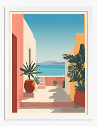
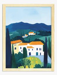
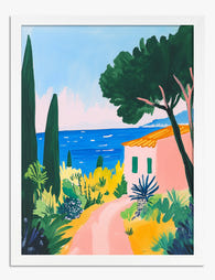
Wide horizons, whitewashed villages, cypress avenues, terracotta rooftops, harbour scenes, lemon groves. These are the most literal interpretations and the easiest to read as Mediterranean. They work best in living rooms, hallways, and bedrooms where you want a sense of escape. Browse the landscape art prints collection for compositions that lean into the warm horizon line.
Botanical studies
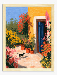
Olive branches, fig leaves, citrus, rosemary, prickly pear, almond blossom. These work in any room but especially kitchens and bathrooms. Sage green prints in this category give you the colour hit without needing to find a piece that's specifically "Mediterranean". A single fig leaf study reads instantly as Italian, even if it isn't. The botanical art prints collection is a strong starting point.
Abstract and shape
Curved sun shapes, terracotta gradients, sandy textures, arched forms echoing Moorish architecture. This is the route to take if you want modern Mediterranean rather than rustic. Abstract pieces in burnt sienna and clay tones are the easiest way to introduce terracotta without committing to a literal landscape. See the abstract art prints collection for shape-led options.
Vintage travel and editorial
Mid-century travel posters of the Amalfi Coast, faded postcards, line-drawn café scenes. These are charming in moderation but easy to overdo. One per room. More than that and you've crossed into theme-park territory.

Modern Mediterranean vs traditional Mediterranean
Before you buy anything, decide which side of the line you're on. The two looks share a palette but use completely different subjects.
Modern Mediterranean leans on abstract shapes, clean line drawings, arched forms, and editorial photography. Frames are slim, often natural oak or white. Negative space does most of the work. This is the look for newer flats, minimalist interiors, and anyone who finds traditional Mediterranean too "themed".
Traditional Mediterranean uses painted landscapes, vintage travel posters, detailed botanical illustrations, and rustic still lifes. Frames can be more ornate, warmer wood tones, sometimes gold. This works in older homes, cottages, and rooms with existing architectural character.
The mistake is mixing them on the same wall. A vintage Capri poster next to a minimal terracotta abstract reads as confused rather than eclectic. Pick a side per room.
Mixing mediums without losing cohesion
Once you've chosen modern or traditional, you can absolutely mix mediums within that lane. A gallery wall of all-photography looks like a hotel lobby. A gallery wall of all-abstract looks like a corporate office. Variety is what makes it feel curated.
The trick is anchoring everything with two consistent elements: a shared palette and a shared frame treatment. If every print contains some warm white, some terracotta, and at least a hint of sage, you can mix a photograph, a watercolour, a line drawing, and an abstract on the same wall and it will hold together.
The frames matter just as much. Pick one frame finish for the entire wall, even if the prints themselves are wildly different in style. Natural oak is the safest bet across both modern and traditional Mediterranean looks. White frames push you firmly modern. Avoid black frames in this palette unless you're deliberately introducing contrast; they tend to read as Scandinavian rather than Mediterranean.
Room-by-room application
Living room
This is where you go biggest. A single statement piece works well above a sofa: an XL canvas of a Greek hillside, a terracotta abstract at 70x100cm, or a horizontal olive grove landscape. If you're going for a gallery wall, plan for three to five pieces with one dominant terracotta hero, two warm white-grounded supporting pieces, and one sage green accent.
Bedroom
Above the bed, horizontal compositions feel more restful than vertical ones. A pair of matching 50x70cm prints (one terracotta-led, one sage-led) flanking the bed or hung side by side above the headboard is a reliable formula. Keep the imagery soft: hazy landscapes, blurred botanicals, abstract washes rather than sharp graphic shapes.
Kitchen and dining
Botanical prints earn their keep here. A trio of small to medium prints (lemon, olive, fig) above a dining table or along a kitchen wall creates rhythm without overwhelming. Canvas prints are particularly good in kitchens because they handle humidity better than framed work behind glass or acrylic.
Entryway and hallway
Narrow walls suit vertical compositions and tight clusters. A single 40x60cm framed print of an arched doorway, a cypress tree, or a terracotta abstract sets the tone before anyone reaches the rest of the house. For long hallways, a row of three to four matched-frame prints in graduated colour (deep terracotta, soft terracotta, cream, sage) works beautifully.

Complementary accents (use sparingly)
The core trio is enough. But if you want to introduce a fourth colour for depth, three work without disrupting the palette:
- Cobalt blue in tiny doses, picking up the Greek island reference. A single small print with cobalt details, never more than 5% of the visual weight.
- Ochre yellow for warmth, especially in autumn-leaning rooms. Works best when introduced through a single piece with sun-bleached yellow tones.
- Burnt orange as a deeper extension of the terracotta family. Useful if your terracotta prints feel too pink and you want to ground them.
The rule: one accent colour per room, not all three. The moment you add cobalt, ochre, and burnt orange together you've left the Mediterranean and arrived at "global eclectic", which is a different style guide entirely.
Frame choices that make or break the look
Frame choice is doing more work than you think. The same print can read as modern Mediterranean, coastal grandmother, or dated Tuscan depending on the frame.
- Natural oak or light wood: the safest, most versatile choice. Works for both modern and traditional Mediterranean. Echoes the wooden beams and shutters of the source aesthetic.
- White frames: push you firmly modern minimal. Best for abstract work and editorial photography. Can look stark if your walls are cool white.
- Unframed canvas: ideal for larger statement pieces, particularly landscapes and abstracts. Reads as contemporary and slightly bohemian. Good for renters because canvas is lighter and easier to hang.
- Dark walnut or black: avoid in this palette. Both tend to drag the warm tones into something heavier and more autumnal than Mediterranean.
The fitting matters as much as the material. Frames that arrive separately from the print, or prints that warp inside cheap frames, will undermine the whole look. Framed prints that ship pre-fitted, with UV-protective acrylic instead of glass, give you better colour longevity in sunny rooms (which is where you're most likely to hang Mediterranean work anyway).
Seasonal flexibility
A common worry: does this palette only work in summer? No, but it needs adjustment.
In autumn and winter, lean harder into the terracotta side of the ratio (push to 40%), introduce ochre as your accent rather than sage, and consider swapping out one sage piece for something with more depth: a darker landscape, a moodier abstract, an evening scene rather than a midday one. The same wall can feel summery in July and grounding in November with one or two prints rotated.
Budget approach
You don't need to spend a fortune to get this right. A few principles:
- One hero, several supporting pieces. Spend the most on a single large print that anchors the room. Surround it with smaller, more affordable prints.
- Standard sizes save money. 30x40cm, 50x70cm, and 60x80cm are easier to frame and easier to replace later if your taste shifts.
- Quality of print matters more than quantity. Three considered pieces always beat seven mediocre ones. Matte giclée prints on thick paper hold their colour for decades, which means you're buying once.
If you're starting from scratch, build the room in stages. Hero piece first, live with it for a fortnight, then add the supporting cast. Walls assembled all at once tend to look styled. Walls built over time tend to look collected.

The actionable summary
Start with your walls. If they read cool, choose prints with generous cream borders or repaint if you can. Decide modern or traditional and don't cross the streams. Apply the 60-30-10 ratio with terracotta as your dominant accent and sage as your punctuation. Match your frames, vary your subjects, and build the room in stages rather than all at once. Hang the hero piece first, live with it, then add.

Fab products featured in this blog
-
Sunlit Mediterranean Path Art Print
Translation missing: en.products.product.sale_price From £11.95£19.95 -

Terracotta Muse Art Print
Translation missing: en.products.product.sale_price From £11.95£19.95 -
Tuscan Hillside Retreat Art Print
Translation missing: en.products.product.sale_price From £11.95£19.95 -

Sunlit Puglia Courtyard Art Print
Translation missing: en.products.product.sale_price From £11.95£19.95 -

Tuscan Hillside Village Art Print
Translation missing: en.products.product.sale_price From £11.95£19.95 -

Tuscan Hillside Retreat Art Print
Translation missing: en.products.product.sale_price From £11.95£19.95 -

Modernist Living Doorway Art Print
Translation missing: en.products.product.sale_price From £11.95£19.95 -

Sunlit Mediterranean Terrace Art Print
Translation missing: en.products.product.sale_price From £11.95£19.95 -

Menorca, Spain — Blue Line Study Art Print
Translation missing: en.products.product.sale_price From £11.95£19.95 -

Terracotta Muse Art Print
Translation missing: en.products.product.sale_price From £11.95£19.95 -
Sunlit Tuscan Welcome Art Print
Translation missing: en.products.product.sale_price From £11.95£19.95 -

Sunlit Mediterranean Haven Art Print
Translation missing: en.products.product.sale_price From £11.95£19.95 -

Terracotta Muse Canvas Print
Translation missing: en.products.product.sale_price From £49.95£74.95 -
Pink Path to the Sea Art Print
Translation missing: en.products.product.sale_price From £11.95£19.95 -

Sunlit Mediterranean Steps Art Print
Translation missing: en.products.product.sale_price From £11.95£19.95 -

Sunlit Mediterranean Path Art Print
Translation missing: en.products.product.sale_price From £11.95£19.95 -

Sunlit Terrace Retreat Art Print
Translation missing: en.products.product.sale_price From £11.95£19.95 -

Terracotta Layers Art Print
Translation missing: en.products.product.sale_price From £11.95£19.95 -

Sunlit Tuscan Village Lane Art Print
Translation missing: en.products.product.sale_price From £11.95£19.95


More from The Frame

Jungle Bedroom Ideas for Adults: Grown-Up Ways ...
Jungle bedrooms have a reputation problem. Search the term and you'll find nursery mood boards, cartoon monkeys, and bright kelly green walls that would keep anyone awake. The grown-up version...

The Strawberry Thief: Everything You Need to Kn...
Strawberry Thief is the William Morris design people search for by name. It's also the one most often bought badly: wrong size, wrong colourway for the room, wrong print quality...

Our Favourite Jungle Prints for Every Room: The...
Jungle prints have a reputation problem. Done badly, they tip a room into themed-restaurant territory faster than almost any other trend. Done well, they add depth, movement and a sense...