


 Order today for delivery by
9 Minimalist Bedroom Decor Ideas Where the Art Does the Heavy Lifting
Nine specific setups where a single well-chosen print replaces half a room's worth of decor.


Most minimalist bedroom guides tell you to declutter, paint everything beige, and buy a platform bed. We think that misses the point. The fastest way to define a minimalist bedroom is to choose one piece of art first and let the room arrange itself around it.
Why art is the easiest (and most reversible) way to define a minimalist bedroom
A minimalist bedroom lives or dies by its focal point. Strip away the clutter and your eye has nowhere to land, which is why so many pared-back bedrooms feel like hotel rooms the morning after a bad night. Art fixes this instantly. It gives the room a mood, a palette, and a point of view without adding physical clutter.
It's also the least committal design decision you can make. Painting a wall takes a weekend and a lot of regret if you get it wrong. New furniture means living with a mistake for years. A print you can swap out, reframe, or move to another room. That's a serious advantage when you're still figuring out what you want your bedroom to feel like.
The best minimalist bedroom design tips tend to agree on one thing: everything in the room should earn its place. Art earns its place more easily than almost anything else, because it does the heavy aesthetic lifting while taking up no floor space and no drawer space. One strong piece can carry an entire room.

Japandi calm: earth-toned abstract prints on warm white walls
Japandi is the easiest minimalist look to get wrong because people confuse it with "beige everything." It's actually about tension: the warmth of Scandinavian wood against the restraint of Japanese design. Your art needs to carry both qualities.
Look for abstract prints in muted earth tones, think terracotta, clay, oatmeal, and soft charcoal. Organic brush shapes, ink washes, or stone-like forms work beautifully. Avoid anything too graphic or too saturated. The print should feel like it was made slowly.
Hang one piece at around 60x80cm or 70x100cm above a low bed, framed in natural oak. Keep the surrounding wall completely bare. On the bed, layer unbleached linen in two closely related tones. That's the entire room. A good starting point is browsing Japandi wall art and picking the piece that makes you exhale when you look at it, that's usually the right one.
What to avoid
Bright white frames (too clinical), heavy black frames (too Scandi), and anything with a glossy finish. Japandi calls for matte everything. The slight texture of thick matte paper under acrylic glaze is exactly the finish you want here.
Scandi clean: black and white line art with natural wood frames
Scandi minimalism is cooler and crisper than Japandi. It leans into contrast rather than nuance. This is where black and white art genuinely shines, because the palette is already baked into the aesthetic.
Single-line figure drawings, simple botanical silhouettes, and geometric compositions all work. The restraint of black ink on white paper mirrors the restraint of the room itself. One print, framed in light oak or pale ash, hung dead centre above a bed with white bedding and a single textured throw.
Scale matters more here than people realise. A 50x70cm print above a king-size bed looks lost. Go bigger than feels comfortable: 70x100cm is often the sweet spot, and even 100x70cm landscape works brilliantly above a low headboard. The frame should be slim, not chunky. Scandi design doesn't do bulk.
The one-colour-only rule
If you're going full Scandi, let the art stay strictly black and white and introduce any colour through a single textile instead, a mustard throw or a sage pillowcase. The art stays graphic, the room stays warm. Mixing coloured art with coloured textiles in a Scandi bedroom usually ends in visual noise.
Warm minimalism: soft colour botanical prints layered with textured bedding
Warm minimalism is the answer to anyone who finds Scandi too cold and Japandi too austere. It allows colour, as long as it's soft, and it rewards texture. This is where botanical art prints do their best work.
Think dusty eucalyptus, pressed-flower studies in sepia and sage, or soft watercolour leaves in blush and ochre. The colours should look like they've been sun-faded for a decade. Nothing in a warm minimalist room should feel new.

Pair the print with heavily textured bedding: waffle cotton, chunky knit throws, slubby linen. The art provides the colour, the textiles provide the warmth, and the walls stay quiet. One medium print (60x80cm) above the bed is usually enough. If the room is large, a second smaller piece on an adjacent wall at seated eye-level can anchor a reading corner.
The single statement print: one oversized piece, nothing else
This is our favourite answer to "how to decorate minimalist bedroom" when someone's starting from scratch. One large print. Nothing else on the walls. No shelves, no mirrors, no little trinkets.
The piece needs to be properly oversized. 100x70cm landscape above a bed, or 70x100cm portrait on a tall narrow wall. The scale is what makes it feel intentional rather than lonely. A small print on a big empty wall looks like you ran out of budget. A huge print on the same wall looks like you knew exactly what you were doing.
Hang it lower than you think. The centre of the piece should sit around 145-150cm from the floor, not up at ceiling height. Minimalist bedrooms calm down when the eye line drops. Art hung too high always feels disconnected from the room.
This approach works especially well in small bedrooms, which goes against the common instinct to "scale down" art in smaller spaces. One large piece makes a small bedroom feel considered. Three small pieces make it feel busy.
Monochrome gallery pair: two coordinating prints with consistent framing
If you can't commit to a single statement, two prints is the next best option. Three is usually a mistake in a minimalist bedroom. Pairs read as intentional. Trios read as a gallery wall that got out of hand.
The rules for a good pair:
- Same frame, same size, same orientation. Any variation starts to feel like a collection rather than a composition.
- Coordinating but not identical. Two prints from the same series, or two pieces that share a palette and a feeling. Avoid matching sets that look like hotel art.
- Space them tight. 5-8cm between frames reads as one unified piece. 15cm or more and they start to feel like two separate decisions.
Hang them above the bed, centred together on the wall. If your bed is 160cm wide, two 40x50cm or 50x70cm prints work beautifully side by side. The pair should span roughly two thirds of the headboard width, no more.
Monochrome palettes (all black and white, or all soft greys and creams) make the pair feel especially restrained. The moment you introduce competing colours between two prints, the whole arrangement loses its minimalist discipline.
Dark and moody minimalism: charcoal and muted tones on darker walls
Minimalism isn't always pale. Some of the most striking minimalist bedrooms are built around deep, saturated walls: inky navy, forest green, warm charcoal. The art rules change completely in these rooms.

On dark walls, lighter art does the work. A print with cream, bone, or soft ochre tones against a charcoal wall creates a glowing focal point without feeling precious. Avoid dark-on-dark unless you want the art to disappear. Deep moody rooms need the art to lift, not blend.
Frame choice shifts too. On a dark wall, a dark frame (walnut, blackened oak) lets the art float. A pale frame creates a hard border that can feel like a window into another room, which sometimes works and sometimes looks jarring. Our rule: match the frame to the wall tone, let the artwork provide the contrast.
Lighting matters more here than in any other minimalist setup. A dark bedroom with one strong print needs a warm, directional light source nearby, either a wall-mounted reader or a lamp with a soft bulb. The art should be subtly lit, not spotlit.
How framing ties the whole room together (and why cheap frames don't)
This is the part most minimalist bedroom guides skip entirely, and it's the part that quietly makes or breaks the look. Framing is not an accessory to your art. It's a material in the room, same as your bed frame, your flooring, your window frames.
Cheap frames fail in minimalist bedrooms for three reasons. First, they warp. Pressed MDF or veneered frames respond badly to normal household humidity, and the first thing you notice when you walk past a warped frame is that something is wrong, even if you can't name it. Second, they come separately from the print, which means fitting it yourself, which means dust, misalignment, and that slightly bubbled look where the paper doesn't sit flat. Third, they look like what they are. In a minimalist room, where every surface is scrutinised, a plasticky frame undermines everything else.
Solid wood frames (we use FSC-certified wood, no MDF, no veneers) age the way the rest of your room ages. They develop a bit of patina. They sit flat. They don't warp in a steamy bedroom near an ensuite. And when the print and frame arrive together, properly fitted, with UV-protective acrylic instead of glass, you don't have to touch anything. It just hangs.
Matching your frame to the room's wood tones
Pick up the warmest wood already in the room and match the frame to it. If your bed is oak, go oak. If your floor is walnut, go walnut. If you have multiple wood tones (which minimalism tolerates in small doses), match the frame to the largest surface, usually the floor or the bed. Metal frames can work but tend to read more industrial than minimalist. Save them for a different room.
Where to start if your bedroom currently has bare walls
If you're staring at empty walls right now, resist the urge to buy three things at once. The modern minimalist bedroom prints approach is to start with one piece and live with it for a few weeks before adding anything else. Most of the time, you won't need anything else.

Here's the order we'd recommend:
- Decide the mood first, not the piece. Calm Japandi? Crisp Scandi? Warm and layered? Dark and moody? Pick one. Trying to blend them is how rooms end up looking confused.
- Buy one piece larger than feels sensible. 70x100cm minimum above a double bed, 100x70cm landscape above a king. Oversizing is almost impossible in a minimalist room.
- Match the frame to your dominant wood tone. Or go frameless with a canvas if you want something softer and lighter on the wall. Canvas also handles humid rooms well, worth knowing if your bedroom is near a bathroom.
- Hang it low, centre at roughly 145-150cm from the floor. Trust us on this one.
- Live with it for two weeks before adding anything. You might find you don't need the second piece, the shelf, or the plant.
Browsing minimalist art for the bedroom with a specific mood in mind is far more useful than scrolling with "something nice" as the brief. The filter is the mood, not the subject matter.
The best minimalist bedrooms we've seen all have one thing in common: a single, confident art choice made early. Everything else, the bedding, the lamp, the one chair in the corner, falls into place around it. Start there, and the room will tell you what, if anything, it needs next.

Fab products featured in this blog
-

Matisse-Inspired Bedroom View Art Print
Sale price From £11.95£19.95 -

Bold Minimal Muse Art Print
Sale price From £11.95£19.95 -

Matisse-Inspired Bedroom View Canvas Print
Sale price From £49.95£74.95 -
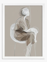
Poised Minimalist Muse Art Print
Sale price From £11.95£19.95 -

Matisse-Inspired Bedroom with a View Art Print
Sale price From £11.95£19.95 -

Matisse-Inspired Bedroom with a View Art Print
Sale price From £11.95£19.95 -

Bold Minimal Muse Canvas Print
Sale price From £49.95£74.95 -

The Bedroom by Vincent van Gogh Art Print
Sale price From £11.95£19.95 -

Poised Minimalist Muse Canvas Print
Sale price From £49.95£74.95 -

Matisse-Inspired Sunny Retreat Art Print
Sale price From £11.95£19.95 -

The Bedroom by Vincent van Gogh Canvas Print
Sale price From £49.95£74.95 -

Bedroom with a View, Matisse Inspired Art Print
Sale price From £11.95£19.95 -

Seaside Bedroom, Matisse-Inspired Art Print
Sale price From £11.95£19.95 -

She Believed She Could, So She Did Art Print
Sale price From £11.95£19.95 -

Matisse-Inspired Bedroom with a View Canvas Print
Sale price From £49.95£74.95 -
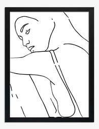
Elegant Minimalist Muse Art Print
Sale price From £11.95£19.95 -

Quiet Shoreline Abstract Art Print
Sale price From £11.95£19.95 -

Matisse-Inspired Bedroom with Sleeping Cat Art Print
Sale price From £11.95£19.95 -

Matisse-Inspired Bedroom with a View Canvas Print
Sale price From £49.95£74.95 -

Matisse-Inspired Seaside Bedroom Art Print
Sale price From £11.95£19.95


More from The Frame

Why Botanical Art Works Better in Small Living ...
Botanical art does something strange to small rooms: it softens them without crowding them. In large rooms, it often gets lost, floating on a wall that needs more weight. This...

Blending Vintage and Modern Décor? Start With Y...
Your furniture is already a mix. A mid-century sideboard here, a modern bouclé chair there, maybe your grandmother's wingback holding court in the corner. The walls are where you make...

7 Steps to Style a Woodland Gallery Wall with F...
A fox print is one of the most forgiving anchors you can build a gallery wall around. The silhouette is distinctive, the colour palette (rust, cream, charcoal, forest green) plays...