
 Order today for delivery by
 New Home Art Prints: A Room-by-Room Guide to Getting It Right
A systematic, room-by-room approach to filling blank walls without wasting money on prints that don't work.


You've moved in, the boxes are mostly unpacked, and now you're standing in front of a wall of beige plasterboard wondering where to start. This guide treats art selection as a project, not a vibe. Work through it room by room and you'll avoid the expensive mistakes most people make in their first six months.
Start with the room you spend the most time in (not the hallway)
The instinct when you move in is to tackle the hallway first because guests see it. Ignore that instinct. The hallway is narrow, the lighting is usually poor, and you walk through it in two seconds. Spend your first budget on the room where you actually live.
For most people, that's the living room or the bedroom. The living room is where you sit for hours and stare at the wall above the sofa. The bedroom is the first thing you see in the morning and the last thing at night. Both rooms reward investment in larger, better prints because you have time to actually look at them.
A practical order of priority for a new home: living room first, bedroom second, dining area or kitchen third, home office fourth, hallway fifth, bathroom sixth. This isn't about importance, it's about how often a print will earn its keep on your wall.
Budget accordingly. If you have £400 to spend on art in your first three months, put £200 into one strong piece for the living room, £120 into something for the bedroom, and save the rest for a smaller print or a pair somewhere else. Spreading £400 across eight small prints in eight rooms will leave every room looking thin.

The blank wall audit: measuring up and picking your focal points
Before you buy anything, walk every room with a tape measure and a notebook. For each wall that needs art, write down three things: the wall width, the height from skirting to ceiling, and what's on the wall directly below where art would hang (sofa, bed, console, nothing).
Not every wall needs a print. Some walls look better empty, especially if they're already busy with windows, radiators, or doorways. The rule we use: if a wall has more than two other visual elements competing for attention, leave it blank or save it for later. Empty wall space is not a problem to solve, it's a design choice.
Identify your focal points. A focal point is the first wall you see when you enter a room, or the wall your eye lands on when you sit down. In a living room it's usually the wall behind the sofa or the wall opposite the sofa. In a bedroom it's the wall above the bed. These are the walls that deserve your best print.
The rest of the room can be filled in over months, not weeks. The "fill in later" strategy is underrated. New homeowners panic-buy small prints to cover everything immediately, then end up replacing them within a year.
Size matters more than subject: our sizing cheat sheet for common walls
The single most common mistake is buying prints that are too small. A print that looked huge on your laptop screen will look like a postage stamp above a three-seater sofa. Professional consensus on this is clear: art above furniture should be roughly two thirds to three quarters the width of the furniture below it.
A 180cm sofa wants art around 120 to 135cm wide. That can be one large 100x150cm canvas, or a pair of 50x70cm framed prints hung side by side with a small gap. A 140cm sideboard wants art around 95 to 105cm wide. A standard double bed (135cm wide) wants art around 90 to 100cm wide above the headboard.
Here's a quick cheat sheet for common walls:
- Above a 3-seater sofa: 70x100cm framed, or 100x150cm canvas, or two 50x70cm prints paired
- Above a double or king bed: 60x90cm centred, or three 30x40cm prints in a row
- Above a console or sideboard: 50x70cm centred, or a 40x50cm pair
- Narrow hallway wall: 30x40cm or 40x50cm, hung in a sequence of three or four
- Dining room feature wall: 70x100cm vertical, or a 60x80cm pair
- Home office above desk: 40x50cm or 50x70cm, single print
Hang art so the centre of the print sits roughly 145 to 152cm (around 57 to 60 inches) from the floor. This is gallery standard eye level. The exception is art above furniture, where you want the bottom edge of the frame about 15 to 20cm above the top of the sofa or headboard, even if that pushes the centre slightly higher.
If you're buying online and worried about scale, cut a piece of newspaper or brown paper to the exact dimensions of the print and tape it to the wall for a day. You'll know within an hour whether the size is right.
Why framing quality makes or breaks a new home (and what to look for)
The biggest disaster in the wall art category is the frame, not the print. Cheap frames warp within a year, especially in rooms with any humidity. MDF and veneered frames swell, the corners separate, and the whole thing starts to lean away from the wall. Glass frames shatter in transit roughly more often than retailers will admit.
What to actually look for: solid wood frames (FSC-certified is a good sign because it indicates the supply chain is documented), acrylic glazing rather than glass for anything over 50x70cm, and prints that ship pre-fitted in the frame rather than as separate components you assemble yourself.
Our art prints ship with the print already mounted in a solid FSC wood frame, with UV-protective acrylic glazing instead of glass. That matters for two reasons: acrylic doesn't shatter, and UV protection is what stops colours fading in sunny rooms. A south-facing living room will bleach a cheap print within eighteen months.
Print quality matters too. Look for thick matte paper (100lb minimum, ideally heavier), giclée printing, and pigment-based inks rather than dye-based. Dye inks are cheaper and fade faster. Pigment inks, properly applied, last for centuries even in direct sun. If a retailer doesn't list paper weight or ink type, assume the worst.
Red flags when shopping online: suspiciously cheap large prints (a quality 70x100cm framed print can't realistically cost £25), reviews mentioning warping or fading, vague product descriptions that talk about "premium quality" without specifying paper or ink, and frames sold separately from prints. The frame and print should arrive together in one box, properly fitted.
For bathrooms and kitchens specifically, we'd recommend canvas over framed paper. Canvas handles humidity better, doesn't have a glazing layer to fog up, and is lighter so the hanging fixtures take less stress.

Choosing a cohesive palette across rooms without being matchy-matchy
The matchy-matchy trap is real. New homeowners often buy a "set" of four prints that all share the same colour palette and hang one in each room, hoping it creates flow. It doesn't. It creates a hotel.
A better approach: pick three colours that appear somewhere in your home (one neutral, one warm accent, one cool accent) and make sure every print you buy contains at least one of those three. The neutral might be cream, warm grey, or oatmeal. The warm accent might be terracotta, mustard, or burnt sienna. The cool accent might be sage green, slate blue, or charcoal.
This gives you flow without uniformity. A bold abstract in the living room can share a sage green with a quiet botanical in the bedroom, even though the two prints look nothing alike. Your eye registers the relationship subconsciously.
Avoid trying to match prints to your sofa exactly. Sofas get replaced. Cushions change. Your art should harmonise with the room without being shackled to one piece of furniture. Lean towards prints whose dominant colours appear as accents in your room, not as the main upholstery.
The three prints every new home needs first
If you do nothing else in your first month, buy these three.
One: a large statement piece for the living room. This is your anchor. 70x100cm framed or 100x150cm canvas. Choose something you genuinely love, not something that "matches the cushions." This is the print that will define the room's personality for years.
Two: a calming piece for the bedroom. Above the bed, centred. Slightly muted, slightly less bold than the living room piece. Botanical, abstract landscape, or quiet figurative work all tend to do well here. This is the only print you'll see in low light every day, so subtlety pays off. Browse bedroom art prints for ideas in the right tonal range.
Three: a smaller print for an entry sightline. This isn't necessarily in the hallway itself, it's whatever wall you see first when you walk through the front door. It might be the end of the hall, the first wall in the living room, or the wall facing the front door. A 40x50cm print here sets the tone for the whole house. The hallway collection has good options sized for this purpose.
These three prints, properly sized and well framed, will make the house feel finished even with empty walls everywhere else. Anything you add after this is decoration. These three are foundation.
Common mistakes that make new homes look unfinished
A few patterns we see repeatedly in new homes that are almost there but not quite.
Hanging too high. This is the single most common hanging mistake. Art at picture rail height looks like it's floating away from the room. Drop it. Centre at 145 to 152cm.
Buying small prints to fill big walls. A 30x40cm print on a wall above a three-seater sofa looks lonely. Either go bigger or pair it with two or three companion prints to create mass.
Mismatched frames in the same room. Three prints in three different frame styles fight each other. Pick one frame finish per room (black, oak, or white) and stick with it. Different rooms can have different frame styles, but within one room, consistency reads as intentional.
Gallery walls before you're ready. Gallery walls are advanced. They require specific spatial planning, frame coordination, and a sense of which prints belong together. New homeowners are often pushed towards gallery walls because they look impressive online, but a single well-sized statement piece almost always works better in a new home where you're still figuring out your taste.
Filling every wall. Empty walls aren't unfinished, they're breathing room. A house with art on three walls and one wall left blank reads more sophisticated than a house with art on every wall.
Cheap frames on good prints. A beautiful £80 print in a £15 frame still looks like a £15 piece on the wall. Frame quality is what people register first.

Browse our newest art prints for fresh inspiration
If you're at the stage of looking for ideas rather than executing on a plan, our new in collection is a good starting point. The just arrived wall art rotates regularly, so it's worth checking back as you work through rooms over the first few months. New art print ideas tend to land best when you've already measured your walls and know what size you need, so do the audit first, then browse.
When you buy new art prints for a move-in, the temptation is to fill everything immediately. Resist it. The houses that look best six months in are the ones where the owner started with three considered prints, lived with them, and added more slowly as the home revealed what it actually needed.

Measure first. Buy fewer, bigger, better prints. Spend money on framing rather than spreading it across more pieces. Leave some walls empty on purpose. Do those four things and you'll skip the awkward middle phase that most new homes get stuck in.

Fab products featured in this blog
-

This Must Be The Place Art Print
Sale price From £11.95£19.95 -

Modernist Living Room Poster Art Print
Sale price From £11.95£19.95 -

Modernist Living - The Art of Living Art Print
Sale price From £11.95£19.95 -

The Bedroom by Vincent van Gogh Art Print
Sale price From £11.95£19.95 -

Yellow Modernist House Art Print
Sale price From £11.95£19.95 -

Yellow Modernist House Art Print
Sale price From £11.95£19.95 -

Modern Oasis Retreat Art Print
Sale price From £11.95£19.95 -

Welcome to the Mad House Art Print
Sale price From £11.95£19.95 -

Modernist Living - The Art of Living Art Print
Sale price From £11.95£19.95 -

Mi Casa Su Casa Art Print
Sale price From £11.95£19.95 -

Mi Casa Su Casa Canvas Print
Sale price From £49.95£74.95 -
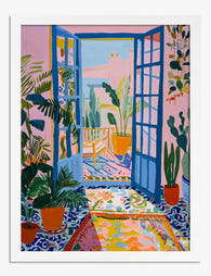
Matisse-Inspired Sunlit Doorway Art Print
Sale price From £11.95£19.95 -

Colourful New York Rowhouses Art Print
Sale price From £11.95£19.95 -

This Must Be The Place Canvas Print
Sale price From £49.95£74.95 -
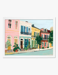
New Orleans Row Houses Art Print
Sale price From £11.95£19.95 -

Bathroom Rules Art Print
Sale price From £11.95£19.95 -

Mi Casa Su Casa Art Print
Sale price From £11.95£19.95 -

Urban Literary Retreat Art Print
Sale price From £11.95£19.95


More from The Frame

From Chintz to Contemporary: Every Type of Flor...
"Floral" is one of the least useful words in interiors. It covers everything from a delicate pressed fern to a wall-sized peony in neon pink. If you've ever said "I...

Best Floral Prints for a Bedroom: A Room-by-Roo...
Bedrooms are the one room in the house where you look at your art from six inches away, half asleep, every single morning. That changes the rules. This guide covers...

You're Overthinking Floral Wall Art: A Room-by-...
You want florals on your walls. You also don't want your flat to look like a Cotswolds tearoom circa 1997. That tension is the entire reason this guide exists. Why...