
 Order today for delivery by
 Stop Buying Random Amalfi Coast Prints: How to Curate a Gallery Wall
A measured, no-guesswork blueprint for building an Italian coastal gallery wall that actually looks curated.


Most Amalfi Coast gallery walls fail for the same reason: they're a pile of pretty prints rather than a planned arrangement. The fix is to treat your wall like a layout problem with specific rules, specific sizes, and a clear anchor. This guide gives you the formulas.
Why the Amalfi Coast is perfect gallery wall material
The Amalfi Coast hands you a built-in palette: cobalt sea, whitewashed buildings, terracotta tiles, lemon yellows, sun-bleached sandstone, deep cypress green. Almost any three prints from the region will share a colour temperature, which is the single hardest thing to get right in a gallery wall.
You also get visual variety inside that palette. Sweeping coastlines, tight street scenes, lemon groves, harbour boats, pastel facades. That means you can hang five prints without any of them feeling repetitive, which is the failure mode of most themed walls.
If you're starting from scratch, browse the full Amalfi Coast art prints collection before you commit to a layout. Seeing the range tells you what's realistic to build around.

Choosing a layout: grid, salon hang, or linear row
There are three layouts worth your time. Pick one before you buy anything.
The grid
Two, three or four prints of identical size, hung in even rows and columns with equal spacing. It's the easiest to execute and the hardest to get wrong. A 2x2 grid of 40x50cm prints reads as confident and architectural. Best above sofas, sideboards and beds.
The salon hang
Asymmetric, mixed sizes, organised around a central anchor print. This is the classic "gallery wall" look. It's harder to plan and demands more prints (usually 5 to 9), but it carries large blank walls and staircases better than anything else.
The linear row
A single horizontal line of three to five prints at equal heights and equal spacing. Brilliant above long furniture (a 2m sideboard, a console table) or running up a staircase wall. Visually calm, very forgiving.
Our honest take: if you've never done this before, start with a grid or a linear row. The salon hang looks effortless in photos because someone spent two hours rearranging paper templates.
How many prints you actually need (hint: start with 3 or 5)
Odd numbers almost always look better than even numbers in asymmetric arrangements. Even numbers work for grids.
- Small wall (under 1.2m wide): 3 prints
- Medium wall (1.2 to 2m wide): 5 prints
- Statement wall (2 to 3m wide): 7 prints
- Large wall or staircase (3m+): 9 or more prints
A useful rule from interior design consensus: your gallery wall should occupy roughly two-thirds the width of the furniture beneath it, or 50 to 75 percent of the available wall span if it's standalone. Anything smaller looks marooned. Anything larger fights the room.
If you're filling a 1.8m sofa, you want the total gallery wall (including spacing between prints) to span around 1.2m. That naturally lands you at 5 prints in mixed sizes, or 3 larger prints in a row.
Picking sizes that work together without looking random
The biggest mistake people make is buying five prints in five different sizes. You don't need that much variety. Two or three sizes is plenty.
Here's the anchor strategy that actually works:
- Start with one anchor. A 50x70cm or 70x100cm print that's clearly the largest piece.
- Add two mid-size prints at 40x50cm or 30x40cm. These sit beside or below the anchor.
- Fill gaps with small prints at 21x30cm if you need them.
For a 5-print salon hang, a reliable size mix is: one 70x100cm anchor, two 40x50cm prints, two 30x40cm prints. For a grid, pick one size and use it throughout. For a linear row of three, three 40x50cm prints will carry almost any space.
Fab art prints go up to 70x100cm and canvas prints up to 150x100cm, which gives you a proper statement anchor if the wall calls for it.

Keeping it cohesive: matching frames, complementary subjects
Two things hold a gallery wall together: frame consistency and a unified palette.
Frames
Pick one frame finish and stick to it across every print. The three that work best for Italian coastal scenes:
- Natural oak. Warm, slightly Mediterranean, plays well with terracotta and sand tones.
- Black. Sharper, more graphic, good if your prints have strong blues and whites.
- White. The lightest option, almost disappears, best on coloured or textured walls.
Mixing frame finishes within one gallery wall almost always looks like a mistake, even when it's intentional. If you want variation, vary the print sizes, not the frames.
Fab's framed prints come with FSC-certified solid wood frames (no MDF, no veneer) and a UV-protective acrylic glaze instead of glass. The acrylic matters for two reasons: it doesn't shatter if a frame slips during hanging, and it stops fading even on a wall that catches afternoon sun. Worth knowing if your gallery wall is going somewhere bright.
Subjects
You want variety within a theme, not chaos. A working formula for five prints:
- 1 wide coastal vista (Positano cliffs, Amalfi from the sea)
- 1 architectural close-up (a pastel facade, a tiled dome)
- 1 still life or detail (lemons, a Vespa, café chairs)
- 1 harbour or boat scene
- 1 landscape or lemon grove
That mix gives the eye somewhere to travel without any two prints competing for the same job.
Mixing Sorrento, Positano, and wider Amalfi Coast prints
The three regions share a visual language but each has its own signature, which is why mixing them works.
- Positano brings the vertical drama: stacked pastel houses on cliffsides, the iconic cathedral dome, dense colour.
- Sorrento is softer and more horizontal: lemon groves, cliff-top hotels, the bay looking towards Vesuvius.
- Wider Amalfi Coast prints (Ravello, Praiano, Amalfi town itself) give you architectural detail, churches, narrow streets, fishing boats.
Pulling one or two from each gives a gallery wall that feels like a real travel memory rather than a stock photo set. Browse the Positano art prints and Sorrento Italy wall art ideas collections side by side to see how they balance.
The cohesion rule: as long as the colour temperatures match (all warm, all cool, or a deliberate split), the locations can vary freely. Avoid combining a bright midday Positano shot with a moody, blue-hour Sorrento shot. The light won't match and the wall will feel disjointed.
Spacing, hanging height, and the tools you'll need
This is where most gallery walls go wrong. Specific measurements matter.
Spacing between frames
5 to 8cm between frames is the sweet spot. Closer than 5cm and the prints feel cramped. Wider than 10cm and they stop reading as a single arrangement. Keep the spacing consistent across the whole wall. If you start with 6cm gaps, every gap should be 6cm.
Hanging height
The centre of your gallery wall should sit at roughly 145 to 152cm from the floor. That's the gallery standard, calibrated to average eye level. If you're hanging above furniture, leave 15 to 20cm between the top of the furniture and the bottom of the lowest frame. Any closer and it feels stacked, any further and the art floats away from the room.
Tools you'll need
- Tape measure
- Spirit level (a phone app works in a pinch but a real one is better)
- Pencil
- Brown paper or newspaper, scissors, masking tape
- Drill, appropriate wall fixings, hammer
The paper template method
Before you put a single hole in the wall:
- Cut paper templates the exact size of each frame.
- Mark where the hanging point is on each template (measure from the frame's hanging hook to the top of the frame).
- Tape the templates to the wall using masking tape.
- Live with the layout for 24 hours. Move things around. Step back.
- Once you're happy, drill through the marked hanging point on each template, then tear the paper away.
This single step saves more gallery walls than any other piece of advice. Fab's framed prints arrive ready to hang with fixtures already attached, so once your holes are in the right place, the rest takes about ten minutes.

Three gallery wall templates you can copy exactly
Each of these is sized for a specific wall scenario. Adjust the prints to your taste but keep the dimensions and spacing.
Template 1: The Three-Print Row (for above a 1.6m sofa or sideboard)
- 3 prints, all 40x50cm portrait
- Hung in a horizontal line, all tops aligned
- 6cm spacing between frames
- Total span: 132cm
- Centre line of prints at 150cm from floor (or 20cm above furniture)
Suggested mix: a Positano cliffside, a lemon still life, an Amalfi harbour scene. All in natural oak frames.
This is the easiest layout in this guide and the hardest to make look bad. If you're nervous, start here.
Template 2: The Five-Print Salon (for a 2m statement wall)
- 1 anchor print at 50x70cm (landscape), positioned centre-left
- 2 prints at 30x40cm (portrait), stacked to the right of the anchor with 6cm between them
- 2 prints at 21x30cm (one portrait, one landscape), one above the anchor on the left, one below the stacked pair on the right
- 6cm spacing throughout
- Anchor centred at 150cm from floor
Suggested mix: a wide Amalfi coastline as the anchor, two Sorrento lemon prints stacked, a Positano dome detail and a Vespa or café scene as the smaller two.
This is the layout that looks "designer" but follows a strict template. Build it with paper first.
Template 3: The Staircase Climb (for a stairwell or 3m+ wall)
- 5 prints, all 30x40cm portrait, all in matching black frames
- Hung in a diagonal line following the rise of the staircase
- The bottom of each frame sits 145cm above the corresponding stair tread (so the line rises with the stairs)
- 8cm horizontal spacing between frames
Suggested mix: five different town views (Positano, Amalfi, Ravello, Sorrento, Praiano), all shot in similar light. The repetition of size and frame makes the rising line read as deliberate rather than random.
If you'd rather skip the planning entirely, pre-curated wall art sets come matched for size, palette and theme already.
A few common mistakes to avoid
- Mixing warm and cool light in your prints. A golden-hour Sorrento next to a stark midday Positano will fight forever. Pick one mood.
- Hanging too high. Art belongs at eye level, not picture-rail level. 150cm centre is the rule.
- Buying frames separately from prints. Frames bought elsewhere rarely sit flush with prints they weren't made for, leading to warping, gaps and visible mount lines. Framed prints that ship as a complete unit avoid this entirely.
- Trying to fill the wall in one go. Start with three prints. Add two more in a month. Gallery walls are allowed to grow.
Final thought
The reason most Italian coastal gallery walls look chaotic is that they're assembled, not designed. Pick your layout first, pick your frame finish second, pick your prints third. Tape paper to the wall before you drill. Keep your spacing to 6cm and your centre line at 150cm. Do those four things and the rest looks after itself.


Fab products featured in this blog
-

Positano Coastline View Art Print
Sale price From £11.95£19.95 -

Amalfi Coast Getaway Art Print
Sale price From £11.95£19.95 -

Amalfi, Italy Travel Illustration Canvas Print
Sale price From £49.95£74.95 -

Positano Harbour Watercolour Art Print
Sale price From £11.95£19.95 -

Amalfi Coast Village Bliss Art Print
Sale price From £11.95£19.95 -

Positano Cliffside View Canvas Print
Sale price From £49.95£74.95 -

Amalfi Coast, Italy Canvas Print
Sale price From £49.95£74.95 -

Amalfi Coast Sunlight Art Print
Sale price From £11.95£19.95 -

Amalfi Coast, Italy Linework Art Print
Sale price From £11.95£19.95 -

Amalfi Coast Travel Poster Art Print
Sale price From £11.95£19.95 -

Sorrento Limoncello Coast Art Print
Sale price From £11.95£19.95 -

Amalfi Coastal Dream Art Print
Sale price From £11.95£19.95 -
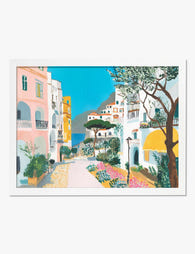
Amalfi Coast Stroll Art Print
Sale price From £11.95£19.95


More from The Frame

Vintage Lemon Prints: From 18th Century Botanic...
Lemons have been showing up in Western art for nearly 400 years, and the visual language we still use today, glossy fruit floating against pale paper with a curl of...

Citrus Prints for Kitchen Walls: Where to Hang ...
Citrus art in kitchens has a bad reputation, and mostly it's deserved. Too many cartoon lemons, too many chalkboard-style oranges, too many prints that look lifted from a chain restaurant....

Why Does Water Lily Art Work in Every Room of Y...
Water lilies sit in a rare category of art: soft enough for a bedroom, structured enough for a hallway, humid-tolerant enough for a bathroom. This guide tells you exactly where...