
 Order today for delivery by
 The Complete Guide to Greenhouse Botanical Gallery Walls
A measurement-led method for capturing conservatory atmosphere on a regular living room wall.


A greenhouse gallery wall is not just a row of plant prints. It is a deliberate mix of glasshouse architecture, tropical foliage, and botanical close-ups that together suggest the lush, humid, slightly overgrown atmosphere of a Victorian conservatory. This guide gives you the formula, the measurements, and three layouts you can copy directly.
Why greenhouse botanicals make better gallery walls than random prints
Most botanical gallery walls fail in the same way: a scattergun of pretty plant illustrations with no through-line. They read as decoration rather than a scene.
Greenhouse botanicals work because they share an implied setting. A print of the Kew Palm House, a close-up of monstera veins, and a tropical fern study all live in the same imaginary world. Your eye reads them as connected even when the styles vary wildly, which means you can mix vintage lithographs with modern photography and still end up with something coherent.
The other advantage is colour discipline. Greenhouse imagery is dominated by greens, warm whites, glass blues, and occasional flower pops. That natural palette does the heavy lifting for you, which is why botanical greenhouse art prints tend to look collected rather than chaotic, even on a first attempt.

Choosing your mix: glasshouse architecture, close-ups, and tropical scenes
The formula is three categories. Aim for roughly 30% from each, with a small buffer for personal taste.
Glasshouse architecture (the anchor)
These are the prints that signal "greenhouse" without a single leaf. Photographs or illustrations of Kew, the Barbican Conservatory, the Eden Project, Belgian orangeries, or any cast iron and glass structure. They tend to have strong horizontal or vertical lines, which gives the wall structural backbone.
You need at least one architecture print. Without it, you have a botanical wall, not a greenhouse wall.
Botanical close-ups (the texture)
Macro shots or detailed illustrations of single leaves, seed pods, fern fronds, or flowers. These add intimacy and slow the eye down. Vintage scientific illustrations work brilliantly here because their precision contrasts nicely with photographic architecture.
Tropical scenes (the lushness)
Wider shots of palm fronds, banana leaves, monstera, bird of paradise, or jungle layering. These provide the "overgrown" feeling that separates a greenhouse aesthetic from a tidy herbarium. Without them, the wall feels too clinical.
If you want to browse subjects in one place, the botanical art prints collection covers all three categories.
The layout formula: start with one anchor print and build outward
Forget arranging six prints at once. The way to plan a gallery wall is sequentially, from a single fixed point.
Step 1. Pick your anchor. This is your largest print, almost always a glasshouse architecture piece. For walls under 180cm wide, use a 50x70cm print. For walls 180-250cm, go to 70x100cm.
Step 2. Place the anchor off-centre. Position it so its centre sits roughly one third of the way across the wall, not in the middle. Centred anchors make gallery walls feel symmetrical and stiff.
Step 3. Add the second-largest print on the opposite side, slightly higher or lower than the anchor. This is your counterweight, usually a tropical scene at 40x50cm or 50x70cm.
Step 4. Fill the gaps with smaller close-ups (30x40cm or A4). Work outward from the anchor, alternating subjects so two close-ups never sit directly next to each other.
Step 5. Stop when you can draw an imaginary rectangle around the whole arrangement and it feels balanced. Most greenhouse gallery walls land at five to nine prints. Below five looks timid. Above nine starts to look frantic unless you commit fully to a salon-style hang.

Exact sizing and spacing for walls between 120cm and 250cm wide
Spacing is where most gallery walls go wrong. Too much space and the prints float independently. Too little and it looks crammed. For a calm, considered greenhouse look, leave 5-8cm between frames. For a denser salon-style hang, drop to 3-5cm. Pick one and stick with it across the whole wall.
120cm wall (alcove, hallway, narrow bedroom wall)
Use four to five prints. One 50x70cm anchor, one 40x50cm counterweight, and two to three 30x40cm close-ups. Spacing 5cm. Total arrangement roughly 110cm wide and 90cm tall.
180cm wall (standard living room wall above a sofa)
Use six to seven prints. One 70x100cm anchor, one 50x70cm tropical, and four 30x40cm close-ups. Spacing 6cm. Total arrangement roughly 165cm wide and 110cm tall. Sit the bottom edge of the lowest print 20-25cm above the sofa back.
220cm wall (large living room or dining wall)
Use seven to nine prints. One 70x100cm anchor, two 50x70cm secondary prints (one tropical, one architectural), and four to six 30x40cm close-ups. Spacing 6-8cm. Total arrangement roughly 200cm wide.
250cm wall (open-plan main wall)
Go salon-style with nine to twelve prints. One 70x100cm anchor, three 50x70cm prints across the categories, and the rest a mix of 30x40cm and A4. Spacing 4-5cm to keep density high. This is where greenhouse aesthetics really sing because the layered, slightly overgrown feeling matches the actual reference.
If sizing every print individually feels like too much admin, the wall art sets are pre-matched for scale and tone, which strips out half the planning.
Keeping frames consistent without everything looking identical
The "matchy" problem is real. Identical frames in identical sizes look like a hotel corridor. The fix is to commit to one finish but vary the frame width or style within it.
Pick one finish: all black, all natural oak, all walnut, or all brass. Mixing finishes almost always reads as accidental rather than eclectic.
Vary the width: use a thin profile (around 1.5cm) on your close-ups and a wider profile (3cm or more) on your anchor. The visual hierarchy this creates is what separates a "collected" wall from a "bought as a set" wall.
Use mounts strategically: a wide white mount around a small print makes it feel more important and gives the eye somewhere to rest between dense images. Skip mounts on tropical scenes where you want the foliage to fill the frame.
A practical note on materials. Frames built from solid FSC-certified wood hold their shape over years, which matters because gallery walls are a long-term arrangement. Veneered MDF frames warp at the corners within a few seasons, particularly in rooms with any humidity, and a single warped frame ruins the geometry of the whole wall.
UV-protective acrylic glaze is the other quiet hero. Greenhouse-themed prints often hang in the brightest rooms in the house, and standard glass with non-UV inks will fade greens to a muddy yellow within a couple of years.
How to balance greens, neutrals, and pops of colour
Greenhouse imagery skews heavily green, which sounds like a non-issue until you hang eight green prints together and the wall reads as a single muddy mass.
The 60-30-10 rule works well here. Aim for roughly 60% green-dominant prints (foliage, ferns, palms), 30% neutral-dominant prints (architecture with white frames and glass, pale botanical illustrations on cream backgrounds), and 10% colour pop prints (a single orchid, a flowering hibiscus, a bird of paradise bloom).
Distribute the neutrals deliberately. Place them so they break up runs of green, never clustered together. The architecture prints usually do this work for you because their pale skies and white framework act as visual breathing room.
For colour pops, one is plenty on a five-print wall. Two on a nine-print wall. More than that and the eye stops knowing where to land.

Hanging tips that save your walls (and your patience)
Make paper templates. Cut newsprint or brown paper to the exact size of each frame. Mark where the hanging hook sits on the back of the frame onto the paper. Tape templates to the wall with masking tape and live with the layout for at least 48 hours before drilling. You will move things. Everyone moves things.
Measure from the centre, not the floor. Gallery walls should be centred at roughly 145-150cm from the floor, which is gallery standard eye level. If you are hanging above furniture, override this and centre the arrangement so its bottom edge sits 20-25cm above the furniture back.
Use two fixings per frame on anything 40x50cm or larger. A single nail allows the frame to tilt every time someone closes a door. Two fixings keep things level permanently.
Drill into plasterboard with proper anchors. Self-drilling plasterboard plugs hold up to 15kg comfortably, which covers any framed print at standard sizes. For solid walls, a 6mm masonry drill bit and a brown plug works for everything up to 70x100cm.
Hang the anchor first. Then work outward, checking each new print against the templates. If you find yourself adjusting the templates after the first real frame goes up, move the templates, not the frame.
A useful detail: prints that arrive with fixtures already attached and properly fitted within the frame save about an hour per piece versus assembling a frame and print yourself. They also avoid the most common gallery wall failure, which is bubbling between print and backing board where the two were not properly mounted.
Three gallery wall layouts you can copy directly
Layout 1: The Conservatory Grid (180cm wall, six prints)
A clean three-by-two grid with one swap to break the symmetry.
- Top row left to right: 50x70cm Palm House interior, 50x70cm monstera close-up, 50x70cm fern illustration
- Bottom row left to right: 50x70cm tropical jungle scene, 70x100cm Kew exterior anchor (spans bottom-centre two cells), 50x70cm orchid pop
- Spacing: 6cm
- Frames: all black, 2cm profile, no mounts
This works best in modern living rooms with clean architectural lines.
Layout 2: The Off-Centre Cluster (220cm wall, seven prints)
An organic arrangement that reads as collected over time.
- 70x100cm glasshouse architecture anchor positioned one third from the left, hung at 145cm centre
- 50x70cm tropical scene to the upper right, top edge aligned with anchor top
- 50x70cm botanical illustration to the lower right, bottom edge aligned with anchor bottom
- Four 30x40cm close-ups filling the remaining right-side space, alternating subjects
- Spacing: 5-7cm (vary slightly to keep it organic)
- Frames: all natural oak, varying widths from 1.5cm on close-ups to 3cm on the anchor
Best in older homes, period properties, or anywhere with character mouldings.
Layout 3: The Salon Wall (250cm wall, eleven prints)
Dense, lush, deliberately overgrown.
- 70x100cm Victorian glasshouse anchor, slightly left of centre
- Three 50x70cm prints at uneven heights (one tropical, one architectural, one close-up)
- Seven mixed 30x40cm and A4 prints filling all remaining space
- Spacing: 4cm consistent
- Frames: all brass or all warm walnut, mixed widths
- Optional: one or two prints unmatted, the rest with thin cream mounts
This is the layout that captures the actual greenhouse feeling most accurately, because real conservatories are layered and slightly chaotic. It needs a wall you can fully commit to.

A note on lighting
Green-heavy walls go muddy under cool overhead lighting. Warm-white bulbs (2700K-3000K) keep foliage prints vibrant. If you can add a picture light or a directional spot above the anchor, the whole wall lifts. Avoid hanging directly opposite a window where afternoon sun will hit the wall flat, which flattens depth in close-up prints. Side-lit walls always look better.
Seasonal refresh without rehanging
Once your layout is set, you can swap two or three prints seasonally without touching the fixings. Spring leans into flowering glasshouse and orchid prints. Summer goes heavier on tropical scenes and palm photography. Autumn brings in ferns, dried seed pods, and pressed botanical illustrations. Keep the anchor and the architecture prints fixed year-round so the structure stays consistent.
For source variety across seasons, the broader nature art prints collection is worth bookmarking for moments when you want to pull greenhouse aesthetics in a slightly different direction.
The short version
Pick one anchor (architecture), one counterweight (tropical), and a handful of close-ups. Commit to a single frame finish but vary the widths. Space everything 5-8cm apart for calm, 3-5cm for salon density. Make paper templates before you drill. And resist the urge to make it perfect on the first hang, because the best greenhouse walls look like they grew into place.

Fab products featured in this blog
-

Kew Gardens Botanical House Art Print
Sale price From $19.95$32.95 -

Kew Gardens Glasshouse Travel Poster Canvas Print
Sale price From $64.95$107.95 -

Kew Gardens Glasshouse Travel Poster Art Print
Sale price From $19.95$32.95 -

Kew Gardens Botanical House Canvas Print
Sale price From $64.95$107.95 -

Botanical Stairway Canvas Print
Sale price From $64.95$107.95 -

Glasshouse Cacti at Kew Art Print
Sale price From $19.95$32.95 -
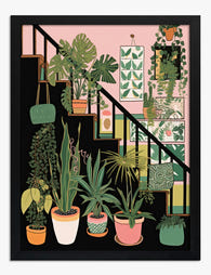
Botanical Stairway Art Print
Sale price From $19.95$32.95 -

The Botanical House Canvas Print
Sale price From $64.95$107.95 -

Kew Gardens Glasshouse Travel Poster Canvas Print
Sale price From $64.95$107.95 -

Botanical Staircase Haven Canvas Print
Sale price From $64.95$107.95 -

Kew Gardens Glasshouse Travel Poster Art Print
Sale price From $19.95$32.95 -

The Botanical House — Heritage Print Canvas Print
Sale price From $64.95$107.95 -
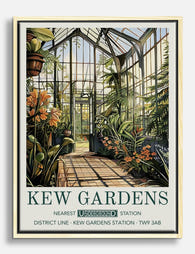
Kew Gardens Botanical House Canvas Print
Sale price From $64.95$107.95 -

Glasshouse Cacti at Kew Canvas Print
Sale price From $64.95$107.95


More from The Frame

Van Gogh Botanical Prints vs Traditional Botani...
Both traditions put plants on your wall, but they do wildly different things once they get there. Traditional botanical illustration is quiet, precise, and pattern-friendly. Van Gogh's flowers and gardens...

William Morris vs Art Nouveau: What Style Is It...
Short version: William Morris was not Art Nouveau. He was Arts and Crafts, a movement he helped invent. The two styles overlap enough to confuse almost everyone, and getting the...

Whimsical Nursery Wall Art Ideas That Grow With...
Most nursery art is designed for the parents standing in the room at 3am, not the seven-year-old who will eventually sleep there. That's why so much of it gets swapped...