
 Order today for delivery by
 The Complete Guide to Styling Vintage Floral Art Prints
How to make Morris, Japanese botanicals and Art Nouveau florals feel current in 2026, not stuck in 1894.


Vintage florals have a reputation problem. Done badly, they look like a tea room in a heritage village. Done well, they're one of the most striking, layered things you can hang on a modern wall.
This guide is about doing them well. We'll cover the three distinct vintage floral traditions worth knowing, the framing and scale decisions that separate "intentional" from "dated," and the wall colours that make these prints sing rather than sulk.
The comeback of floral prints in modern interiors (and why it's not just nostalgia)
The current interest in vintage floral art prints isn't a costume drama. It's a reaction to a decade of identikit interiors: greige walls, mass-produced abstract canvases, three line drawings of a face. People are bored, and they want pattern, history and craft back in their homes.
Vintage florals deliver all three. A William Morris print carries 150 years of design pedigree. A Japanese botanical from the Edo period carries a completely different visual language built on negative space and line. An Art Nouveau floral carries the swagger of Belle Époque Paris. None of this reads as nostalgic when the rest of the room is doing something modern.
The trick, and it really is the whole trick, is making sure the print is the vintage element. Not the print, plus the frame, plus the wallpaper, plus the cushions, plus the lamp. Pick your vintage moment and let everything else be quieter.

William Morris florals: the gold standard for vintage floral wall art
Morris is the obvious starting point, and for good reason. His patterns (Strawberry Thief, Pimpernel, Honeysuckle, Willow Bough) are some of the most recognisable designs in Western decorative arts. They're dense, symmetrical, and built on close observation of British plants and birds.
What makes william morris floral prints work in a modern home is exactly what made them radical in the 1880s: they're maximalist, but they're also rigorously composed. There's nothing accidental about a Morris pattern. Every leaf has a job.
Where Morris works
Morris excels in spaces with a bit of architectural presence. Dining rooms, hallways with high ceilings, the wall behind a freestanding bath. He needs room to breathe. A single large Morris print (we'd recommend 70x100cm minimum) on a plain wall above a modern sideboard is one of the most reliable styling moves you can make.
Where Morris struggles
Small bedrooms with a lot of pattern already happening. Kitchens with busy tiling. Anywhere you've got competing decorative elements. Morris is the loudest voice in any room he enters, so don't ask him to share a stage.
The framing call
This matters more for Morris than any other style. An ornate gilt frame on a Morris print is a one-way ticket to grandma's house. A slim matte black frame, or natural oak with a clean profile, immediately drags the print into the present. Skip the mount board entirely or keep it narrow and off-white. Anything thicker than 5cm of mount and you're back in 1985.
Japanese botanicals: a lighter, more minimal alternative
If Morris is a full orchestra, Japanese botanicals are a single cello. Think of the Edo-period prints of plum blossom, irises, chrysanthemums and bamboo. Lots of paper showing. A few confident lines. Restrained colour, often just ink and one or two flat washes.
These prints sit in a completely different design conversation. They're not maximalist florals dressed down. They were minimal from the start, which is why they work so well in contemporary interiors that already lean toward restraint.
Where Japanese botanicals work
Bedrooms, studies, narrow hallways, anywhere with a Scandinavian or Japandi bent. They pair beautifully with linen, raw wood, off-white walls and matte ceramics. A triptych of three smaller Japanese botanicals (40x60cm each) spaced evenly above a low bench is a very hard look to get wrong.
Browse traditional japanese art prints if you want to see the range. The same flower (an iris, say) can read as graphic, calligraphic or almost abstract depending on the artist and era.
The framing call
Natural ash, light oak, or a very slim white frame. Japanese botanicals were originally printed on paper meant to be handled, not framed and glazed, so any heavy framing fights the spirit of the work. Keep it light.

Art Nouveau florals: when you want curves and drama
Art Nouveau is the bridge between Morris's pattern density and the looser lines of the early 20th century. Think Alphonse Mucha's whiplash curves, his lily-framed women, the metro entrances of Paris, the iris-and-peacock obsession of the 1890s.
These prints have a theatricality the other two don't. They're often vertical, often feature a figure surrounded by florals, and they almost always involve curves doing things curves shouldn't logically be able to do.
Where Art Nouveau works
Halls. Stairwells. Bathrooms with good ceiling height. Behind a console in an entryway. Anywhere you want one decisive piece of drama rather than a layered scheme. Art Nouveau is inherently confident, so the room around it should be quiet enough to let the print do its job.
Where it struggles
Open-plan family rooms with a lot of other visual activity. Anywhere too cosy. Art Nouveau wants a slightly formal setting to read properly. Drop it next to a beanbag and a TV and it looks marooned.
The framing call
Counterintuitively, Art Nouveau looks best in restrained framing. A thin black or deep walnut frame keeps the focus on the curves of the artwork itself. Avoid anything period-appropriate (no swirly gilt) unless you're committed to a full historical scheme, which most people aren't.
How to stop floral prints looking dated: framing, scale, and wall colour
This is the section that does the heavy lifting. Three variables, and getting any of them wrong is what tips a print from "considered" to "chintzy."
Framing
We've touched on this for each style, but the universal rule: the more vintage the print, the more modern the frame should be. Slim profiles. Matte finishes. Black, white, natural oak or walnut. Skip the ornate, skip the gold, skip anything with a moulded edge.
A real concern with vintage floral prints sold cheaply is warping, bubbling, or frames arriving separately from the print. Our framed prints ship fitted and ready to hang in one box, with UV-protective acrylic glaze rather than glass, so the colours hold up even in a sunny room. Worth checking before you buy from anywhere.
Scale
The single biggest mistake people make with vintage florals is going too small. A 30x40cm Morris print on a large wall reads as fussy and timid. The same print at 70x100cm reads as intentional and confident. Scale is what tells a guest "I chose this," rather than "I inherited this."
The rule we use: if it's a single statement print, go as big as the wall allows, leaving roughly equal breathing room above and below the piece relative to surrounding furniture. If it's part of a gallery wall, vary sizes but make one piece the clear anchor.
Wall colour
The same Morris print on a brilliant white wall looks like a heritage shop display. On a deep sage green wall, it looks like a designed room. On a warm putty or clay wall, it looks contemporary and grown-up. On a charcoal wall, it looks like a private members' club.
Our general guidance: avoid pure white behind vintage florals. The contrast is too clinical and tends to highlight every "old-fashioned" quality of the print. Instead, try a muted, slightly chalky colour from the print's own palette. A Morris Pimpernel sits beautifully on a soft olive. A pink-toned Japanese plum blossom looks elegant on a warm grey. Pull the colour from the artwork, then dial down the saturation by 30%.

Mixing floral prints with other art styles without creating chaos
The advice "mix old and new" is everywhere and useless on its own. Here's what actually works.
The one bold element rule
If your vintage floral is doing the heavy lifting (large scale, strong pattern, prominent position) then everything else in the room's art collection should be quieter. Black and white photography. A muted abstract. A line drawing. The floral is the soloist and the rest is rhythm section.
The colour bridge
Pick one accent colour from the floral print and repeat it twice elsewhere in the room. Not in matching cushions (that's the matchy-matchy trap), but in different mediums. The dusty rose in a Morris print might reappear as a ceramic lamp base and the spine of a stack of books. This visual repetition is what makes the floral feel integrated rather than parachuted in.
Era spacing
Don't pair a Victorian floral with a Victorian portrait and a Victorian still life. You'll have built a museum room. Instead, put a Victorian floral next to a 1960s graphic print and a contemporary photograph. The eras should be different enough that they read as a curated collection, not a period set.
The gallery wall question
Vintage florals can work in gallery walls, but with caveats. We'd avoid the dense cluster of small prints (more than five, all under 40x60cm) because that's exactly the cottagey effect people are trying to escape. Instead, try a structured grid of three or four medium prints, or one large anchor flanked by two smaller supporting pieces. Spacing should be generous: 8-10cm between frames minimum.
Our top picks: the best vintage floral prints for living rooms, bedrooms, and hallways
A few specific recommendations based on what we've seen work consistently.
Living rooms
A single large decorative floral art print above the sofa, in the 70x100cm or 100x70cm range, framed in slim black or walnut. We'd lean Morris or Art Nouveau here, both of which can hold their own against the visual weight of furniture. If the sofa is patterned or the room is busy, swap to a Japanese botanical to keep things calm.
Canvas works well in living rooms too if you want a softer, less reflective look. Our canvas prints use a mirrored edge wrap so the main image isn't cropped, and the matte finish handles sunny rooms without glare.
Bedrooms
Japanese botanicals are almost always the right answer. They're restful, they don't compete with bedding, and they work in pairs or threes above a bed or dresser. A pair of 50x70cm botanical prints in pale oak frames above a bed feels considered without feeling clinical.
If you want Morris in a bedroom, go for one of his quieter patterns (Willow Bough rather than Strawberry Thief) and keep everything else in the room very plain: white linen, natural wood, no other pattern.
Hallways
Hallways are where Art Nouveau and victorian floral prints earn their keep. Narrow walls and limited furniture mean a single dramatic print can carry the whole space. Vertical formats work particularly well in hallways given the shape of the wall.
For longer hallways, a series of three or four botanical art prints in matching frames, evenly spaced, makes a corridor feel intentional rather than transitional. Keep frame style and mat width consistent. Vary the artwork.

A final word on getting it right
Vintage florals reward commitment. If you're going to hang Morris, go big, frame it slim, and let it run the room. If you're going Japanese, lean into the restraint and don't over-style around it. If you're going Art Nouveau, give it the breathing space its drama demands.
The prints themselves have already done their job, some of them for over a century. Your only job is not to bury them under the wrong frame, the wrong wall colour, or six other things competing for attention. Pick your moment, then get out of its way.

Fab products featured in this blog
-

Jasmine Pattern Vase, Morris Inspired Art Print
Sale price From £11.95£19.95 -

Morris Floral Vase No. 5 Art Print
Sale price From £11.95£19.95 -

William Morris Exhibition Poster Art Print
Sale price From £11.95£19.95 -

Flower Garden Textile by William Morris Art Print
Sale price From £11.95£19.95 -

William Morris Cotton Prints Exhibition Art Print
Sale price From £11.95£19.95 -

William Morris Snakes & Peonies Exhibition Art Print
Sale price From £11.95£19.95 -

Morris Floral Vase Study No. 04 Art Print
Sale price From £11.95£19.95 -

William Morris Tulip Liberty London Poster Art Print
Sale price From £11.95£19.95 -

William Morris Cotton Prints Exhibition Art Print
Sale price From £11.95£19.95 -

Chrysanthemum by William Morris Art Print
Sale price From £11.95£19.95 -

Liberty London Roses Exhibition Poster Art Print
Sale price From £11.95£19.95 -

William Morris Lodden Floral – Liberty London Art Print
Sale price From £11.95£19.95 -

Morris Botanical Vase, Fig. 08 Art Print
Sale price From £11.95£19.95 -
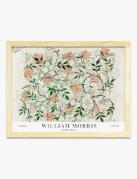
Jasmine Pattern by William Morris Art Print
Sale price From £11.95£19.95 -

Cray by William Morris Art Print
Sale price From £11.95£19.95 -
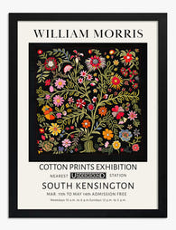
William Morris Cotton Prints Exhibition Art Print
Sale price From £11.95£19.95 -

William Morris Botanical Bloom Exhibition Art Print
Sale price From £11.95£19.95 -

William Morris Cotton Prints Exhibition Canvas Print
Sale price From £49.95£74.95


More from The Frame

Citrus Prints for Kitchen Walls: Where to Hang ...
Citrus art in kitchens has a bad reputation, and mostly it's deserved. Too many cartoon lemons, too many chalkboard-style oranges, too many prints that look lifted from a chain restaurant....

Why Does Water Lily Art Work in Every Room of Y...
Water lilies sit in a rare category of art: soft enough for a bedroom, structured enough for a hallway, humid-tolerant enough for a bathroom. This guide tells you exactly where...

Van Gogh Botanical Prints vs Traditional Botani...
Both traditions put plants on your wall, but they do wildly different things once they get there. Traditional botanical illustration is quiet, precise, and pattern-friendly. Van Gogh's flowers and gardens...