
 Order today for delivery by
 The Kitchen Gallery Wall Edit: Curated Food Prints That Work
Stop scrolling Pinterest for inspiration and start with actual measurements, exact print counts, and combinations that work.


Most kitchen gallery walls fail for the same reason: people pick prints they like individually, hang them roughly, and hope for the best. This guide gives you the formulas, the numbers, and the print combinations to skip that step. By the end you'll know exactly how many prints you need, where to hang them, and which ones look good together.
Gallery walls in kitchens: why they work better than you think
Kitchens are usually treated as functional rooms with maybe a single print above the table and nothing else. That's a missed opportunity. Kitchens already have visual rhythm built in (cabinets, tiles, hardware) and a gallery wall slots into that grid naturally rather than fighting it.
The trick is that a kitchen gallery wall needs to be tighter and more disciplined than one in a lounge. You're sharing wall space with extractor hoods, plug sockets, and shelving, so sprawling salon hangs rarely work. Tight, considered groupings do.
There are practical zones to avoid. Don't hang prints directly above the hob (grease and heat will ruin them), don't hang them within splash range of the sink, and keep them at least 30cm clear of the kettle and toaster zone. Steam is the silent killer of paper prints over time, and even acrylic-glazed framed prints don't enjoy a daily sauna.
Good spots: the wall opposite the run of cabinets, the breakfast nook, the wall around or above a dining table, the gap between wall units and worktop if it's deep enough, and the wall above a sideboard or larder cabinet.
Grid vs. salon hang: which layout suits your kitchen
A grid hang means identical frame sizes, identical spacing, arranged in a clean rectangle. A salon hang is the looser, mixed-size arrangement you usually see in Victorian-style rooms with art layered floor to ceiling.
For kitchens, we almost always recommend a grid. Here's why: kitchens have a lot of competing visual information already (cabinet handles, splashback tiles, appliances, open shelving, glassware). A salon hang adds another layer of busyness on top of that, which is exactly the cluttered look most people are trying to avoid.
A 2x2 grid of 30x40cm prints, or a 3x1 row of 40x50cm prints, gives you presence without chaos. The eye reads it as one object instead of six.
The exception is the breakfast nook. If you have a dedicated dining corner with a banquette or a small table tucked against a wall, a salon hang can work because the surrounding area is calmer. You're essentially treating it as a mini lounge zone rather than part of the working kitchen.

Choosing a cohesive theme (without making it boring)
The most common mistake is picking prints that are all "food" but have nothing else in common. A vintage Italian wine poster, a moody dark photograph of figs, a pastel illustration of cupcakes, and a botanical lemon print are all food prints. Hung together they look like a charity shop wall.
Cohesion comes from three things: palette, style, and era. You don't need all three to match, but you need at least two.
Palette: pick a colour story and stick to it. Warm earth tones (terracotta, mustard, olive, cream) work beautifully in most kitchens. Cool tones (sage, slate, soft blue, off-white) suit Scandi or coastal kitchens. Pick three to four colours that appear across all the prints, even if the subjects differ.
Style: all illustrated, all photographic, or all vintage poster. Mixing styles is hard to pull off and usually reads as accidental rather than curated.
Era: modern minimalist food photography pairs with modern illustration. Vintage botanicals pair with vintage advertising posters. Don't mix a 1920s aperitif poster with a 2020s flat-lay coffee photograph.
A safe formula: pick a subject family (fruit and vegetables, Mediterranean ingredients, baking, coffee culture, wine and aperitivo) and a single style. Browse food art prints filtered by that style and the palette will start to emerge naturally.
How many prints you actually need (hint: fewer than you think)
This is where most guides get vague. Here's a proper formula.
Measure your wall in centimetres (width x height). The gallery wall should cover roughly 60-75% of the available width and sit within the middle vertical third. Going above 75% looks cramped, below 60% looks lost.
Small kitchen wall (under 120cm wide): 2 to 3 prints. A vertical pair of 30x40cm or a horizontal row of three 21x30cm.
Medium wall (120-180cm wide): 3 to 4 prints. A row of three 40x50cm, or a 2x2 grid of 30x40cm.
Large wall (180-250cm wide): 4 to 6 prints. A 3x2 grid of 30x40cm, or a row of four 40x50cm, or three 50x70cm.
Feature wall (over 250cm wide): one statement piece at 70x100cm or a 3x2 grid of 40x50cm prints. Resist the urge to keep adding.
The rule we live by: when in doubt, do fewer prints at a larger size rather than more prints at a smaller size. Six tiny 13x18cm prints in a kitchen always look like a mistake. Three 40x50cm prints almost never do.
Frame colour and finish: matching your kitchen hardware
This is the detail that separates a thrown-together wall from a designed one, and almost nobody talks about it. Your frame finish should echo the dominant metal or wood tone already in your kitchen.
Brass or gold hardware: natural oak frames or warm walnut. Avoid black frames (too harsh against brass) and white frames (too cold). If you want contrast, a deep walnut works.
Matte black hardware: black frames are the obvious answer and they do work, but try one print in oak as a mixer to stop it looking too uniform. White frames also work if you have white cabinets.
Chrome or stainless steel hardware: white frames or pale oak. Black can work but feels heavier. Avoid warm woods like walnut, they clash with the cool metal.
Brushed nickel or pewter: white, pale oak, or black. This is the most flexible hardware to work with.
No visible hardware (handleless kitchens): take your cue from the worktop and flooring instead. Warm wood floor with stone worktop? Oak frames. Concrete or dark worktop? Black frames.
Mixing two frame finishes within one gallery wall can work if you alternate them in a pattern (oak, black, oak, black across a row). Three or more finishes almost always looks accidental. Pick one and commit.
A note on the frames themselves: cheap frames warp in kitchens because of humidity changes. Solid wood frames with proper construction hold up. Our framed prints use FSC-certified solid wood with UV-protective acrylic glaze rather than glass, which means no glare from kitchen lighting and no fading even on a sunlit wall. Worth the investment in a room where the air moves around a lot.

Exact spacing and hanging heights for kitchen gallery walls
Vague advice ends here. These are the numbers.
Spacing between frames: 5 to 7cm gap on all sides. Closer than 5cm looks crammed, wider than 7cm and the prints stop reading as a group. For a tight grid hang in a small kitchen, go with 5cm. For a more breathable feel in a larger space, 7cm.
Centre height: the centre point of your gallery wall (not the centre of the top print) should sit at 145-150cm from the floor. This is gallery standard and it works because it lands at average eye level for most adults.
Above furniture: if you're hanging above a sideboard, dining table, or worktop, leave 15-20cm between the top of the furniture and the bottom of the lowest frame. Less than 15cm looks like the art is resting on the surface. More than 20cm and it floats.
Above a dining table: the bottom of the lowest frame sits 25-30cm above the tabletop. People need to see each other across the table without art in the way.
The mock-up method (do this, don't skip it): before you put a single hole in the wall, lay all the frames out on the floor in the exact arrangement and spacing you want. Step back. Photograph it from above. Adjust. Then cut paper templates to the size of each frame, tape them to the wall in position using masking tape, and live with it for 24 hours. You'll catch every spacing mistake before it becomes a hole in the plaster.
For perfectly even spacing, use a spacer block: cut a piece of cardboard to your exact gap size (say 6cm) and use it as a physical guide between frames as you hang. Easier than measuring every time.
Can you hang above kitchen cabinets? Technically yes, but only if there's at least 40cm of space between cabinet top and ceiling. Anything less and the prints look squashed. If your cabinets go nearly to the ceiling, don't force it.
Our favourite food art print combinations for a 3, 4, or 6-piece wall
The combinations below are tested formulas. Each one balances colour, subject, and visual weight so the wall reads as a single composed piece rather than four random things.
The 3-piece wall (Mediterranean kitchen)
A horizontal row of three 40x50cm prints in oak frames. Theme: Italian pantry.
- A still life of lemons or a lemon tree branch (yellow and green dominant)
- A bottle of olive oil or an olive branch (green and cream)
- Fresh pasta or a bowl of tomatoes (warm red and cream)
Palette: yellow, green, terracotta, cream. Works against white walls, sage cabinets, or warm cream cabinets. Brass hardware pairs perfectly.
The 4-piece wall (Scandi breakfast nook)
A 2x2 grid of 30x40cm prints in white or pale oak frames. Theme: morning ritual.
- A coffee cup or coffee pot, illustrated
- A loaf of bread or pastries
- A bowl of fruit (berries or pears work)
- A jug of milk or honey on a cloth
Palette: cream, soft brown, muted pink, oat. Works beautifully in a small dining corner with a round table. Pairs with chrome or brushed nickel hardware.
The 6-piece wall (statement dining wall)
A 3x2 grid of 30x40cm prints in matching black frames. Theme: market haul.
- Top row: a cluster of herbs, a head of garlic, a fig still life
- Bottom row: a glass of red wine, a wheel of cheese, a bunch of grapes
Palette: deep green, burgundy, charcoal, cream. This combination needs a darker or more dramatic kitchen to land properly (deep green cabinets, navy, charcoal). In an all-white kitchen it can feel heavy.
Browse curated wall art sets if you want the matching done for you, or filter kitchen wall art by colour to build your own combination.

A note on seasonal rotation
One advantage of a grid hang in standard frame sizes is that you can swap prints in and out without rehanging anything. Buy two or three extra prints in the same dimensions (autumn squashes, winter citrus, spring asparagus, summer stone fruit) and rotate them through the existing frames every few months. The frames stay, the mood changes.
This is the easiest way to keep a kitchen feeling current without redecorating. It also means you can experiment with prints you're less sure about, since they'll only be up for three months at a time.

Final thoughts
The kitchens with the best gallery walls aren't the ones with the most prints or the most expensive frames. They're the ones where someone took the time to measure properly, picked a palette and stuck to it, and resisted the urge to add a seventh print.
Start with the wall, not the prints. Measure, work out your coverage percentage, pick your layout, then choose prints to fit. Doing it in that order is the difference between a gallery wall that looks designed and one that looks decorated by accident.

Fab products featured in this blog
-

The Kitchen Objects Exhibition Print Canvas Print
Sale price From £49.95£74.95 -

Whimsical Kitchen Essentials Art Print
Sale price From £11.95£19.95 -

Blue Kitchen Sketches Canvas Print
Sale price From £49.95£74.95 -

Whimsical Kitchen Essentials Canvas Print
Sale price From £49.95£74.95 -

Whimsical Kitchen Essentials Canvas Print
Sale price From £49.95£74.95 -

No Bitchin In My Kitchen Art Print
Sale price From £11.95£19.95 -

Vibrant Kitchen Gathering Canvas Print
Sale price From £49.95£74.95 -
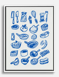
Playful Kitchen Sketches Canvas Print
Sale price From £49.95£74.95 -

Vibrant Interiors Kitchen Scene Canvas Print
Sale price From £49.95£74.95 -

City View Kitchen Canvas Print
Sale price From £49.95£74.95 -

Supper Spread on Pink Canvas Print
Sale price From £49.95£74.95 -

Mooncake Baking Table Canvas Print
Sale price From £49.95£74.95 -

Kitchen Window onto the Square Canvas Print
Sale price From £49.95£74.95 -

Italian Kitchen Doodles Art Print
Sale price From £11.95£19.95 -
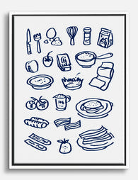
Kitchen Doodles in Navy Canvas Print
Sale price From £49.95£74.95 -
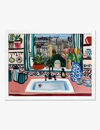
Parisian Kitchen Window Art Print
Sale price From £11.95£19.95 -
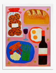
Supper Spread on Pink Art Print
Sale price From £11.95£19.95 -

Vibrant Kitchen Gathering Art Print
Sale price From £11.95£19.95 -

Sunlit Kitchen Still Life Canvas Print
Sale price From £49.95£74.95 -
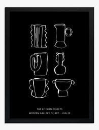
The Kitchen Objects Exhibition Poster Art Print
Sale price From £11.95£19.95


More from The Frame

Why Kew Gardens Became the World's Most Famous ...
Kew Gardens holds around 200,000 botanical illustrations, the largest collection of its kind anywhere. Behind that number is a story of royal ambition, global exploration, and artists sent to the...

Are Botanical Prints Still in Style? Why They W...
Yes, botanical prints are still in style. But the version of botanical art that feels current in 2025 looks very little like the pastel rose bouquets in gilt frames you...

What Peacock Feathers Symbolise in Art: From An...
Few motifs have travelled as far or meant as many things as the peacock feather. It has been carved into Persian palaces, embroidered onto Mughal thrones, painted by Art Nouveau...