


 Order today for delivery by
The Only Kitchen Art Guide Food Lovers Need
How to celebrate food on your walls without turning your kitchen into a trattoria themed gift shop.


Most kitchen art advice sends you straight toward pasta cartoons, "EAT" signs, and cursive coffee quotes. If you actually care about food, you probably want something more considered on your walls. This guide covers what works, where to hang it, and how to make food art feel editorial rather than novelty.
Why most kitchen art gets it wrong (and what to do instead)
The default kitchen art formula is cheerful, literal, and loud. A fried egg illustration. A chalkboard-style espresso sign. Three lemons in a bowl rendered in flat vector. These pieces photograph well on social media and die on a real wall within a week.
The problem is tone. A working kitchen already has visual noise: hardware, appliances, utensils, open shelving, food itself. Adding cartoonish art competes with the room rather than complementing it. The result reads as a themed restaurant, not a home.
The better approach is to treat kitchen art the same way you would art for a lounge. Choose pieces with depth, texture, and a point of view. A moody still life of artichokes beats a flat illustration of pasta every time. Editorial food photography, botanical prints, abstract compositions in kitchen-appropriate palettes: these are what sophisticated kitchen wall art for foodies actually looks like.
A good test: would you hang this piece anywhere else in your home? If the answer is "only in the kitchen because it's about food," you're probably in novelty territory.
Food photography vs food illustration: which suits your kitchen
The split between photography and illustration is the single most useful decision you can make before buying anything.
Food photography works best in modern, minimalist, and industrial kitchens. Think dark backgrounds, dramatic lighting, close-up compositions of ingredients or finished dishes. It reads as sophisticated because it borrows the visual language of cookbooks and food magazines rather than children's menus. A single large print of oysters on ice or a halved pomegranate on linen will anchor a modern kitchen in a way no illustration can.
Food illustration suits traditional, country, and warm Mediterranean-style kitchens. The key word is "illustration," not "cartoon." Botanical-style ink drawings of herbs, vintage-feel watercolours of citrus, hand-painted mushroom studies: these have craft and character. They sit beautifully alongside painted shaker cabinets, open shelves of ceramics, and wooden countertops.
The failure mode in both categories is the same: anything that feels mass-produced, overly cute, or designed to be "fun" rather than beautiful. Our food and drink prints collection leans into both camps but avoids the novelty trap in each.

The best spots for art in a kitchen (and the ones to avoid)
Not every kitchen wall wants art. Some zones are too chaotic, too hot, or too exposed to be good homes for a print.
Spots that work:
- Above a run of countertop where no cooking happens (coffee station, prep zone away from the hob)
- The wall above a breakfast bar or kitchen island with seating
- Between upper cabinets if there's a natural gap of 18 inches or more
- The wall behind or above a dining table in a kitchen-diner
- Open shelving backdrops where art sits behind ceramics and glassware
- Narrow galley kitchen end walls
Spots to avoid:
- Directly behind or beside the hob
- Immediately above the kettle or coffee machine where steam rises daily
- Inside a splash zone around the sink
- Any wall that gets hit by direct afternoon sun through an unshaded window if you've chosen poor-quality printing
The coffee station deserves special mention. For many food lovers it's the one corner of the kitchen that feels truly personal, and it benefits enormously from being treated as a micro-gallery. Two or three smaller prints stacked or arranged in a tight grid above the machine create a dedicated feature zone without competing with the rest of the kitchen.
Size guide: what works above countertops, shelving, and breakfast bars
Scale is where most people go wrong. A 30x40cm print floating alone above a two-metre countertop looks lost. A 100x150cm canvas squeezed between two upper cabinets looks claustrophobic.
The reliable rule is the two-thirds principle: your art (or arrangement of art) should fill roughly two-thirds the width of whatever it sits above.
Above a countertop run: For a standard 1.2m stretch of worktop, a single print at 40-60cm wide works well. For longer runs of 2m or more, go to 70-100cm wide or create a pair of 40x50cm prints spaced evenly.
Between upper cabinets: If you have an 18-inch gap, aim for a print 10-12 inches tall. The frame should sit roughly central with breathing room on all sides. Avoid filling the entire space.
Above a breakfast bar or kitchen island: Treat this like a dining table. A single statement piece of 60-100cm wide works best, hung so the bottom edge sits 25-30cm above the counter surface.
Above a kitchen-diner table: Match the art to roughly two-thirds the width of the table. A 150cm dining table takes a 100cm piece comfortably. Hang it so the centre is around 145-150cm from the floor, which puts it at eye level when standing and still feels present when seated.
On a narrow galley end wall: Go bigger than you think. A single vertical piece at 50x70cm or 70x100cm will visually lengthen the room and give the space a focal point beyond cabinets.
Colour palettes that complement food art without clashing with cabinetry
The quickest way to make kitchen art feel wrong is to ignore your existing finishes. Cabinetry and hardware set the temperature of the room, and your art needs to agree with them.
Warm metals (brass, bronze, aged gold): Lean into warm tones in your art. Terracotta, ochre, deep burgundy, mustard, warm greens. Food photography featuring olive oil, honey, roasted vegetables, cured meats. Botanical prints of herbs and figs.
Cool metals (chrome, nickel, stainless steel): Choose art with cool undertones. Charcoal, slate blue, sage, muted sea greens, crisp whites. Think oyster photography, seafood still lifes, cold-palette botanicals, graphic black-and-white kitchen scenes.
Painted cabinets in strong colours (deep green, navy, dusty pink): Treat the cabinets as the loud element and keep art relatively quiet. Monochrome food photography, simple botanical line drawings, pieces with lots of negative space. The art is punctuation, not a shout.
White or very pale neutral kitchens: You have the most freedom here. This is where moody, high-contrast editorial food photography lands best, because the room gives it the gallery backdrop it needs.
If your kitchen leans green or natural, a run of botanical art prints featuring culinary herbs or fruit branches creates coherence without being overtly food-themed.

How to hang art safely in a kitchen (steam, grease, and sunlight)
Kitchens are the harshest environment in the house for art. Heat, moisture, airborne grease, and sunlight will destroy a poorly made print within a year. This is where quality framing stops being a nice-to-have and becomes essential.
Distance from heat sources: Keep any framed or canvas piece at least 60-75cm (24-30 inches) from the hob, oven, and kettle. Steam condenses on glass and acrylic, and over time it will seep behind cheap frames and warp the paper inside.
Grease: Airborne grease settles on everything in a kitchen, even on walls far from the hob. A framed print with a sealed acrylic glaze wipes clean. An unframed paper print or a cheap frame with a loose backing will absorb grease into the paper edges and discolour within months.
Sunlight: Direct sun fades low-quality prints quickly. Museum-grade giclée printing with UV-protective glazing is designed to hold colour for decades even in bright rooms. Our framed prints use UV-protective acrylic rather than glass, which means no shattering risk in a working kitchen and genuine fade protection.
Canvas vs framed: Canvas handles humidity well because there's no glass to fog or paper to warp. It also weighs less and poses no safety risk if it falls. Framed prints look more polished and offer better protection against grease. In a steamy kitchen with lots of cooking, canvas is often the smarter choice. In a tidy kitchen-diner where you want gallery polish, framed wins.
Avoid hanging anything paper-only, unframed, directly to a kitchen wall. It will not survive.
Five kitchen layouts with specific print recommendations
1. Small galley kitchen (under 2m wide)
You have two long walls fighting for attention. Pick one. Hang a single vertical piece on the end wall, 50x70cm or 70x100cm, to draw the eye through the length of the room. Choose a dark, moody food photograph if cabinets are white, or a bright botanical if cabinets are dark.
2. L-shaped kitchen with open shelving
Use the shelving wall as a textured backdrop and keep art on the opposite return wall. One 60x80cm framed print above the countertop zone, centred, works beautifully. A single piece reads calmer than a gallery here.
3. Kitchen-diner with island
Treat the dining area as the main art moment. A statement piece of 80x100cm or larger behind the table anchors the whole room. Then add a single smaller print, perhaps 40x50cm, near the coffee station or over the bar seating to echo the palette.
4. Open-plan kitchen flowing into living space
Use food art as the visual bridge. Place a larger piece in the kitchen zone and a complementary piece (same artist, same palette, or same style) in the adjacent living area. This creates flow without matchy-matchy repetition. Editorial food photography works especially well because it reads as "art" first, "food" second from across the room.
5. Compact urban kitchen with high ceilings
Go vertical. A tall, narrow print or a stack of two framed pieces makes use of wall height that would otherwise sit empty. Think 50x70cm doubled vertically, or a single 70x100cm portrait orientation piece.

Framing matters: why quality framing is non-negotiable in a working kitchen
Framing is where most kitchen art fails, and it's rarely because of the image. It's because the frame itself can't handle the room.
Cheap frames in a kitchen fail in predictable ways. The backing warps as humidity cycles through the day. The print lifts away from the mount and bubbles. Grease seeps in through gaps between the frame and the glass. The frame itself, if made from MDF or veneered particleboard, swells and splits at the corners. Within a year you have a piece that looks tired even if the artwork underneath is still perfect.
Solid wood frames behave completely differently. FSC-certified solid wood is dimensionally stable, resists moisture, and doesn't delaminate. Combined with a properly fitted UV-protective acrylic glaze and a sealed backing, a well-made frame will keep a kitchen print looking showroom-fresh for years.
The other common failure is prints and frames shipped separately, which inevitably means a trip to a framing shop, a wait, and a bill that often exceeds the cost of the print itself. Prints that arrive ready-framed, properly fitted, with fixtures already attached, remove all of that friction.
If you're buying art specifically as gifts for food lovers, the framing question matters even more. Nobody wants to receive a lovely print and then be told they need to sort out their own framing.

A note on seasonal rotation
Food lovers tend to cook seasonally, and there's no reason your walls can't follow. Keep one or two permanent pieces as anchors (the editorial photograph you love, the botanical print that works year-round) and rotate smaller pieces with the seasons. Spring herbs, summer stone fruit, autumn mushrooms and squashes, winter citrus. Store the off-season pieces flat in their original packaging and you'll get decades out of them.
The bottom line
Choose fewer, better pieces. Match the style of art to the style of kitchen rather than defaulting to "fun" food imagery. Keep art out of steam and grease zones, size it to the two-thirds rule, and spend on framing that can survive the room. Do these four things and your kitchen will feel like it belongs to someone who actually cares about food, not someone who shops the clearance aisle at a novelty gift store.

Fab products featured in this blog
-

Italian Kitchen Essentials Art Print
Sale price From £11.95£19.95 -

Playful Kitchen Sketches Art Print
Sale price From £11.95£19.95 -
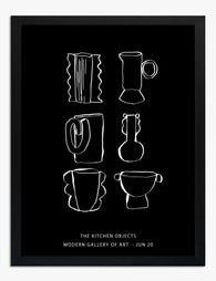
The Kitchen Objects Exhibition Poster Art Print
Sale price From £11.95£19.95 -
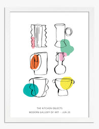
The Kitchen Objects Exhibition Print Art Print
Sale price From £11.95£19.95 -
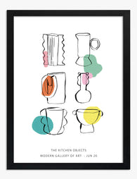
The Kitchen Objects Exhibition Print Art Print
Sale price From £11.95£19.95 -

The Open Pantry Cupboard Art Print
Sale price From £11.95£19.95 -

Kitchen Cupboard Classics Art Print
Sale price From £11.95£19.95 -

Chequerboard Kitchen Still Life Art Print
Sale price From £29.95£49.95 -
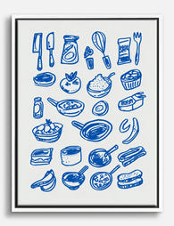
Playful Kitchen Sketches Canvas Print
Sale price From £49.95£74.95 -

Sunlit Kitchen Still Life Art Print
Sale price From £11.95£19.95 -

Pink Kitchen with Hanging Utensils Art Print
Sale price From £11.95£19.95 -

Blue Kitchen Sketches Art Print
Sale price From £11.95£19.95 -

Yes Chef, After Matisse Art Print
Sale price From £11.95£19.95 -

Whimsical Kitchen Essentials Art Print
Sale price From £11.95£19.95 -

Whimsical Kitchen Essentials Art Print
Sale price From £11.95£19.95 -

Italian Pasta Shapes Kitchen Poster Art Print
Sale price From £11.95£19.95 -

The Painted Kitchen Cupboard Art Print
Sale price From £11.95£19.95 -

Vibrant Kitchen Gathering Art Print
Sale price From £11.95£19.95 -

The Kitchen Is The Heart Of The Home Art Print
Sale price From £11.95£19.95


More from The Frame

Transform Your Bedroom with Botanical Art: A Cu...
Botanical prints are the easiest art to buy and the hardest to style. One print looks considered; four looks like a garden centre gift shop. This guide is about restraint:...

Why Botanical Art Works Better in Small Living ...
Botanical art does something strange to small rooms: it softens them without crowding them. In large rooms, it often gets lost, floating on a wall that needs more weight. This...

Blending Vintage and Modern Décor? Start With Y...
Your furniture is already a mix. A mid-century sideboard here, a modern bouclé chair there, maybe your grandmother's wingback holding court in the corner. The walls are where you make...