
 Order today for delivery by
 Vintage Botanical Prints in Modern Homes: How to Get the Look Without the Grandma Vibes
The framing, scale, and mixing tricks that separate a fresh botanical wall from a dated one.


Botanical prints have a reputation problem. Done badly, they read as chintzy, twee, or straight out of a 1980s guest bedroom. Done well, they're one of the most timeless things you can put on a wall, which is exactly why we're going to walk through how to get it right.
Actually vintage vs. vintage-style botanical prints
Actually vintage means an original print from a Victorian botanical volume, an early 20th century Kew Gardens poster, or a mid-century field guide plate. These often come with foxing (those brown speckles), yellowed paper, and unpredictable sizing. They can be beautiful, but they're expensive, fragile, and hard to frame consistently across a wall.
Vintage-style means a modern reproduction or a new illustration drawn in a historical style. These are printed on fresh paper at sizes that fit standard frames, with colours that haven't shifted over 150 years. For most people building a modern interior, this is the better route. You get the aesthetic without committing to a conservation project.
There's no shame in going reproduction. A well-printed reproduction on thick matte paper, with proper colour fidelity, looks closer to the original than a badly lit photograph of the original ever would. What you want to avoid is the thin, oversaturated poster paper that gives everything a slightly plastic sheen.
If you're just starting to browse, vintage art prints and Kew Gardens art prints are the two categories most people begin with. Kew's archive in particular has been widely reproduced, and vintage kew gardens art prints have become a shorthand for the whole botanical genre.

Why scale matters more than style when mixing old and new
The single biggest reason botanical prints look dated is that they're too small. A 30x40cm print floating above a 200cm sofa reads as apologetic. The print isn't the problem. The proportions are.
The rule we come back to is that your art should occupy roughly two-thirds the width of the furniture beneath it. Above a 180cm sofa, you want art (or a grouping) that spans about 120cm. Above a 90cm sideboard, aim for 60cm. This works whether the print is a Victorian fern study or a contemporary abstract.
Big botanical prints feel confident. Small ones feel like they're hiding. If you're nervous about going large with something ornate, remember: scale is what separates "modern home with botanical art" from "grandmother's hallway." A single 70x100cm framed print of a Victorian palm reads as intentional and graphic. Four small 20x30cm prints of the same subject read as clutter.
For canvas, you can push even bigger. A 100x150cm canvas of a botanical illustration, hung unframed with its edges wrapped, feels closer to a museum installation than a traditional print. The lack of frame strips away the fussy connotations immediately.
Framing choices that keep vintage botanical prints feeling fresh
Frame choice does more heavy lifting than any other decision. Get this right and even the most traditional Victorian illustration will look current.
What to reach for
- Slim black metal or wood frames (around 2cm profile). Graphic, gallery-like, and lets the botanical detail do the talking.
- Pale oak or natural ash. Warm without being twee. Particularly good with green-heavy prints.
- White box frames with a wide mount. Very editorial, works in minimal spaces.
What to avoid
- Ornate gilt or gold swirl frames. This is the number one thing that pushes a print into "inherited from an aunt" territory.
- Dark mahogany with heavy detailing. Reads as period drama, not modern home.
- Thin gold metal. Trendier than gilt but still fussy on a detailed illustration.
Matting matters too. A cream or off-white mount (never pure bright white against aged illustration colours) at 5-7cm around the print gives it breathing room and instantly makes it feel more considered. Flush framing, with no mount, works for larger prints where the illustration itself already fills the space.
One practical note: framed prints should arrive properly fitted, with the frame and print packed together, not the frame in one box and the print in another to assemble at home. This is where a lot of botanical prints fall down. The illustration might be lovely but the framing job looks homemade. Our framed prints ship as one piece with UV-protective acrylic (which won't yellow or shatter like glass), so what arrives is what you hang.

The gallery wall approach: mixing Kew Gardens vintage posters with modern botanical art
Gallery walls are where botanical prints most often go wrong. The instinct is to pair like with like: six Victorian ferns in matching frames, evenly spaced. The result looks like a museum gift shop display.
The better approach is to use the vintage botanicals as anchors and mix in contemporary work. A three-to-two ratio works well: three vintage-style pieces (a Kew palm, a Victorian rose study, a Victorian botanical illustration of ferns) alongside two modern pieces (an abstract line drawing of leaves, a photographic close-up of a monstera).
What unifies the wall isn't subject matter. It's one of the following:
- Frame consistency. All slim black, or all pale oak. The frames become the through-line.
- Colour palette. Everything sits in the same tonal family (muted greens and ochres, say) even if the styles vary wildly.
- Paper tone. Cream-toned modern prints alongside cream-toned vintage reproductions.
Pick one unifier and let everything else vary. If your frames match, your subjects and colours can be diverse. If your palette matches, your frames can mix black and oak.
For sizing, avoid the trap of making everything the same size. A gallery wall with one 60x80cm anchor, two 40x50cm supporting pieces, and a couple of 30x40cm accents feels dynamic. Six identical 40x50cm prints in a grid feels like a chart.
The botanical art prints collection is a good place to see how vintage and modern styles sit alongside each other. Kew gardens vintage posters in particular play well with abstract botanical line drawings, because the shared subject matter creates conversation without competition.
Colour palettes that bridge Victorian botanical art and contemporary interiors
Victorian botanical illustration has a very specific palette: mossy greens, terracotta, ochre, faded rust, cream backgrounds, occasionally a startling coral or magenta from a tropical flower. These colours are actually very close to what's currently trending in interiors, which is why the style works now.
The trick is to pull two or three colours from your prints and echo them elsewhere in the room, without turning the whole space into a botanical illustration. If your Kew palm print has sage green foliage and warm cream background, put a sage cushion on the sofa and a cream ceramic on the shelf. That's it. Don't add a green rug and green curtains and green throw as well.
Palettes that work
- Sage, cream, warm terracotta. Reads as considered and modern.
- Deep forest green, oatmeal, black. More graphic and editorial.
- Muted ochre, off-white, soft grey. Very calm, works in north-facing rooms.
Palettes to avoid
- Hunter green with burgundy and gold. Full traditional English drawing room.
- Pastel mint with dusty pink. Reads as nursery.
- Beige on beige on beige. Loses the graphic punch that makes botanicals interesting.
Wall colour matters too. Botanical prints do not need white walls to look modern. In fact, a putty, warm grey, or soft clay wall behind a botanical print often looks more intentional than stark white, which can make the print feel adrift. If you're painting specifically for the art, a warm off-white or a very muted sage sets off vintage botanicals beautifully.

Three real room setups: minimal, eclectic, and transitional
Here's how the same category of print sits in three very different interiors.
The minimal room
One 70x100cm framed vintage-style botanical illustration, slim black frame, wide cream mount, hung above a low console. Nothing else on the wall. The single-print approach lets the illustration act as sculpture. Works in Scandi-influenced rooms, apartments with clean architecture, and anywhere the rest of the space is disciplined. Trade-off: it demands quality, because there's nowhere for a mediocre print to hide.
The eclectic room
A gallery wall of nine pieces above a velvet sofa: four vintage-style botanicals (a fern, a palm, a rose, a citrus), three abstract modern prints, a small framed photograph, and a vintage textile in a box frame. Frames mixed between black metal and pale oak. Colours pulled together by a shared warm palette. Feels collected, personal, layered. Trade-off: takes time to build and is harder to get right on the first try.
The transitional room
Two matching 50x70cm framed botanicals (both Kew-style palms) either side of a mirror above a fireplace. Frames in warm oak. This is the compromise position: enough symmetry to feel classic, enough restraint to feel current. Works in period properties where you don't want to fight the architecture but also don't want to lean into full Victorian pastiche. Trade-off: less exciting than the eclectic route, more forgiving to execute.
If you're drawn toward flower-heavy compositions rather than pure foliage, the floral art prints collection tends to work particularly well in the transitional setup, where symmetry and softness balance each other.
Where to start if you're buying your first vintage-style botanical print
If this is your first botanical print, don't start with a gallery wall. Start with one piece, the right size, in a good frame. Live with it for a month. See how it changes the room. Then decide whether you want more.
Pick one large piece over three small ones. If your budget stretches to one 70x100cm framed print or three 30x40cm framed prints, go with the one. Impact beats quantity every time with botanicals.
Think about the subject before the style. Palms, ferns, and citrus fruits (from vintage kew gardens art prints and similar archives) tend to feel more graphic and modern than dense floral bouquets. Single specimens on cream backgrounds age better in modern interiors than crowded compositions. If you're drawn to famous botanical gardens art, you're actually looking at the most graphic, modern-friendly end of the genre.

Consider the room's light. Botanical illustrations, particularly ones with delicate line work and muted vintage colours, can lose all their character in dim, north-facing rooms. In lower light, look for prints with stronger contrast or larger, bolder subjects (palms rather than fine wildflower studies). UV-protective glazing means direct sunlight isn't the threat it used to be, but the print still needs enough ambient light for the detail to read.
Buy from somewhere that ships the print already framed and fitted. This is where most botanical print purchases go wrong. The illustration might be perfect but the frame arrives separately, the print has to be pressed in at home, and the whole thing ends up slightly askew. If the seller doesn't ship framed prints ready to hang, treat that as a warning sign.
The best botanical prints in modern homes have three things in common: they're bigger than you'd instinctively choose, they're framed simply, and they're not trying too hard. Get those three right and the grandma vibes stay firmly on the shelf.

Fab products featured in this blog
-
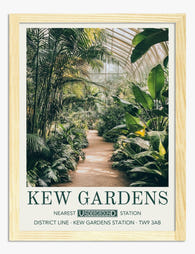
Kew Gardens Glasshouse Poster Art Print
Sale price From £11.95£19.95 -

Kew Gardens Botanical House Art Print
Sale price From £11.95£19.95 -

Kew Gardens Glasshouse Poster Art Print
Sale price From £11.95£19.95 -

Kew Gardens Botanical House Art Print
Sale price From £11.95£19.95 -
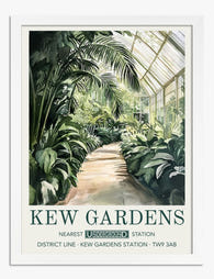
Kew Gardens Glasshouse Poster Art Print
Sale price From £11.95£19.95 -

Kew Gardens Botanical House Canvas Print
Sale price From £49.95£74.95 -

Kew Gardens Glasshouse Poster Art Print
Sale price From £11.95£19.95 -

Kew Gardens Arboretum Botanical Poster Art Print
Sale price From £11.95£19.95 -

Kew Gardens Orangery Poster Art Print
Sale price From £11.95£19.95


More from The Frame

The Complete Guide to Decorating with Botanical...
Botanical prints are the closest thing interior design has to a universal donor. They work with almost any style, palette, and period. Almost. This is a room-by-room guide with specific...

Botanical vs Floral Prints: Which Style Actuall...
Botanical and floral prints get lumped together constantly, and it's costing people the chance to get their walls right. They're not the same thing, they don't behave the same way...

The Best Tulip Wall Art for Every Interior Styl...
Tulips are having a proper moment in interiors, and the range of prints available can make choosing feel harder than it should be. Once you understand the four main styles...