
 Order today for delivery by
 Vintage Design Trends in 2025: What's Worth Hanging and What's Already Over
A curated take on the vintage print styles defining 2025 interiors, and the ones quietly being retired.


The vintage revival is real, but not everything old is gold
Vintage is having its biggest moment in a decade, and the walls are finally catching up to the furniture. After years of minimalist beige and oversized abstract shapes, people are hanging things again: botanical plates, faded travel posters, ornate type. The risk is that "vintage" gets used to justify anything yellowed or floral, and a lot of what's trending now will look dated by 2027.
This is a curatorial guide, not a permission slip. We've sorted the vintage design trends worth investing in from the ones already on the way out, with concrete advice on what to hang, how to frame it, and how to avoid the grandma's-attic effect.

Trend 1: Faded botanicals and natural history prints
The botanical print never really left, but the version trending now is specifically the faded, scientifically-illustrated kind. Think Pierre-Joseph Redouté roses, antique fern studies, mushroom plates from old field guides. The colour palette has shifted from the bright primaries of nineties chintz to soft sepia, mossy green, and dusty rose, often on cream or warm ivory backgrounds.
Why now: this style sits perfectly inside the broader quiet luxury aesthetic. It feels collected rather than bought, and it pairs well with the natural-material interiors (linen, oak, terracotta) that have dominated the past two years. It also signals an interest in nature and slowness, which reads well after years of glossy maximalism.
What to look for
Buy prints with visible plate numbers, Latin nomenclature, or original paper texture. These details are what separate a genuine-looking natural history reproduction from generic floral wall art. A single oversized botanical (think 70x100cm) above a sideboard reads more curated than a tight grid of four matching ones, which is starting to feel formulaic.
For framing, a slim oak or walnut frame in the wood's natural finish works better than black or white. Black makes botanicals feel Victorian and heavy. White makes them feel dorm-room. Browse the botanical art print collection for examples of the faded, scientific style rather than the bright graphic version.
Trend 2: Mid-century travel posters with muted colour palettes
Travel posters are back, but with a critical edit: the saturated, primary-coloured Cassandre-style railway posters that were everywhere in 2018 have been replaced by softer, sun-bleached versions. The new palette leans into dusty oranges, faded teals, ochre yellows, and muted terracottas. The mood is less "graphic design history" and more "found in a French flea market."
The destinations matter too. Italian Riviera, Côte d'Azur, North African coast, lesser-known alpine villages. Generic Paris and London posters are over. Specific, slightly obscure places feel more personal and travelled.
Sizing and pairing
A single large travel poster (60x80cm minimum) anchored above a console or bed works far better than a wall of three. If you want more than one, pair contrasting destinations rather than matching a set, so it looks like a collection you built rather than bought. Frame in warm wood or thin brass-toned metal. Avoid the heavy black poster frame, which screams 2015 cinema lobby.
The travel art print collection has options in the muted palette if you want to skip the saturated tourist-shop versions. Look for prints where the colours feel slightly degraded, as if the paper has been sitting in sunlight for fifty years.

Trend 3: Art Nouveau and Art Deco typography making a comeback
Ornate typography is back after a long minimalist drought, and the revival is split between two related but distinct movements: Art Nouveau (1890-1910, flowing organic letterforms, Mucha-style figurative work) and Art Deco (1920-1940, geometric, symmetrical, gilded).
If you're new to the distinction: Art Nouveau is curvy, nature-inspired, and feels handmade. Art Deco is angular, glamorous, and feels machine-precise. Both are trending, but they suit different homes.
Where each works
Art Nouveau prints work best in homes with softer architectural features: period flats with cornicing, curved arches, plaster walls. They clash slightly in stark modern boxes unless used as deliberate contrast.
Art Deco prints, especially typographic ones in black, cream, and gold, work brilliantly in modern flats and rental spaces. They add formality without feeling fussy. A pair of Art Deco type prints flanking a doorway or above a bed gives instant structure to a plain room.
What to avoid
Skip Art Nouveau prints that lean too heavily on the Mucha-girl-with-flowers cliché. They've been mass-produced into oblivion and now read as student-flat décor rather than considered choice. Look for typographic posters, advertising reproductions, or architectural studies instead. The vintage design art print collection has both eras represented.
Trend 4: Vintage Japanese woodblock-inspired prints
Ukiyo-e style prints have moved from niche interest to genuine trend, helped along by a broader cultural moment for Japanese design (wabi-sabi interiors, the boro textile revival, Japandi furniture). Hokusai's wave is now too ubiquitous to be interesting, but the wider ukiyo-e tradition (Hiroshige's landscapes, Yoshida's twentieth-century woodblocks, lesser-known kachō-ga bird-and-flower prints) is genuinely fresh.
The appeal is partly aesthetic and partly compositional. Japanese woodblock prints use negative space in a way Western art rarely does, which makes them work in rooms that already feel busy. A single woodblock-style print above a cluttered shelf can actually calm the space down.
How to style them
Resist the urge to go full Japan. A single ukiyo-e style print in an otherwise European-feeling room reads as collected and worldly. A whole room of Japanese references reads as theme park.
Frame in light oak or natural wood with a generous white border. Skip black lacquer frames unless you genuinely have a minimalist Japanese-influenced interior, otherwise it tips into costume. The traditional Japanese art print collection is a good starting point for prints beyond the wave.
What's already feeling tired (and what to replace it with)
Some vintage aesthetics that defined the past few years are now overexposed. Here's what we'd retire, and what to hang instead.
Over: Viral 1950s pin-up and "that girl" vintage advert prints. The pink "Drink Coca-Cola" type posters and reproduction 1950s women's magazine ads were everywhere on Instagram for two years. They now feel like a costume.
Replace with: Genuine mid-century advertising for products that aren't loaded with kitsch (Italian aperitif posters, vintage Swiss tourism boards, mid-century book covers).
Over: Saturated 1970s psychedelic prints. The rainbow gradient, melted typography, marigold-and-brown palette had its moment in 2022-2023. It's now firmly identifiable as a specific micro-trend rather than timeless vintage.
Replace with: 1970s muted earth tones (terracotta, ochre, sage) in less graphic compositions. Documentary photography from the era also works.
Over: Basic Matisse-style cut-out line drawings. Sold as "vintage" but really a late-2010s minimalist trend dressed up as vintage. Mass-produced and now visually meaningless.
Replace with: Actual mid-century art prints with more substance: Hilma af Klint-influenced abstracts, Bauhaus geometric studies, or genuine vintage exhibition posters.
Over: Tight gallery walls of small matching prints. The nine-print grid in identical frames peaked around 2020. It now reads as Pinterest-by-numbers.
Replace with: One oversized statement print, or an asymmetric arrangement of three to five differently-sized pieces that share a tonal palette rather than a subject.

How to pick vintage trends that won't date your home in two years
A few rules we'd suggest holding onto, regardless of what the algorithms push next.
Choose palette over subject
The faster-dating element of any vintage trend is the subject matter (the specific pin-up, the specific destination, the specific psychedelic motif). The slower-dating element is the palette. If you buy prints in colour palettes you'd hang anyway (warm neutrals, dusty greens, soft ochres), the work will outlive whatever specific trend brought it to you.
Mix eras deliberately
A room full of 1920s Art Deco posters reads as themed. A room with one Art Deco type print, one 1890s botanical, and one 1960s travel poster reads as a collection. The mix is what signals personal taste rather than a single-source shop. Keep the tonal palette consistent across eras and the mix will feel intentional rather than chaotic.
Invest in scale
The single biggest upgrade most rooms need is bigger art. A 30x40cm print floating on a large wall looks tentative. The same image at 70x100cm looks confident and considered. Vintage subjects in particular benefit from scale, because the detail (paper texture, type, illustration) becomes visible and rewarding.
Care about framing more than you think you should
The biggest failure mode in vintage prints is bad framing: warped MDF, plastic glazing that yellows, frames shipped separately and never quite aligned with the print. Get the framing right and even a modest print looks like it belongs. Get it wrong and a beautiful print looks cheap.
Solid wood frames in oak, walnut, or natural ash work for almost all vintage styles. UV-protective glazing matters more for vintage prints than contemporary ones, because faded and warm-toned paper shows fading damage quickly. Our framed prints arrive ready to hang with the print already fitted properly inside a solid FSC wood frame, which removes the main failure point.
Be honest about reproductions
You're almost certainly buying reproductions, not originals, and that's fine. An original 1920s lithograph in good condition is a four-figure purchase and a conservation project. A museum-quality giclée reproduction on thick matte paper, printed with archival inks, gives you the visual experience at a sensible price. What matters is the print quality: heavy paper, sharp detail, accurate colour. Thin glossy paper and overly bright colours are the giveaways of a cheap reproduction, regardless of how vintage the subject is.
Where to start: our picks from the Fab vintage collection
If you're building a vintage-leaning wall from scratch, we'd suggest one of three starting points depending on your room.
For a soft, period-feeling room (cornicing, warm walls, linen furniture): start with a single oversized faded botanical at 70x100cm in a natural oak frame. Add a smaller Art Nouveau typographic print nearby once the botanical is settled. Browse the botanical art print collection for the muted, scientific style.
For a modern flat that needs warmth: a single muted-palette travel poster at 60x80cm above a sofa or sideboard adds character without committing the whole room to a period look. A walnut frame softens the modernity of the architecture. The vintage design art print collection has options that bridge contemporary and vintage.
For a busy, layered room (lots of furniture, textiles, objects): a Japanese woodblock-inspired print is the calming element you need. The negative space in ukiyo-e composition gives the eye somewhere to rest. One large print at 70x100cm framed in light oak is better than several smaller ones.

The thread running through everything worth hanging right now is restraint. Faded over saturated, specific over generic, one big piece over nine small ones. Vintage works when it feels like something you found and chose, not something you ordered in a set. Buy fewer, larger, better-framed prints in palettes you actually want to live with, and the work will still look right long after the current trend cycle has moved on.

Fab products featured in this blog
-

Vintage Flea Market Poster Art Print
Translation missing: en.products.product.sale_price From £11.95£19.95 -

Flea Market Poster Retro Furniture Vibes Art Print
Translation missing: en.products.product.sale_price From £11.95£19.95 -

Vintage Vibes Collection Canvas Print
Translation missing: en.products.product.sale_price From £44.95£74.95 -

Vintage Car Retro Photography Art Print
Translation missing: en.products.product.sale_price From £11.95£19.95 -

Vintage Garden Blooms Art Print
Translation missing: en.products.product.sale_price From £11.95£19.95 -

Vintage Botanical Medley Art Print
Translation missing: en.products.product.sale_price From £13.99£19.99 -

Vintage Botanical Study Art Print
Translation missing: en.products.product.sale_price From £11.95£19.95 -

Vintage Botanical Medley Canvas Print
Translation missing: en.products.product.sale_price From £55.99£79.99 -

Vintage Floral Exhibition Poster Canvas Print
Translation missing: en.products.product.sale_price From £44.95£74.95 -

Vintage Tabletop Elegance Canvas Print
Translation missing: en.products.product.sale_price From £44.95£74.95 -

Seguy Vintage Floral Deco Art Print
Translation missing: en.products.product.sale_price From £11.95£19.95 -

Vintage Bee & Flowers Art Print
Translation missing: en.products.product.sale_price From £11.95£19.95 -

Chic Library Vibes Art Print
Translation missing: en.products.product.sale_price From £11.95£19.95 -

Vintage Botanical Medley Canvas Print
Translation missing: en.products.product.sale_price From £55.99£79.99 -
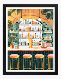
Retro Cocktail Vibes Art Print
Translation missing: en.products.product.sale_price From £11.95£19.95


More from The Frame

The Best Botanical Prints for Your Conservatory...
Conservatories are sun traps, and most art prints are not built for them. The same light that makes the space so lovely to sit in will cook a poorly made...

Arts and Crafts Cat Art: Victorian Roots, Moder...
Cat art is everywhere right now, and most of it is forgettable. The pieces that actually hold up on a wall borrow from a much older tradition, one that runs...

The Greenhouse Aesthetic: Why Glasshouse Art Is...
There's a particular daydream doing the rounds on mood boards right now: cast iron arches, fogged glass, palms pressing against the panes, a wrought iron table laid for tea. Almost...