
 Order today for delivery by
 Warm or Cool Art for Green Walls? A Colour Pairing Guide
From sage to forest, the art colours, subjects, and frame finishes that make a green wall sing.


Green has gone from accent to anchor. If you've just painted a wall in sage, olive, or something approaching forest, the next question is what to hang on it. This guide answers that, shade by shade.
The green wall boom: why everyone's painting and what comes next
Green has become the default "bold but liveable" choice for people who've outgrown grey but aren't ready for terracotta. Paint brands have been calling it for a few years now, with sage in particular cited as having an extended moment, and the trend has spread from kitchens into bedrooms, lounges, and home offices.
The appeal makes sense. Green reads as calming, nature-adjacent, and surprisingly neutral once it's actually on the wall. The problem comes next: most people paint, step back, and then stall. The art that worked against off-white suddenly looks wrong, and generic "colours that go with green" advice rarely talks about prints specifically.
So let's get specific. The right art for a green wall depends on which green you've chosen, how much of the room it covers, and what frame you put around it.
Art for sage green walls: warm tones, botanical subjects, and natural frames
Sage is a warm, slightly grey-green. It behaves like a neutral, which means it pairs with far more than people expect, but it also means cool, icy art can look stranded against it.
Lean into warmth. Terracotta, ochre, dusty pink, peach, burnt orange, and cream all sing against sage. Think figurative line drawings with warm washes, abstract shapes in earthy palettes, or vintage-style travel posters with sun-bleached colour. Anything that feels like late afternoon light will work.
Botanicals are the obvious pick, and they work for a reason. A pressed-fern print or a loose watercolour of eucalyptus extends the natural mood of the wall without competing with it. The trick is to choose botanicals with warm undertones (ochre stems, bronze leaves, sepia backgrounds) rather than bright spring greens, which can read as clashing rather than complementary. Our botanical art prints collection leans heavily into this warmer, more muted palette for exactly this reason.
For frames on sage, natural oak is the safest and arguably the most flattering choice. It picks up the warmth in the paint and gives the whole arrangement a grounded, slightly Scandinavian feel. Brass or gold frames also work beautifully and add a touch of polish without feeling formal.

Art for dark green and forest green walls: high contrast is your friend
Dark green and forest green behave completely differently. These are deep, saturated colours that absorb light, which means subtle, low-contrast art will simply disappear into the wall.
You need contrast. White, cream, and bone backgrounds will pop. Bold blacks, deep mustard yellows, rich reds (used carefully, more on that below), and metallic golds all hold their own. Abstract prints with strong tonal range, classical portraits, architectural photography in black and white, and graphic typographic prints all work especially well.
Subject matter can be bolder too. Where sage rewards quiet botanicals, forest green can carry a dramatic still life, a moody landscape, or a large-scale abstract. The wall is already doing heavy lifting visually, so the art needs to meet it with equal confidence.
One important note on red and green: avoid putting them together unless you're being deliberate about it. A red-dominant print on a forest green wall will tip into festive territory faster than you'd expect. If you love a print with red in it, balance it with enough neutral tones (cream, black, gold) that the red reads as an accent rather than the headline.
Frame-wise, dark green walls are where gold and brass really earn their keep. A warm metallic frame against deep green is the closest thing to a guaranteed win in interiors. Black frames also work and create a sharper, more graphic look. Avoid pale woods here, as they tend to look weak against the depth of the paint.
Why green-on-green can work (and when it falls flat)
Hanging green art on a green wall sounds like a mistake, and sometimes it is. But done well, it creates one of the most sophisticated looks available.
The rules are temperature and intensity. Warm greens (sage, olive, moss) pair with other warm greens. Cool greens (emerald, mint, jade) pair with cool greens. Mixing temperatures is what makes green-on-green feel off, like two paint tester pots that don't quite agree.
Intensity matters just as much. A muted sage wall wants muted green art, not a vivid emerald palm print. Conversely, a deep forest wall can take a richer, more saturated green within the artwork. Think of it as a tonal conversation: the art should either be clearly lighter, clearly darker, or distinctly different in saturation from the wall, never almost-the-same.
When green-on-green falls flat, it's usually because the two greens are too similar in value and the art has no other colours to anchor it. The fix is to choose pieces where green is one element among several, supported by warm browns, creams, blacks, or metallics that give the eye somewhere to rest. Our green art prints collection is worth browsing if you want to see how this plays out across different styles.

Frame finishes that pop against green: gold, black, and natural oak
Frames matter more than people think, and on a green wall they can make or break the whole arrangement. Here's how the three best finishes behave:
Gold and brass
Gold is the green wall's best friend. It works across nearly every shade, from palest sage to deepest forest, because gold and green are natural neighbours in design history (think botanical illustration, art nouveau, William Morris). A thin gold frame adds quiet luxury. A wider gold frame turns a print into a statement.
Gold works particularly well when there's already gold elsewhere in the artwork, which is why our gold art prints collection pairs so naturally with green interiors.
Black
Black frames create the sharpest contrast and the most graphic, contemporary feel. They're ideal for forest green walls and for art that's already high-contrast (black and white photography, bold typography, modernist abstracts). On sage, black frames can look striking but slightly severe, so balance them with softer textiles in the room.
Natural oak
Oak is the warmest, most organic option and the natural pairing for sage and olive walls. It echoes the earthiness of the paint and works especially well with botanical, landscape, and figurative subjects. On forest green, oak can feel a little quiet, but it's a good choice if you want the art itself to be the loud element.
A quick word on framing in general. The frame should arrive flat, properly fitted to the print, with no warping or bubbling, and ready to hang straight from the box. This sounds obvious but it's where most art print purchases go wrong. Our framed prints ship in one box with fixtures already attached, and the frames are solid FSC-certified wood (no MDF) with UV-protective acrylic glaze rather than glass, which means no glare and no fading even in a sunny room.
Sizing art for a feature wall vs a full green room
How much green you've painted changes the answer.
For a single feature wall, go bigger than feels comfortable. A feature wall is a backdrop, and undersized art on a bold colour just looks lost. As a rough guide, your art should fill roughly two-thirds the width of the furniture below it (sofa, bed, sideboard). For a typical three-seater sofa, that means a piece around 100x70cm or larger, or a paired arrangement of two 60x80cm prints. Our canvas prints go up to 100x150cm and framed art prints up to 70x100cm, which is genuinely large in a domestic setting.
For a fully green room, the dynamic flips. With green on every wall, a single huge piece can feel oppressive. Gallery walls work better here because they break up the colour and add visual variety. Mix sizes and orientations, keep the frame finish consistent for cohesion, and leave generous breathing room between pieces (around 5 to 8cm).
For small green walls (alcoves, chimney breasts, narrow hallways), a single medium piece around 50x70cm framed is usually the right scale. Resist the urge to add more.

Five specific print-and-wall pairings we love right now
Some combinations that consistently work, with the reasoning behind each.
1. Warm botanical line drawing on sage, natural oak frame
A loose ink-and-wash botanical with ochre or sepia tones, framed in oak. This is the entry-level pairing that almost never fails. Best for bedrooms, reading nooks, and anywhere you want a calm, grounded feel.
2. Black and white architectural photography on forest green, black frame
A high-contrast photograph (a doorway in Lisbon, a Brutalist staircase, a Parisian rooftop) in a thin black frame. The white in the image lifts the wall, the black frame sharpens the whole thing. Particularly good in studies, hallways, and dining rooms.
3. Abstract in cream, ochre, and rust on olive green, gold frame
A warm-toned abstract with brushwork and texture, framed in gold. Olive walls can feel heavy without warm relief, and this combination introduces light without breaking the mood. Works above a sofa or sideboard.
4. Vintage botanical illustration on dark green, brass frame
A classic 19th-century-style botanical (think Pierre-Joseph Redouté influence) with cream background and detailed plant rendering, in a brass frame. This is the most timeless pairing on the list and works in almost any room.
5. Bold contemporary portrait on forest green, black frame
A modern figurative piece with strong skin tones, cream or pale backgrounds, and confident composition. The wall provides drama, the portrait provides humanity. Best in living rooms or above a bed.
If you want pieces that genuinely shift across seasons and don't lock you into one mood, our new neutrals collection sits comfortably against most greens and gives you flexibility if you ever repaint.
A note on light
Green changes more than almost any other paint colour depending on light. North-facing rooms make greens read cooler and greyer. South-facing rooms warm them up significantly. Artificial light, especially warm bulbs, pushes greens toward yellow.
Look at your wall at the time of day you actually use the room, and choose art that works in that light. A print that looks perfect in midday sun might fall flat under a warm evening lamp, so consider both.
The honest takeaway
Match temperature first, then think about contrast. Warm greens (sage, olive) want warm art and warm frames. Cool, deep greens (forest, hunter) want high contrast and metallic frames. Botanical subjects are the safe choice and they work for a reason, but don't be afraid of portraits, abstracts, and photography on darker greens, which can carry far more drama than people expect.
And go larger than your instinct tells you. The most common mistake on a green feature wall is hanging something too small. Pick one piece that earns its place, frame it properly, and let the wall do the rest.


Fab products featured in this blog
-

Green Sofa Still Life Art Print
Sale price From £11.95£19.95 -

Sunlit Green Window Art Print
Sale price From £11.95£19.95 -

The Botanical House Chrysanthemum Study Art Print
Sale price From £11.95£19.95 -

Thoughtful Figure in Green Art Print
Sale price From £11.95£19.95 -

Houseplant in the Corner Art Print
Sale price From £11.95£19.95 -

The Botanical House Art Print
Sale price From £11.95£19.95 -
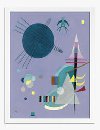
Violet and Green by Wassily Kandinsky Art Print
Sale price From £11.95£19.95 -

Thoughtful Figure in Green Canvas Print
Sale price From £49.95£74.95 -

Sunlit Aloe on the Windowsill Canvas Print
Sale price From £49.95£74.95 -

Pastel Green Fields Art Print
Sale price From £11.95£19.95 -

Quiet Green Woodland Walk Art Print
Sale price From £11.95£19.95 -

Botanique — Green Botanical Collection Art Print
Sale price From £11.95£19.95 -

The Botanical House — Heritage Blooms Canvas Print
Sale price From £49.95£74.95 -

Earthy Overlap Art Print
Sale price From £11.95£19.95 -

Glasshouse Cacti at Kew Art Print
Sale price From £11.95£19.95 -

Sunlit Shapes Canvas Print
Sale price From £49.95£74.95 -

Fern Flourish Vase Canvas Print
Sale price From £49.95£74.95 -

Sunlit Green Retreat Art Print
Sale price From £11.95£19.95 -

Rocks and Trees by Cézanne Art Print
Sale price From £11.95£19.95


More from The Frame

William Morris vs Art Nouveau: What Style Is It...
Short version: William Morris was not Art Nouveau. He was Arts and Crafts, a movement he helped invent. The two styles overlap enough to confuse almost everyone, and getting the...

Whimsical Nursery Wall Art Ideas That Grow With...
Most nursery art is designed for the parents standing in the room at 3am, not the seven-year-old who will eventually sleep there. That's why so much of it gets swapped...

Whimsical Art vs Quirky Art: What's the Differe...
If you've ever been confused browsing for playful wall art, wondering if that dressed-up fox print is whimsical, quirky, or something else entirely, you're not alone. The two styles overlap...