
 Order today for delivery by
 What Interior Designers Know About Butterfly Wall Art That You Don't
The line between butterfly art that feels gallery-grade and butterfly art that feels like a teenager's bedroom is thinner than you think.


Butterfly prints have a reputation problem, and most people styling them make the same handful of mistakes. The motif itself is genuinely beautiful, with centuries of scientific illustration and fine art to draw from. The trick is knowing which versions to buy, how to frame them, and where on the wall they actually belong.
Why butterfly art has an image problem (and how to fix it)
The reason butterfly wall art reads as juvenile isn't the butterflies. It's the execution. Five things, specifically, drag the motif down: pastel palettes (think bubblegum pink and mint), wall decals masquerading as art, prints sized too small for the wall, overly literal cartoon-style illustrations, and flimsy frames that wave their MDF flag from across the room.
Strip those out and butterfly art behaves like any other natural history subject. A muted Papilio specimen on cream paper, in a slim oak frame, is closer to a Kew Gardens print than a nursery decoration. The reference points you want are Victorian entomology plates, Joris Hoefnagel's miniatures, and the kind of framed specimens you'd see in a country house library.
Once you commit to that direction, the rules get easier. Skew towards muted, vintage, or monochrome palettes. Buy bigger than you think. Frame properly. And resist anything with glitter, 3D wings, or a script-font caption about chasing dreams.

Living room: one statement piece vs. a curated set
The living room is where butterfly wall art ideas tend to go one of two ways: a single large print that anchors the room, or a tightly edited set that reads as a collection. Both work. Mixing them usually doesn't.
The single statement approach
If your sofa is the room's main horizontal line, the art above it should be roughly two-thirds the width of the sofa. For a standard three-seater (around 200cm), that's a print in the 100x140cm or 100x150cm range. A 50x70cm print floating above a long sofa looks apologetic, not refined.
A single oversized butterfly specimen print, ideally one with a dark or neutral ground, holds a lounge beautifully. Canvas works particularly well at this scale because it absorbs light rather than reflecting it, and our XL canvases go up to 100x150cm without losing any of the original image at the edges.
The curated set approach
If you'd rather build a set, three is the magic number. Either three identical-sized prints in a row (50x70cm each, evenly spaced about 5cm apart), or a triptych of related specimens. The discipline is in the consistency: same frame, same paper tone, same era of illustration. The moment you start mixing watercolour butterflies with photographic ones with stylised graphic ones, the wall stops looking curated and starts looking accumulated.
For butterfly art for living room walls, our strong preference is for vintage botanical and entomological styles paired with deeper room colours: clay, ink blue, olive, warm taupe. Browse the butterfly art prints collection and notice which prints would still work if you removed the butterflies entirely. Those are the ones with strong composition. Buy those.
Bedroom: palettes and placements that promote calm
The bedroom is where butterfly prints for bedroom decisions go sideways most often, usually because people default to pastels in a misguided attempt at "softness." Pastels don't read as calm. They read as cake decoration.
What actually promotes calm is tonal restraint. A single palette repeated across the print, the bedding, and the walls. That might be cream, bone, and warm grey. It might be all greens, sage through forest. It might be sepia and ivory. The butterflies should sit within the palette, not bounce against it.
Placement above the bed
Above a headboard, leave roughly 15 to 25cm of clear wall between the top of the headboard and the bottom of the frame. The print itself should be no wider than the bed. For a standard double (135cm wide), a 70x100cm portrait print or two 50x70cm prints side by side both work. For a king (150cm), step up to 100x70cm landscape or a 60x80cm pair.
What to avoid
Avoid anything that flutters across the canvas in a swarm. Multiple butterflies in motion read as wallpaper, not art. A single specimen, centred and still, has gravity. So does a typological grid (rows of specimens organised by species), which is the most reliably grown-up format butterfly art comes in.
For shared bedrooms where one half of the partnership is butterfly-sceptical, lean into scientific illustration on darker grounds. A black-backed specimen print in a black frame reads more "natural history museum" than "girlhood bedroom," and tends to win over the doubters. Our bedroom wall art collection is a good place to see this approach in context.

Hallway and entryway: making a first impression with butterfly prints
Hallways are the most under-used wall in most homes, and butterfly prints are unusually well suited to them. The reason is scale: hallways are narrow, which means you're always viewing the art from close range. Butterfly prints, with their wing patterns and fine detail, reward close looking the way a landscape doesn't.
Our preference for entryways is a vertical run of three to five smaller prints (30x40cm or 40x50cm), framed identically, hung in a single column or a tight grid. The repetition does the heavy lifting. The viewer takes in the rhythm first, the individual butterflies second.
For a single long hallway wall, a horizontal row of four matching prints at eye level (centre of frame around 145 to 150cm from the floor) creates a procession effect. Space them evenly, ideally with the gap between frames equal to about a quarter of the frame width.
One thing to flag: hallways often have less natural light, so glare matters. Our framed prints use UV-protective acrylic glaze rather than glass, which means no reflective hotspots from overhead lighting and no fading from the small amount of daylight that does reach the space.
Bathroom: why butterfly botanicals thrive in smaller spaces
Bathrooms are the room people forget about, and they're where butterfly decor ideas can actually feel freshest. The reasons are partly practical and partly visual.
Practically, bathrooms have humidity, which is brutal on cheap framing. Warped MDF, bubbling paper, separated mounts. The whole genre of bathroom art problems. Canvas prints handle humid environments noticeably better than paper does, because the poly-cotton blend has a bit of give and the stretcher bars are solid wood rather than composite. If you're styling a bathroom, canvas is the safer call.
Visually, bathrooms are small, which means you can get away with bolder choices. A single bright butterfly specimen on a dark ground would overwhelm a sitting room. In a downstairs loo, it's perfect. The wall is small, the viewer is captive for thirty seconds, and you want something memorable.
Pairing butterflies with botanicals
The single most effective bathroom move is pairing a butterfly print with a botanical one. Two 30x40cm prints side by side, one of a moth or butterfly specimen, one of a fern or pressed leaf, both in the same frame. It reads as a Victorian cabinet of curiosities, which is exactly the tone you want. Browse the botanical art prints collection for the partner pieces.
Avoid placing prints directly above the shower, where steam concentrates. Anywhere else in the bathroom is fine.

Frame choices that elevate butterfly art (black, oak, or white?)
Frame choice is the single biggest variable in whether butterfly art looks expensive or cheap, and most people get it wrong by defaulting to white. Here's how we'd actually choose.
Black frames are the most reliably sophisticated choice for butterfly art. They reference natural history collections, museum vitrines, and entomological cases. They work especially well with prints that have a cream or off-white ground, because the contrast frames the specimen the way a museum mount would. Choose black for vintage specimen prints, scientific illustrations, and anything you want to read as "studied" rather than "decorative."
Oak frames soften the look without losing the grown-up tone. Solid oak, not veneer, makes a real difference here. The grain has warmth and irregularity that synthetic frames can't fake. Oak suits prints with green, brown, or sepia palettes, and it sits beautifully in rooms with other wood furniture. It's our default recommendation for living rooms and bedrooms.
White frames are the riskiest choice for butterflies, because they amplify any saccharine quality the print already has. They can work, but only with prints that have strong dark elements or a coloured ground. A muted butterfly on cream paper in a white frame disappears. A bold specimen on charcoal in a white frame looks gallery-clean. If in doubt, pick black or oak.
All our frames are solid FSC-certified wood, which matters not just ethically but practically. Solid wood doesn't warp, doesn't separate at the corners, and holds its finish for decades. The frame arrives properly fitted to the print, in one box, ready to hang.
Size guide: matching print dimensions to your wall and furniture
The most common mistake people make is buying small. A print that looks generous on a website looks postage-stamp on a wall. Use these rules as a starting point.
Above a sofa: the art should be two-thirds the width of the furniture. Three-seater sofa (200cm)? Aim for 130 to 150cm of art (one large print or a pair). Two-seater (160cm)? Aim for 100 to 110cm.
Above a bed: the art should not exceed the width of the bed. Double bed (135cm)? A 70x100cm portrait or two 50x70cm prints. King (150cm)? 100x70cm landscape or a 60x80cm pair.
Above a console or sideboard: the art should be roughly the same width as the furniture, minus 15 to 20cm. For a 120cm console, a 100x70cm print sits well.
On a blank wall: measure the wall, then aim for the art to fill 50 to 60% of the available width. Anything less and it floats.
Eye level for the centre of the print: 145 to 150cm from the floor in most rooms, lower (around 140cm) above seating where the viewer is typically sitting down.
If you're between sizes, always size up. A print that's slightly too big looks confident. A print that's slightly too small looks like a placeholder.

Our favourite butterfly prints for each room
For the living room, we'd reach for vintage entomological plates with deeper grounds. Look for prints that feature a single large specimen rather than a swarm, framed in oak or black at 70x100cm or larger. These have the gravity to anchor a sofa and the detail to reward close looking. The living room wall art collection has more in this direction.
For the bedroom, choose tonal, restrained prints with cream or sepia grounds, framed in oak. A single Morpho specimen, a typological grid of small moths, or a soft watercolour study all work. Avoid anything with bright saturated colour, which fights the calm you're trying to build.
For the hallway, build a series. Three to five small prints (30x40cm), identical frames, identical paper tone, hung in a column or grid. Black frames for drama, oak for warmth.
For the bathroom, pair a butterfly print with a botanical on canvas. The humidity tolerance is better, the matte finish reads as gallery-quality, and the pairing nods to Victorian natural history without trying too hard.
The shorthand for getting butterfly wall art right: buy bigger than you think, frame in oak or black, choose specimens over swarms, and resist anything that looks like it belongs on a greetings card. The motif has been a serious subject for serious artists for four hundred years. Treat it that way and your walls will too.

Fab products featured in this blog
-

Klimt-Inspired Art Nouveau Bloom Exhibition Print Art Print
Sale price From £11.95£19.95 -

William Morris Butterfly Exhibition Poster Art Print
Sale price From £11.95£19.95 -
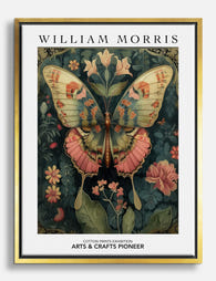
Morris-Inspired Butterfly Botanical Canvas Print
Sale price From £49.95£74.95 -

William Morris Butterfly Exhibition Poster Canvas Print
Sale price From £49.95£74.95 -

Morris-Inspired Butterfly Botanical Art Print
Sale price From £11.95£19.95 -

Night Butterflies — Klimt Exhibition Poster Canvas Print
Sale price From £49.95£74.95 -

Klimt's Floral Haven Art Print
Sale price From £11.95£19.95 -

William Morris Butterfly Exhibition Poster Art Print
Sale price From £11.95£19.95 -

William Morris Butterfly Exhibition Poster Art Print
Sale price From £11.95£19.95 -

William Morris Cotton Prints Exhibition Canvas Print
Sale price From £49.95£74.95 -

Kew Gardens Butterfly Elegance Art Print
Sale price From £11.95£19.95 -

Night Butterflies by Gustav Klimt Art Print
Sale price From £11.95£19.95 -

Night Butterflies — Klimt Exhibition Poster Art Print
Sale price From £11.95£19.95 -

Kew Gardens Butterfly Exhibition Poster Canvas Print
Sale price From £49.95£74.95 -

Night Butterflies by Gustav Klimt Canvas Print
Sale price From £49.95£74.95 -

Butterfly & Peony on Deep Navy Art Print
Sale price From £11.95£19.95 -

William Morris Butterfly Exhibition Poster Art Print
Sale price From £11.95£19.95 -

Klimt Butterflies Exhibition Poster Canvas Print
Sale price From £49.95£74.95 -

Kew Gardens Butterfly Elegance Exhibition Poster Art Print
Sale price From £11.95£19.95 -
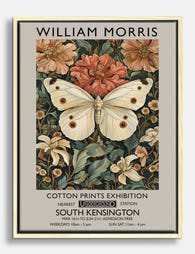
William Morris Butterfly Exhibition Poster Canvas Print
Sale price From £49.95£74.95


More from The Frame

Why Does Water Lily Art Work in Every Room of Y...
Water lilies sit in a rare category of art: soft enough for a bedroom, structured enough for a hallway, humid-tolerant enough for a bathroom. This guide tells you exactly where...

Van Gogh Botanical Prints vs Traditional Botani...
Both traditions put plants on your wall, but they do wildly different things once they get there. Traditional botanical illustration is quiet, precise, and pattern-friendly. Van Gogh's flowers and gardens...

William Morris vs Art Nouveau: What Style Is It...
Short version: William Morris was not Art Nouveau. He was Arts and Crafts, a movement he helped invent. The two styles overlap enough to confuse almost everyone, and getting the...