What Interior Stylists Know About Whimsical Plant Decor That Lasts
A working guide to choosing playful botanical prints with the artistry, colour and craft to outlast the algorithm.

Botanical art has been hanging on walls since the 1700s, but the current wave of playful, illustrated plant prints is different. Stylists are leaning into it precisely because it feels personal in a way that mass-market photography never did. Here's how to separate the prints with real staying power from the ones that will feel tired by next spring.
Why plant art keeps trending while other motifs come and go
Botanical art has one quiet advantage over almost every other genre: it borrows its longevity from nature itself. A monstera leaf, a pressed fern, a curling vine. These shapes have been beautiful since Victorian botanists were pressing them between pages, and they'll be beautiful in fifty years.
That's the principle of biophilic design at work, which is the professional consensus that we feel calmer and more anchored in spaces that reference the natural world. Plant art taps that instinct without requiring you to water anything.
Compare that to motifs that surge and crash. Inspirational quote prints, neon signage, pixelated retro graphics. They tie themselves to a specific cultural moment, so they age with it. A well-drawn fiddle leaf fig doesn't.
The whimsical end of the category, the slightly surreal, slightly playful botanicals, has a particular kind of resilience. It doesn't pretend to be serious art, so it doesn't suffer when serious art trends shift. It just keeps being charming.

The shift from photorealistic to illustrated: what's driving it
Walk into a styled home from 2015 and you'll see the same photographic botanicals everywhere. Glossy close-ups of palm leaves, high-saturation succulents, the occasional sepia fern. They were everywhere because they were easy, and they were easy because they were generic.
Illustrated botanical prints have largely replaced them, and the reasons matter if you want to invest in something that lasts.
The first driver is personality. An illustration is a point of view. Someone chose to draw that leaf with that line weight, that colour, that level of stylisation. You can feel a human hand in it, and that hand keeps the work from feeling interchangeable.
The second is the maximalist resurgence. Maximalism asks you to layer, mix and curate. Photographic botanicals are hard to layer because they all share the same flat, photographic register. Illustrations layer beautifully because they have texture, line and character that play well with other art styles.
The third is access. Independent illustrators can now print and ship globally, which has flooded the market with genuinely original work. That's a good thing for shoppers. It means whimsical plant art prints no longer come from a shortlist of three stock photographers.
What to look for in an illustrated print
You want artistry, not gimmick. A good illustrated botanical has confident linework, considered colour and at least one element that surprises you. A face hidden in the foliage, an unexpected colour pairing, a sense of movement.
What you don't want is a literal joke. A cactus wearing sunglasses is a meme, and memes have a shelf life measured in months. A cactus rendered with strange, glowing pink edges in a sand-coloured landscape is an illustration, and illustrations stay interesting.
Colour trends in whimsical botanical art right now
Colour is where most trend-driven prints date themselves. The acid greens and millennial pinks of 2018 still hang in flats whose owners haven't worked out why their lounge feels stuck.
For 2025 and into 2026, the palettes with real staying power share something in common: they're rooted in landscape colours, not synthetic ones.
Sage and olive greens continue to anchor the category. They're flattering against most wall colours, they don't fight your furniture, and they read as botanical without being literal.
Terracotta and warm clay tones are doing a lot of the heavy lifting in current illustrated work. They give a print warmth without pushing into the orange territory that feels distinctly 1970s revival.
Burnt sienna, ochre and dusty mustard show up frequently in the more graphic, slightly surreal botanicals. They pair well with off-whites and oak furniture.
Sunset tones, the soft corals and faded pinks that sit next to terracotta, work when they're used sparingly. A whole wall of pink botanicals will date. A single coral leaf inside a mostly green composition will not.
What to be cautious about: very high-saturation tropical palettes, anything that leans neon, and the cool grey-blue botanical trend that peaked a few years ago. These read as moments rather than choices.

Maximalism vs minimalism: where quirky plant art fits in both
Here's where shoppers get confused, because the design press will tell you maximalism is back and minimalism is dead, then tell you the opposite three months later. Both trends are coexisting comfortably, and whimsical botanical prints work in either. They just behave differently.
In a maximalist space
Maximalism is layering, contrast and abundance. A whimsical botanical print earns its place by being one voice in a chorus of pattern, colour and texture.
The trick is to vary scale and style on the same wall. A large illustrated palm next to a small abstract, next to a vintage-style botanical study, next to a piece of figurative work. Mixing styles is what keeps a maximalist gallery wall from looking themed or matchy, which is the most common failure mode.
Frames help here. A mix of black, natural oak and white frames across a botanical art print gallery wall creates rhythm. Matching frames across mixed art styles can feel forced, but mixed frames across mixed styles reads as collected.
In a minimalist space
Minimalism doesn't mean no art. It means each piece carries weight. A single, oversized illustrated botanical above a low console, in a 70x100cm format, can be the entire visual statement of a room.
Whimsical works particularly well here because the quietness of a minimalist room amplifies the print's personality. A spare, line-drawn fern with one unexpected colour pop becomes a focal point without dominating.
The mistake we see most often is treating a minimalist room as a reason to choose a bland print. Don't. A minimalist setting deserves a more interesting print, not a less interesting one, because there's nothing else competing for attention.
How to invest in playful plant prints you'll still love in five years
This is the part most articles skip, and it's the most important. Confidence in the purchase comes from knowing what to look for.
Choose artistry over novelty. A print should hold up when the joke wears off. Ask yourself: would I still find this beautiful if the punchline weren't there? If the answer is no, it's a t-shirt, not a piece of art.
Look for complexity that rewards a second look. Good illustrated work has detail you don't notice the first time. A texture in the background, a tonal shift in a leaf, a hidden creature. This is what makes a print interesting on day 500, not just day one.
Prioritise colour palettes that reference landscape, not lifestyle. Earthy, natural, slightly muted. These have been the foundation of fine art for centuries for a reason.
Pay attention to print and frame quality. This is where most quirky prints fall apart. A great illustration on thin paper, badly framed, looks cheap regardless of the art. Look for thick matte paper, giclée printing, and solid wood frames rather than veneers or MDF. UV protection matters too if the print will sit near a window, because nothing dates a piece faster than faded colour.
Buy framed and properly fitted. One of the recurring complaints in the wall art category is prints shipped separately from frames, arriving warped, bubbled or misaligned. A print that arrives framed and ready to hang in one box, fitted by someone who knows what they're doing, is worth the small premium.

The styles we're seeing shoppers gravitate to most
A few clear directions are emerging in what's actually selling and being styled into homes right now.
Surreal botanicals
Plants in slightly impossible scenes. A giant leaf in a tiny landscape, a vase with foliage doing something it shouldn't, dreamlike scale shifts. These work because they hold the eye longer than a literal botanical study.
Hand-drawn line work with selective colour
Mostly black or sepia line drawings with one or two pops of pigment. They feel personal and slightly editorial, and they slot into almost any room because the restrained colour palette won't fight anything.
Folk-inspired botanical pattern
Repeating leaf motifs, slightly naive in their drawing style, often in warm earthy palettes. These reference traditional textile patterns and feel grounded rather than trendy.
Oversized single specimens
One enormous leaf, one stem, one bloom, rendered with confidence and presented at scale. These work especially well in canvas at 100x150cm, where the matte finish flatters the simplicity. The mirrored edge wrapping on a canvas means you don't lose any of the composition to the sides, which matters when the composition is this minimal.
Maximalist jungle scenes
The opposite move: densely layered, slightly chaotic compositions full of overlapping foliage, creatures and pattern. These suit busy rooms that want a focal point with enough detail to anchor the chaos.
Whichever direction you lean, you'll find more variety in the colourful art prints and broader nature art print categories than in any single subcategory.
Where to start: our favourite whimsical plant prints for 2025
If you're new to the category, here's how we'd approach the decision.
Start with one statement piece. Pick a single large print, framed, for your most-used room. 70x100cm in a frame, or 100x150cm on canvas, depending on whether you want polish (framed) or a lighter, more relaxed feel (canvas). Framed prints look more considered. Canvas is lighter on the wall, easier in humid rooms like bathrooms, and reads as more casual.
Choose a palette that matches your largest piece of furniture. Not your wall colour, which you might repaint, but the sofa or bed you'll live with for years. This anchors the print in your actual room rather than a fantasy version of it.
Layer slowly. Once the statement piece is up, add one or two smaller pieces over the following months. A 30x40cm illustrated botanical above a side table, or a pair flanking a doorway. Building a wall over time is how stylists do it, and it always reads better than buying a gallery wall in one go.
Vary the subjects. If your statement piece is a leafy green palm, your secondary pieces should not all be leafy green palms. Mix in a stem, a bloom, an abstract botanical, or a piece of work that isn't botanical at all. Variety is what keeps a botanical-led room from feeling like a garden centre.

A note on framing
A whimsical print can read as either elevated or slightly throwaway depending on how it's framed. A solid wood frame, properly fitted, with UV-protective glazing, makes the difference. We've seen the same illustration look like a fiver at a market in one frame and like a piece worth ten times that in another. The frame matters as much as the print.
A note on size
The most common mistake is going too small. A whimsical print at 30x40cm above a three-seater sofa will look stranded. As a rough guide, your art should fill roughly two thirds the width of the furniture beneath it. If you're hanging above a 200cm sofa, you want around 130-140cm of art, whether that's one large piece or several smaller ones grouped.
The takeaway
Whimsical plant prints last when they're built on real artistry, grounded in landscape colours, and presented with proper craft. They date when they lean on novelty, synthetic palettes, or cheap presentation.
Buy fewer pieces. Buy better ones. Frame them properly, hang them at the right scale, and give yourself permission to enjoy something playful on the wall without worrying that you'll grow out of it. The good ones don't get old. They get familiar, which is a different thing entirely.

Fab products featured in this blog
-

Fresh Botanical Shelf Art Print
Translation missing: en.products.product.sale_price From £11.95£19.95 -

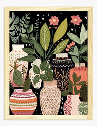
Boho Botanical Vases Art Print
Translation missing: en.products.product.sale_price From £11.95£19.95 -

Sentiment Botanique Art Print
Translation missing: en.products.product.sale_price From £11.95£19.95 -

Fresh Botanical Vibes Art Print
Translation missing: en.products.product.sale_price From £11.95£19.95 -

Vibrant Windowsill Greenery Art Print
Translation missing: en.products.product.sale_price From £11.95£19.95 -

Eclectic Botanical Stairway Art Print
Translation missing: en.products.product.sale_price From £11.95£19.95 -

Green Botanical Botannique Art Print
Translation missing: en.products.product.sale_price From £11.95£19.95 -

Cheerful Plant Stand Canvas Print
Translation missing: en.products.product.sale_price From £44.95£74.95 -

Boho Botanical Haven Art Print
Translation missing: en.products.product.sale_price From £11.95£19.95 -

Bold Botanical Vases Art Print
Translation missing: en.products.product.sale_price From £13.99£19.99 -

Geometric Botanical Harmony Art Print
Translation missing: en.products.product.sale_price From £13.99£19.99 -

Botanical Boho Vases Canvas Print
Translation missing: en.products.product.sale_price From £44.95£74.95 -

Fern Flourish Vase Art Print
Translation missing: en.products.product.sale_price From £11.95£19.95 -

Vibrant Indoor Botanicals Canvas Print
Translation missing: en.products.product.sale_price From £44.95£74.95 -

Eclectic Indoor Jungle Canvas Print
Translation missing: en.products.product.sale_price From £44.95£74.95 -

Plants on the Landing Art Print
Translation missing: en.products.product.sale_price From £11.95£19.95 -
Boho Botanical Vases Art Print
Translation missing: en.products.product.sale_price From £11.95£19.95 -

Modern Floral Still Life Art Print
Translation missing: en.products.product.sale_price From £11.95£19.95 -

Floral Statement Style Art Print
Translation missing: en.products.product.sale_price From £11.95£19.95


More from The Frame

What Art Actually Works in a Kitchen (And What ...
Most kitchen art looks like it was chosen last, in a rush, from a homewares aisle. It doesn't have to. With the right materials and a bit of restraint, your...

From Scientific Illustration to Monstera Minima...
Botanical art has quietly become one of the most enduring categories in interior design, partly because it spans roughly 500 years of visual styles. Some of it looks like it...

Tropical Pool Prints or Coastal Calm? Finding Y...
There's a version of coastal style that involves rope-wrapped vases and starfish in apothecary jars. This is not that guide. This is about using swimming pool wall art as the...