
 Order today for delivery by
 What Interior Stylists Know About Window Art Ideas for Gallery Walls
The interior stylist's playbook for turning vintage panes, arched casements, and scenic views into one cohesive wall.


Gallery walls fail when there's no thread tying the pieces together. Window themed wall decor solves that problem before you've even started, because every print already shares the same architectural logic: a frame within a frame, light falling through panes, a view held in place. That built-in cohesion is why stylists keep returning to it.
Why windows make one of the best gallery wall themes
Most gallery walls go wrong because the prints have nothing in common beyond the fact that you liked them. Window artwork for walls sidesteps this entirely. The motif itself does the heavy lifting: panes, mullions, sills, and shutters create visual repetition across every piece, even when the styles differ wildly.
There's also a colour palette advantage. Windows are almost always photographed or illustrated with similar lighting logic, soft daylight, golden hour, or moody overcast, which means your prints naturally share a tonal range. You don't have to fight to make them harmonise.
And then there's the frame-within-a-frame effect. Each print is already a window. When you frame it and hang it on the wall, you're stacking that geometry, and the result reads as deliberate rather than random. It's the closest thing to a foolproof gallery wall theme.

Choosing a layout: grid, salon hang, or horizontal row
Three layouts cover almost every wall you'll encounter. Pick based on the wall, not the prints.
The grid
A grid (typically 2x2, 3x3, or 2x3) suits modern interiors and walls with clean architectural lines. It's the most forgiving option because identical sizes and equal spacing remove most of the decisions. Use a grid when your prints are similar in style, for example all architectural windows or all photographic, and when the wall behind is flat and uninterrupted.
A 9-piece grid works beautifully on walls between 6 and 8 feet wide. A 6-piece (2x3) grid is the sweet spot for walls between 4 and 6 feet. Anything narrower, drop to a 2x2.
The salon hang
A salon hang mixes sizes and orientations in a loose, asymmetrical arrangement. It looks editorial and lived-in, and it's the layout you want when you're combining different window styles, French casement, arched Mediterranean, rustic barn, and need the layout to absorb that variety. Aim for 5 to 7 pieces on walls 4 to 6 feet wide, and 7 to 11 pieces on anything larger.
The trick is to anchor the arrangement around one larger print, usually slightly off-centre, then build outwards. Keep the outer edges of the arrangement roughly rectangular even though the interior is irregular.
The horizontal row
A row of three or four prints, evenly spaced and aligned along their centres, works above sofas, beds, and console tables. It's the most architectural of the three layouts and reads as quiet rather than busy. Use matching frame sizes for maximum impact.
How many prints you actually need (and what sizes to mix)
Stylists rarely buy a single print and hope for the best. They plan the full set first.
For a salon hang, the reliable formula is one large anchor (50x70cm or 70x100cm), two medium supporters (40x50cm or 50x70cm), and three to four smaller pieces (30x40cm or A4). That gives you six to seven prints, enough to fill a standard living room wall without crowding.
For a grid, pick one size and stick to it. 30x40cm prints in a 3x3 grid covers roughly 110x150cm of wall once you account for spacing. 40x50cm prints in a 2x3 grid covers around 130x170cm. Measure your wall before you order.
For a horizontal row, three 50x70cm prints span about 180cm with proper spacing. Four 40x50cm prints span around 180cm too. Either looks balanced above a standard 3-seater sofa.
A useful rule: your gallery wall should occupy roughly two thirds to three quarters of the width of the furniture beneath it. Narrower than that and it looks marooned. Wider and it fights the furniture.
Mixing window styles: architectural, rustic, and scenic together
This is where most people overreach. Mixing window styles is the whole point of a window themed gallery wall, but there's a ceiling on how many you can include before it tips into chaos.
Three styles is the magic number. Beyond that, the eye stops registering "window theme" and starts registering "random collection of windows." Pick three from this list:
- Architectural drawings: technical illustrations of casements, arched windows, sash windows. Crisp, graphic, often monochrome. Browse the architectural art prints collection for these.
- Rustic and vintage: weathered shutters, peeling paint, wrought iron grilles, often photographed in Mediterranean or rural settings.
- Scenic views through windows: a window looking out onto mountains, ocean, a Parisian street. The window frames the view rather than being the subject itself.
- Botanical at the window: climbing roses, jasmine, ivy framing a pane. Soft and romantic.
- Interior glimpses: looking into a room through its window, often with curtains or shutters.
The combination that almost always works: one architectural, one rustic, one scenic. The architectural piece grounds the wall, the rustic adds texture, and the scenic provides depth and a focal point.
What doesn't work: combining literal trompe l'oeil "fake window" canvases with real window themed prints. The trompe l'oeil pieces are trying to fool the eye into thinking there's a window in the wall. The art prints are honestly themselves. Mixing them creates a tonal clash, and you should generally avoid faux window canvases altogether if your room already has real windows nearby.

The one-frame-colour rule and why it matters
If you take one rule from this guide, take this: every frame on a window themed gallery wall should be the same colour.
The prints themselves carry all the variation you need: different window styles, different palettes, different eras. The frames are the unifying element. The moment you mix oak with black with white, you introduce a fourth, fifth, and sixth visual variable, and the wall reads as cluttered no matter how good the prints are.
Three frame colours cover most interiors:
- Natural oak for warm rooms with cream, beige, terracotta, or sage palettes. Softens the look.
- Black for high-contrast modern rooms, white walls, and architectural prints. Sharpest look.
- White for pale Scandinavian interiors and bedrooms. Recedes into the wall and lets the prints carry the room.
Frame quality matters here too. Cheap frames with MDF cores and printed wood-effect finishes warp over time, especially in humid rooms. Solid wood frames with proper joinery hold their shape and age well. Our framed prints use FSC-certified solid wood with UV-protective acrylic glaze, which means they don't fade in direct sunlight and don't develop the slight bow that ruins a gallery wall after eighteen months.
One more thing on frames: ship-with-print matters. The most common gallery wall failure isn't the layout. It's prints that arrive separately from frames, get fitted at home with bubbles or misalignment, and never quite look right. Buy framed prints that ship pre-fitted in one box.
Spacing, alignment, and hanging tools you'll need
Stylists work to a 5 to 7cm gap between prints (roughly 2 to 3 inches). That's the standard, and it works for almost every gallery wall regardless of size or layout.
Break the rule in two situations:
- Very small prints (A5 or under): drop the gap to 3 to 4cm so the prints read as a group rather than scattered.
- Very large prints (70x100cm and above): increase the gap to 8 to 10cm so each piece has room to breathe.
For alignment, grids align on all four edges. Horizontal rows align along the horizontal centre line of each print, regardless of size differences. Salon hangs align loosely around the outer rectangle of the arrangement, with at least two prints sharing a top, bottom, or side edge to give the eye something to anchor on.
Centre your gallery wall so the visual midpoint sits at roughly 145 to 150cm from the floor. That's gallery standard eye level. If the wall is above furniture, leave 15 to 20cm between the top of the furniture and the bottom of the lowest frame.
What you'll need
- Tape measure
- Spirit level (a phone app works in a pinch)
- Pencil
- Painter's tape (low-tack, for marking positions)
- Brown paper or newspaper (cut to print size for paper templates)
- Picture hooks or wall anchors appropriate to your wall type
The paper template trick saves hours. Cut paper to the size of each print, tape the templates to the wall in your planned layout, and live with it for a day before you put any holes in the plaster. You'll spot problems you couldn't see on a floor mock-up.
Our framed prints arrive ready to hang with fixtures already attached, so once your templates are in place you're 10 minutes from finished.

Three ready-made gallery wall combinations from our collection
If you'd rather skip the curation and copy a layout that works, these three combinations have been tested and re-tested.
The Mediterranean Salon (warm, textured, lived-in)
Six prints, salon hang, oak frames. One large 70x100cm scenic view through an arched window onto a coastline. Two 50x70cm rustic shutter photographs. Two 40x50cm architectural drawings of arched openings. One 30x40cm botanical at the window. Best for living rooms with cream, terracotta, or olive palettes. Source the photographic pieces from the photography art prints collection.
The Architectural Grid (modern, graphic, calm)
Nine prints, 3x3 grid, black frames, all 30x40cm portrait. Mix architectural drawings of different window types: sash, casement, arched, oriel, bay. Keep all prints monochrome or two-tone. Best for home offices, hallways, and minimalist living rooms.
The Bedroom Trio (soft, romantic, low-contrast)
Three prints, horizontal row, white frames, all 50x70cm. One vintage window with billowing linen curtains. One soft scenic view through a French casement. One architectural illustration of an arched window. Best above a bed in a bedroom with pale walls. Pre-curated wall art sets make this option faster than building your own.
For inspiration on individual pieces and full sets, the window art prints collection is the place to start.

A note on rooms with real floor-to-ceiling windows
If your room already has dramatic real windows (a bay, floor-to-ceiling glass, a feature window), skip the window themed gallery wall on the adjacent wall. The prints will compete with the real architecture and both will lose. Use window prints in rooms where the actual windows are modest or absent, hallways, internal walls, dining rooms, bedrooms, where the prints can do the work of suggesting light and view.
Common mistakes to avoid
- Four or more window styles: drops the cohesion. Cap at three.
- Mixed frame colours: even one rogue frame breaks the wall.
- Trompe l'oeil faux windows next to real windows: looks cheap and confused.
- Ignoring colour temperature: a warm golden-hour print next to a cold blue overcast print fights itself. Stick to one temperature across the wall.
- Hanging too high: 145 to 150cm centre line, not "wherever the existing nail was."
Final advice
Plan the full set before you order anything. Decide your three styles, your frame colour, your layout, and your spacing. Make paper templates and live with them on the wall for a day. Then order everything together so it arrives in matched frames, properly fitted, ready to hang. The gallery walls that look effortless are always the ones that were planned from the beginning.

Fab products featured in this blog
-

Window Blooms Canvas Print
Sale price From £49.95£74.95 -

Lantern in the Pines Art Print
Sale price From £11.95£19.95 -

Open Window, Painted Sink Art Print
Sale price From £11.95£19.95 -

Interior with Open Windows by Raoul Dufy Canvas Print
Sale price From £49.95£74.95 -
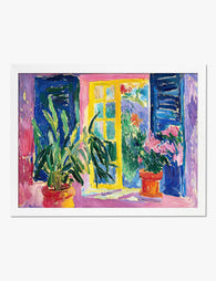
Open Window with Plants Art Print
Sale price From £11.95£19.95 -

Window Blooms Art Print
Sale price From £11.95£19.95 -

Cosy Holiday Window Art Print
Sale price From £11.95£19.95 -

Matisse-Inspired Open Window with Black Cat Canvas Print
Sale price From £49.95£74.95 -

Open Window, Collioure by Matisse Art Print
Sale price From £11.95£19.95 -

The Window by Henri Matisse — Exhibition Poster Art Print
Sale price From £11.95£19.95 -
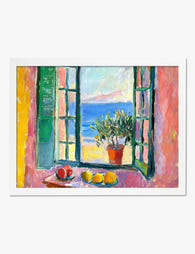
Open Window with Lemons (Matisse-Inspired) Art Print
Sale price From £11.95£19.95 -

Open Window with Tulips Canvas Print
Sale price From £49.95£74.95 -

Open Window by Henri Matisse Canvas Print
Sale price From £49.95£74.95 -

Parisian Window in the Style of Matisse Art Print
Sale price From £11.95£19.95 -

Open Window Over the Italian Coast Canvas Print
Sale price From £49.95£74.95 -

City Holiday Windows Art Print
Sale price From £11.95£19.95 -

Summer Window Reflections Art Print
Sale price From £11.95£19.95 -

Summer Window Reflections Art Print
Sale price From £11.95£19.95 -

Houseplant in the Corner Art Print
Sale price From £11.95£19.95 -

House Plants by the Window Canvas Print
Sale price From £49.95£74.95


More from The Frame

William Morris vs Art Nouveau: What Style Is It...
Short version: William Morris was not Art Nouveau. He was Arts and Crafts, a movement he helped invent. The two styles overlap enough to confuse almost everyone, and getting the...

Whimsical Nursery Wall Art Ideas That Grow With...
Most nursery art is designed for the parents standing in the room at 3am, not the seven-year-old who will eventually sleep there. That's why so much of it gets swapped...

Whimsical Art vs Quirky Art: What's the Differe...
If you've ever been confused browsing for playful wall art, wondering if that dressed-up fox print is whimsical, quirky, or something else entirely, you're not alone. The two styles overlap...