
 Order today for delivery by
 What Do Tulips Symbolise in Art? From Dutch Still Lifes to Your Living Room Wall
Four centuries of meaning packed into one flower, and how to pick a print that actually says something.


Tulips carry more baggage than any other flower in art history. They've been religious symbols, financial weapons, moral warnings, and quiet objects of beauty. Understanding that lineage changes how you look at a tulip print, and more importantly, how you choose one.
Tulip Mania: the flower that was once worth more than gold
In 1637, at the peak of the Dutch tulip market, a single bulb of the Semper Augustus, white with crimson flame-streaks running up each petal, reputedly sold for the price of a canal house in Amsterdam. Bulbs changed hands multiple times in a day without anyone ever seeing the flower they'd bought. When the market collapsed in February of that year, it took only a few weeks to wipe out fortunes across the Dutch Republic.
Tulip Mania is often described as the first speculative bubble, and it shaped how tulips were painted for the next century. Because most people could not afford the actual bulbs, they commissioned paintings instead. A painting of a Semper Augustus was a fraction of the price of the bulb and lasted rather longer.
This economic backstory matters because it explains the strange doubleness of tulip symbolism in art. The flower represented staggering wealth and, simultaneously, the vanity of chasing it.

Tulips in Dutch Golden Age painting (and what Rembrandt tulips actually are)
The Dutch Golden Age, roughly 1585 to 1702, produced the richest body of tulip painting in Western art. Ambrosius Bosschaert helped invent the flower still life as a genre, arranging blooms from different seasons together in a single vase, something impossible in nature but revealing in paint. Jan Brueghel the Elder followed with dense, jewel-toned bouquets. Rachel Ruysch, the first female member of the Confrerie Pictura in The Hague, painted with such precision that her works commanded 1,200 guilders in her lifetime, more than Rembrandt earned for many of his portraits.
Ruysch is worth pausing on. Her tulips often include tiny imperfections, a curling petal, an insect on a leaf, a bloom past its prime. These are not mistakes. They are deliberate mortality reminders folded into abundance.
Now, about "Rembrandt tulips." This is one of the most confused terms in the whole category. Rembrandt tulips are not tulips painted by Rembrandt. They are tulip varieties, specifically those with dramatic flame-and-feather streaking on the petals, named after the Dutch Golden Age painting tradition rather than the artist himself.
Even more oddly, that streaking was caused by a virus, the tulip breaking virus, which weakened the bulbs and eventually made them impossible to cultivate reliably. The most valuable tulips of the 17th century were, botanically speaking, sick. The beauty was a symptom. That fact alone is more poetic than most memento mori.
Symbolism decoded: love, transience, renewal, and abundance
Before the Dutch, tulips belonged to the Ottoman court. The word "lale" in Ottoman Turkish shares its letters with "Allah" and with the crescent moon, and the tulip appears constantly in Ottoman textiles, tiles, and manuscripts as a spiritual and royal emblem. Tulips arrived in Europe via the botanist Carolus Clusius, who cultivated them at Leiden in the 1590s and, in doing so, kick-started both Dutch horticulture and the tradition of scientific botanical illustration that runs right through to the present.
So by the time you're looking at a 17th-century Dutch tulip painting, the flower already carries at least three layers of meaning: Ottoman spiritual symbol, luxury commodity, and object of scientific study. The Dutch added two more.
The first is love. Tulips became a common gift between courting couples and appear in wedding portraits and dowry inventories. Red tulips in particular signalled a declaration.
The second is transience, and this is where things get interesting. Vanitas paintings used skulls, extinguished candles, and rotting fruit to remind viewers of mortality. But tulips did the same work more subtly. A tulip is at its most beautiful for a matter of days. Paint one at full bloom and you've already captured something that no longer exists.
This is the paradox that distinguishes tulips from roses or lilies in art. They symbolise abundance and its inevitable end at the same time. That doubleness is why they keep working across centuries.
How different tulip colours carry different meanings
Colour symbolism in tulip art comes from two overlapping traditions: Dutch Golden Age painting and Victorian flower language, which formalised the meanings in the 19th century. The associations most people recognise today are a blend of both.
Red tulips mean passionate love and declaration. In Dutch still lifes they often anchor the composition, drawing the eye first.
White tulips signify purity, forgiveness, and worthiness. They frequently appear near religious symbols in vanitas work.
Purple tulips carry royalty and nobility, an association inherited directly from the Ottoman court where purple dyes were reserved for the sultan.
Yellow tulips originally meant hopeless love in Victorian language, though this has softened over time to cheerfulness and friendship. In Dutch paintings, yellow tulips often signal sunlight and abundance.
Pink tulips mean affection and care, less intense than red but warmer than white.
Streaked or "Rembrandt" tulips, the flame-patterned varieties, historically meant beautiful eyes or spectacular presence. They're the showpieces, and in a still life they're almost always positioned at the top of the arrangement.
That last detail is a genuinely useful bit of art history for anyone choosing a print. The most valuable tulip in a 17th-century arrangement was placed highest, drawing the eye upward. If you're hanging a large tulip print, treat it the same way. Position it as the focal point of a wall, not as decorative filler beside something more important.

Modern tulip art: photography, minimalist illustration, and abstract interpretations
The idea that tulip art ended with the Dutch Golden Age is a strange one, but you'd be forgiven for thinking it based on most writing about the flower. In fact, the last twenty years have produced some of the most interesting tulip work in centuries.
Minimalist line art strips the tulip back to its essential shape, a curved stem, three or four petals, sometimes rendered in a single continuous line. This style feels contemporary but does something surprisingly old. A single-stem tulip in restrained black ink on a white background creates the same "memento of transience" feeling as an overloaded vanitas painting, just through emptiness rather than abundance. The message is the same. The delivery is the opposite.
X-ray tulip photography, pioneered by artists working since the 1990s, produces ghostly, translucent images that show the flower's internal structure. These read as direct descendants of vanitas painting. You are, quite literally, looking through the flower to what lies beneath. Modern memento mori, made with radiation instead of oil paint.
Botanical illustration, the tradition Clusius helped start, is having a revival. Contemporary botanical tulip prints combine scientific accuracy with artistic composition, often on cream or pale backgrounds that echo old herbarium pages. They work brilliantly in kitchens, studies, and any room that benefits from a slightly quieter, more studied feel. If this appeals, our botanical art prints collection is the place to start.
Abstract and colour-field tulip art treats the flower as a shape and a colour rather than a subject. A block of soft coral pink and green, barely recognisable as a tulip, still carries the flower's associations. This works particularly well at large scale, 70x100cm or above, where the ambiguity becomes the point.
Photographic tulip prints with dark backgrounds, sometimes called "chiaroscuro" style, deliberately reference the lighting of Dutch Golden Age painting. If you love the mood of a Bosschaert but want something that reads as contemporary, this is the bridge.
Choosing a tulip print that tells a story in your home
Knowing the history is useful only if it helps you choose. Here's how we'd translate it into a decision.
Start with the mood you want the room to hold. A traditional vanitas-style tulip print, dark background, moody lighting, abundant arrangement, brings gravity and richness. It works in a lounge, a dining room, a study. It does not work above a child's cot.
Match the style to the wall, not just the room. A dense, detailed Dutch-style print needs breathing room. Give it a wall of its own, ideally in a darker paint colour, sage green, dusty plum, warm charcoal, and let it be the focal point. A minimalist line drawing does the opposite job. It needs pale walls and space around it to work.
Think about scale honestly. A 30x40cm tulip print above a large sofa will look apologetic. If you want a Dutch-inspired piece to carry a room, go 60x80cm or larger. For our range this means considering the framed option, which arrives ready to hang with fixtures already fitted, or a large canvas if you want a lighter, unframed finish.
Consider colour temperature. Tulip prints with warm reds, oranges, and yellows push a room toward cosy and traditional. Cooler palettes, whites, pale pinks, greens, feel more contemporary and calm. Purple and streaked varieties add drama without warmth.
Decide between framed and canvas based on the style. Traditional Dutch-inspired tulip prints benefit from a proper frame, particularly a black or dark walnut moulding, which echoes 17th-century framing conventions. Modern minimalist and photographic tulip work often looks best on canvas with a mirrored edge wrap, or in a slim natural oak frame that gets out of the way.
One practical note. Framed prints are heavier than canvas, so if you're hanging above a bed or on plasterboard without solid fixings, canvas is the sensible choice. Framed prints look more polished but you do need a wall that can take them.

Our favourite tulip art prints and the traditions they draw from
We've grouped the tulip prints we return to most often into four broad families, each pulling from a different point in the flower's four-hundred-year story.
Dutch-inspired still lifes. These are the direct descendants of Bosschaert, Ruysch, and Brueghel. Dark backgrounds, abundant arrangements, dramatic lighting, often with subtle vanitas elements like a fallen petal or a curling leaf. If you want a print that carries genuine art historical weight, this is the starting point. Look for versions that lean pronkstilleven (ostentatious display, jewel tones, gilded vases) if you want opulence, or vanitas (more restrained, with mortality symbols) if you want gravity. Our vintage art prints range includes several pieces in this tradition.
Botanical illustration. The Clusius lineage. Single or small groups of tulips rendered with scientific accuracy on pale backgrounds, often labelled or dated to reference old herbarium pages. These prints feel calm, considered, and quietly intellectual. They work in almost any room and are the most versatile choice if you want tulips but not drama.
Minimalist and line-based work. Contemporary interpretations that reduce the tulip to its essential shape. Best in modern interiors, particularly rooms with clean architectural lines. A single-stem line drawing at 50x70cm above a console table or bed is one of the most reliably good choices in the whole category.
Photographic and abstract. Everything from x-ray tulip photography to soft-focus colour-field pieces. These are the pieces that read as contemporary art rather than decoration, and they reward larger sizes. If you want a tulip print that people ask about, this is where to look. Browse our floral art prints and full tulips art prints selections to see the range.

A final thought
The reason tulips have kept their grip on artists for four hundred years is that they hold contradictions comfortably. Wealth and vanity. Beauty and decay. Ottoman spirituality and Dutch commerce. Scientific precision and abstract mood.
Choose a print that leans into one of those tensions rather than smoothing them out. A tulip that looks slightly past its best, or a single stem that feels almost too spare, will hold your attention for years. A too-perfect, too-decorative tulip will fade into the wallpaper within a month. The flower has always been more interesting than that, and the right print should be too.

Fab products featured in this blog
-

Tulip Glow Bouquet Art Print
Sale price From £11.95£19.95 -

Garden Tulip by William Morris Art Print
Sale price From £11.95£19.95 -

William Morris Exhibition Tulips Poster Art Print
Sale price From £11.95£19.95 -

Tulip Harmony in Blue Vase Art Print
Sale price From £11.95£19.95 -
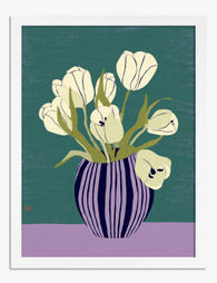
Soft Tulips in Striped Vase Art Print
Sale price From £11.95£19.95 -

Tulip Glow Bouquet Canvas Print
Sale price From £49.95£74.95 -

Garden Tulip by William Morris Art Print
Sale price From £11.95£19.95 -

William Morris Exhibition Tulips Poster Canvas Print
Sale price From £49.95£74.95 -

Soft Tulips in Striped Vase Canvas Print
Sale price From £49.95£74.95 -

William Morris Tulip Vase Art Print
Sale price From £11.95£19.95 -

Garden Tulip by William Morris Art Print
Sale price From £11.95£19.95 -

Garden Tulip by William Morris Canvas Print
Sale price From £49.95£74.95 -

Tulips in a Stone Urn Art Print
Sale price From £11.95£19.95 -

Flower Market Stockholm Tulips Art Print
Sale price From £11.95£19.95 -

Flower Beds in Holland by Van Gogh Art Print
Sale price From £11.95£19.95 -

Tulips and Lemons Still Life Art Print
Sale price From £11.95£19.95 -
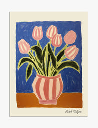
Pink Tulips in a Striped Vase Art Print
Sale price From £11.95£19.95 -

Garden Tulip by William Morris Canvas Print
Sale price From £49.95£74.95 -
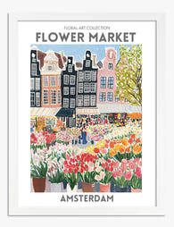
Amsterdam Flower Market Tulip Poster Art Print
Sale price From £11.95£19.95 -

Tulips and Lemons Still Life Art Print
Sale price From £11.95£19.95


More from The Frame

Are Botanical Prints Still in Style? The Trend ...
Botanical prints have been declared "over" roughly every three years since 2015, and yet they keep hanging on more walls than ever. The truth is they're not a trend at...

Room-by-Room or Whole-Home? Styling Botanical P...
Most botanical prints are hung wrong. They're too small for the wall, glossy in rooms that need calm, and floating at eye level above sofas they should be anchoring. This...

You're Overthinking Art Above Your Sofa
The blank wall above your sofa isn't a maths problem. It's a mood decision, a colour decision, and a "what do I actually want to look at every evening" decision....