Whimsical vs Realistic Nature Art: Which One Actually Makes a Room Feel Alive?
A buyer's guide to choosing between dreamy illustration and crisp photography, with rules for mixing both without the chaos.

Most articles on this topic stop at definitions. We want to help you actually choose. Whimsical and realistic nature art do very different things to a room, and the right answer depends on your walls, your furniture, your light, and honestly, your personality.
Defining the spectrum: from photographic realism to full-blown whimsy
Whimsical versus realistic nature art isn't a binary choice. It's a spectrum, and the most interesting prints often sit somewhere in the middle.
At one end you have photographic realism: a misty Scottish loch shot at dawn, every reed and ripple captured exactly. Move along the spectrum and you reach traditional botanical illustration, the kind of detailed, scientifically accurate work that fills old reference books. Keep going and you hit impressionism, where mood starts to outweigh accuracy. Then loose watercolours, then stylised flat illustration, and finally full whimsy: anthropomorphic mushrooms, pastel forests, foxes wearing scarves.
So what is whimsical art style, exactly? It's work that prioritises emotion, imagination and playfulness over accuracy. Proportions get exaggerated. Colours get pushed. The artist's hand is visible. You're not looking at nature as it is, you're looking at how nature feels to someone who finds it enchanting.
Impressionism and semi-realistic illustration are the bridges. They're worth knowing about because they let you tilt a room in either direction without committing to the extremes.

How each style affects the mood of a room
Realistic nature art tends to calm a space. A photographic landscape of a Norwegian fjord or a precise botanical study of fern fronds acts like a window. Your eye reads it as a real place, and the brain does what it does when looking out of an actual window: it relaxes.
Whimsical art prints do the opposite. They lift energy, inject character and signal that the people who live here don't take themselves too seriously. An illustrated mushroom forest in soft pinks and ochres won't lower your heart rate the way a misty mountain photograph does. It will make you smile, which is its own kind of value.
Realism reads as sophisticated, considered, often a touch formal. Whimsy reads as warm, personal, sometimes nostalgic. Neither is better. They're tools that do different jobs.
Here's the lifestyle test we use. If you're someone who decompresses by going for long walks and wants your home to feel like a retreat, realism probably suits you. If your idea of a good evening is friends, wine and a long conversation about something silly, whimsy will feel more like home. Most people sit in the middle, which is why the spectrum matters.
Whimsical nature art: best rooms, best pairings, best wall colours
Whimsical work earns its keep in rooms where mood matters more than gravitas. Nurseries and children's bedrooms are obvious. So are kitchens, downstairs loos, reading nooks, hallways, and any room that's already a bit cluttered with personality.
A few specifics:
Kitchens. Illustrated nature prints sit beautifully here. A trio of small (30x40cm) whimsical herb illustrations above an open shelf works harder than one large photographic piece, because kitchens are already busy with texture and the eye doesn't want another wide vista to absorb. Keep them framed in natural oak or black to ground the playfulness.
Bedrooms with darker walls. Deep teal, plum and chocolate browns flatter whimsical illustration. The saturated wall absorbs noise and lets a soft, dreamy print glow against it.
Home offices. Whimsy here softens the seriousness of a desk and screen. A single large whimsical nature print at 50x70cm directly opposite where you sit will pull your eye up from the laptop and shift your mood. Useful at 4pm.
Nurseries. Obvious territory, but a word of warning: don't go too saccharine. Pick whimsy with sophisticated colour palettes (terracotta, sage, mustard, cream) rather than primary brights, and the room will still feel intentional when the child is seven.
The best wall colours for whimsy are either warm neutrals (oat, plaster pink, warm white) that let the illustration sing, or deep saturated tones (forest green, navy, burgundy) that make pastel illustration feel jewel-like. Cool greys tend to flatten whimsical art. Avoid.
For furniture pairings, whimsy works hardest against simple, restrained pieces. A loose, playful illustration above a clean-lined sofa creates tension that flatters both. Put a whimsical print above a heavily carved antique sideboard and the room starts shouting.
Realistic nature art: when accuracy and calm are what you need
Realism is the dependable workhorse of nature art. It tends to age well, it suits more rooms, and it does the heavy lifting in spaces that need to feel composed.
Living rooms are where realism really sings. A large (70x100cm) landscape print above the sofa creates depth, the sense of a view, and the calm authority that a good living room needs. If you have ceilings under 2.5m, go with horizontal compositions to widen the room visually. Higher ceilings can carry vertical landscapes or mountainscapes that draw the eye upward.
Bedrooms with light, neutral palettes are realism's other natural home. A misty coastal photograph in soft greys and blues at the head of the bed will lower the temperature of the room. You'll sleep better in a room that feels like a window onto somewhere peaceful.
Bathrooms benefit from realism too, particularly close-up botanical photography or detailed botanical illustrations. The detail rewards the long looks you take when you're brushing your teeth or in the bath.
Realism needs light to do its work. Detailed photography in a dim room loses its texture and starts to look murky. If your space is poorly lit, either commit to good ambient lighting (a wall lamp angled at the print, a nearby table lamp) or lean towards whimsy, which tolerates dim conditions much better because it relies on bold shape and colour rather than fine detail.
One honest trade-off: realistic nature art can occasionally feel like hotel art if you choose pieces that are too generic. The fix is specificity. Pick a landscape of somewhere you've actually been, or a botanical of a plant you actually love. Specific beats decorative every time.

Mixing both styles in the same home without creating chaos
You can absolutely mix whimsical and realistic nature art in the same home. You can even mix them in the same room. But there are rules, and breaking them is what creates the visual mess that puts people off trying in the first place.
Rule one: separate by wall, not by inch. Whimsy and realism are happiest on different walls in the same room, or in adjacent rooms visible from each other. Putting an illustrated fox print directly next to a photographic landscape on the same wall, at the same size, in similar frames, creates competition. Each piece undermines the other.
Rule two: bridge with colour. If you're mixing styles across a room, choose pieces that share at least two colours. A whimsical print with sage, terracotta and cream will sit happily across the room from a realistic landscape that contains those same tones. Colour is the thread that makes mixed styles read as intentional.
Rule three: vary the scale. When mixing, make one piece clearly dominant and the other clearly secondary. A large (70x100cm) realistic landscape paired with a small (30x40cm) whimsical piece elsewhere in the room reads as confident curation. Two pieces of equal size in different styles reads as indecision.
Rule four: unify the frames, or unify nothing. If your styles are different, your frames should match. Same wood, same width, same finish. This is the single most effective way to make mixed-style art feel like it belongs together. Alternatively, go fully eclectic with different frames on every piece, but you need at least five pieces for that to work as a deliberate gallery wall rather than a mistake.
Rule five: use whimsy to soften formal spaces, realism to elevate casual ones. A whimsical illustration in a formal dining room can break the stiffness. A precise botanical photograph in a relaxed family snug can lift the room without making it feel uptight. This is the formality spectrum in action and it's one of the most useful mixing principles we know.
How print quality affects whimsical art more than you'd expect
This is the bit most articles miss. Print quality matters for all art, but it matters more for whimsy than it does for realism, and the reason is simple.
Realistic photography hides its flaws. A slight colour shift or a touch of digital noise reads as atmosphere. Your brain is generous because it's already busy reading the image as "real."
Whimsical illustration doesn't have that cover. It's pure colour, pure shape and pure line. Any banding in a gradient, any dullness in a pastel, any fuzziness in an outline is immediately visible. Cheap reproduction kills whimsical work in a way it doesn't quite kill a photograph.
A few things matter here:
Paper. Whimsical illustration needs a thick matte paper. Gloss flattens the soft colour transitions that illustrators rely on. Thin paper warps and the print loses its presence. Museum-grade giclée on heavy matte stock is what you want, and it's what we use across our nature art prints because the difference is genuinely visible up close.
Ink. Pastels and soft colours are unforgiving. Inks that fade, shift or lack pigment depth will turn a beautiful sage-and-blush illustration into something that looks washed out within months. Look for inks rated to last hundreds of years, even in direct sunlight.
Framing. A poorly fitted frame is bad for any print, but it's especially cruel to whimsical work. A warped board, a print that's slipped behind the mount, an acrylic glaze with bubbles, all of these things stand out far more on a flat illustrated piece than on a textured landscape photograph. This is the most common failure in the category, which is why we ship our framed prints fully fitted in one box with the fixtures already attached. No assembly, no warping, no separate frame turning up a week later.
If you're investing in whimsy, invest in the print quality. It's the difference between a print that looks like a thoughtful piece of art and one that looks like a printout.

Our verdict: when to go whimsical and when to stay grounded
If you want one rule, here it is: realism for the rooms where you want to feel calm, whimsy for the rooms where you want to feel something.
Go whimsical when:
- The room is for play, sleep, reading or cooking rather than entertaining or working
- Your walls are saturated, your furniture is restrained, and the room needs personality
- You're decorating for children, but want pieces that will still look good in five years
- The space has poor natural light and detailed photography would get lost
- You want the room to reflect a side of you that the rest of your decor doesn't
Stay realistic when:
- You're decorating a living room, formal dining room or main bedroom
- The room has good natural light and you want to make the most of it
- You want art that ages well and stays relevant through changing interior trends
- The rest of the room is already busy and needs a calming focal point
- You want the room to feel like a retreat
And mix both when your home has range. Most homes do. A realistic landscape in the living room, a botanical illustration in the bathroom, a whimsical piece in the kitchen and another in the bedroom is a perfectly coherent house, as long as you bridge with colour and frame consistently.

The mistake isn't choosing wrong. The mistake is choosing without thinking about the room, the light and the life that happens in it. Stand in the space, decide what you want to feel there, and let that answer the question.

Fab products featured in this blog
-

Whimsical Woodland Hills Art Print
Translation missing: en.products.product.sale_price From £11.95£19.95 -

Sentiment Botanique Art Print
Translation missing: en.products.product.sale_price From £11.95£19.95 -

Botanique Green Botanical Canvas Print
Translation missing: en.products.product.sale_price From £49.95£74.95 -

Tiny People at the Zoo Art Print
Translation missing: en.products.product.sale_price From £11.95£19.95 -
Pastel Camouflage Abstract Art Print
Translation missing: en.products.product.sale_price From £11.95£19.95 -

Botanique Green Botanical Art Print
Translation missing: en.products.product.sale_price From £11.95£19.95 -

Into the Forest Whimsy Art Print
Translation missing: en.products.product.sale_price From £11.95£19.95 -

Tiny People at the Zoo Canvas Print
Translation missing: en.products.product.sale_price From £49.95£74.95 -

Sentiment Botanique Canvas Print
Translation missing: en.products.product.sale_price From £49.95£74.95 -

Bright Path Through the Woods Art Print
Translation missing: en.products.product.sale_price From £11.95£19.95 -

Rococo Vase with White Cat after Cezanne Art Print
Translation missing: en.products.product.sale_price From £11.95£19.95 -

Forest Stroll Whimsy Art Print
Translation missing: en.products.product.sale_price From £11.95£19.95 -

Orange Bloom Garden Canvas Print
Translation missing: en.products.product.sale_price From £49.95£74.95 -

Tiny People at the Zoo Canvas Print
Translation missing: en.products.product.sale_price From £49.95£74.95 -

Little Ghost in the Meadow Canvas Print
Translation missing: en.products.product.sale_price From £49.95£74.95 -
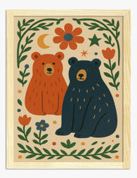
Two Happy Bears Folk Illustration Art Print
Translation missing: en.products.product.sale_price From £11.95£19.95 -

Forest Daydream Canvas Print
Translation missing: en.products.product.sale_price From £49.95£74.95 -

Whimsical Hillside Stroll Art Print
Translation missing: en.products.product.sale_price From £11.95£19.95 -

Little Astronaut Among the Stars Art Print
Translation missing: en.products.product.sale_price From £11.95£19.95 -

Two Tigers in a Folk Garden Art Print
Translation missing: en.products.product.sale_price From £11.95£19.95


More from The Frame

What Colours Go With Bouquet Prints? Pairings I...
You've found a bouquet print you love. Now you need to know if it will actually work above your sofa, opposite that mustard armchair, next to the curtains you spent...

Boho Sun Wall Art: How to Nail the Look Without...
Boho sun art has a reputation problem. Done badly, it screams student halls and macramé overload. Done well, it's one of the warmest, most grounding aesthetics you can put on...

Every Animal in William Morris's Designs: The C...
Most people know the thrush in Strawberry Thief and stop there. But Morris's wider body of work contains foxes, hares, peacocks, ravens, lions, herons, woodpeckers, deer, and doves, often half-buried...