Why Does Cottage Style Wall Decor Work in Modern Homes?
A wall-art-first guide to cottage decorating that feels collected and considered, not chintzy or stuck in 1987.

Cottage style has quietly become one of the most flexible decorating languages in British homes, and most of its success lives on the walls. Done well, it feels warm, lived-in, and unmistakably personal. Done badly, it looks like a tea towel exploded.
What cottage style actually is (and what it isn't)
Cottage style is a decorating approach built around comfort, natural materials, soft colour, and a sense that things have been gathered over time. It values imperfection: a chipped jug, a slightly wonky stack of books, a botanical print that looks like it was rescued from a flea market. The point is intimacy, not grandeur.
It is not farmhouse style, even though the two get muddled constantly. Farmhouse leans utilitarian, with shiplap, barn doors, black metal, and sliding signage about gathering. Cottage leans romantic, with florals, faded watercolours, soft curves, and a quieter palette. Farmhouse says "we work the land." Cottage says "we read in the garden."
It is also not cottagecore, which is an aesthetic movement aimed mostly at mood boards and TikTok. Cottagecore is the costumed version: linen pinafores, wildflower wreaths, baking bread for the camera. Cottage style is the actual decorating discipline you can live inside without performing.
The modern cottage movement, which has been replacing modern farmhouse as the dominant English-speaking interior trend, takes the soul of traditional cottage decorating (natural textures, soft palette, botanical art, antiques) and strips out the chintz, the dark wood overload, and the curtain pelmets. That is the version most people actually want.
The colour palette that makes cottage decor work
Cottage colour is warm, slightly chalky, and never bright. The four anchors are warm white (think Farrow & Ball's Pointing or School House White), sage green, soft stone, and chalky blue. Add one accent if you must: dusty pink, ochre, or rust.
Avoid stark white, which reads cold and modern, and avoid grey, which immediately drags the look into 2015. Cottage palettes have yellow undertones, not blue. Test paint samples in daylight and lamplight before committing, because anything with too much cool blue will fight the warmth you are trying to build.
Wall art needs to live inside this palette. A bright, saturated print on a sage wall will hijack the whole room. The art prints that work best for cottage interiors share the same chalky, sun-faded quality as the walls: watercolour botanicals, muted landscapes, vintage-style florals, soft animal studies. Save the high-contrast graphic prints for a different style entirely.

Living room: choosing a statement cottage print and building around it
Cottage living rooms are anchored by one larger piece of wall art, usually above the sofa or fireplace, with smaller supporting pieces around the room. Pick the statement print first and let it set the temperature for everything else.
For a true cottage feel, the best statement subjects are pastoral landscapes (rolling fields, distant cottages, hedgerows in soft focus), large-scale botanical studies (a single fern, a magnolia branch, a study of wildflowers), or vintage-style animal portraits (hares, hounds, horses, songbirds). A 70x100cm framed print above a standard three-seater sofa lands almost perfectly. Anything smaller and the wall looks underdressed.
Browse landscape art prints for the pastoral option, which is the safest starting point if you are nervous about florals reading dated. Landscape watercolours give you all the cottage atmosphere without a single rose in sight.
Build outwards with two or three smaller pieces: a botanical pair flanking a window, a small framed bird study on a bookshelf, an unframed canvas of a coastal scene leaning against a wall on top of a console. Cottage style loves layered, slightly casual hanging. Nothing should look measured to the millimetre.
Cottage living room ideas for renters
If you cannot drill, lean larger framed prints against the wall on the floor behind a low bookshelf, or prop them on a picture ledge. A single 100x70cm canvas above a sofa, hung from a removable adhesive hook rated for the weight, will do more for the room than any other change. Canvas is your friend here because it is lighter, easier to mount, and forgiving in older buildings with crumbly plaster.
Bedroom: creating a cottage aesthetic with soft, romantic wall art
Bedrooms are where cottage style turns up the romance, but only if you keep the palette restrained. Above the bed is the most important wall in the room, and it should hold either one large print or a quiet pair, never a busy gallery wall (you have to look at it from the bed, and clutter at eye level reads as visual noise).
The subjects that consistently work above a cottage bed are soft floral watercolours (peonies, foxgloves, anemones), single botanical studies on cream backgrounds, and gentle landscape pieces with a low horizon. Stay away from anything with strong text, dark backgrounds, or sharp graphic lines.
A pair of 50x70cm framed prints in matching frames, hung about 15cm above the headboard with 5 to 10cm between them, gives you that collected, slightly old-fashioned symmetry cottage bedrooms do well. If you prefer a single piece, go larger: 70x100cm in landscape orientation works above a standard double or king.
Explore floral art prints for the romantic-but-not-twee end of the spectrum. The trick is choosing florals that look painted rather than photographed, and faded rather than vivid.

For a more grown-up cottage bedroom, try a single moody landscape (a misty estuary, a meadow at dusk) in a dark wood frame above the bed. This is the modern cottage move: traditional subject, restrained styling, generous scale.
Kitchen and hallway: small prints and unexpected placements
Kitchens and hallways are where cottage style gets the most fun, because both spaces forgive a less formal approach to art. Small prints in odd corners, propped against tiles, hung beside a clock, tucked above a door frame: these are the placements that make a cottage interior feel personal rather than staged.
In the kitchen, hang one or two small framed prints (30x40cm or 40x50cm) on the wall above a counter, beside open shelving, or in the space between cabinets and ceiling that usually goes wasted. Subjects that suit kitchens: a still life of lemons or pears, a vintage-style mushroom or herb chart, a small botanical study, a quiet animal print (a hen, a hare, a sleeping cat).
Botanical art prints are particularly strong in kitchens because they reference the garden and the table without resorting to literal "EAT" signage, which is the single most common cottage-kitchen mistake.
Hallways, which most decorators ignore entirely, are the perfect place for a small cottage gallery wall. Long narrow walls need vertical interest, and three to five small prints arranged at varying heights bring the corridor to life. Mix subjects: a botanical, a landscape, an animal study, a small abstract watercolour. Keep the frames consistent, even if the art is varied. That single rule is what makes a gallery wall look intentional rather than chaotic.
At the bottom of the stairs, lean a larger framed piece against the wall on top of a console or chest, with a lamp and a small ceramic bowl. This is the cottage hallway shorthand. It works almost every time.
Frame choices that support the look
Frame choice is doing more work than people realise. The same print in three different frames will give you three different rooms.
Natural oak or ash: the modern cottage default. Warm, light, and informal. Works with sage, stone, and warm white walls. Best for botanicals, landscapes, and lighter floral prints. This is the frame that keeps cottage style from looking dated.
Dark wood (walnut, dark stained oak): the traditional English cottage move. Adds gravitas and pairs beautifully with chalky blue walls, deep green walls, or rooms with a lot of cream and stone. Best for moody landscapes, hunting scenes, and detailed botanicals. Use sparingly in small rooms because dark wood reads heavy.
White or off-white: the airy, slightly Scandinavian-cottage option. Best for bedrooms, kitchens, and small hallways where you want the art to feel light. White frames suit floral watercolours and pale botanical studies but can look thin against busy prints.
Black: generally avoid. Black frames belong to a different style language entirely (gallery, modern, graphic) and will pull cottage rooms toward a contemporary look you are not trying to achieve.
A practical note: the frames worth buying are solid wood with proper fixtures, not MDF wrapped in printed veneer. Cheap frames warp within a year, especially in kitchens and bathrooms where humidity fluctuates, and the difference is visible from across the room. Look for FSC-certified solid wood and UV-protective glazing if you have any direct sunlight, otherwise watercolour prints will fade noticeably within a few summers.
Browse cottage art prints if you want to see frame and print combinations already styled to work together.

The textures and materials that complete the cottage feel
Wall art is the loudest layer, but cottage style only really lands when the surrounding textures agree with it. Linen, wool, stoneware, unlacquered brass, aged wood, woven rush, and natural rattan are the materials that signal cottage. Polished chrome, glass-topped tables, high-gloss anything, and synthetic velvet break the spell instantly.
In a living room, that translates to a linen-covered sofa (or a slipcover over whatever you already own), a wool throw with visible weave, a stoneware lamp base, and a rug with some texture (jute, sisal, or a faded vintage wool). In a bedroom, swap pristine cotton bedding for washed linen and add a quilt at the foot of the bed.
These materials matter for wall art because they share a quality the prints share too: matte, soft, slightly imperfect surfaces that absorb light rather than reflect it. A high-gloss frame on a wall above a linen sofa will look wrong without you being able to say exactly why. Matte papers, matte canvases, and lightly waxed wooden frames all hold the same conversation as the rest of the room.
Common mistakes that make cottage style look dated
This is the section most cottage articles skip, because the mistakes are uncomfortable to name. Here they are anyway.
Too much of one subject. Six floral prints in one room is a florist's, not a cottage. Mix botanicals with one landscape and one animal study.
Frames in five different finishes. Cottage gallery walls fail when every frame is a different colour. Pick one or two finishes maximum.
Saturated, glossy reproductions of famous paintings. A shiny print of Monet's water lilies in a gold frame is not cottage style. It is hotel corridor.
Tiny art on big walls. A 30x40cm print above a large sofa looks lost. Scale up. The single biggest improvement most cottage rooms need is bigger art.
Word art. "Live laugh love", "Gather", "Home sweet home", scripted Bible verses, anything with text in a fancy font. These pull cottage style straight into the dated bracket. If you want words, frame an actual page from a vintage book, not a printed slogan.
Matching everything. Cottage style is collected, not coordinated. Buying a "set" of three identical prints from the same shoot will always look more catalogue than cottage. Mix sources, eras, and subjects within one palette.
Grey. It is not a cottage colour. Stone, taupe, mushroom, and warm off-white all do the job grey is trying to do, but with the warmth cottage style needs.
Overstyling. Cottage interiors look effortless. If every surface has a vignette of three objects at varying heights, you have crossed into shop window territory. Leave breathing room.

Where to start
If you are decorating a room from scratch, buy the largest piece of wall art first and let it set the palette, the frame finish, and the mood. Everything else is easier to choose once that anchor is on the wall. If you are updating a room you already live in, swap out one thing: the print above the sofa, the pair above the bed, or the small piece at the end of the hallway. Cottage style rewards patience and rewards specificity, and one well-chosen print will move a room further than a weekend of rearranging the cushions.

Fab products featured in this blog
-
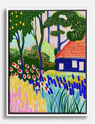
Colourful Garden Retreat Canvas Print
Translation missing: en.products.product.sale_price From £44.95£74.95 -
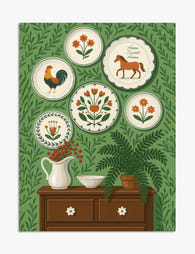
Folk Art Plates on Green Wall Illustration Art Print
Translation missing: en.products.product.sale_price From £11.95£19.95 -

Cottage Garden by Gustav Klimt Canvas Print
Translation missing: en.products.product.sale_price From £44.95£74.95 -

Modernist Living Room Poster Canvas Print
Translation missing: en.products.product.sale_price From £44.95£74.95 -

Klimts Cottage Bliss Canvas Print
Translation missing: en.products.product.sale_price From £44.95£74.95 -

Cezanne’s House Of Pere Lacroix, Tranquil Cottage Art Print
Translation missing: en.products.product.sale_price From £11.95£19.95 -

Klimts Vibrant Cottage Canvas Print
Translation missing: en.products.product.sale_price From £44.95£74.95 -

Rustic Holiday Charm Canvas Print
Translation missing: en.products.product.sale_price From £44.95£74.95 -

Cottage Garden by Gustav Klimt Canvas Print
Translation missing: en.products.product.sale_price From £44.95£74.95 -

Modern Bauhaus Retreat Canvas Print
Translation missing: en.products.product.sale_price From £44.95£74.95 -

Mediterranean Modern Room Art Print
Translation missing: en.products.product.sale_price From £11.95£19.95 -

Cotswolds Wisteria Bridge Art Print
Translation missing: en.products.product.sale_price From £11.95£19.95 -

Van Goghs Dreamy Cottages Canvas Print
Translation missing: en.products.product.sale_price From £44.95£74.95 -
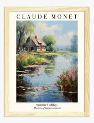
Monet Inspired Summer Cottage by the Lake Art Print
Translation missing: en.products.product.sale_price From £11.95£19.95 -

Modern Bauhaus Retreat Canvas Print
Translation missing: en.products.product.sale_price From £44.95£74.95 -

Modern Boho Mugs Canvas Print
Translation missing: en.products.product.sale_price From £44.95£74.95 -

Rustic Holiday Warmth Canvas Print
Translation missing: en.products.product.sale_price From £44.95£74.95 -

Modern Oasis Retreat Art Print
Translation missing: en.products.product.sale_price From £11.95£19.95 -

Modern Bauhaus Haven Canvas Print
Translation missing: en.products.product.sale_price From £44.95£74.95


More from The Frame

Hosting at Christmas: Three Small Changes That ...
Most Christmas hosting advice asks you to do too much. You don't need a complete seasonal overhaul, you need your rooms to feel finished. The difference between a space that's...

You Bought the Sofa. Now What?
The sofa arrived. It looks great. And now you're staring at the empty wall above it wondering if you've made a terrible mistake, because nothing else in the room seems...

You've Finished the Renovation. The Walls Are S...
The dust has settled. The skip is gone. You've made roughly 4,000 decisions about grout colour and socket placement, and now you're standing in a beautifully painted room staring at...