Why French Impressionist Prints Work Better as a Collection
How to build a Monet-anchored gallery wall that looks collected and intentional, not corporate and generic.

A single Monet on a wall is a lovely thing. But a thoughtfully arranged group of French impressionist prints does something a single piece can't: it creates a mood, a whole atmosphere of light and weather and Sunday afternoons. The trick is avoiding the trap that catches almost everyone who tries it.
Why impressionist prints are perfect for gallery walls
Impressionism was always about accumulation. Monet painted Rouen Cathedral more than thirty times. Degas returned to dancers and bathers obsessively. The movement itself is built on variation around a theme, which is exactly what a good gallery wall does.
The shared visual language helps too. Soft brushwork, atmospheric light, similar tonal ranges. You can mix Monet, Renoir, Degas and Cézanne on one wall and they'll feel like a conversation rather than an argument. Try doing that with a Rothko, a Hockney and a Banksy.
There's a catch, though. The same qualities that make these prints play nicely together also make them prone to looking generic. Beige-ish, blurry-ish, pretty-ish. We'll come back to that.

Start with Monet: choosing your anchor piece
Every gallery wall needs an anchor. With impressionism, Monet is almost always the right choice. His work has the visual weight, recognisability and compositional clarity to hold a wall together while smaller pieces orbit around it.
But not every Monet works as an anchor. This is where most people go wrong.
Anchors that work
The Water Lilies series (especially the deeper blue and green compositions), Impression, Sunrise, and the Houses of Parliament fog studies all make excellent anchors. They have a strong central tonal mood, enough darkness to ground a wall, and compositions that read clearly from across the room.
Anchors that don't
The Giverny garden paintings, with their dense, all-over floral patterns, are gorgeous but visually busy. Hang one as your centrepiece and your eye has nowhere to rest. The same goes for the haystack series when used too large. They're better as supporting players in a collection than as the lead.
For a 2.5m wall, your anchor wants to be substantial. We'd suggest a 70x100cm framed print as your centrepiece. Browse Monet reproduction prints and look for one with a clear focal area, somewhere your eye naturally lands.
Mixing Monet with Renoir, Degas and Cézanne without clashing
Once your anchor is settled, you're choosing companions. Each artist brings something different, and the best gallery walls use that contrast deliberately.
Renoir brings warmth and figures. His pinks, peaches and dappled light add a softness that contrasts beautifully with Monet's cooler water scenes. Use him for a hit of human presence, a portrait or a café scene.
Degas brings structure and movement. His ballet dancers and bathers have a draughtsman's edge that the others lack. He's your tension, the print that stops the wall going too soft. His pastels also introduce muted ochres and chalky greens that bridge other palettes.
Cézanne brings weight. His still lifes and Provençal landscapes have a geometric solidity that anchors the lighter, more dissolved Monets. He's also the one who'll add a touch of earthier colour: terracotta, olive, slate.
A reliable formula for a five-piece wall: one Monet anchor, one Renoir figure or scene, one Degas dancer or bather, one Cézanne still life or landscape, and one wildcard (more on that below).
What we'd avoid: mixing French impressionists with post-impressionists like Van Gogh or Gauguin. The brushwork and saturation are too different. Van Gogh's intensity will eat your softer prints alive, and the wall will read as confused rather than curated. Keep your post-impressionists for a different room.
The colour thread: keeping your wall cohesive
The single most useful technique for an impressionist gallery wall is what we call the colour thread. You pick two or three colours that appear, in some form, in every print on the wall. Not the dominant colour necessarily. Just present.
For a Monet-anchored wall, a classic thread is blue, sage green and a warm cream. Your Water Lilies has all three. Pick a Renoir with a touch of blue in the sky or clothing. A Degas with sage in a tutu or background. A Cézanne with cream-coloured fabric or pale sky.
The result is a wall that feels intentional without being matchy. Your eye picks up the blue in one print, finds it again in another, then a third. That repetition is what creates cohesion.
Avoid threading too many colours. Three is the limit. Four colours becomes noise, and the wall starts to feel decorated rather than collected.

Size and spacing: a specific layout that works on a 2.5m wall
Vague advice helps no one. Here's a layout that actually works, measured for a typical 2.5m wide wall (the kind you'd find above a three-seater sofa or a sideboard).
The five-piece configuration
- Centre anchor: 70x100cm framed Monet, hung portrait orientation
- Upper left: 40x50cm Renoir, landscape orientation
- Lower left: 30x40cm Degas, portrait orientation
- Upper right: 30x40cm Cézanne, landscape orientation
- Lower right: 40x50cm wildcard, portrait orientation
Spacing
Keep 6cm between every frame edge. This is tighter than the 8 to 10cm most people use and it matters specifically for impressionist work. Soft palettes need closer spacing to read as a unit. Pull the prints further apart and the wall fragments visually.
Hanging height
The centre of your anchor piece should sit at 145cm from the floor. Above a sofa, leave 20 to 25cm between the top of the sofa back and the bottom edge of your lowest frame. Any more and the wall and sofa stop talking to each other.
Test before you hang
Cut kraft paper templates the exact size of each frame. Tape them to the wall and live with them for two days. With impressionist prints, where the differences between arrangements are subtle, this step matters more than with bold graphic art. Move them around. Shift the anchor 10cm left. Trust your eye.
Frame choices that unify different prints
Frames are where most impressionist gallery walls fall apart. Either everything matches in identical thin black frames (which makes the wall look like a corporate office) or every frame is wildly different (which makes the wall look like a charity shop).
The middle path: vary frame styles but keep one element consistent.
Option one: same wood, varied widths. All frames in natural oak, but the anchor gets a wider profile (3 to 4cm) and the smaller prints get slimmer ones (1.5 to 2cm). This is our preferred approach for impressionism. Warm wood echoes the natural light in the paintings.
Option two: same colour, varied finishes. All frames in a soft black or a warm white, but mixing matte and satin finishes. Cleaner, more contemporary.
Option three: matched frames, varied mat widths. All identical frames, but the anchor has a 6cm mat and the smaller prints have 3cm mats. This creates hierarchy without changing the frame itself.
What we'd avoid: ornate gilt frames on every print. It's the fastest route to the hotel lobby look. One gilt frame as a wildcard can work beautifully. Five of them is a museum gift shop.
For impressionist work specifically, framed art prints with UV-protective glazing are worth the extra spend. These prints often hang opposite windows (you want them lit), and unprotected paper will fade over decades. Acrylic glazing also reduces glare, which matters when the painting itself is about light.
How to avoid the "hotel lobby" effect
You know it when you see it. A row of impressionist prints in identical thin gold frames, evenly spaced, in muted pastels, on a beige wall. Inoffensive, forgettable, the visual equivalent of lift music.
It happens because impressionism's strengths (soft palettes, familiar imagery, gentle brushwork) become weaknesses when arranged without intention. Here's how to break the curse.
Add one unexpected element
Every great impressionist wall has a wildcard. A black and white family photograph in a vintage frame. A botanical pressing. A small contemporary piece in a colour that picks up your thread. A piece of personal art from a holiday. One disruptor is all it takes to shift the wall from generic to specifically yours.
Vary your subjects
Five Monet water lilies, even at different sizes, will look like a hotel corridor. Mix water scenes with figures, still lifes with landscapes, intimate compositions with grand ones. Variety in subject matter reads as a real collection.
Mind your wall colour
Soft impressionist palettes disappear on beige and cream walls. They sing on richer backgrounds: deep sage, warm clay, smoky blue, even a soft black. If you're committed to white walls, go warm white rather than cool white, and let your frames carry the warmth.
Lighting matters more than you think
Impressionist paintings were obsessive studies of light. Hang them in bad lighting and you've defeated the entire point. Avoid harsh overhead spots that flatten the soft brushwork. A picture light above the anchor, or a lamp angled to graze the wall, brings out the texture and depth that makes these prints worth owning. Warm bulbs (2700K) suit the palette far better than cool daylight bulbs.

Ordering the right sizes: our recommendations for a 3, 5, or 7-piece arrangement
Different wall sizes call for different configurations. Here's what we'd order for each.
The 3-piece arrangement (good for narrower walls, 1.5 to 2m)
- 1x 60x80cm Monet anchor (Water Lilies or Impression, Sunrise)
- 1x 40x50cm Renoir
- 1x 40x50cm Degas
Hang the anchor centrally, the two smaller prints flanking it with 6cm gaps. Simple, effective, hard to get wrong. Where to splurge: the anchor and its frame. Where to save: smaller prints in standard sizes.
The 5-piece arrangement (the sweet spot for most walls, 2 to 2.7m)
Use the layout described earlier. This is the configuration we recommend most often because it gives you enough variety to feel like a collection without becoming chaotic. Where to splurge: the anchor and the wildcard. Where to save: the supporting prints.
The 7-piece arrangement (for larger walls, 2.7m+, or stairwells)
- 1x 70x100cm Monet anchor
- 2x 50x70cm prints (one Renoir, one Cézanne)
- 2x 40x50cm prints (one Degas, one wildcard)
- 2x 30x40cm prints (smaller works to balance the composition)
Seven pieces is the upper limit for most rooms. Beyond that, the wall starts to feel cluttered rather than curated. Arrange in a loose grid with the anchor slightly off-centre for visual interest.
If you'd rather buy the arrangement pre-curated, our wall art sets take the guesswork out of pairing. Or browse the full impressionism art prints collection and build your own.
Build it slowly
The best gallery walls aren't bought in a single afternoon. Start with your Monet anchor. Live with it for a few weeks. Add a Renoir or Degas next, then build outward as you find pieces you genuinely love. Walls that look effortlessly collected usually were collected, just compressed in time. Buy the anchor first, get the frame right, and the rest will tell you what it wants to be.


Fab products featured in this blog
-
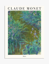
Irises by Claude Monet Art Print
Sale price From £11.95£19.95 -

Irises by Claude Monet Art Print
Sale price From £11.95£19.95 -

The Parc Monceau by Claude Monet Art Print
Sale price From £11.95£19.95 -

Camille in the Garden by Monet Canvas Print
Sale price From £49.95£74.95 -

The Parc Monceau by Claude Monet Canvas Print
Sale price From £49.95£74.95 -

Girl with Dog by Claude Monet Art Print
Sale price From £11.95£19.95 -

The Path through the Irises by Monet Canvas Print
Sale price From £49.95£74.95 -

Parisian Charm Collection Canvas Print
Sale price From £49.95£74.95 -

Claude Monet's Garden, Giverny Art Print
Sale price From £11.95£19.95 -

Colour Is My Obsession — Monet Quote Art Print
Sale price From £11.95£19.95 -
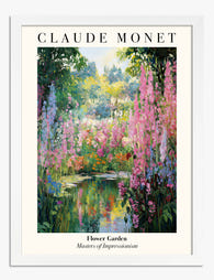
Flower Garden by Claude Monet Art Print
Sale price From £11.95£19.95 -

Landscape by Pierre-Auguste Renoir Art Print
Sale price From £11.95£19.95 -

Parisian Charm Collection Art Print
Sale price From £11.95£19.95 -

Monet's Garden at Giverny Poster Art Print
Sale price From £11.95£19.95 -

The Path through the Irises by Monet Art Print
Sale price From £11.95£19.95 -

Le Cours du 14 Juillet by Monet Canvas Print
Sale price From £49.95£74.95 -
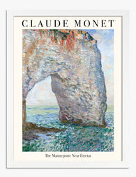
The Manneporte Near Étretat by Monet Art Print
Sale price From £11.95£19.95


More from The Frame

The Best Tulip Wall Art for Every Interior Styl...
Tulips are having a proper moment in interiors, and the range of prints available can make choosing feel harder than it should be. Once you understand the four main styles...

What Do Tulips Symbolise in Art? From Dutch Sti...
Tulips carry more baggage than any other flower in art history. They've been religious symbols, financial weapons, moral warnings, and quiet objects of beauty. Understanding that lineage changes how you...

Living Room William Morris Forest Designs: Hist...
Morris and the English woodland: where the obsession began Before William Morris was a designer, a poet, a socialist, or the reluctant father of modern interior style, he was a...