
 Order today for delivery by
 Why Matisse Botanical Prints Work in Every Room of Your Home
A room-by-room styling guide for making Matisse's leaves and florals feel intentional, not accidental.


Why Matisse's botanicals are the most versatile wall art you can buy
Matisse's botanical work sits in a rare sweet spot. The shapes are bold enough to anchor a wall on their own, but the palettes (soft sage, terracotta, dusty blue, faded pink, ochre) are gentle enough to play nicely with almost any room. That combination of graphic confidence and warm, muted colour is why these prints land in everything from minimalist new builds to cluttered Victorian terraces without looking out of place.
The other thing worth saying upfront: botanicals carry a sense of calm that purely abstract work doesn't. Even when the shapes are stylised to the edge of abstraction, your brain still reads "leaf" or "flower," and that brings a softness to a room. It's the reason Matisse botanical wall art tends to outlast trend cycles in a way that pure geometric prints rarely do.
This guide goes room by room. We'll talk specific sizes, frame choices, colour pairings, and where unframed canvas actually beats a framed print.

Living room: go large and let one print anchor the space
The most common mistake we see in living rooms is undersized art. A 30x40cm print floating above a three-seater sofa looks like a postage stamp on a billboard. For botanicals specifically, this is even worse, because the organic shapes need room to breathe.
Our rule of thumb: the print should be roughly two-thirds the width of the sofa or sideboard below it. For a standard 200cm sofa, that means a 70x100cm framed print in portrait, or a 100x150cm canvas in landscape if you want maximum impact. Botanicals scale up beautifully because the linework is confident and graphic, so detail doesn't get lost the way it can with photographic prints.
Why one big print usually beats three small ones
A single large Matisse leaf print does the heavy lifting on its own. The composition is already balanced, the negative space is part of the design, and you don't need to construct a gallery wall around it. If your living room already has a lot going on (patterned rug, mixed textures, plants), one big botanical is the calmer choice.
If you have a more pared-back room, that's when you can experiment with a pair or trio. Two 50x70cm prints hung side by side with about 5cm between them work well above a sideboard. Stick to prints from the same series so the line weight and palette match.
Framing for living rooms
We'd push you toward a framed print here over canvas, in oak or black depending on your other wood tones. Living rooms tend to be where you've invested in furniture, and a framed print sits more comfortably alongside that. The UV-protective acrylic glaze also matters in living rooms, which often have the most direct sunlight in the house. Glass would create glare you'd notice every time you sat on the sofa.
Bedroom: softer palettes and the case for unframed canvas
Bedrooms are the one room where we genuinely prefer canvas to a framed print, and Matisse botanicals are perfect for it. The matte canvas finish softens the colours slightly, which suits a bedroom's quieter mood. A framed print can feel a touch formal above a bed; an unframed canvas feels more like part of the room.
For a standard double bed (135cm wide), a single 60x80cm canvas in portrait works well centred above the headboard. For a king (150cm) or super king (180cm), go up to 80x120cm or even a 100x150cm landscape. The bottom edge of the art should sit roughly 15 to 25cm above the headboard, no higher.
Palette pairings for bedrooms
Matisse's softer botanical works (the pale pink leaves, the dusty blue cut-outs, the ochre fern studies) lean into a restful palette. Pair them with:
- Off-white or oat-coloured walls (skip bright white, it's too clinical)
- Linen bedding in natural, sage, or terracotta
- Warm wood furniture, ideally oak or walnut
- One muted accent colour pulled directly from the print
The trap to avoid is matching too literally. If the print has sage leaves, you don't need sage cushions, a sage throw, and a sage lamp. Pull one colour through, then let the rest of the room sit in neutrals.

Should you hang art above the bed at all?
Some people skip it entirely. If your bedroom is small or the headboard is already visually busy (buttoned, fabric, ornate), you might be better off hanging the print on an adjacent wall instead. A 50x70cm leaf print on the wall facing the bed gives you something to look at when you wake up, which is arguably nicer than something you can't see when you're in the room.
Hallway: narrow walls, bold leaves, and why portrait orientation wins
Hallways are the most underused wall space in most homes. They're also the easiest place to make a strong impression, because hallway art is almost always seen in passing, which means bold and graphic beats subtle and detailed.
Matisse leaf prints are made for this. The shapes read clearly even when you're walking past, and the palettes brighten what is usually the darkest part of the house.
Why portrait orientation wins in hallways
Most hallways are narrow, with low ceilings relative to their length. Landscape prints fight the proportions of the wall; portrait prints work with them. A 50x70cm or 70x100cm portrait print at eye level (centre of the print around 145 to 150cm from the floor) is the safest choice.
If you have a long hallway, a series of three portrait prints spaced evenly along one wall looks deliberate without becoming a full gallery wall project. Keep them all the same size and frame style. Mixing sizes in a tight space reads as chaotic rather than curated.
Lighting matters more than you'd think
Hallways often rely on artificial light, which can flatten the warm tones in Matisse's palette. Warm white bulbs (2700K to 3000K) preserve the natural colour temperature of the inks. Cool white lighting makes terracotta look dusty and sage look grey. If you can't change the bulbs, lean toward Matisse's blue and green botanicals, which hold up better under cool light than the pinks and oranges.
Kitchen and dining: pairing Matisse floral prints with natural materials
Kitchens and dining rooms are where Matisse's botanical art prints come into their own, because they look made for natural materials. Wood worktops, rattan pendant lights, ceramic tableware, linen napkins. Botanicals tie all of that together in a way that abstract or photographic art doesn't.
Sizing for dining rooms
Above a dining table or sideboard, you have more flexibility than you do above a sofa, because there's nothing sitting at head height to compete with. A pair of 50x70cm portrait prints above a sideboard works well, or a single 70x100cm landscape above a six-seater dining table.
Hang slightly lower than you would in a living room. The bottom edge of the art should be about 20 to 30cm above the sideboard or table surface, which creates a visual connection between the art and the objects below it.
Can you hang art in the kitchen?
Yes, with caveats. Avoid hanging directly above the hob (heat and grease will degrade anything over time, including the frame). A small 30x40cm botanical on a quieter wall, near the dining nook or above a coffee station, brings the kitchen to life without putting the art at risk.
Canvas tends to handle kitchen humidity slightly better than framed prints with acrylic glazing, because there's no enclosed surface for moisture to settle behind. If your kitchen runs steamy, canvas is the practical choice.

Colour matching: walls, furniture, and the Matisse palette
Matisse's botanical palette tends to circle around a handful of recurring colours: sage green, deep emerald, terracotta, dusty pink, cobalt blue, mustard yellow, and warm ochre. Once you can identify which colours are dominant in your specific print, matching the rest of the room becomes much easier.
Wall colours that work universally
- Off-white (warm-toned): lets the print be the centrepiece. Always safe.
- Soft clay or putty: flatters terracotta and ochre botanicals beautifully.
- Sage or eucalyptus walls: only if the print itself is NOT green-dominant. Otherwise everything blurs together.
- Deep navy or forest green: dramatic backdrop for pale-palette botanicals. High risk, high reward.
Avoiding the matchy-matchy trap
Pick one colour from the print and use it elsewhere in the room. Just one. If your print features sage leaves and a terracotta vase, pick sage for a cushion or terracotta for a lamp base, not both. Restraint is what separates a styled room from a themed one.
If you want to lean into green more broadly without making it Matisse-themed, green art prints in other styles (abstract, landscape, vintage botanical illustration) can sit on adjacent walls and pull the palette through the home without feeling repetitive.
Choosing between framed prints and canvas for different rooms
This is the question we get asked most, and there's no universal answer. Here's our honest framework.
Choose framed prints when:
- The room is formal or already invested in (living room, dining room, study)
- You want the art to feel like a finished, considered object
- The wall gets direct sunlight (the UV-protective acrylic glaze prevents fading without the glare of glass)
- You want crisp definition and depth in the linework
- You're hanging in a space where the polished look matters (entrance hall, above the mantel)
Choose canvas when:
- The room is humid (kitchen, bathroom, conservatory)
- You want a softer, less formal feel (bedroom, snug, kids' room)
- You're going XL and the weight of a framed print would be unwieldy
- You prefer the gallery-wrap look with no frame at all
- You're renting and want something lighter to hang on plasterboard
A framed print with proper fixtures arrives ready to hang. Canvas the same. The biggest issue in this category, broadly, is art that arrives in pieces with the frame separate from the print, leaving you to assemble and align it yourself. Buy from anyone who ships framed and fitted in one box, and you'll save yourself a lot of grief.
Gallery wall or solo statement? Our honest recommendation
For Matisse botanicals specifically, we lean strongly toward solo statements. The compositions are designed to stand alone. Matisse spent decades refining the balance of negative space in his cut-outs, and surrounding that with seven other prints often undoes the work.
That said, gallery walls do work with Matisse if you follow a few rules:
- Stick to two or three Matisse prints maximum. Beyond that it starts to feel like a museum gift shop.
- Mix in other styles deliberately. A black-and-white photograph, a small abstract painting, a piece of pressed botanical artwork. The contrast makes the Matisse pieces stronger.
- Use one frame style throughout. Mixed prints, single frame language. Either all oak, all black, or all unframed canvas.
- Plan it on the floor first. Lay everything out before you put a single hole in the wall.
If you're nervous, start with one large print. You can always add more later, and a single confident piece almost always looks more intentional than a hesitant cluster.

A few last things worth knowing
Hang heights are simpler than the internet makes them. The centre of any single print should sit roughly 145 to 150cm from the floor, which is average eye level. Above furniture, the bottom of the print sits 15 to 30cm above the surface. That's it. Don't overthink it.
If you're in a rental, use damage-free strips for anything under about 2kg, which covers most prints up to 50x70cm. Anything larger, particularly framed work, needs proper picture hooks. The hole is small, easy to fill, and worth it.
Finally, give the print a few days in the room before you decide if it's working. Matisse's colours shift noticeably between morning and evening light, and a print that feels uncertain at 9am often looks perfect by sunset. Live with it before you move it.

Fab products featured in this blog
-

Sunlit Botanical Room, Matisse-Inspired Art Print
Sale price From £11.95£19.95 -

Open Doors to a Pink Sunroom Canvas Print
Sale price From £49.95£74.95 -

Matisse-Inspired Cut-Out Botanical Art Print
Sale price From £11.95£19.95 -
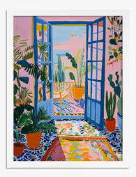
Matisse-Inspired Sunlit Doorway Art Print
Sale price From £11.95£19.95 -

Papiers Matisse — Blue Botanical Cutout Art Print
Sale price From £11.95£19.95 -
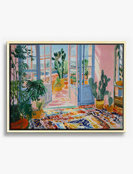
Sunlit Doorway with Cacti Canvas Print
Sale price From £49.95£74.95 -
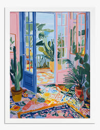
Open Doors to a Pink Sunroom Art Print
Sale price From £11.95£19.95 -
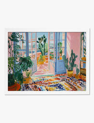
Sunlit Doorway with Cacti Art Print
Sale price From £11.95£19.95 -

Matisse-Inspired Table Blooms Art Print
Sale price From £11.95£19.95 -

Papiers Matisse Botanical Blue Art Print
Sale price From £11.95£19.95 -

Matisse-Inspired Table Blooms Art Print
Sale price From £11.95£19.95 -

Matisse-Inspired Botanical Joy Art Print
Sale price From £11.95£19.95 -

Matisse-Inspired Botanical Joy Canvas Print
Sale price From £49.95£74.95 -

Liberty London Cotton Fabrics Exhibition Art Print
Sale price From £11.95£19.95 -

Foliage by Henri Matisse Art Print
Sale price From £11.95£19.95 -

Still Life with Geraniums by Henri Matisse Art Print
Sale price From £11.95£19.95 -

Seated Woman with Fruit and Plants Art Print
Sale price From £11.95£19.95 -

Matisse Bouquet of Daisies Exhibition Art Print
Sale price From £11.95£19.95


More from The Frame

Van Gogh Botanical Prints vs Traditional Botani...
Both traditions put plants on your wall, but they do wildly different things once they get there. Traditional botanical illustration is quiet, precise, and pattern-friendly. Van Gogh's flowers and gardens...

William Morris vs Art Nouveau: What Style Is It...
Short version: William Morris was not Art Nouveau. He was Arts and Crafts, a movement he helped invent. The two styles overlap enough to confuse almost everyone, and getting the...

Whimsical Nursery Wall Art Ideas That Grow With...
Most nursery art is designed for the parents standing in the room at 3am, not the seven-year-old who will eventually sleep there. That's why so much of it gets swapped...