William Morris Prints in Every Room: A Practical Hanging Guide
Exact sizes, frame colours and room-by-room advice for hanging Morris leaf prints without second-guessing yourself.

You've fallen for a Morris leaf print. Now you need to know exactly where to hang it, how big to go, and what frame won't ruin it. This guide is the manual, with real measurements and real opinions.
Why William Morris leaf prints are having a moment (again)
Morris never really left, but his foliage designs (Willow Boughs, Acanthus, Wreath, the leaf-only colourways of Pimpernel) are showing up everywhere in 2025 interiors. The reason is simple: after a decade of beige minimalism, people want pattern back, and Morris offers pattern with restraint. Leaves read as botanical rather than busy. They sit comfortably next to oak, linen, plaster pink and forest green without fighting for attention.
The other reason is technical. Modern giclée printing finally does justice to the original colour palettes. Older reproductions tended to muddy the olive greens or oversaturate the indigos. A properly printed Morris leaf design now shows the cross-hatching, the subtle tonal shifts and the hand-drawn quality of the original woodblock prints. If you're looking at William Morris leaf art prints, the difference between a flat poster and a museum-grade print is immediately visible in person.
A quick note on what we mean by "leaf prints" specifically. We're talking about Morris designs where foliage is the dominant motif: Willow Boughs, Acanthus, the leafy backgrounds of Strawberry Thief, the trailing vines of Bachelors Button. Floral-heavy designs like Pimpernel or Honeysuckle behave slightly differently, and we'll flag where it matters.

Living room: the single statement print above the sofa
Do this: one large print, centred above the sofa, in a single frame. Do not do a gallery wall of small Morris prints above a sofa. It looks fussy and the patterns compete.
For a standard three-seater sofa (around 200cm wide), you want a framed print that's roughly two-thirds the width of the sofa. That puts you at 70x100cm portrait or 100x70cm landscape. Anything smaller and it floats awkwardly. The bottom of the frame should sit 20 to 25cm above the back of the sofa, close enough to feel connected, not so close it touches when someone leans back.
Acanthus is the obvious choice here. The leaves are large-scale, the composition reads from across the room, and the original indigo and olive colourway grounds a neutral sofa beautifully. If your lounge is darker (deep green walls, navy sofa), go for one of the lighter Morris leaf colourways with cream or buttermilk backgrounds. The contrast does the work.
One thing to address upfront: framed prints this size are heavy, and the most common disaster is a frame that arrives warped, with the print poorly fitted or bubbling under cheap glazing. This is genuinely the biggest failure mode in the category. The print should ship pre-fitted in the frame, with UV-protective acrylic (not glass, which shatters at this size and adds significant weight), and proper hanging fixtures already attached. If it arrives in two boxes or you have to assemble anything, send it back.
What about two prints side by side?
It works, but only if they're from the same Morris design family and the same colourway. Two 50x70cm prints of, say, Willow and Willow Boughs in matching frames, spaced 8 to 10cm apart, reads as intentional. Mixing Strawberry Thief with Acanthus does not.
Hallways and entryways: making a first impression with foliage
Hallways are where Morris leaf prints earn their keep. They're narrow, often lit poorly, and they need something with depth that rewards a closer look. Dense foliage patterns are perfect because the eye travels through them as you walk past.
For a standard hallway wall (you're standing maybe 1.5m back at most), go medium. A single 50x70cm portrait print, or a vertical run of three 30x40cm prints spaced 6cm apart. Hang the centre of the artwork at 145cm from the floor, which is gallery standard and works for most heights.
If your hallway is wider than 1.2m, a 60x80cm landscape print of a trailing leaf design (Bachelors Button works well) above a console table is the move. Leave 15 to 20cm between the top of the table and the bottom of the frame.

Frame colour in hallways matters more than anywhere else because the light is usually unforgiving. Black frames look crisp against pale walls but can feel heavy if the hallway is small. Oak frames soften the look and bounce what little daylight you have. Avoid white frames in hallways. They yellow visually under warm bulbs and the print loses its edge.
Bedroom: creating calm with muted leaf patterns like Willow Boughs
Willow Boughs is the bedroom print. It's the one Morris design that almost everyone agrees works in a sleeping space, and there's a good reason: the pattern is rhythmic, low-contrast, and the willow leaves trail in a way that reads as restful rather than energetic. It's the wallpaper Morris used in his own bedroom, which is not coincidence.
Above a standard double or king bed, hang a single 70x100cm portrait print centred over the headboard. The bottom of the frame should sit 15 to 20cm above the headboard. For a smaller bed or a low headboard, drop to 50x70cm.
Stick to the original Willow Boughs colourway (cream background, sage and olive leaves) if your bedroom is neutral. If you've gone bolder with the walls, the darker green-on-green colourway holds its own against painted plaster pink or deep blue.
Pair Willow Boughs with linen bedding, brass or aged-brass lamps, and absolutely nothing else patterned on the same wall. The print is the pattern in the room. Cushions and throws should be plain or, at most, a tight stripe. The whole point is calm.
What not to do in a bedroom
Don't hang Strawberry Thief above the bed. We know it's tempting. The birds and the dense foreground make it too active for a room you're trying to sleep in. Save it for the hallway or the dining room. Don't go small either. A 30x40cm print above a double bed looks like an apologetic afterthought.
Home office and study: why dense botanical patterns help you focus
There's professional consensus among interior designers that highly detailed, naturalistic patterns reduce visual restlessness in work environments, because the eye has somewhere to land between tasks rather than scanning a blank wall. Morris's denser leaf designs (Acanthus, the foliage backgrounds of Pimpernel) do this job better than almost anything.
For a home office, you want the print directly in your peripheral vision when you're at your desk, not behind you. Hang a 50x70cm or 60x80cm print on the wall to the side of your desk, with the centre at roughly eye height when seated (around 115cm from the floor).
If your office is small, one print is enough. If you have a longer wall, two prints from the broader William Morris collection in matching frames, spaced evenly, give you something to look at when you're on a call.

Frame in oak or walnut here. Black feels too austere for a room you spend hours in. Avoid white. The wood tones warm up screen-fatigued eyes in a way painted frames don't.
A practical note on lighting. Morris prints with darker backgrounds (the indigo Acanthus, deep-green Wreath) need decent ambient light or they read as black smudges from across the room. A wall sconce above the print, or a floor lamp angled towards it, transforms how it looks after 4pm.
Kitchen and dining: smaller prints, big personality
Kitchens are humid, splash-prone, and short on wall space. This is the one room where we'd push you towards canvas prints rather than framed paper prints if the print will hang anywhere near the hob or sink. Canvas handles humidity better and there's no glazing to grease up.
For dining rooms (a separate proposition, less humid, more wall), framed prints are back on. A dining room is where you can be braver. Go bigger than feels natural. A 70x100cm Strawberry Thief or a dense Acanthus above a sideboard turns a beige room into somewhere you actually want to linger after dinner.
In small kitchens, think 30x40cm or 40x50cm prints in unobtrusive spots: above a coffee station, in the gap between cabinets and ceiling, next to an open shelving unit. Keep them away from direct steam sources. Morris's leaf-and-fruit designs (the leafy passages of Fruit, the trailing greens of Trellis) feel at home near food.
Frame colour matters more than you think: our picks for Morris leaf prints
This is where most people go wrong. They pick the print, then default to a black frame because it feels safe. Black frames work for maybe a third of Morris designs. Here's how we'd actually approach it.
Oak frames work with almost every Morris leaf print. The warm wood tone echoes the natural palette Morris was working from. Use oak when the print has a cream or buttermilk background (most Willow Boughs colourways, the lighter Acanthus), and in rooms with existing wood furniture. This is the safe default if you're unsure.
Black frames work best with high-contrast Morris designs: the indigo Strawberry Thief, the dark-ground Wreath, anything with strong outlines and saturated colour. Black sharpens these prints. Use black in modern interiors with white or pale walls. Avoid it in rooms with lots of brown wood furniture, where it can feel disconnected.
White frames work in exactly one scenario: a very pale room with pale walls, where you want the print to feel almost dissolved into the architecture. They tend to yellow under warm light and can make prints feel washed out. We rarely recommend them.
Walnut or darker wood frames are underused and excellent with the moodier Morris leaf designs. If you've got the darker Acanthus or the deep-green Wreath, walnut adds warmth without the heaviness of black.
On frame width: keep it narrow, between 1.5cm and 2.5cm. Morris designs have so much internal detail that a chunky frame fights the print. The frame should be a quiet edge, not a participant.
Sizing guide: which print size for which wall
This is the guidance nobody seems willing to give. Here it is in actual numbers.
Above a sofa (180-220cm wide): 70x100cm portrait, or a pair of 50x70cm portraits.
Above a console table or sideboard (100-140cm wide): 60x80cm landscape, or a 50x70cm portrait.
Above a double or king bed: 70x100cm portrait, single print, centred.
Above a single bed or in a small bedroom: 50x70cm portrait.
Hallway, narrow: 50x70cm portrait, or three 30x40cm prints vertically.
Hallway, wide: 60x80cm landscape above a console.
Home office side wall: 50x70cm or 60x80cm, single or paired.
Kitchen feature wall: 40x50cm, framed or unframed canvas.
Dining room above sideboard: 70x100cm, go big or don't bother.
Powder room or downstairs loo: 30x40cm. Small rooms reward small prints with high detail.
The "too much Morris" problem
You can have multiple Morris prints in a home. You cannot have multiple Morris prints in the same sightline. The rule we use: one Morris print per room, two maximum if they're from the same design family. Beyond that, the patterns start arguing with each other, and the curated effect tips into period-drama set dressing.
If you want more foliage across the house, supplement with other botanical art prints or single-subject green leaf prints that share the palette but not the pattern density. A simple ginkgo or fern study in the same olive-and-cream tones extends the mood without piling on the Arts and Crafts maximalism.

A few final practical notes
Buy the best print quality you can afford. This is where the money goes. Cheap reproductions flatten Morris's colour gradients and the whole thing reads as a poster. Museum-grade giclée on thick matte paper gives you the depth that makes these designs worth hanging in the first place.
Hang things at 145cm to centre, not higher. Most people hang art too high, and Morris prints in particular benefit from being closer to eye level because the detail is the point.
Rotate seasonally if you want, but use proper hanging fixtures and don't drag prints in and out of storage carelessly. UV-protective glazing means you don't have to hide them from sunlight, which removes the main argument for rotation anyway.
And resist the urge to match. The whole appeal of Morris is that the patterns are confident enough to stand alone. Let them.

Fab products featured in this blog
-

William Morris Bird & Fruit Exhibition Poster Art Print
Sale price From £11.95£19.95 -

William Morris Birds Art Print
Sale price From £11.95£19.95 -

Kennet by William Morris Canvas Print
Sale price From £49.95£74.95 -

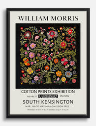
William Morris Cotton Prints Exhibition Art Print
Sale price From £11.95£19.95 -

Studies in Botanical Ornament by William Morris Art Print
Sale price From £11.95£19.95 -

William Morris Cotton Prints Exhibition Art Print
Sale price From £11.95£19.95 -

Flower Garden Textile by William Morris Canvas Print
Sale price From £49.95£74.95 -

Morris-Inspired Birds & Peonies Botanical Art Print
Sale price From £11.95£19.95 -

Morris Birds & Blooms Art Print
Sale price From £11.95£19.95 -

Willow by William Morris Art Print
Sale price From £11.95£19.95 -

Birds by William Morris Canvas Print
Sale price From £49.95£74.95 -

Willow Pattern by William Morris Art Print
Sale price From £11.95£19.95 -

Artful Nature by William Morris Art Print
Sale price From £11.95£19.95 -

Studies in Botanical Ornament by William Morris Art Print
Sale price From £11.95£19.95 -

William Morris Tulip Liberty London Poster Art Print
Sale price From £11.95£19.95 -

William Morris Studies in Botanical Ornament Art Print
Sale price From £11.95£19.95 -
William Morris Cotton Prints Exhibition Canvas Print
Sale price From £49.95£74.95 -

Green Leaves, Morris Inspired Art Print
Sale price From £11.95£19.95 -
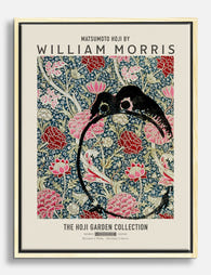
Hoji Garden by William Morris Canvas Print
Sale price From £49.95£74.95 -

Kennet by William Morris Art Print
Sale price From £11.95£19.95


More from The Frame

The Best Wall Art for Plant Lovers (That Doesn'...
You already have too many plants. You know it, your partner knows it, the fiddle leaf fig blocking the window knows it. But your walls are still bare, and there's...

Are Botanical Prints Still in Style? The Trend ...
Botanical prints have been declared "over" roughly every three years since 2015, and yet they keep hanging on more walls than ever. The truth is they're not a trend at...

Room-by-Room or Whole-Home? Styling Botanical P...
Most botanical prints are hung wrong. They're too small for the wall, glossy in rooms that need calm, and floating at eye level above sofas they should be anchoring. This...