Daffodils bring yellow into a room faster than almost anything else. Here they come loose and painterly, crisply botanical, gathered in a jug on a table, or drifting across a spring field. That yellow earns its keep in a dim hallway or above a kitchen counter. For more of the season, tulips art prints sit happily alongside them, while floral still life art prints go quieter and deeper.
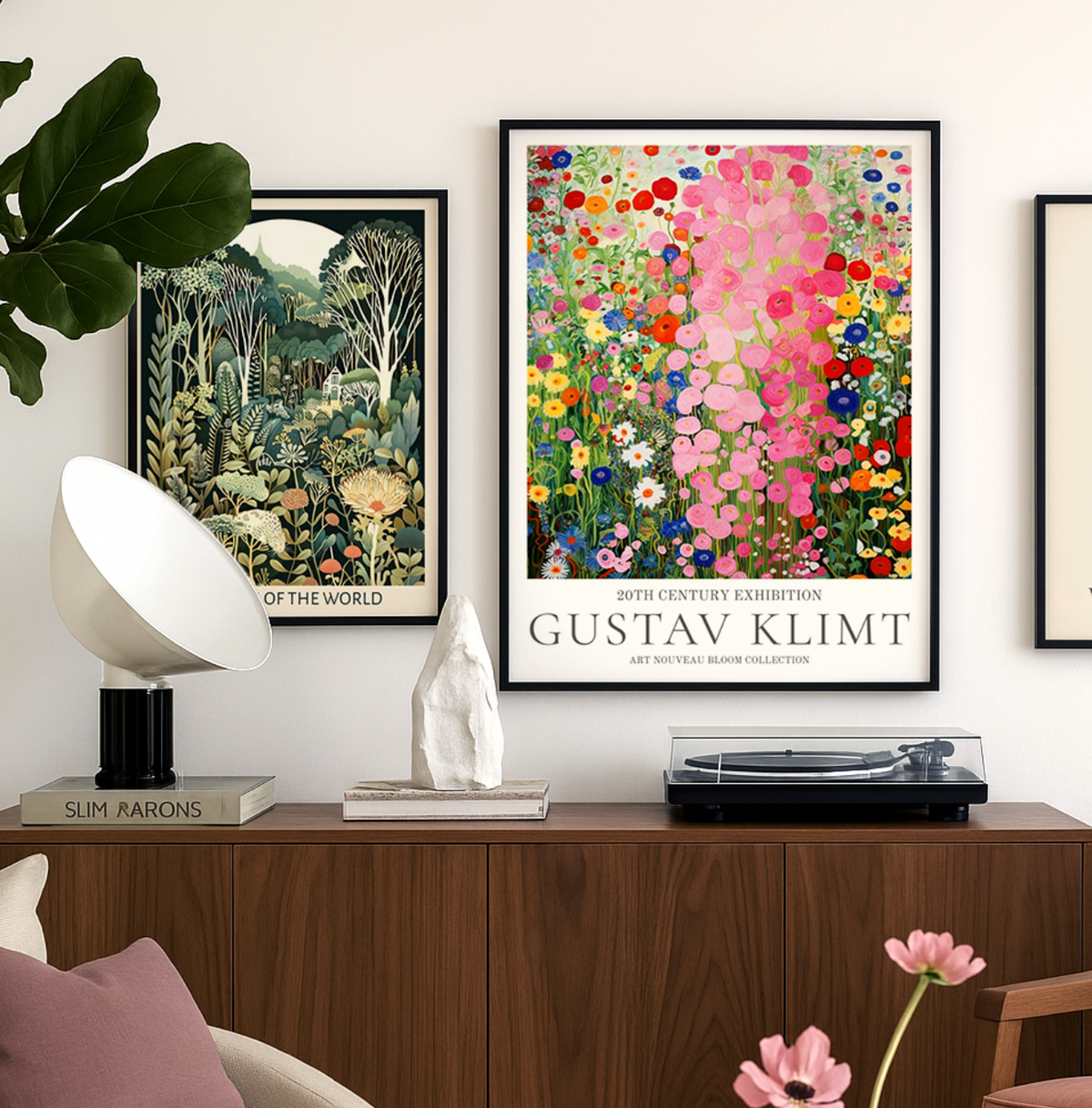
Gustav Klimt wasn’t just an artist — he was a master of seduction through pattern, color, and symbolism. At Fab, we celebrate his work not just as art history, but...
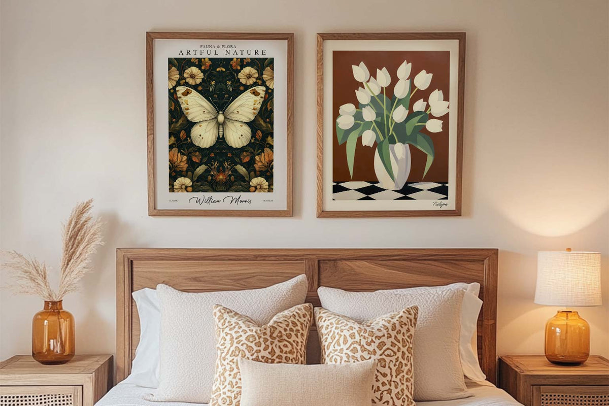
A blank wall can be intimidating. You know you want art, but where do you even start? You scroll through endless options online, walk through galleries feeling lost, or stare...
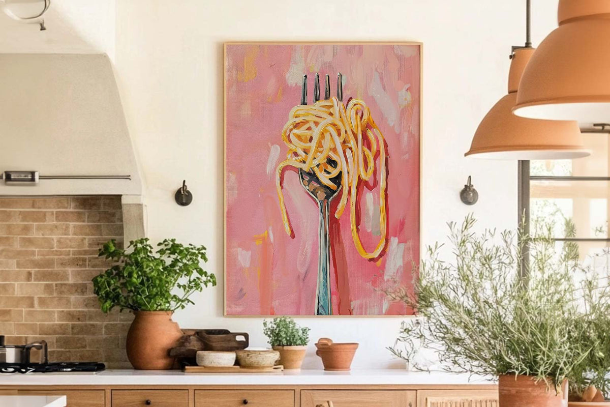
Your kitchen isn't just for cooking. Your dining room isn't just for eating. These are the spaces where life happens. Where you have your morning coffee, where friends gather around...
Choosing a daffodil print
Quick answers on framing, colour, where these prints work best and how buying from Fab works
What styles of daffodil art prints can I choose from?
Daffodil wall art spans a wide range of looks, from soft watercolor botanical studies and hand-painted florals to simple line drawings and bold, modern graphic treatments. Vintage-inspired botanical illustrations and woodblock-style florals are also popular for a more traditional feel. Choose a painterly version for warmth and texture, or a minimal line print if you want something quieter that reads as a graphic accent rather than a focal point.
Where do daffodil prints look best in a home?
Because daffodils signal the end of winter, they bring an instant lift to spaces that feel cool or dim, such as hallways, entryways, north-facing bedrooms and stairwells. In a kitchen or breakfast nook, a golden yellow bloom pairs naturally with white cabinetry and wood tones. For a living room, scale up: one large daffodil print above a sofa or console makes the colour feel intentional rather than decorative filler.
What colours go well with daffodil wall art?
Daffodil yellow is warm and high-contrast, so it works beautifully against soft neutrals like cream, oatmeal, warm white and pale grey, which let the bloom carry the room. For something richer, try deep green, navy or slate walls, where yellow reads as a glowing accent. Pick up the colour elsewhere in small doses, such as a cushion or ceramic, so the print feels connected to the room.
Should I choose a daffodil print or a tulip print?
Both are spring florals, but they read differently on a wall. Daffodils are golden and trumpet-shaped, giving a sunny, cheerful, slightly nostalgic feel that suits cottage, country and traditional interiors. Tulips have cleaner, more sculptural silhouettes and come in a broader colour range, so they sit more easily in modern or minimal rooms. If you love both, hang them as a pair in matching sizes for a coordinated spring gallery.
Choosing a selection results in a full page refresh.