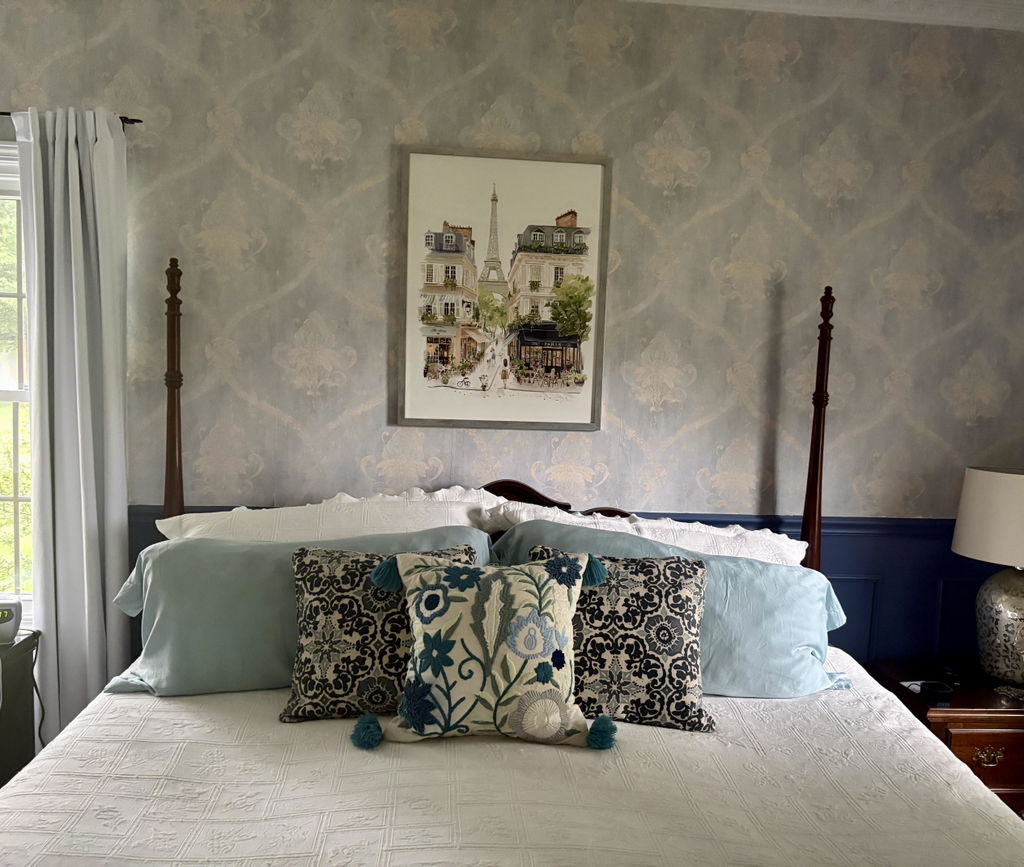
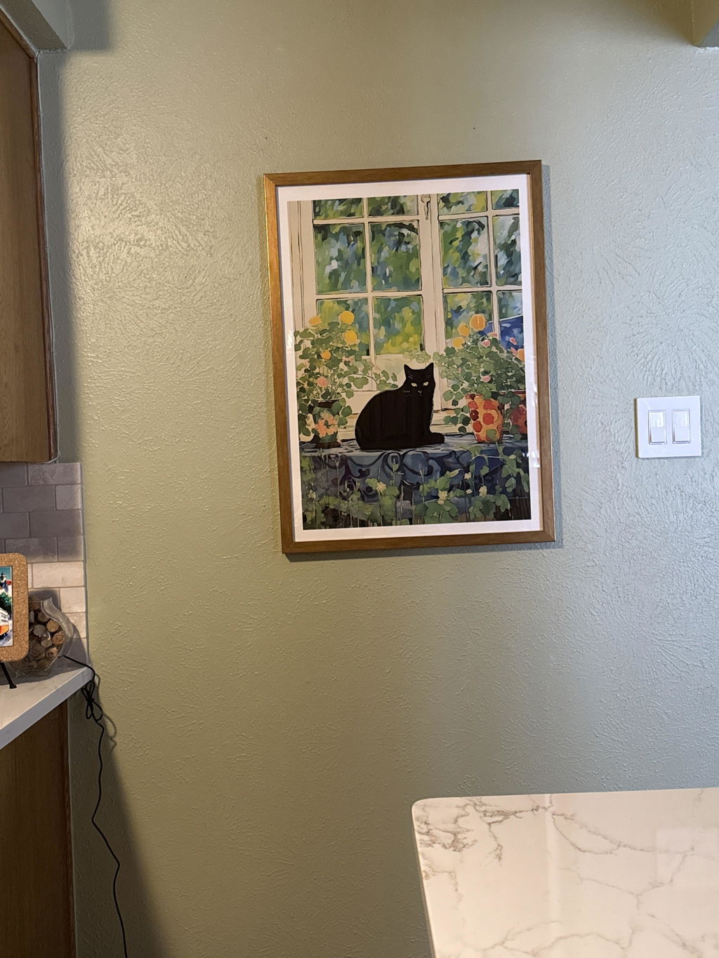
Solid wood. Professionally framed. Arrives ready to hang.
Make your print ready to hang.
Green Art Prints
4.8
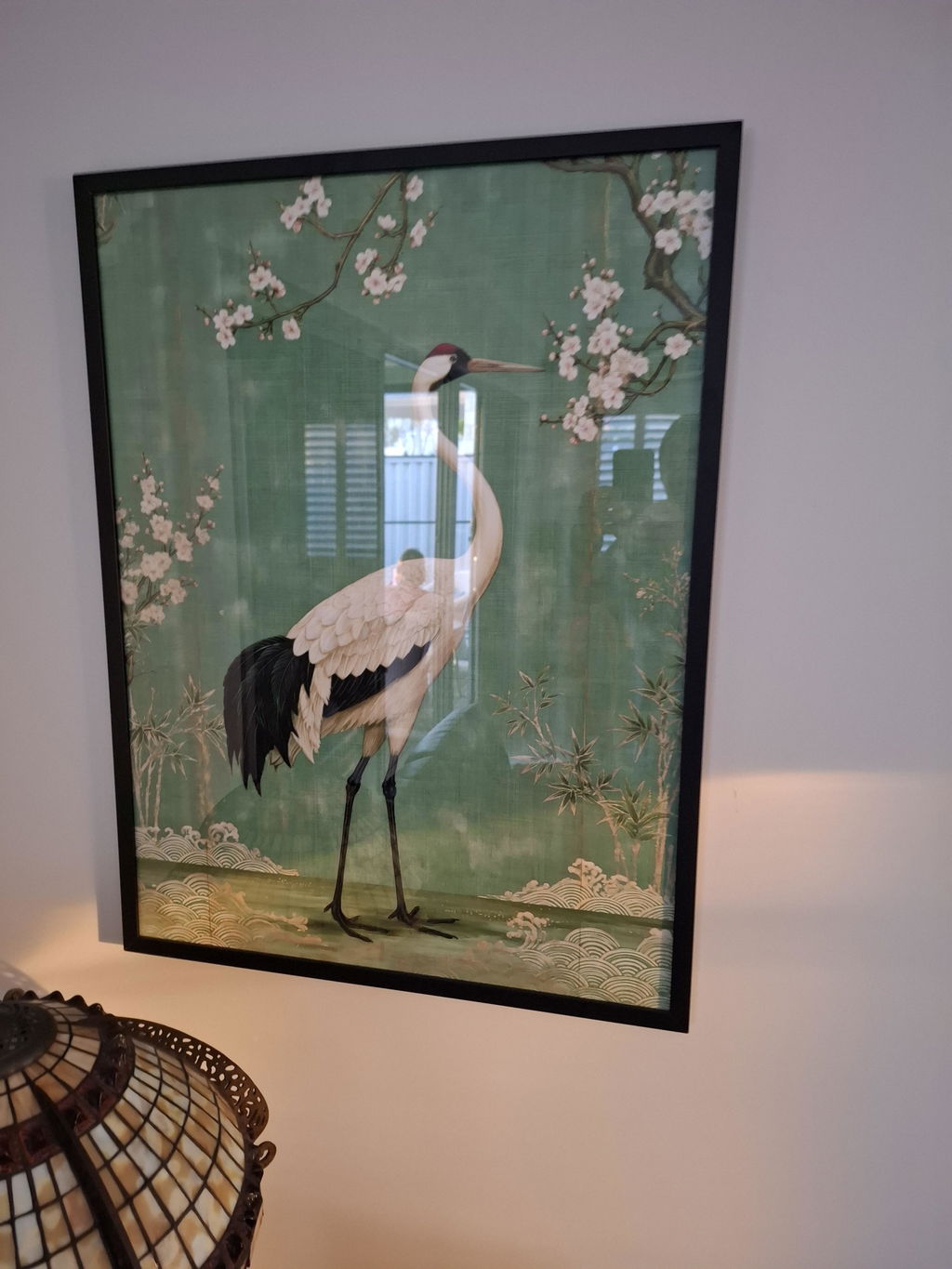
Green does a lot of work in a room: it cools a bright wall, warms a dark one, and pulls a scheme together. Here you'll find every shade of it, sage and olive, deep emerald, the bright wash of a golf course fairway, the soft greens behind an Audubon bird. If you're chasing a particular subject, botanical art prints and leaf art prints narrow it down fast; tree art prints go bigger and quieter.
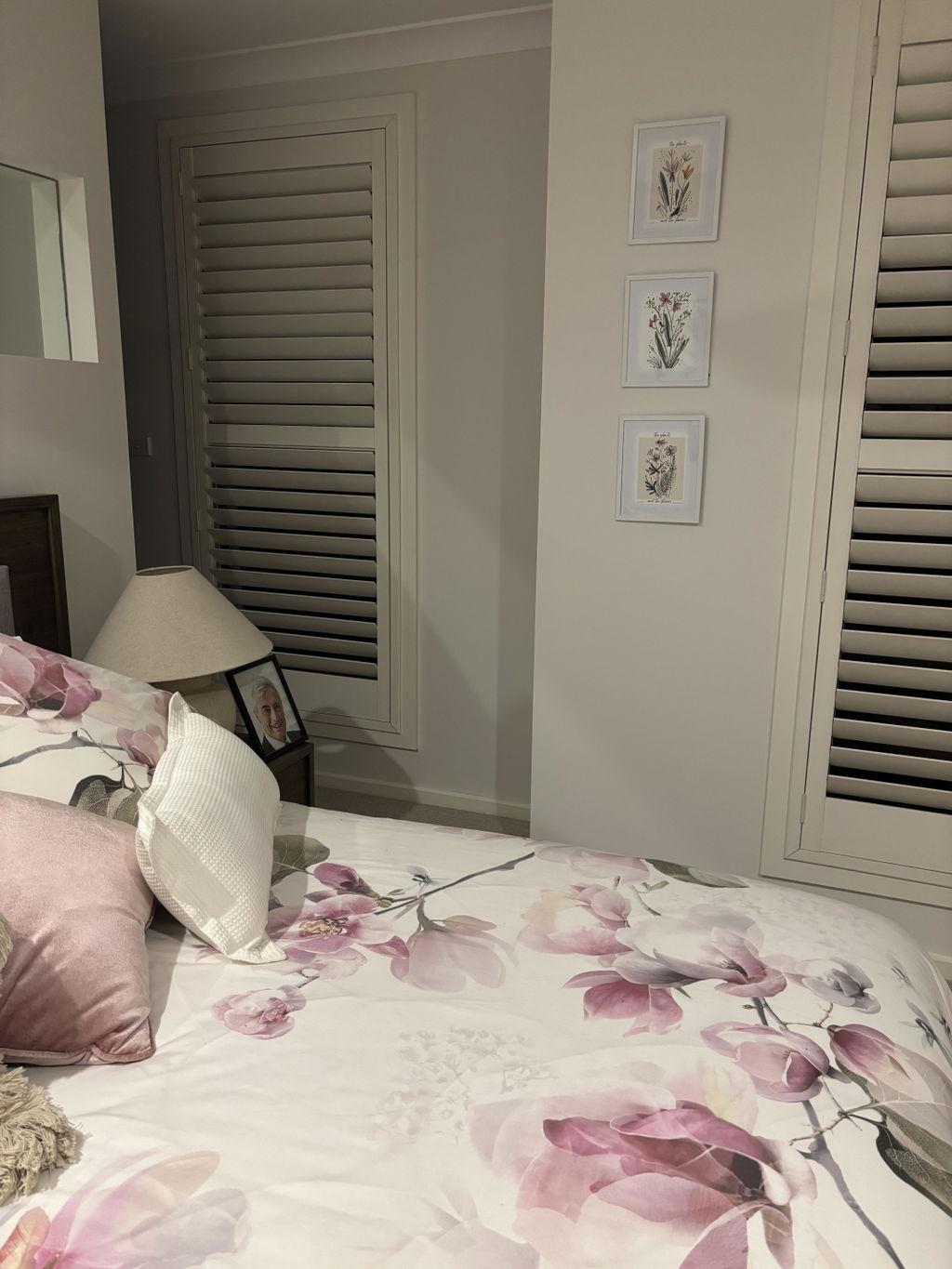
I purchased three botanical sketches and displayed them in white frames. I positioned them one under the other and they look wonderful. Really pleased with the effect.
Green is the colour most people land on when they want something more interesting than neutral but less committal than navy or terracotta. The problem is that "green" covers everything...
A gallery wall in one colour family is harder than it looks. Without contrasting colours doing the heavy lifting, you have to build interest through shade, subject and scale. This...
Green has gone from accent to anchor. If you've just painted a wall in sage, olive, or something approaching forest, the next question is what to hang on it. This...
Which green should go on your wall

Answers on matching shades to a room, picking subjects, framed or unframed, and how ordering works
What's the difference between sage, olive, and forest green art prints?
The difference comes down to undertone and depth. Sage is a soft, grey-tinged green that reads cool and airy, so sage prints act almost like a neutral beside cream walls, pale oak, and blush accents. Olive carries warm yellow-brown undertones, making it earthier and heavier, a natural fit with terracotta, rust, and boho or Mediterranean rooms. Forest is the deepest and most saturated, giving a moody, enveloping anchor that suits larger walls, brass, and dark wood. For small or low-light rooms, sage keeps things open; forest adds drama.
How do I stop dark green botanical wall art from making a room feel heavy?
Treat the dark green piece as the room's single dark element and keep everything around it light. Hang one print on a pale wall, leave generous breathing space around it, and choose art with visible negative space or a light background so the deep green reads as a focal point rather than a mass. Balance it with cream, linen, jute and warm wood, plus a light oak or white frame for lift. Warm lamplight and a dimmer keep the colour rich at night, and a mirror opposite bounces daylight back into small or low-light rooms.
Which subjects suit green wall art best — botanical, landscape, or abstract?
All three work, so let the room decide. Botanical subjects, from single oversized leaves to vintage-style plant studies, are the most reliably popular and read as calm and natural in bedrooms, bathrooms and kitchens. Green landscapes such as Tuscan hills, misty forests and meadows add depth and a sense of space, making them strong choices above a sofa or bed. Abstracts in sage, olive or emerald bring energy and pair easily with modern furniture and neutral walls. For a gallery wall, mix one landscape with two botanicals or abstracts in the same green family.
Is sage green wall art still in style in 2026, or is olive green the fresher choice?
Sage green wall art is still very much in style, but olive currently feels fresher. Designers describe soft, greyed sage as safe and widely used, while warmer, muddier olive, moss and eucalyptus greens are the tones getting the most attention in 2026 as rooms shift towards depth and warmth. For a calm, light room with pale walls and wood tones, sage prints remain an easy win. For more character, choose olive-toned botanicals or abstracts, or mix both greens in a gallery wall for a layered look.
Which shade of green art print works best for a living room?
For most living rooms, sage green wall art is the safest and most versatile pick. It reads as calm and sophisticated without competing with your sofa or rug. If your room already leans neutral (think beige, cream, warm white), an emerald green art print makes a stronger statement and gives the space some real energy. We'd recommend a framed 50x70cm or 70x100cm print above the sofa as a starting point, since that scale fills the wall properly without overwhelming a standard UK living room.
Can I mix different shades of green in a gallery wall?
Absolutely, and it tends to look far better than matching everything to one exact shade. The trick is sticking to two or three tones that sit in the same warmth family. For example, sage green, olive green, and forest green prints all play nicely together because they share warm, earthy undertones. Avoid mixing a cool mint with a warm olive, though, because it reads as accidental rather than curated. A set of three to five framed green art prints in varying sizes makes a gallery wall that feels collected, not catalogue-perfect.
What frame colour should I choose for green art prints?
For sage and muted greens, a natural oak frame warms everything up beautifully and suits Scandi or mid-century rooms. For deeper tones like emerald or forest green wall art, a black frame sharpens the whole print and gives it a more contemporary, polished feel. Our frames are solid FSC-certified wood with UV-protective acrylic glazing, so the colours stay true even if the print sits near a window. They arrive ready to hang, properly fitted with no warping, which makes a real difference compared to prints where you have to sort framing yourself.
Are green prints a good gift for someone who just moved house?
They're one of the best art gifts you can give, honestly. Green works in almost any room and doesn't clash with decor choices the recipient hasn't made yet. A framed green botanical print in 30x40cm is a thoughtful, ready-to-hang gift that doesn't require any DIY or decision-making on their end. Our prints ship framed and fitted in one box, so they can literally unbox it and put it on the wall. And with our 99-day returns policy, there's zero risk if it doesn't suit their space.
How do I decorate with green art if the rest of my room is quite neutral?
A neutral room is actually the ideal canvas for green wall art because the colour does the heavy lifting without fighting anything else. We'd go with one large statement print (70x100cm) rather than scattering smaller pieces, since a single bold piece anchors a neutral room and gives it a clear focal point. Pair it with one or two green accessories like a cushion or a vase to echo the colour, but don't overdo it. Green abstract art prints work particularly well here because they add colour and visual interest without introducing a literal subject that might date or feel too specific for the space.
Choosing a selection results in a full page refresh.