
 Our Biggest Sale of The Year
 Order today for delivery by
No products found
Use fewer filters or remove all
More Fab art curations


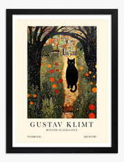

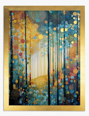


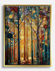


 We’re serious about art, ask away



From sizing to framing and print quality, Fab's art experts break it all down—so you can find the right art for your space.
How do I choose art that suits my space?
Start with how you want the room to feel — calm, vibrant, cozy, bold. Then look for pieces that match that mood, not just your furniture. Forget design rules. If something catches your eye or makes you feel something, that’s a good sign it’ll work. Fab’s collections are curated to help you discover pieces that reflect your personal style, whether you're a minimalist, a maximalist, or just figuring it out as you go.
Does art really make that much of a difference?
Absolutely. Art has the power to change how a room feels the moment you walk in — it adds mood, energy, and personality without lifting a paintbrush. Whether it’s a single bold print or a small gallery wall, great art gives your space a point of view. It makes a room feel finished, more lived in, more “you.” That’s why we say it’s the easiest home upgrade you’ll ever make — and the most personal.
What size art prints should I get for my room?
It depends on your wall, but here’s a general rule: go slightly bigger than you think. Larger pieces create impact and make the space feel intentional, while smaller prints work best in pairs or gallery walls. Over a sofa or bed, aim for two-thirds the width of the furniture. Still unsure? Fab makes it easy — each product page includes clear size options, and you can always mix and match with ready-to-hang framing for a finished look.
Should my art prints match my décor?
Only if that’s your thing. Matching art to décor can create a soothing, cohesive space — but contrast can be just as powerful. A modern print in a vintage room? A pop of color in a minimalist space? That’s personality. Fab helps you choose art that fits you, not just your color scheme. So whether you want to blend in or stand out, there’s no wrong way to express your style.
What if I’m not sure what kind of art prints are right for me?
You don’t need an art degree or a Pinterest-perfect home to choose great art prints. Start with what speaks to you — a color, a subject, a feeling. Fab makes discovery easy with curated collections based on style, mood, and room, so you can find pieces that feel right without second-guessing yourself. Trust your taste. We’ve got the rest.
Should I choose a framed print or a canvas?
Both look amazing — it just depends on the vibe you’re going for.
Framed prints are sleek, modern, and versatile — perfect if you want a polished, gallery-style finish. Canvas gives a softer, more organic feel, with texture and warmth that works beautifully in relaxed or rustic spaces.
No matter which you choose, every piece is made to order with premium materials and arrives ready to hang.