
 Order today for delivery by
 Lighthouse Art Prints
A lighthouse can carry a room on mood alone, a white tower against storm cloud, a beam cutting fog, a striped stack in flat summer light. Some here lean graphic and bold, others soft and painterly, so pick by the feeling you want at the end of a hallway or above a bed. If the wider shoreline appeals, coastline art prints and harbor art prints sit close by.


No products found
More Fab art curations








Coastal Reading From The Frame
More on sizing, hanging and building a sea-themed wall from The Frame, Fab's blog.
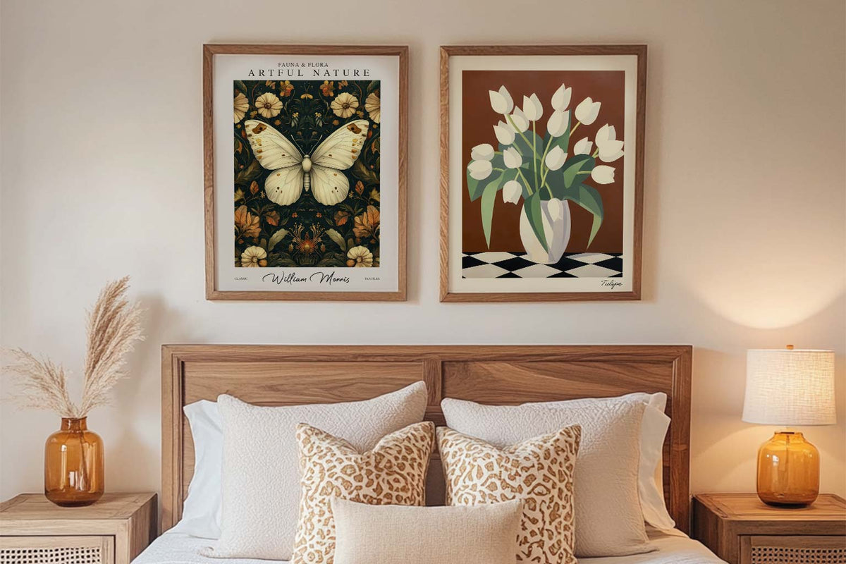
Starter Art Prints for First-Time Buyers
A blank wall can be intimidating. You know you want art, but where do you even start? You scroll through endless options online, walk through galleries feeling lost, or stare...
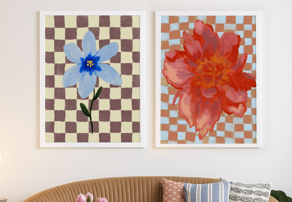
How To Use Art To Make a Room Feel Complete
You walk into your living room and something's off. The furniture is there, the lighting works, everything matches. But the room feels flat. Like it's missing something important but you...
How to Personalise a Rented Home with Wall Art
You're staring at beige walls that scream "rental property" and wondering how to make this place feel like you actually live here. You love art, but the lease says no...
 Which lighthouse print suits you



Quick answers on framing choices, wall placement, colour matching and living with a print once it arrives