Vintage, Retro, or Nostalgic? What the Labels Actually Mean for Wall Art
A practical guide to three slippery labels, and why the difference matters more for your wall than your vocabulary.

Walk into any art print shop and you'll find the same poster filed under "vintage" in one place and "retro" in another. The labels are used loosely, often interchangeably, and almost never explained. Here's how to actually tell them apart, and why it matters less than you might think when you're choosing art for your wall.
Vintage, retro, and nostalgic: the real definitions (and why they overlap)
The cleanest distinction professional dealers and design historians use is this: vintage describes an item that genuinely was produced in a past era, usually at least 20 years ago. A travel poster printed in 1962 is vintage. So is a film advert from 1978.
Retro describes something made now, in the style of the past. A new print designed to look like a 1970s ski poster is retro. The aesthetic is borrowed, the object itself is new.
Nostalgic is the third category most guides skip, and it's the most useful one for wall art buyers. Nostalgic art is defined by emotional pull rather than age. It triggers a memory or a feeling associated with a particular time, your time, often your childhood. A print of a Walkman, a rotary phone, or a 90s arcade cabinet is nostalgic. It might also be retro (if newly designed) or vintage (if it's a genuine period piece), but the defining feature is the feeling, not the production date.
The categories overlap because they describe different things. Age, style, and emotion are three separate axes. A single print can sit on all three at once.

Is 1980s vintage or retro? Where we draw the line
This is the question that breaks every guide on the internet, usually because the answer depends on what you're actually asking.
An object physically made in the 1980s is vintage. A poster printed in 1985, with the foxing and faded inks to prove it, qualifies under the standard 20-year rule used by auction houses, dealers, and most of the design industry. By that rule, anything from before roughly 2005 is technically vintage now.
A new print made today in an 80s aesthetic is retro. Neon grids, chrome lettering, sunset gradients, Memphis Group shapes. These are retro designs, even if you bought them last week.
So the honest answer to "is the 80s vintage or retro?" is: both, depending on the print in front of you. If it was made then, vintage. If it was made now to look like then, retro. If it makes you feel something specific about being eight years old in 1987, it's also nostalgic, regardless.
The reason the question feels unresolved is that the 20-year window is rolling. Items from 1995 weren't vintage in 2010, but they are now. The 90s are sliding into vintage territory in real time. The 2000s will follow. Some purists hold the line at "pre-1980s only," but that's a personal preference rather than a recognised definition.
For decorating purposes, none of this matters very much. What matters is whether the piece does what you want it to do on your wall.
Why the emotional tone matters more than the label
Here's the unpopular opinion: most people shopping for wall art aren't actually shopping for vintage or retro. They're shopping for a feeling, and they're using whichever word feels closest.
Someone searching for a "vintage Italian travel poster" usually wants warmth, sun, holiday associations, faded colour, hand-drawn lettering. Whether the print was actually made in 1958 or last Tuesday is irrelevant to the feeling they want in their hallway.
Someone looking for retro art prints tends to want energy: bold geometry, saturated colour, optimistic graphics. Someone drawn to nostalgic art prints usually wants something more personal, an object or scene that connects to their own memory.
Three different emotional registers, often confused under one label. When you stop trying to identify the "correct" category and start asking what feeling you want the room to have, the choice gets dramatically easier.
A useful test: stand in the room and ask whether you want it to feel like a quiet old library (vintage), a confident graphic statement (retro), or a personal time capsule (nostalgic). The answer usually picks itself.

Nostalgic art prints vs genuine vintage posters: quality and longevity
This is where the practical differences get interesting, because the buying decision is rarely just aesthetic.
Genuine vintage posters are physical objects with provenance. An original 1960s lithograph might cost anywhere from £80 for a minor print to several thousand for a sought-after piece. The paper is usually thin, often acidic, sometimes torn or foxed, and almost always fading. They need professional framing with archival mounts and UV-filtering glazing if you want them to survive another few decades. They're beautiful, fragile, and historically interesting.
Reproduction vintage posters are a confusing middle category. A retailer prints a digital scan of an original onto modern paper and calls it "vintage." It looks similar, costs much less, but is genuinely a retro print being sold under a vintage label. Worth knowing when you're comparing prices.
Modern retro and nostalgic prints are designed and printed today using current methods. The good ones use giclée printing on heavy matte paper with archival inks that hold their colour for centuries, even in direct sunlight. Ours are printed on FSC-certified paper with water-based inks, and the framed versions use a UV-protective acrylic glaze rather than glass, which means no glare and no fading even on a sunny wall.
The practical implication: a genuine vintage poster gives you a piece of history but demands careful handling and ages visibly. A well-made modern print, retro or nostalgic, gives you the aesthetic with archival longevity and none of the fragility. For most decorating purposes, the modern version is the better functional choice. For collecting, provenance changes the equation entirely.
One thing worth flagging: the biggest failure in the print category is bad framing. Cheap reproductions arrive in warped MDF frames with prints that bubble, slip, or sit crooked behind acrylic that scratches in a week. Whether you're buying retro or vintage-style, the frame matters at least as much as the print. Solid wood, properly fitted, shipped together in one box, ready to hang.
How to mix vintage-style and retro prints on the same wall
Mixing styles across eras is where most gallery walls fall apart, but the rules are simpler than they look.
Pick a unifying element
Your wall needs one thing in common across every print. Usually that's either colour palette or frame style, ideally both. A 1950s-inspired botanical print and an 80s-style geometric piece can hang happily together if they share a warm earth-toned palette and sit in matching black wood frames. Without that thread, the wall reads as chaos.
Stay within two adjacent eras
Combining 60s and 70s aesthetics works because the visual languages overlap. Combining 50s and 90s is harder because the contrast becomes jarring. If you want to span a wider range, lean on the colour palette to do the heavy lifting.
Match frame finishes, vary print styles
A common mistake is varying everything: different frame colours, different mat widths, different finishes. Lock the frames down (all black, all natural oak, all white) and let the prints themselves do the era-jumping. The consistency at the edge gives your eye permission to enjoy variety in the middle.
Get the sizing right
For a gallery wall mixing styles, two or three larger anchor prints (around 50x70cm or 70x100cm) plus a few smaller pieces (30x40cm) reads as deliberate. Six prints all the same medium size reads as a catalogue page. Vary the scale.
Consider canvas for the standout
If you've got one piece you want to feel like the focal point, consider canvas. A large canvas print at 100x150cm, hung unframed, brings a different texture to a wall full of framed work. The contrast between matte canvas and glazed framed prints adds depth.

When labels actually matter: collecting vs decorating
The clearest way to settle the vintage/retro/nostalgic confusion is to ask yourself which of two things you're doing.
If you're collecting
Labels matter enormously. Provenance, authenticity, edition size, condition, and age determine value. A genuine first-print 1965 concert poster is worth a thousand times what a high-quality reproduction of the same image costs. If that gap matters to you, you need to verify what you're buying.
Red flags when shopping for genuine vintage: no information about the original printer, no date, suspiciously perfect condition, prices that seem too low. Reputable dealers describe condition honestly, document provenance, and price accordingly. If a "vintage" poster is being sold for £25 with no history attached, it's almost certainly a modern reproduction, which is fine, but it should be sold as one.
If you're decorating
Labels matter much less. What matters is whether the piece works in the room, holds up over time, and gives you the feeling you wanted. A beautifully made nostalgic print of a 1990s record player will do more for your living room than a faded original lithograph that needs museum-grade conditions to survive.
For most people, most of the time, decorating is the actual goal. The "is it really vintage?" question becomes a distraction from the question that matters: do you want to look at this every day for years.
If you do want the genuine article, vintage art prints in the modern reproduction sense (vintage-style, archivally printed) give you the aesthetic without the fragility. If you want something that connects to a specific personal memory, browse by feeling rather than by era. The categories on a website are useful navigation, not laws.
A note on price expectations
Roughly: genuine original vintage posters from desirable eras run from £80 into the thousands. Modern archival prints in vintage or retro styles, framed in solid wood with UV-protective glazing, typically sit between £40 and £200 depending on size. Cheap reproductions in MDF frames sit below that, and you'll feel the difference within a year.
The middle category is where most decorating budgets land, and where the quality gap between retailers is widest. Solid wood versus MDF, archival inks versus standard, properly fitted prints versus warped ones, all of these matter more than whether the design itself is technically vintage or retro.

The takeaway
Use the labels as rough navigation, not as rules. Vintage means actually old. Retro means newly made in an old style. Nostalgic means it makes you feel something specific about your own past. The categories overlap, the 80s sit on the boundary, and the 90s are walking across it now.
When you're decorating, stop trying to identify the correct label and start asking what feeling you want on the wall. Pick the print that does that, in a frame that won't warp, on paper that won't fade. Hang it where you'll see it every day. That's the only test that matters.

In diesem Blog vorgestellte Fab-Produkte
-

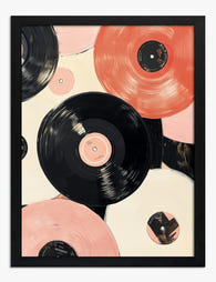
Poster Drei Vinyl-Schallplatten – Retro trifft Moderne
Translation missing: de.products.product.sale_price Ab CHF 16.00CHF 22.00 -

Poster Mid-Century-Möbel mit Retro-Charme
Translation missing: de.products.product.sale_price Ab CHF 16.00CHF 22.00 -

Poster Retro-Vinyl-Charme
Translation missing: de.products.product.sale_price Ab CHF 16.00CHF 22.00 -

Leinwandbild Retro-Vinyl-Vibes
Translation missing: de.products.product.sale_price Ab CHF 61.00CHF 87.00 -

Poster Schallplatte in Bewegung – Schwarz-Weiß-Fotografie
Translation missing: de.products.product.sale_price Ab CHF 16.00CHF 22.00 -

Poster Retro-Stühle und Tisch – Vintage Vibe Finds
Translation missing: de.products.product.sale_price Ab CHF 16.00CHF 22.00 -

Poster Retro-Schallplatten im minimalistischen Vinyl-Design
Translation missing: de.products.product.sale_price Ab CHF 16.00CHF 22.00 -

Poster Nostalgische Vinyl-Schallplatten im Retro-Look
Translation missing: de.products.product.sale_price Ab CHF 16.00CHF 22.00 -

Poster Retro-Schallplatten in kräftigen Farben
Translation missing: de.products.product.sale_price Ab CHF 16.00CHF 22.00 -

Leinwandbild Retro-Schallplatte – Buntes Vintage-Feeling
Translation missing: de.products.product.sale_price Ab CHF 61.00CHF 87.00 -
Poster Retro-Schallplatten in Schwarz & Altrosa
Translation missing: de.products.product.sale_price Ab CHF 16.00CHF 22.00 -

Poster Retro-Schallplatte in Altrosa & Cremebeige
Translation missing: de.products.product.sale_price Ab CHF 16.00CHF 22.00 -

Poster Pop-Art mit Retro-Vinyl-Schallplatten
Translation missing: de.products.product.sale_price Ab CHF 16.00CHF 22.00 -

Leinwandbild Retro-Charme Kollektion - Mid-Century-Möbel
Translation missing: de.products.product.sale_price Ab CHF 61.00CHF 87.00 -

Poster Vinyl-Schallplatten in Pop-Art im Retro-Stil
Translation missing: de.products.product.sale_price Ab CHF 16.00CHF 22.00 -

Poster Retro-Tankstelle
Translation missing: de.products.product.sale_price Ab CHF 16.00CHF 22.00 -

Leinwandbild Vintage Vibes Kollektion
Translation missing: de.products.product.sale_price Ab CHF 61.00CHF 87.00 -

LEER (Kopie) (Kopie) (Kopie) (Kopie) (Kopie) (Kopie) (Kopie) (Kopie)
Translation missing: de.products.product.sale_price Ab CHF 16.00CHF 22.00 -

Poster Retro-Motelschild in Pastell, Mid-Century
Translation missing: de.products.product.sale_price Ab CHF 16.00CHF 22.00


Mehr aus The Frame

William Morris Wallpaper vs. Art Prints: How to...
Morris is everywhere again. Strawberry Thief on cushions, Pimpernel on lampshades, Willow Bough on tea towels in shops that didn't stock anything floral five years ago. The question is whether...

Vintage Art Prints Explained: From Botanical to...
Vintage art is one of the most loved categories in wall decor, and one of the most loosely defined. Botanicals, travel posters, oil portraits and psychedelic 1970s graphics all get...

7 Ways to Style William Morris Tree Prints in Y...
Tree of Life. Woodpecker. The towering, tangled branches that made Morris famous. These prints have a vertical pull and a visual density that other Morris designs don't, which means hanging...