
 Order today for delivery by
 What to Actually Hang on Your Kitchen Walls (And What to Avoid)
The honest guide to kitchen art that survives steam, grease, and years of everyday cooking without looking cheap.


Most kitchen art is too small, too generic, and hung too high. It fades within two years because the frame was cheap, the glazing was thin, and nobody thought about steam. This guide tells you what actually works, what to avoid, and where to put it.
Why kitchens are the hardest room to get right with art
Kitchens are the trickiest room in the house for art, and it's not close. You've got steam rising off pans, oil misting from the hob, temperature swings from the oven, and often the least uninterrupted wall space of any room because cabinets, extractors, and appliances take up most of it.
Then there's the layout problem. Sightlines are broken up by worktops, splashbacks, open shelving, and pendant lights. What looks fine on a bare wall in isolation can feel completely lost once you factor in a run of upper cabinets or a tiled backsplash competing for attention.
And finally there's the durability issue nobody talks about. A £25 canvas from a homeware sale might look great on day one, but 18 months of humidity will warp the stretcher bars, dull the print, and leave you with something that looks tired in the exact room you spend the most time in.

The subjects that actually work: botanicals, food, citrus, and abstract colour
Four categories consistently earn their place on kitchen walls, and there's a reason for each.
Botanicals
Pressed leaves, ferns, herb studies, and vintage botanical illustrations work in kitchens because they echo what's already happening in the room: living, edible, green things. They pair beautifully with wood, stone, and any neutral palette, and they don't shout for attention when you're trying to cook.
Botanical prints also age well. A well-executed fern study from a 19th-century encyclopedia looks as relevant in a 2026 kitchen as it did in 1890. Browse our botanical art prints if you want a starting point that won't date.
Food and drink
Food art is the obvious choice, but it's also the easiest to get wrong. Stay away from glossy stock-photo pasta shots and moody wine bottle photography with heavy filters. What works instead: painterly still lifes, hand-drawn produce studies, coffee illustrations with real character, and vintage market posters.
Match the subject to how you actually use the room. A coffee-focused print suits a kitchen where mornings matter. Wine and cheese suits an entertaining kitchen. Sourdough and grain suits a baker. This sounds obvious but most people buy generic and regret it.
Citrus and lemons
Lemon prints for kitchens have become a genre in their own right, and rightly so. Yellow is one of the few strong colours that reads as fresh rather than heavy, citrus imagery is timeless, and a good lemon print gives a neutral kitchen an instant lift without committing you to a full colour scheme.
The key is choosing something painterly or illustrative rather than a photograph. Photographic citrus tends to look like a stock image. A watercolour or oil study of lemons feels like art.
Abstract colour
If food and plants feel too on the nose, abstract work in kitchen-friendly palettes (soft ochres, sage, terracotta, cream, muted blues) is the strongest alternative. Abstract art gives the room a grown-up feel and stops the kitchen from looking like a themed café.
Subjects to avoid (and why generic canvas sets look cheap)
Some kitchen art choices are almost impossible to make work.
Multi-panel canvas sets where one image is split across three or five canvases. They were everywhere in the 2010s and they've aged badly. The gaps between panels break the image, the canvases rarely hang perfectly aligned, and the whole thing screams mass market.
Typography quotes in kitchen script fonts. "But first, coffee." "Eat, drink, gather." "This kitchen is seasoned with love." These date the moment you buy them and they add nothing you don't already know.
Filtered food photography. Anything with a heavy gradient, an obvious Instagram-style overlay, or oversaturated colours will look tired within a year. Real photography works when it's shot properly and printed on quality paper. Filtered photography just looks like a filter.
Chalkboard-effect menu prints. They belong in cafés, not homes.
Anything ironic about wine. You know the ones.
The common thread: these categories all borrow the visual language of commercial hospitality (cafés, bistros, gastropubs) and try to import it into a domestic setting. It rarely works because your kitchen isn't a business. It's a room in your home.
Size matters: why your kitchen print is probably too small
The single most common mistake in kitchen art is undersizing. People buy a 30x40cm print, hang it on a two-metre wall, and wonder why the room still feels bare.
Here's the working rule: art should fill roughly two-thirds of the available wall zone it's occupying. Not the whole wall. The zone. If you've got a 120cm stretch of wall between two cabinets, your art should be around 80cm wide. If you've got a 180cm empty wall above a dining nook, aim for 120cm or more.

Specific size guidance for common kitchen zones:
- Above a dining nook or breakfast table: 70x100cm minimum, ideally 100x70cm or larger if the table seats four or more
- Between two upper cabinets: measure the gap, subtract 20cm total, that's your target width
- On a feature wall with no cabinetry: go as large as you dare. A single 100x150cm canvas will always look better than three small prints scattered around
- Above a coffee station or bar area: 50x70cm or 60x80cm portrait orientation
Our art prints go up to 70x100cm framed, and our canvas prints go up to 100x150cm. If you're second-guessing size, size up. Nobody has ever complained their kitchen art was too big.
Framing for kitchens: why UV-protective glazing and solid wood frames are non-negotiable
Kitchen art has to survive in conditions that would destroy anything hung in a bedroom. That means the framing choices matter more here than anywhere else in the house.
Solid wood frames beat composite. Cheap frames are made from MDF or veneered composite that swells in humidity, warps at the joints, and starts to look shabby within a year. Solid wood, properly finished, holds its shape and its colour. Every frame we sell is solid FSC-certified wood.
UV-protective glazing is essential. Kitchens often have the best natural light in the house, which is lovely for cooking and disastrous for unprotected prints. Cheap prints fade visibly within 12 to 24 months. We use UV-protective acrylic glazing rather than glass, which does two useful things at once: it blocks the light that causes fading, and it won't shatter if you knock it off the wall while manoeuvring a roasting tin.
Canvas has trade-offs in kitchens. Canvas is lighter, cheaper to hang on plasterboard, and gives a softer, more casual look. But it's also more vulnerable to humidity because the fabric can slacken over time, and it collects grease and cooking residue that's harder to clean off than a sealed print behind acrylic. If your kitchen is a serious cooking kitchen with lots of steam, framed prints with proper glazing are the safer choice. If your kitchen is more of a light-cooking, entertaining space, canvas is fine.
Everything should ship pre-fitted. One of the most annoying things about buying framed art online is having prints arrive separately from frames, then trying to mount them yourself without dust getting trapped or the mount going wonky. Our framed prints arrive fitted, glazed, and ready to hang with the fixtures already attached.
Where to hang art in a kitchen: the five sweet spots
Not every kitchen wall is created equal. These are the five zones that actually work.
1. The dining nook or breakfast table
The most reliable spot. You're not near the hob, you're not fighting cabinetry, and people will spend real time looking at the art while they eat. Hang at 145cm to the centre of the piece for seated viewing (lower than standing-height galleries), and go large.
2. The empty feature wall
Most kitchens have one wall that's mostly empty because there's no room for cabinets or appliances. This is your statement wall. A single large piece works better here than a fussy arrangement.
3. Above open shelving or a sideboard
If you've got a run of open shelving or a freestanding piece of furniture in the kitchen, the wall above it is prime real estate. Match the width of the art to roughly two-thirds the width of the furniture below.
4. The coffee or bar station
A dedicated corner for coffee, drinks, or a bar cart benefits from something tall and narrow. Portrait orientation prints in the 50x70cm to 60x80cm range work well here.
5. The near-stove zone (with caveats)
You can hang art near a stove, but you need to be sensible. Stay at least 1.5 metres from the hob if possible, use sealed framed prints rather than canvas, and expect to clean the glazing occasionally. Avoid this zone entirely if you don't have a good extractor.

The zones to actively avoid: directly above the hob (grease, heat), directly next to the kettle or coffee machine (steam plumes), and inside any cabinet nook where extractor fans blow cooking air.
Single statement piece vs. a small gallery wall: which suits your layout
This is a decision people overthink. The answer is usually determined by the wall, not by taste.
Go statement piece if: you have one clear wall of 1.5 metres or more, your kitchen is already visually busy with tiles, shelving, and appliances, or you rent and can't put multiple holes in the wall.
A single large framed print or canvas gives the room a focal point and calms everything else down. It's also more forgiving. Getting one thing right is easier than getting five things to hang in balance.
Go gallery wall if: you have a genuinely empty wall with no competing detail, you enjoy rearranging things, or you want to combine subjects (a botanical, a food print, an abstract) rather than commit to one.
Kitchen gallery walls work best in odd numbers (three or five) with a consistent frame finish. Mixing frame colours in a small, busy room usually looks chaotic.
For renters, leaning a large framed print on a countertop shelf or plate rail is a legitimate option. It looks intentional, it doesn't put holes in walls, and you can take it with you.
Our top picks for kitchen wall art
Rather than a generic list, here's what we'd actually recommend depending on what you're trying to achieve.
For a light, fresh kitchen that needs a lift: a large lemon or citrus print at 70x100cm above the dining table. Yellow is one of the few colours that works even in kitchens with strong existing palettes, and painterly citrus doesn't feel themed. Start with our lemon art prints.
For a moody, dark kitchen with navy or forest green cabinets: vintage botanical illustrations in cream frames. The contrast lifts the darkness without fighting it. Ferns, palms, and old herbarium studies work particularly well.
For a busy family kitchen: one large abstract in soft, kitchen-friendly colours. Ochres, terracottas, and muted blues work with most schemes and don't compete with the visual noise of family life.
For a serious cooking kitchen: framed food studies or market posters, properly glazed, hung well away from the hob. Our food and drink art prints collection is the obvious starting point.
For a small galley kitchen: one portrait-orientation piece at the end of the galley, drawing the eye through the space. Something tall and vertical extends the room visually.

If you want to browse everything in one place, our kitchen art prints collection is curated specifically for the constraints of this room.
The short version
Size up, not down. Choose solid wood frames with UV-protective glazing if you cook seriously. Skip anything that looks like it belongs in a chain café. Match the subject to how you actually use the room, not to what looked good on a mood board. And measure your zones before you buy, because kitchen art lives or dies on whether it fits the wall it's meant to fill.

Fab products featured in this blog
-

Lemon Branch Study Art Print
Sale price From €16,95€23,95 -

Whimsical Kitchen Essentials Art Print
Sale price From €17,95€29,95 -

Fruit Market Lemons Art Print
Sale price From €17,95€29,95 -

Pink Kitchen with Hanging Utensils Art Print
Sale price From €17,95€29,95 -

Italian Kitchen Things Art Print
Sale price From €16,95€23,95 -

Fruit Market Lemons Canvas Print
Sale price From €64,95€107,95 -

Kitchen Window, Pink Wall Art Print
Sale price From €17,95€29,95 -

Blood Orange Kitchen Print Art Print
Sale price From €17,95€29,95 -

Lemon Branch Study Art Print
Sale price From €16,95€23,95 -

Lemon Branch Linework Art Print
Sale price From €16,95€23,95 -

Whimsical Kitchen Essentials Canvas Print
Sale price From €64,95€107,95 -

Big Yellow Lemon and Slice Art Print
Sale price From €16,95€23,95 -

Kitchen Cupboard Classics Art Print
Sale price From €17,95€29,95 -
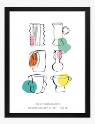
The Kitchen Objects Exhibition Print Art Print
Sale price From €17,95€29,95 -

Pink Kitchen with Hanging Utensils Canvas Print
Sale price From €64,95€107,95 -

Sunlit Lemons Still Life Art Print
Sale price From €17,95€29,95 -
The Kitchen Objects Exhibition Print Art Print
Sale price From €17,95€29,95 -
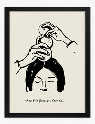
When Life Gives You Lemons Art Print
Sale price From €17,95€29,95 -

Lemons in a Blue and White Bowl Art Print
Sale price From €16,95€23,95 -

Three Lemons on a Plate Art Print
Sale price From €16,95€23,95


More from The Frame

Lemon Decor: Timeless Trend or Passing Fad? You...
Lemon art is everywhere right now, which naturally raises the question of whether it belongs on your walls or in a time capsule marked "2023." The honest answer is more...

Beyond the Kitchen: 5 Unexpected Rooms Where Le...
Lemon art has a branding problem. Search for it online and you'll drown in kitchen shots: farmhouse signs, fruit bowls, tea towels with slogans. But a good lemon print is...

Lemon Art for the Kitchen: Where to Hang It, Wh...
Lemon art has quietly become the most-requested kitchen subject of the last few years, and for good reason. This guide skips the styled-shelf inspiration and gets straight to the decisions...