How to Build a Gallery Wall That Doesn't Look Like You Guessed
The decision framework professional stylists use, with three layouts you can copy down to the centimetre.

Most gallery walls fail for the same reason: people pick the art first and figure out the wall second. Reverse that order and the rest gets easier. This guide walks you through the exact decisions that separate "intentional" from "I just kept hammering."
Start with the wall, not the art
Before you buy a single print, measure the wall and the furniture below it. Gallery walls have to relate to something, usually a sofa, console, bed, or sideboard, and that relationship is what makes the arrangement feel anchored rather than floating.
The professional rule of thumb: your gallery wall should span roughly two-thirds the width of the furniture beneath it. So a 220cm sofa wants a gallery wall around 145cm wide. Wider than the sofa looks top-heavy. Much narrower looks like an afterthought.
The bottom edge of your lowest frame should sit 15 to 20cm above the furniture. Closer than that feels cramped. Further away and the art visually detaches from the room and starts to drift towards the ceiling.
Once you have the width and the bottom line, sketch the rectangle on paper. That rectangle is your canvas. Everything you do next happens inside it.
The paper template trick
Cut sheets of newspaper or brown kraft paper to the exact dimensions of each frame you're considering. Tape them to the wall with low-tack masking tape and live with them for a couple of days. Move them around. Stand back from across the room. Look at them in morning light and evening light.
This sounds tedious. It saves you from drilling holes you'll regret, and it's the single most useful thing you can do before committing.

The grid vs the salon hang
There are really only two gallery wall philosophies. Everything else is a variation on one of them.
The grid hang
Identical frame sizes, equal spacing, arranged in a clean rectangle. Two by two, three by two, three by three, four by two. The grid is calm, architectural, and almost impossible to get wrong if your maths is right.
Use a grid when the room is already busy (patterned rugs, layered textiles, lots of objects), when the wall is in a formal space like a dining room or home office, or when your art shares a clear visual theme such as botanical illustrations, black and white photography, or a series of abstract art prints in the same palette.
The salon hang
Mixed sizes, varied orientations, frames clustered with intentional asymmetry. The salon hang has more energy and personality. It also has more ways to go wrong.
Use a salon hang when you want the wall to feel collected over time, when you're mixing styles and eras on purpose, or when your room is otherwise quite minimal and needs a focal point with some movement. Lounges, hallways, and stairwells suit salon hangs particularly well.
Our honest position: if you're nervous, start with a grid. A well-executed grid of six matching frames will outperform a wonky salon hang every time. You can always graduate.
Choosing a colour thread that ties everything together
This is where most gallery walls fall apart. People pick prints they individually love, hang them together, and wonder why the wall looks like a noticeboard.
The fix is to identify a colour thread before you buy anything. A colour thread is one or two shades that appear in every piece, even if the rest of the palette varies wildly.
The three-colour maximum
Across your entire gallery wall, limit yourself to three dominant colours. Not three exact shades, but three colour families. For example: warm neutrals (cream, oatmeal, camel), one deep accent (navy or forest green), and one warm pop (terracotta or mustard).
A useful structure borrowed from interior design is the 60/30/10 rule. Roughly 60% of your visual area should be your dominant colour, 30% a secondary colour, and 10% your accent. Apply this across the whole wall, not within each piece.
Identifying the thread in art you already own
If you've already collected pieces you love and they look chaotic together, lay them flat on the floor and squint. Squinting blurs the detail and exposes the underlying tones. You'll usually spot one or two colours that appear, in different proportions, across most of them.
If a piece doesn't share that thread, it doesn't belong on this wall. It can live somewhere else. Be ruthless. One off-tone piece will sabotage five well-chosen ones.

Mixing styles without chaos
A common myth is that gallery walls have to stick to one style. They don't. Some of the best ones combine a vintage botanical, a moody contemporary photograph, and a colourful modern abstract. The trick is knowing what holds them together.
The unifying elements, in order of importance:
- Colour thread (covered above)
- Frame consistency (covered next)
- Visual weight balance
Visual weight is how heavy a piece feels, which has nothing to do with its actual mass. A small piece with a bold black silhouette has more visual weight than a larger piece in soft pastels. Distribute your heavy pieces so the wall doesn't lean.
The simplest rule: if you draw an imaginary diagonal line across your gallery wall, you should have similar visual weight in each half. One large saturated abstract on the left? Balance it with two or three smaller bold pieces on the right.
The anchor piece method
Start with your largest or boldest piece. This is your anchor. Place it slightly off-centre, never dead middle, then build outwards. Pieces nearest the anchor should relate to it most directly through colour or subject. Pieces further out can be quieter.
Mixing vintage art prints with contemporary art prints works beautifully when the anchor sets the tone. A vintage anchor pulls modern pieces into a more nostalgic register. A bold contemporary anchor makes vintage pieces look intentional rather than fusty.
Frame consistency: the secret competitors miss
If you take one thing from this article, take this: matching frames make mismatched art work.
When the art varies in style, era, and subject, the frames need to do the unifying. Pick one frame finish for the entire gallery wall and stick to it. Black, natural oak, white, or warm walnut. One choice. No mixing.
This is the single biggest reason professionally styled gallery walls look professional and DIY ones look chaotic. The frames create a visual rhythm that lets your eye accept the variety inside them.
A practical note on framing quality: cheap frames warp, especially in rooms with humidity changes like kitchens or bathrooms near showers. Look for solid wood (FSC-certified is a good signal of quality sourcing) rather than veneered MDF. Acrylic glazing instead of glass is also worth considering for gallery walls, both because it's lighter for hanging multiple pieces and because it doesn't shatter if a frame falls.
Our framed prints arrive ready to hang with the print already fitted, so you're not assembling anything or worrying about whether the print will sit flat behind the glazing. That matters more than it sounds when you're trying to hang ten of them in one afternoon.
Three tested layouts you can steal
These are starting points, not gospel. Adjust the dimensions to your wall, but keep the proportions and spacing.
Layout 1: The Six-Up Grid (above a 200-220cm sofa)
Six identical frames at 40x50cm portrait orientation, arranged in two rows of three.
- Total wall coverage: roughly 135cm wide x 110cm tall
- Spacing between frames: 5cm on all sides
- Bottom edge of lower row: 18cm above sofa back
- Best for: living rooms, art prints for living room in a series, photography, botanical illustrations
This layout is the safest high-impact arrangement in this guide. It takes about an hour to hang and looks like you hired someone.
Layout 2: The Asymmetric Salon (above a 150cm console or sideboard)
Five frames in mixed sizes, anchored by one large piece.
- One 60x80cm portrait (the anchor), positioned slightly left of centre
- One 30x40cm landscape, top right of the anchor
- One 30x40cm portrait, bottom right of the anchor
- One 21x30cm portrait, far right at mid-height
- One 40x50cm landscape, far left, slightly lower than the anchor
- Spacing between all frames: 6cm
- Total wall coverage: roughly 140cm wide x 105cm tall
This is the layout that looks "collected" without looking random. The asymmetry is deliberate.
Layout 3: The Vertical Stair (narrow hallway or staircase)
Three frames stacked with offset alignment.
- Top: 30x40cm portrait
- Middle: 40x50cm landscape, offset 8cm to the right
- Bottom: 30x40cm portrait, aligned with the top frame
- Spacing between rows: 6cm vertical
- Best for: hallways under 80cm wide, the wall above a slim console, awkward narrow spaces
For staircases, repeat the pattern climbing alongside the bannister, keeping the bottom edge of each frame the same vertical distance from the stair tread directly below it.
Pre-curated wall art sets take the guesswork out of layouts like these because the sizes and palettes are designed to work together from the start.

Spacing, height, and the mistakes that make gallery walls look off
The spacing rule
Frames should sit 5 to 7cm apart. Not 10cm. Not 3cm. Anything wider than 7cm and the pieces stop reading as a single composition and start looking like separate decisions. Anything tighter than 5cm and the wall feels claustrophobic.
Use the same spacing throughout. Inconsistent gaps are the fastest way to make a salon hang look amateur.
The height rule
The centre of your gallery wall (not each individual frame) should sit at roughly 145 to 150cm from the floor, which is standard gallery eye level. When the wall is above furniture, this is overridden by the 15 to 20cm above-furniture rule.
The most common mistake we see: hanging too high. People instinctively hang art at their own eye level while standing close to the wall, which is too high once you step back into the room.
Other mistakes worth avoiding
- Frames in three different finishes. One finish only.
- No relationship to furniture below. Floating gallery walls look like they were hung in an empty room.
- An even number of frames in a salon hang. Odd numbers (5, 7, 9) feel more dynamic. Even numbers work for grids but can look stiff in asymmetric layouts.
- Mixing matte and high-gloss prints. The finish affects how light hits the wall. Stick to one. Matte is more forgiving and reduces glare.
- Using glass frames in direct sunlight without UV protection. Prints fade. Look for UV-protective glazing if your wall gets afternoon sun.
How to order the right sizes when you already have a plan
You've taped your kraft paper templates to the wall. You've chosen your layout. Now you need to actually buy the prints. Here's how to translate the plan into an order.
Measure your templates, not your imagination
The frame size you order should match the kraft paper rectangle exactly. If your template is 40x50cm, order a 40x50cm framed print. The frame dimensions on most listings refer to the outer frame, so what you see on the wall is what you'll get.
Match orientations carefully
A 40x50cm portrait and a 50x40cm landscape are the same frame rotated, but the artwork inside is composed for one orientation. Ordering the wrong orientation is the most common mistake when buying modern art prints for a planned layout. Double check before ordering.
Order everything at once
Frames from different batches, even in the same finish, can vary slightly in tone. Order all the frames for one gallery wall in a single order so they're produced together and match precisely.
Allow for swap-outs
Order one or two extra prints in your colour palette as backups. If a piece doesn't work in person the way it worked on screen, you have an immediate alternative. The 99-day return window means you've got plenty of time to live with the wall and decide.

A final word
The difference between a gallery wall that looks guessed and one that looks intentional is almost never the art. It's the spacing, the frame consistency, the colour thread, and the relationship to the furniture below. Get those four things right and almost any combination of art will work. Get them wrong and even the best prints will look like they ended up there by accident.
Plan the wall. Pick the thread. Match the frames. Then hang the art.

Fab products featured in this blog
-

Modern Bauhaus Haven Canvas Print
Translation missing: en.products.product.sale_price From €64,95€107,95 -

Bauhaus Dreamscape Canvas Print
Translation missing: en.products.product.sale_price From €64,95€107,95 -

Modern Geometric Haven Art Print
Translation missing: en.products.product.sale_price From €17,95€29,95 -

Modern Bauhaus Retreat Canvas Print
Translation missing: en.products.product.sale_price From €64,95€107,95 -

Bauhaus Charm Canvas Print
Translation missing: en.products.product.sale_price From €64,95€107,95 -

Modern Geometric Home Art Print
Translation missing: en.products.product.sale_price From €17,95€29,95 -

Playful Gathering Canvas Print
Translation missing: en.products.product.sale_price From €64,95€107,95 -

Cozy Library Living Canvas Print
Translation missing: en.products.product.sale_price From €64,95€107,95 -
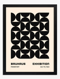
Modern Bauhaus Grid Art Print
Translation missing: en.products.product.sale_price From €17,95€29,95 -

Organic Neutral Flow Canvas Print
Translation missing: en.products.product.sale_price From €64,95€107,95 -

Bauhaus Modern Minimal Canvas Print
Translation missing: en.products.product.sale_price From €64,95€107,95 -

Vinyl Vibes Gathering Canvas Print
Translation missing: en.products.product.sale_price From €64,95€92,95 -

Cozy Studio Gathering Art Print
Translation missing: en.products.product.sale_price From €17,95€29,95 -

Sunset Sail Escape Art Print
Translation missing: en.products.product.sale_price From €17,95€29,95 -

Modern Curve Composition Art Print
Translation missing: en.products.product.sale_price From €16,95€23,95 -
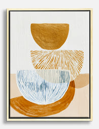
Modern Balance Study Canvas Print
Translation missing: en.products.product.sale_price From €64,95€107,95 -

Urban Minimalist Block Art Print
Translation missing: en.products.product.sale_price From €17,95€29,95 -

Colorful Modernist Haven Canvas Print
Translation missing: en.products.product.sale_price From €64,95€107,95 -

Modern Bauhaus Retreat Canvas Print
Translation missing: en.products.product.sale_price From €64,95€107,95 -

Chic Lounge Evening Canvas Print
Translation missing: en.products.product.sale_price From €64,95€92,95


More from The Frame

Building a Gallery Wall Around Vase Art Prints
Vase prints are the most underrated anchor subject in wall art. The vertical shape gives a gallery wall a built-in compositional spine, and the painterly subject matter sits comfortably alongside...

How to Build a Music Gallery Wall That Actually...
Most music gallery walls fail for the same reason: they're built one print at a time, with no plan. This guide gives you the measurements, the layout templates and the...

How to Style Vintage City Prints Without Lookin...
Vintage city prints are the easiest art category to get wrong. They're widely available, instantly recognisable, and almost designed to read as filler when hung without thought. This guide is...