The Best Art for Bathrooms: What to Hang, Where to Hang It, and What to Avoid
Why the smallest room in your house deserves better than spa stones and bossy text signs.

Bathrooms are the most overlooked rooms in the house, art-wise. We treat them like utility spaces and then spend twenty minutes a day staring at the walls. This guide is about making those walls worth looking at, with specific recommendations on what works, what doesn't, and how to stop your prints from warping.
Why the bathroom is the most underrated room for art
Here's the thing nobody mentions: bathroom art gets studied more than art in any other room. You sit. You stand. You wait for the shower to warm up. There is, frankly, a captive audience. Generic pretty pictures don't reward that level of attention.
The bathroom is also where you can take risks. The walls are small, the stakes are low, and a £40 print is easier to commit to than the centrepiece above the sofa. If you've been wanting to try something weird, this is the room.
And yet most bathrooms end up with the same five images: a beach, a single feather, the word "RELAX" in script, a cluster of bamboo stems, and a black and white shot of a bicycle leaning against a wall. We can do better.

The subjects that work best in bathrooms (and the ones that don't)
Let's start with what doesn't work, because most guides won't.
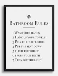
Skip the bossy text signs. "Wash your hands." "Brush your teeth." "But first, coffee" in a bathroom for reasons unknown. Text art that issues instructions in your own home is grating after the third visit. If you must do text, make it something you'd actually want to read, a poem, a strange aphorism, anything that isn't telling you to floss.
Skip the staring faces. Portraits of strangers, particularly close-up ones with direct eye contact, are unsettling in a room where you are by definition vulnerable. If you love portraiture, put it in the hallway.
Skip the bathroom puns and the spa cliché. Bamboo stems, river stones, a single orchid, a misty mountain in soft beige. If it looks like the lobby of a budget chain hotel, it's too safe. The "hotel bathroom test" is a useful filter: if you can imagine the same image hanging in a Holiday Inn, choose something else.
What does work:
- Nature that isn't too literal. Botanical art prints work brilliantly because they reference moisture and greenery without screaming "spa." Vintage botanical illustrations, foliage studies, pressed-flower compositions.
- Abstracts. Loose shapes, washes of colour, geometric studies. They reward repeat viewing without demanding a narrative.
- Black and white photography. Architecture, landscapes, street scenes. The lack of colour means it slots into any palette and doesn't fight the tiles.
- Vintage advertising or ephemera. Old French apothecary labels, antique maps, mid-century travel posters. They give a small room personality.
- Something genuinely funny. A well-judged piece of humour in a downstairs loo is one of the great pleasures of being a guest in someone's house.
The rule of thumb: pick something you'd happily look at for a full minute, because you will.
Downstairs loo vs. main bathroom vs. en-suite: different vibes, different art
These are three different rooms with three different jobs, and they want three different things on the walls.
The downstairs loo (or powder room)
This is the room to be bold. Guests will spend three minutes in here and you'll spend ninety seconds. Nobody is decompressing in a downstairs loo. The walls can be dark, the wallpaper can be unhinged, and the art can be the punchline.
This is where playful, cheeky, or unexpected work shines. Think witty illustrations, oddball vintage prints, a single large statement piece on a moody-painted wall. Browse toilet art prints for the genre at its most committed. Powder rooms also have less ventilation challenge because they don't have showers, so you've got more flexibility on materials.
The main bathroom
This is the everyday room. You want art that holds up to repeated viewing without becoming wallpaper, and that ideally feels calming rather than confrontational at 6am. Botanicals, soft abstracts, landscape photography, gentle figurative work.
Scale up here. Main bathrooms usually have more wall space than you think, and a single 50x70cm or 60x80cm piece reads better than three tiny prints scattered around.
The en-suite
The en-suite is the steamiest of the three and the most personal. Nobody but you sees it, so you can lean into preferences without worrying about taste consensus. The trade-off: humidity is at its highest, so material choice matters more. We'll get to that.

Framed prints vs. canvas in a bathroom: which survives better
Both work. They fail in different ways, so the question is which trade-offs you prefer.
Framed prints with proper protection are the safer bet in most bathrooms. A quality frame seals the paper behind a rigid glaze, which keeps moisture off the surface. We use UV-protective acrylic rather than glass, which means no shattering risk if a frame ever comes off the wall, and no fading from the morning sun coming through a frosted window. The frames are solid FSC wood, not MDF or veneer, which matters because cheap composite frames are the first thing to swell and warp in steam.
The biggest risk with framed art in bathrooms isn't humidity itself, it's poor framing. Frames assembled with low-grade materials, prints that aren't properly mounted, backing boards that absorb moisture. If a frame is built right, with a sealed back and quality materials, a bathroom isn't a problem.
Canvas is lighter and more forgiving. A hand-stretched canvas on a solid wood frame, with the print itself sitting away from the wall, deals with airflow differently. Less of a sealed-system situation. Canvas also doesn't have any glass or acrylic surface for steam to fog up, which is a small but real annoyance with framed art opposite a hot shower.
The downside of canvas is that it can sag in extreme humidity if the stretching is poor. Quality matters. A properly stretched canvas on solid timber holds tension for years. A flimsy one starts to wave within months. Browse bathroom canvas wall art for pieces specifically suited to the room.
Our honest take: framed prints look more polished and protect the artwork better. Canvas is lighter, less reflective, and works well in humid spaces if you don't want the formality of a frame. For a powder room, either is fine. For a steamy en-suite, canvas or a high-quality framed print with acrylic glazing both work, in that order of forgiveness.
Where exactly to hang art in a bathroom (with placement specifics)
Placement matters more in bathrooms than anywhere else because the room is small and you can't get distance from the work.
Opposite the mirror. This is the prime location. It's the wall you face while brushing your teeth, doing your skincare, getting ready. The art should reward two minutes of close looking. Hang it at standard gallery height, with the centre of the piece at roughly 145-150cm from the floor.
Visible from the bath. If you have a tub, work out the eyeline from a lying-down position and put something there. Soft, atmospheric, slightly hypnotic work is ideal. This is not the wall for high-stimulus colour.
The water closet wall. If your toilet is in its own nook or against a dedicated wall, this is the playful slot. Visitors will see it. You will see it. It's the "captive audience" wall at its most literal. Take a risk here.
Above the towel rail or radiator. A horizontal piece works well here because the format echoes the rail beneath it. Aim for art roughly two-thirds the width of the rail.
Where not to hang art:
- Directly above the shower or inside the wet zone. Even the best materials don't want repeated direct water contact. We don't claim our prints are waterproof, because nothing on a wall reasonably should be.
- In the splash zone behind the sink. Toothpaste, soap, water spots. Not worth it.
- Crammed into a gallery wall on a tiny wall. Gallery walls almost never work in bathrooms. The walls are small, the sightlines are short, and a cluster of frames reads as visual clutter. One well-chosen statement piece beats five small ones in nearly every bathroom we've seen.

Black and white or colour? How to match art to your bathroom palette
Bathrooms tend to have more committed colour palettes than other rooms because of the tile, the grout, the fixtures. You can't repaint a wall of tile on a whim. So the art needs to work with what's there.
If your bathroom is white, pale, or neutral: you have the most freedom. Colour-saturated art will pop against a clean background. This is the place for a single bold print, a saturated abstract, or a vibrant botanical.
If your bathroom is already colourful (deep green, navy, terracotta, patterned tile): go black and white, or go monochromatic in a tone that already exists in the room. Adding a third or fourth colour to an already-busy palette is where bathrooms start to feel chaotic.
If your bathroom is dark and dramatic (charcoal, deep navy, oxblood): lean into it. Moody photography, vintage prints with cream or sepia tones, gold-framed work. The art should match the room's confidence.
Minimalist art prints tend to do particularly well in bathrooms because they don't fight with the tile, the mirror, the fixtures, and all the other visual furniture a bathroom inevitably contains.
A practical rule: identify the metal finish in your bathroom (chrome, brass, matte black) and let it inform your frame choice. A brass-fixtured bathroom looks pulled-together with warm wood frames or natural oak. A matte black or chrome bathroom looks sharpest with black frames or unframed canvas.
Humidity, steam, and splashes: what actually damages art and what doesn't
Time for some real talk, because the internet veers between "your art will be destroyed in a week" and "I've had a poster up for ten years and it's fine."
What actually damages art in a bathroom:
- Direct water contact. Splashes, drips, leaks. This is the real enemy, not ambient steam.
- Trapped moisture inside a poorly sealed frame. When humid air gets behind cheap glazing and can't escape, it condenses on the print. Quality frames with sealed backs prevent this.
- Sustained high humidity with no ventilation. A windowless bathroom with no extractor fan and a daily shower is genuinely hostile. Even good materials struggle.
- Direct sun on unprotected prints. UV exposure fades cheap inks fast. Museum-grade giclée inks with UV-protective glazing last for centuries, even in direct sun.
What doesn't damage art:
- Occasional steam from a normal shower in a normally ventilated bathroom. Quality framed prints and properly stretched canvas handle this fine.
- Hanging art "in a bathroom" as a general concept. The room itself isn't the problem. Specific conditions are.
Practical precautions worth taking:
- Run your extractor fan during and for ten minutes after every shower. This single habit does more than any expensive material upgrade.
- Don't hang art directly above a heat source like a towel radiator if you can avoid it. Heat plus moisture cycling is harder on materials than either alone.
- Keep art at least 60cm away from the shower or bath edge. Steam dissipates fast, splashes don't.
- If you're nervous about an investment piece, put it in the main bathroom or the powder room, not the en-suite. Save the highest-humidity room for art you wouldn't be heartbroken to replace.
Oil paintings, genuine watercolours, and original works on paper are the exceptions. Don't put irreplaceable originals in any bathroom. Reproductions and prints, yes. Originals, no.

A few last things
Refresh your bathroom art more often than you do the rest of the house. The pieces are smaller, cheaper, and easier to swap, and a new print can change the feel of the whole room in five minutes. Treat it as the most flexible room in your home, not the most neglected.
Pick something you'd genuinely want to look at while standing still. Hang it where you'll actually see it, not just where there's an empty wall. Ventilate properly. Avoid the splash zone. Skip the bossy signs.
Everything else is preference.

Fab products featured in this blog
-

Bathroom Rules Art Print
Translation missing: en.products.product.sale_price From £11.95£19.95 -

Everyday Bath Rituals Art Print
Translation missing: en.products.product.sale_price From £11.95£19.95 -
Bathroom Rules Canvas Print
Translation missing: en.products.product.sale_price From £49.95£74.95 -

Splish Splash Art Print
Translation missing: en.products.product.sale_price From £11.95£19.95 -

Otter With the Loo Roll Canvas Print
Translation missing: en.products.product.sale_price From £49.95£74.95 -

The Best Seat in the House Art Print
Translation missing: en.products.product.sale_price From £11.95£19.95 -

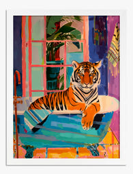
Tiger in the Tub Art Print
Translation missing: en.products.product.sale_price From £11.95£19.95 -

Everyday Bath Rituals Canvas Print
Translation missing: en.products.product.sale_price From £49.95£74.95 -
Tiger in the Tub Art Print
Translation missing: en.products.product.sale_price From £11.95£19.95 -

The Best Seat in the House Canvas Print
Translation missing: en.products.product.sale_price From £49.95£74.95 -

Tabby Cat Reading the Paper Canvas Print
Translation missing: en.products.product.sale_price From £49.95£74.95 -

Black Cat Bubble Bath Jungle Art Print
Translation missing: en.products.product.sale_price From £11.95£19.95 -

Daisies in a Loo Roll Art Print
Translation missing: en.products.product.sale_price From £11.95£19.95 -

Cat Reading the Morning Paper Art Print
Translation missing: en.products.product.sale_price From £11.95£19.95 -

Have A Nice Poo Art Print
Translation missing: en.products.product.sale_price From £11.95£19.95 -

Black Cat and the Toilet Roll Art Print
Translation missing: en.products.product.sale_price From £11.95£19.95 -

Chic Gator Soak Canvas Print
Translation missing: en.products.product.sale_price From £49.95£74.95 -

Wash Away Your Troubles Canvas Print
Translation missing: en.products.product.sale_price From £49.95£74.95


More from The Frame

Boho Sun Wall Art: How to Nail the Look Without...
Boho sun art has a reputation problem. Done badly, it screams student halls and macramé overload. Done well, it's one of the warmest, most grounding aesthetics you can put on...

Every Animal in William Morris's Designs: The C...
Most people know the thrush in Strawberry Thief and stop there. But Morris's wider body of work contains foxes, hares, peacocks, ravens, lions, herons, woodpeckers, deer, and doves, often half-buried...

Countryside Decor Ideas: How to Bring Rural Cal...
Countryside art has quietly become one of the most versatile choices in modern interiors. Not the chintz-and-bunting version, but the kind of soft, considered pastoral scenes that bring the outside...