


 Order today for delivery by
The Best Posters for Bedroom Walls (And Where Exactly to Hang Them)
The sizing formulas, hanging heights, and palette rules that make a bedroom wall finally feel finished.


Most bedroom walls fail for the same reason: the art is too small, hung too high, and chosen for the wrong room. This guide fixes that with actual measurements, a palette framework built around how you sleep, and a decision path for people who have stared at a blank wall above their bed for six months. No inspiration galleries, no 23 ideas, just the rules that work.
Why the bedroom is the hardest room to get right with wall art
The bedroom is deceptively difficult because it has to do two opposite things at once. It needs to feel personal and considered during the 20 minutes you spend awake in it, and it needs to visually quieten down when you switch the lamp off. Living rooms can take bold, high-contrast work. Bedrooms punish it.
There is also a practical issue. The bed is almost always the biggest object in the room, and it sits against the wall you see least often (behind you, as you sleep). That means the primary wall for art, the one above the headboard, is the one you only really look at when you walk in. So it has to work as a single confident gesture, not a gallery you study.
The third problem is scale. People default to buying one A3 poster, hanging it dead centre, and wondering why the room still feels unfinished. It is unfinished, because a 30x42cm print above a 150cm wide bed looks like a postage stamp.

Above the bed: the one placement rule that always works
Here is the rule: the art above your bed should be 60 to 80% of the width of the bed itself. Narrower than 60% and it looks lost. Wider than 80% and it starts fighting the headboard for attention.
What that means in actual centimetres
- Single bed (90cm wide): artwork or arrangement 55 to 70cm wide. A 50x70cm print in portrait works beautifully.
- Double bed (135cm wide): 80 to 110cm wide. A single 70x100cm landscape print hits this perfectly, or two 50x70cm prints hung side by side.
- King bed (150cm wide): 90 to 120cm wide. A 100x70cm landscape, or a pairing of two 50x70cm prints with a small gap between them.
- Super king (180cm wide): 110 to 145cm wide. This is where a 100x150cm canvas or two 70x100cm prints really earn their place.
Hanging height
Hang the bottom edge of the frame 20 to 30cm above the top of the headboard. If there is no headboard, measure 70 to 80cm above the top of the mattress. Any higher and the art visually floats away from the bed, creating that disconnected, hotel-corridor look where nothing belongs to anything.
Resist the urge to hang at eye level. Standard eye-level rules (centre of the art at 145cm from the floor) are for gallery walls and hallways. Above a bed, the art has to relate to the bed, not to a standing viewer.
Colour palettes that help a bedroom feel restful (not boring)
Colour temperature matters more in a bedroom than in any other room because you are in it when your nervous system is meant to be winding down. Cool tones (blues, soft greens, greys with blue undertones) are genuinely calming. Warm tones (terracotta, mustard, deep red) are visually stimulating and work better in rooms where you want energy.
That does not mean your bedroom has to be a cold palette. It means you want your dominant wall art to sit in the cooler or more muted range, with warmth coming in as accents through bedding or a lamp.
Four palettes that work
Chalky neutrals. Bone, oat, warm white, soft taupe. Low contrast, high calm. Works in almost any bedroom and is the safest starting point if you have no idea what you want.
Sage and stone. Muted greens with grey or beige. Botanical without being twee. Pairs well with oak furniture and linen bedding.
Dusty blue and ivory. Cooler and slightly cooler-feeling. Excellent for south-facing bedrooms that get a lot of warm afternoon light and need balancing.
Deep moody. Charcoal, forest, ink. Only works in bedrooms with good natural light during the day, otherwise it swallows the room. Done right it feels cocooning, done wrong it feels like a cave.
What to avoid: high-contrast black and white photography, anything with a lot of pure white next to pure black, hot colour combinations (fuchsia, electric blue, bright yellow). Save these for your living room or hallway.

Subject matter: what to avoid and what actually works
Subject matter in a bedroom should reward long looking without demanding attention. The test: can you fall asleep looking at it, and still find something new in it six months from now?
What works
- Abstract shapes and soft gestural forms. Nothing to decode, nothing to react to. The eye rests. Browse abstract art prints if this is your instinct.
- Botanicals and quiet landscapes. Natural subjects lower visual stimulation. Soft focus works better than hyper-detailed botanical illustration here. Botanical prints in muted palettes are a reliable default.
- Minimal line drawings. Single figure, single line, lots of negative space.
- Soft architectural photography. Arches, doorways, still interiors. Calming because they imply stillness.
What to avoid
- Portraits with direct eye contact. Someone staring at you while you sleep is a problem whether or not you consciously register it.
- Text-based posters with slogans or quotes. You will read them every single morning until you cannot stand them.
- High-energy abstract work with aggressive colour or movement. Save it for the office.
- Anything you chose because it matched a trend. Bedrooms reveal bad decisions faster than any other room because you see them first thing every day.
The word "aesthetic" gets thrown around a lot for bedroom posters, and most of what sits under that label (Y2K collages, dense gallery grids, pop culture) belongs in a teenage bedroom or a rental you will leave in a year. For a bedroom you actually want to live in, aim quieter.
Sizing for bedrooms with low ceilings or small walls
Standard sizing rules assume a standard room. If your ceiling is under 2.4 metres, or your bedroom is under 10 square metres, you need to adapt.
Low ceilings
Go horizontal. A landscape-format print visually widens the wall and lowers the ceiling line less than a portrait does. A single 70x100cm landscape above the bed will look more considered than a tall portrait that pushes your eye uncomfortably close to the ceiling.
Keep the top edge of the frame at least 30cm below the ceiling. Art hung too close to the ceiling makes the room feel like it is pressing down on you.
Small walls
The 60 to 80% rule still applies, but use the smaller end. If your bed is tucked into an alcove or the wall is interrupted by a window, work with what you have rather than forcing the full width. A single well-sized print always beats three small prints crammed in.
The "too small" problem
If you already own an A3 or 30x40cm poster and you love it, do not hang it alone above your bed. Pair it with a second print of the same size, or hang it on the wall beside the bed instead where it has a chance to be seen up close.

Framed vs unframed in a bedroom setting
This one gets treated as personal preference and it shouldn't be. There are real reasons to pick one over the other.
When framed works better
- You have a formal or more traditional bedroom (upholstered headboard, considered furniture, layered bedding).
- Your walls are plain white or off-white and need the definition a frame gives.
- You are hanging a pair above the bed. Matching frames pull the pairing together in a way unframed prints cannot.
- You want the art to feel permanent and anchored.
A framed print with UV-protective acrylic glaze (not glass) is also the safer choice above a bed because there is no risk of broken glass if it ever falls. Acrylic is lighter, shatter-resistant, and does not create the same harsh glare under bedside lamps.
When unframed works better
- You are renting and want to swap art often.
- Your bedroom is minimal and a frame would feel heavy.
- You are using a canvas print, where the stretched canvas finish is the whole point. A hand-stretched canvas with mirrored edge wrapping works beautifully unframed in a pared-back bedroom, and the matte finish won't bounce lamp light back at you.
- You want the print to feel like part of the wall rather than an object on it.
The main thing to avoid is a poster taped up with its corners curling. That is the difference between a finished bedroom and one that still feels half moved-into. If you are going unframed, use a poster rail at the top and bottom, or mount it properly.
A note on glare
Bedside lamps throw light upward and outward. Glossy finishes or framed prints behind standard glass create a bright reflective patch exactly where you don't want one. Matte paper and acrylic glaze solve this, which is why both are worth seeking out for this room specifically.
Poster pairings: two prints that create balance above a headboard
A pair of prints above the bed is often more interesting than a single large piece, and easier to get right than a gallery wall of five or six.
The rules
- Same size, same orientation. Two 50x70cm portraits, or two 40x50cm. Mixing sizes above a bed looks accidental.
- Same frame, or no frame on either. Consistency reads as intentional.
- 5 to 8cm gap between them. Any closer and they look like one awkward thing. Any wider and they stop talking to each other.
- Total width still 60 to 80% of the bed. Two prints plus the gap. Measure before you buy.
- Visual connection. Not identical, but related. Same palette, same artist, same subject matter, or same mood. Two abstracts in the same colour family. Two botanicals of different plants. Two landscapes from the same series.
What not to do
Do not hang one portrait and one landscape. Do not pair a framed print with an unframed one. Do not hang two prints with wildly different palettes and hope the bed ties them together, it won't.
For more pairing options and sets that already work together as a pair, the bedroom art prints collection is organised with this in mind.

Where to start
If you are tackling a bedroom from scratch, buy one 70x100cm print in a muted palette before you buy anything else. Hang it 25cm above your headboard, centred. Live with it for a week. Most bedrooms don't need more than that, and the ones that do will tell you exactly what they need once the main wall is sorted.
If it still feels off after a week, the issue is almost always sizing, not the art itself. Measure again, go up a size, and try once more.

Fab products featured in this blog
-

Klimt 20th Century Exhibition Poster Canvas Print
Sale price From £49.95£74.95 -

Klimt 20th Century Exhibition Poster Art Print
Sale price From £11.95£19.95 -

The Bedroom by Vincent van Gogh Art Print
Sale price From £11.95£19.95 -

Poster — Bold Type Statement Art Print
Sale price From £11.95£19.95 -

The Bedroom by Vincent van Gogh Canvas Print
Sale price From £49.95£74.95 -

Growin and Growing Poster Art Print
Sale price From £11.95£19.95 -

William Morris Exhibition Poster Canvas Print
Sale price From £49.95£74.95 -

William Morris Exhibition Poster Art Print
Sale price From £11.95£19.95 -

Bauhaus Exhibition 1919 Poster Canvas Print
Sale price From £49.95£74.95 -

Klimt-Inspired Hillside Landscape Poster Art Print
Sale price From £11.95£19.95 -

Night Butterflies — Klimt Exhibition Poster Canvas Print
Sale price From £49.95£74.95 -

Growin and Growing Poster Canvas Print
Sale price From £49.95£74.95 -

Job by Alphonse Mucha Art Print
Sale price From £11.95£19.95 -

Poster — Bold Type Statement Canvas Print
Sale price From £49.95£74.95 -

Bauhaus Exhibition 1919 Poster Art Print
Sale price From £11.95£19.95 -

Bauhaus 1919 Geometric Poster Canvas Print
Sale price From £49.95£74.95 -

Klimt Spring Whispers Bloom Poster Art Print
Sale price From £11.95£19.95 -

Klimt Art Nouveau Bloom Collection Poster Art Print
Sale price From £11.95£19.95 -
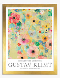
Klimt Floral Symphony Exhibition Print Art Print
Sale price From £11.95£19.95 -

Great Wall Vista Art Print
Sale price From £11.95£19.95


More from The Frame

What Size Art for a Dining Room? A Room-by-Room...
Most dining room art advice stops at "two-thirds the width of your table." Useful as a starting point, useless when you're standing in a 3x3 metre room with a 120cm...

What Interior Stylists Know About Matisse Figur...
Matisse figure prints are having a decade-long moment, which means most people have seen the same Blue Nude II leaning against the same taupe wall roughly a thousand times. The...

The Biggest Orange Prints Mistake and What to D...
The mistake is almost always the same: buying orange prints in sets. A trio of tangerine abstracts, a matching pair of burnt orange landscapes, a cluster of citrus-toned botanicals. Orange...