


 Order today for delivery by
The Biggest Orange Prints Mistake and What to Do Instead
Why one well-sized orange print will always beat three, and how to use the colour without tipping into chaos.


The mistake is almost always the same: buying orange prints in sets. A trio of tangerine abstracts, a matching pair of burnt orange landscapes, a cluster of citrus-toned botanicals. Orange is a colour that rewards restraint, and the fastest way to make a room feel chaotic is to double or triple down on it.
Start with one: why a single orange print beats a cluster
Orange is a saturation-forward colour. Even in its quieter forms, it pulls the eye faster than almost any other shade on the wall. When you hang two or three orange prints together, you don't get twice the impact. You get competing focal points and a room that feels busy before you've added a single cushion.
One well-chosen print, sized correctly for its wall, does more than a cluster ever will. It gives the colour somewhere to land and somewhere to rest. The rest of the room can stay calm, which is precisely what lets the orange sing.
If you're nervous about commitment, this is actually good news. A single large print is a smaller decision than three medium ones, because you're not trying to make separate pieces talk to each other. Pick one from a curated orange art prints collection, size it properly, and stop there. We mean it.

Burnt orange vs bright orange: picking the right tone for your room
The two sit on opposite ends of the same spectrum, and they behave completely differently on a wall.
Burnt orange, think terracotta, rust, ochre, sits closer to brown. It reads as warm and grounded, and it plays nicely with neutrals, sage green, cream, oatmeal, and natural wood. It's forgiving. You can use it in almost any room without it dominating.
Bright orange, tangerine, persimmon, true orange, is a statement colour. It wakes up a room. It needs more breathing space and more neutral surroundings, and it tends to look best where you want energy: kitchens, dining rooms, entryways, creative studios.
A quick rule: if your room already feels calm and you want it to stay that way, choose burnt orange wall art. If your room feels flat and you want to inject life, go bright. Don't mix the two in the same room. They clash in the way two different reds clash, subtly but persistently.
Watch the undertones. Burnt orange with pink undertones fights with burnt orange that leans brown. Hold the print up against your existing textiles before you commit. Or, honestly, order and use the 99-day return window, which is what it's there for.
Living room: sizing and placement above sofas and consoles
The living room is where most orange prints go wrong, and almost always because of scale.
A standard three-seater sofa is around 200cm to 220cm wide. The art above it should span roughly two-thirds of that width, so 130cm to 150cm across. A 40x50cm print floating above a 220cm sofa looks like a postage stamp. It's the single most common mistake we see.
For a single statement piece above a sofa, go to 70x100cm minimum. If you want serious impact, a 100x150cm canvas in a portrait or landscape orientation will anchor the entire room. Hang it so the centre of the print sits about 145cm to 150cm from the floor, or roughly 15cm to 20cm above the top of the sofa back.
Above a console or sideboard, the same two-thirds rule applies. A 120cm console wants art around 80cm wide. Leave 15cm to 25cm of breathing room between the top of the console and the bottom of the frame. Any more and the two elements stop feeling related.
Ceiling height matters too. If you've got 8ft ceilings, stick to landscape or square prints. Portrait prints on low ceilings make the walls feel like they're pressing in. If you've got 10ft+ ceilings, a tall portrait print is your friend, it draws the eye up and makes the room feel considered. Browse living room art prints with these proportions in mind rather than scrolling blindly.
Bedroom: softer orange tones that actually help you sleep
Bright orange does not belong in a bedroom. We'll say it plainly. The colour is physiologically stimulating, which is the opposite of what you want in a space designed for rest.
Burnt orange, peach, muted terracotta, and dusty coral all work beautifully here. They bring warmth without agitation, and they pair particularly well with the linen bedding, oatmeal walls, and natural wood tones that most bedrooms already lean into.
Place a single horizontal print above the bed, spanning roughly two-thirds the width of the headboard. For a king bed (150cm wide), that's a print around 100cm across. For a double (135cm), aim for 90cm. Hang it 15cm to 20cm above the headboard.
Avoid portraits of faces or high-contrast graphic work in the bedroom. Soft abstracts, landscapes, and botanical prints in warm earthy palettes work far better. Have a look through bedroom art prints for pieces that lean this way rather than picking something purely because the colour is right.

Kitchen and dining room: where bright orange really shines
If you've been waiting for permission to go bold, here it is. Kitchens and dining rooms are the two rooms where bright orange earns its keep.
These spaces are already social, already energetic, and usually already lit warmly in the evenings. A tangerine abstract above a dining table, or a persimmon print on a kitchen feature wall, lifts the entire space and makes food look better under warm light.
For a dining room, the art lives or dies by its relationship to the table. A 180cm dining table wants a print or arrangement around 120cm wide, hung so the centre sits roughly 150cm from the floor (or 75cm above the table surface if you want to measure from there). Go bigger if the ceiling is high.
In a kitchen, think about where your eye lands when you walk in. The wall opposite the entrance is the natural home for a statement print. Avoid hanging art directly next to the hob, grease and heat aren't kind to anything, framed or otherwise.
One honest trade-off: if your kitchen gets heavy steam or humidity, a canvas print tends to cope better than a framed paper print. Canvas is stretched over solid wood and doesn't have glazing to fog. Framed prints with UV-protective acrylic glaze (not glass) handle sunlight beautifully but prefer drier walls.
Hallways and small spaces: using orange to add warmth and energy
Hallways are the most underused space in the house, and orange is almost purpose-built for them. These are transition zones. You pass through them quickly, so a bold colour doesn't have the chance to become overwhelming.
A single vertical print at the end of a hallway creates a focal point that pulls you through the space. Think 50x70cm or 70x100cm in portrait orientation, hung at eye level (centre around 145cm from the floor).
For narrower hallways under 1m wide, stick to one print per wall, never a gallery arrangement. The viewing distance is too short to take in multiple pieces, and you'll just feel crowded.
Small rooms, downstairs loos, boot rooms, box rooms, are also surprisingly good for bright orange. The logic is counterintuitive: because you don't spend long in these rooms, you can afford a bolder choice than you would in a space you sit in for hours.
Mixing orange prints into a gallery wall without chaos
If you're set on a gallery wall, there's one ratio to remember: no more than one orange print per five pieces. That's the ceiling. Push past it and the gallery stops being a gallery and starts being an orange wall.
The orange piece should be the visual anchor, not a repeating element. Place it slightly off-centre, ideally at eye level, with calmer pieces radiating out from it. Black and white photography, botanical line drawings, soft abstracts in neutral tones, and typography prints all make good companions.
Avoid using two different orange tones in the same gallery wall. One burnt orange and one bright orange in the same arrangement will fight for attention and make the whole thing feel incoherent. Pick a lane.
The frames matter too. A gallery wall of mixed orange and neutral prints looks best when the frames are unified, same wood tone, same width, same style. That consistency is what holds the whole thing together when the artwork itself is varied.

Framing choices that elevate orange art (and ones that cheapen it)
Framing is where a lot of orange prints lose their potential, and it's the part nobody writes about.
What works:
- Natural oak or light wood with burnt orange. The warm-on-warm pairing is classic and timeless, and it makes the orange look considered rather than loud.
- Black frames with bright orange. High contrast, graphic, confident. Works especially well in modern or industrial spaces.
- White or off-white frames with pale terracotta or peach tones. Keeps the whole thing feeling airy.
- Generous mat borders (4cm to 6cm) in soft cream or warm white. This gives the orange room to breathe and makes any print look more gallery-grade.
What cheapens it:
- Thin metallic frames, particularly gold or brass, with bright orange. The combination reads as dated rather than luxe.
- Dark walnut frames with burnt orange. Too much warmth, the whole thing muddies.
- Coloured frames (navy, green, red) with any orange. Pick one bold element, not two.
- No mat border on a bright orange print. Without that breathing room, the colour hits the frame edge and feels compressed.
Quality matters more than people admit. Solid FSC-certified wood frames sit differently on a wall than veneered MDF. The depth, the weight, the way the corners meet, it all shows. UV-protective glazing is also worth caring about, because orange pigments are among the first to fade in direct sunlight. A cheap print in a sunny room can look muddy within a year.
One practical note: framed prints are heavier than canvas and need proper wall fixings. Canvas prints give you a lighter, more minimal look if you want to skip the frame altogether, and the mirrored edge wrapping means you don't lose any of the image to the wrap.

Common mistakes to stop making
A quick list of things we see constantly:
- Matching the orange in your print to the orange in your cushions. Perfect matches look like a showroom, not a home. Let the tones be related, not identical.
- Buying sets. One considered print always beats three coordinated ones.
- Ignoring undertones. Pink-leaning terracotta clashes with brown-leaning rust. Hold them side by side before committing.
- Going too small. The single biggest regret people have. When in doubt, go up a size.
- Using bright orange in north-facing rooms with cool light. It can read muddy and brown. Warm bulbs or a warmer print tone will fix this.
Knowing when to stop
If you've hung one orange print and you're already thinking about adding a second to the next wall, pause. Live with it for two weeks. Nine times out of ten, the single piece is doing exactly what it needs to do, and the urge to add more is just excitement.
Orange is a colour that works hardest when it has space to work. Give it that space. Pick one print, size it properly, frame it well, and let the rest of the room stay quiet. That's the whole method.

Fab products featured in this blog
-

Orange Bull Art Print
Sale price From £11.95£19.95 -

Big Bold Rose in Orange Art Print
Sale price From £11.95£19.95 -

Orange Horizon Blocks Art Print
Sale price From £11.95£19.95 -

Burnt Orange Horizon Art Print
Sale price From £29.95£49.95 -

Modernist Living — The Art of Living Art Print
Sale price From £11.95£19.95 -

Terracotta Bloom Abstract Study Art Print
Sale price From £11.95£19.95 -

Orange Blooms on Teal Art Print
Sale price From £11.95£19.95 -

Orange Horizon Blocks Canvas Print
Sale price From £49.95£74.95 -

Orange Blooms in a Cream Vase Art Print
Sale price From £19.95£34.95 -

Orange Bull Canvas Print
Sale price From £49.95£74.95 -

Autumn Horizon in Burnt Orange Art Print
Sale price From £11.95£19.95 -

Sunset Blocks Orange Abstract Art Print
Sale price From £11.95£19.95 -

Orange Tree by William Morris Art Print
Sale price From £11.95£19.95 -

Orange Column and Sky Art Print
Sale price From £11.95£19.95 -

Orange Glow — Rothko-Inspired Abstract Art Print
Sale price From £11.95£19.95 -

Blue Pines on Orange Art Print
Sale price From £11.95£19.95 -

Citrus Tide Art Print
Sale price From £11.95£19.95 -

Burnt Orange Maze Lines Art Print
Sale price From £11.95£19.95 -
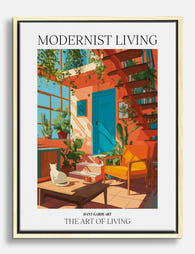
Modernist Living — The Art of Living Canvas Print
Sale price From £49.95£74.95 -

Burnt Orange Horizon Canvas Print
Sale price From £89.95£149.95


More from The Frame

What Size Art for a Dining Room? A Room-by-Room...
Most dining room art advice stops at "two-thirds the width of your table." Useful as a starting point, useless when you're standing in a 3x3 metre room with a 120cm...

What Interior Stylists Know About Matisse Figur...
Matisse figure prints are having a decade-long moment, which means most people have seen the same Blue Nude II leaning against the same taupe wall roughly a thousand times. The...

The Chic Interior Style Guide: How to Use Wall ...
Chic is the hardest aesthetic to pull off because it looks effortless and isn't. The furniture matters, the lighting matters, but the single most visible decision in any chic room...