


 Order today for delivery by
The Chic Interior Style Guide: How to Use Wall Art to Make Any Room Feel Polished
The prescriptive guide to choosing, framing, and placing wall art that makes a room look considered rather than decorated.


Chic is the hardest aesthetic to pull off because it looks effortless and isn't. The furniture matters, the lighting matters, but the single most visible decision in any chic room is what's hanging on the walls. This guide skips the usual advice about rugs and cushions and focuses entirely on how to use wall art as the lever that pulls a room from nicely decorated to properly considered.
What chic actually means in interior design
Chic is restraint with a point of view. It's not minimalism (too austere), it's not "elegant" in the generic Pinterest sense (too vague), and it's absolutely not shabby chic (that's a separate aesthetic involving distressed wood and floral prints, which is fine, just not this).
A chic room feels edited. Every object looks like it was chosen, not accumulated. The colour palette is tight. The materials are honest. Nothing is trying too hard to be noticed, which paradoxically means everything is noticed.
Here's what chic is not: trendy, matchy-matchy, themed, overly symmetrical, or safe. If your living room reads as "coastal," "farmhouse," or "boho," it has a theme, and themes are the opposite of chic. Chic rooms don't announce themselves. They just look right.
The practical implication for wall art is huge. You can't buy a "chic print" the way you can buy a coastal print. Chic is a quality of selection and framing, not a subject matter. Which means the rules for getting it right are more useful than any shopping list.
The colour palette that defines chic spaces
Chic palettes are built from muted, slightly complex neutrals: warm whites, bone, oatmeal, stone, taupe, mushroom, charcoal, and black. They're never pure. A chic white has a hint of cream or grey in it. A chic black has brown or blue undertones.
Where colour appears, it appears with intention. Think muted terracotta, dusty sage, ink blue, aged brass, oxblood. These are complex, slightly dirty colours. They look like they've been mixed, not squeezed from a tube. Primary colours and high-saturation brights will instantly break a chic room.

For wall art specifically, this means choosing pieces where the dominant tones already live inside your room's palette. A print with a splash of rust works in a room with a rust-coloured throw. The same print in a room of cool greys will look like a mistake. Our neutral tones collection is a useful starting point if you want to stay inside this discipline without having to colour-match manually.
A quick test: squint at the room. If any one element jumps forward in colour or brightness, it's probably breaking the aesthetic. Chic rooms read as one tonal field with small accents, not as a collection of competing statements.
Choosing art subjects that feel sophisticated, not safe
Subject matter is where most people quietly sabotage their own rooms. The problem is that the "safe" choices (bright florals, literal landscapes, inspirational script, stock photography of New York) read as generic, which is the enemy of chic.
Subjects that work:
- Abstract compositions with restrained palettes and confident shapes. Not busy, not decorative. One strong idea per piece.
- Architectural studies and drawings, especially line work of buildings, interiors, or structural details.
- Black-and-white photography, particularly figure studies, architecture, or quiet landscapes. Avoid anything that looks like a stock photo.
- Vintage botanical plates in muted ink tones. These feel scholarly rather than decorative.
- Figurative line drawings, single-line nudes, and minimalist portraiture.
- Monochrome landscapes where the composition is doing more work than the colour.
Subjects to avoid: motivational quotes (they age instantly), bright tropical florals, literal beach scenes with "BEACH" written across them, Banksy reproductions, and anything with a hashtag or city name typographically styled across it.
The deeper rule: chic art looks like it was chosen by someone with a specific taste, not by someone trying to fill a wall. If you can imagine the exact same print in a hundred other homes, it's too safe. Our abstract art prints and minimalist art prints are both deliberately curated around this principle.
Why matte paper and quality framing matter more than the image itself
This is the part most guides skip, and it's the single biggest difference between a room that looks polished and one that doesn't. You can hang a brilliant image in a cheap frame and the whole thing will read as cheap. You can hang a modest image in a beautifully made frame and it will look considered.
The things that make framed art look expensive:
- Matte paper, not glossy. Gloss catches light, creates glare, and reads as commercial. Matte absorbs light, shows pigment honestly, and looks like something from a gallery.
- Solid wood frames, not plastic or veneered MDF. You can feel the difference within two seconds of lifting the piece. So can your guests, even if they can't articulate it.
- Acrylic glazing instead of glass. It doesn't throw reflections across the room, which means you can actually see the art from across a sofa. It also doesn't shatter.
- Prints properly fitted inside the frame. The common failure mode in cheap framing is prints that bubble, warp, or sit crookedly inside the mount. A chic room cannot survive a visibly wonky frame.
This is also why we ship the frame and print together in one box, already fitted. The whole category tends to fail at this step, and a print that arrives separately from its frame almost always ends up looking off, no matter how carefully you assemble it.

The practical takeaway: spend less on the image if you have to, but don't compromise on the framing. A simple abstract in a solid oak frame will always look more chic than an expensive image badly mounted in flimsy materials.
Chic art for the living room: what to hang and where
The living room is where most people overdo it. The standard mistake is a cluttered gallery wall of mixed small prints, which creates visual noise and reads as busy rather than considered.
The chic move in a living room is almost always one large piece above the sofa. One statement. The maths is simple: your art should occupy roughly two-thirds the width of the sofa below it. For a standard three-seater around 210cm wide, that means a piece around 100x70cm or 100x150cm if you're going landscape canvas. Smaller than that and it looks apologetic.
Height: the centre of the piece should sit roughly 145-150cm from the floor, which puts it at natural eye level when you're standing. A common error is hanging art too high, which creates a gap between the sofa back and the frame that makes the whole wall look off.
For style, the living room is where you can push slightly bolder. A large abstract with confident shapes, a moody architectural study, or a single oversized black-and-white photograph will all anchor the room. Our artfully chic collection is built specifically for this use case.
If you absolutely must do multiple pieces, do two. Matched in frame, matched in size, hung with equal spacing. Three or more and you're drifting into gallery wall territory, which rarely reads as chic.
Chic art for the bedroom: creating calm without being boring
Bedrooms require a different emotional register. The living room can handle energy. The bedroom cannot. Anything too visually loud will register as low-level stress every time you walk in, even if you can't name why.
The rule for bedroom art is quieter subjects and softer palettes. Think figure studies, quiet landscapes, minimal abstracts, botanical line drawings. Skip anything with high contrast, hard graphic elements, or faces staring directly out of the frame (surprisingly common mistake with portrait photography in bedrooms).
Placement: above the bed is the obvious choice, and it works if you commit to scale. One large piece, or a matched pair hung centred above the headboard. The width of your art should roughly match the width of the headboard, not the whole bed.
The "calm but not boring" tension is solved through texture and tonal depth rather than through adding interest with brighter colours. A deeply pigmented charcoal abstract on matte paper has more presence than a pale print in three colours, and it's quieter at the same time. This is counterintuitive but reliably true.

Avoid the bedside wall for art. Side walls in bedrooms tend to collapse visually when you're lying in bed, and art placed there usually ends up ignored. If you have a seating area in the bedroom, that's the second-best wall.
Things that make rooms look cheap (and how the right print fixes them)
Walking around a room with a critical eye, these are the specific things that drag a space down, and how wall art solves them:
Bare, under-decorated walls. Empty walls don't read as minimalist. They read as unfinished. A single properly scaled piece of art tells the room it's done.
Too much small stuff. A scatter of five small frames at different heights reads as cluttered regardless of what's in them. Replace with one large piece and the whole wall calms down.
Posters tacked up with corners pinned. Even a decent image loses all credibility without a frame. A good print needs a solid frame to earn the room's respect.
Prints in frames that don't fit. Cheap frames sold separately often don't match print proportions, which means you end up with weird borders, bubbling, or awkward matting. Prints and frames designed as a unit avoid this entirely.
Faded or sun-damaged older prints. If a print in your room has gone yellow or washed out, replace it. UV-protective glazing and pigment inks on newer prints last for decades in direct sunlight, which older paper prints never did.
Themed or novelty art. Signs that say "LIVE LAUGH LOVE," pop art of coffee cups, kitchen prints of utensils. These are the single fastest way to make a room look less chic than it should.
An easy audit: walk into each room and ask, for every piece of art, "would I buy this today?" If not, take it down. An empty wall is better than a wall that's actively working against you.
Building a chic home over time: starting with one statement piece
You don't need to redo your home all at once. You almost certainly shouldn't. The chic homes you see in magazines are built slowly, with pieces added when they're right, not when the wall is empty.
The strategy: start with your living room. Specifically, the wall above your sofa. That's the single highest-impact wall in most homes because it's the first thing guests see and it anchors the room everyone spends the most time in.
Buy one piece at the right scale, in a solid frame, in a subject that reflects a specific taste rather than a safe default. Live with it for a few months. Then move to the bedroom. Then the hallway. Then wherever next.
Where to save and where to spend: save on image (prints are by nature reproducible, so an affordable print from a good source will look identical to an expensive one of the same file). Spend on framing, scale, and quality of paper and inks. A 100x70cm print in a solid oak frame with acrylic glazing will outperform a smaller, cheaper original every time.
The restraint rule: when in doubt, stop. A chic home has fewer things on the walls than you think it should. If you've hung one piece in a room and it looks right, resist the urge to add a second. Negative space is part of the aesthetic.
The thing to remember is that chic isn't a style you buy. It's a discipline you apply. Pick fewer pieces, at a bigger scale, in better frames, with more deliberate colours, and your rooms will look more polished than most of what you see in interior magazines.

Start with one wall. Get it right. Move on.

Fab products featured in this blog
-

Chic Cat Lounge Art Print
Sale price From £11.95£19.95 -

Modernist Living, Miami Interior Poster Art Print
Sale price From £11.95£19.95 -

Modernist Living - The Art of Living Art Print
Sale price From £11.95£19.95 -

Modernist Living — The Art of Living Art Print
Sale price From £11.95£19.95 -

Modernist Living — The Art of Living Canvas Print
Sale price From £49.95£74.95 -

Chic Cat Lounge Canvas Print
Sale price From £49.95£74.95 -

Vibrant Interiors Studio Apartment Art Print
Sale price From £11.95£19.95 -

Modernist Living — The Art of Living Art Print
Sale price From £11.95£19.95 -

Chic Evening In Art Print
Sale price From £11.95£19.95 -
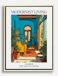
Modernist Living - The Art of Living Canvas Print
Sale price From £49.95£74.95 -

Modernist Living, Miami Interior Poster Canvas Print
Sale price From £49.95£74.95 -

Modernist Living Poster Art Print
Sale price From £11.95£19.95 -

Modernist Living — The Art of Living Art Print
Sale price From £11.95£19.95 -

Modernist Living: The Art of Living Art Print
Sale price From £11.95£19.95 -

Modernist Living — The Art of Living Art Print
Sale price From £11.95£19.95 -
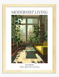
Modernist Living — The Art of Living Art Print
Sale price From £11.95£19.95 -
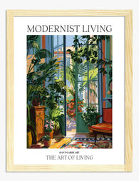
Modernist Living — The Art of Living Art Print
Sale price From £11.95£19.95 -

Vibrant Interiors Kitchen Scene Art Print
Sale price From £11.95£19.95 -

Modernist Living - The Art of Living Art Print
Sale price From £11.95£19.95 -
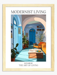
Modernist Living — The Art of Living Art Print
Sale price From £11.95£19.95


More from The Frame

Stylish Living Room Prints: How to Choose Art T...
Living rooms are the hardest space to get art right. The furniture is bigger, the sightlines are longer, and the piece has to earn its keep from the sofa, the...

Minimalist Chic Wall Art: Why One Perfect Print...
Minimalism in interiors has moved past the empty-white-box phase. The new version is warmer, more personal, and built around a handful of things chosen carefully. Nowhere does this matter more...

That Blank Wall Isn't Working: How Bold Graphic...
You've repainted. You've rearranged the sofa. The wall still looks like someone paused halfway through moving in. Graphic art is the fastest, cheapest and most reversible way to finish a...