


 Order today for delivery by
Minimalist Chic Wall Art: Why One Perfect Print Beats a Dozen Accessories
Why a single large, well-framed print will always outperform a shelf of trinkets in a considered room.


Minimalism in interiors has moved past the empty-white-box phase. The new version is warmer, more personal, and built around a handful of things chosen carefully. Nowhere does this matter more than on your walls.
The rise of edited interiors: why minimalist chic is having a moment
For roughly a decade, the dominant interior look was "more". More cushions, more candles, more framed photos clustered on the mantelpiece, more trinkets on the shelf. Everything was layered on top of everything else, and homes started to feel like gift shops.
The reaction was inevitable. Edited interiors, sometimes called quiet luxury or slow design, favour fewer objects, better materials, and more negative space. The point is not austerity. It is intention. Every object in the room is there because you chose it, not because you were filling a gap.
This shift maps neatly onto how people are thinking about wall art. The old approach was the gallery wall: ten small prints in mismatched frames, arranged like a jigsaw. It worked, sometimes, but it demanded a lot of visual bandwidth. The new approach is one print, large, properly framed, allowed to breathe.
Minimalist chic wall art is having a moment because it does more with less. A single confident piece reads as a decision. A dozen small ones often read as indecision.

One print, done right: what that actually looks like in a room
Here is the test. Walk into a room and your eye should land somewhere. In a cluttered room, your eye bounces. In a minimalist room with no art, your eye drifts and finds nothing to hold onto. In a minimalist room with one well-chosen print, your eye lands, settles, and the whole space comes into focus.
That is what a single statement piece does. It becomes the anchor. Everything else, the sofa, the lamp, the rug, exists in relation to it.
The print does not need to be loud to do this. A soft charcoal line drawing at 70x100cm will anchor a room just as powerfully as a saturated abstract, often more so. What matters is scale, placement, and framing. Get those right and you can skip the shelf of ceramics, the string of fairy lights, the stack of coffee table books you never open.
The trick most people miss is that minimalism is not about having less art. It is about giving the art you do have enough room to work.
Choosing the right subject for a minimalist space
Not every print suits a pared-back interior. Here is what tends to work, and why.
Abstract compositions
Soft shapes, washes of colour, gestural marks. Abstract prints suit minimalist rooms because they give the eye something to explore without telling it a story. You can look at a good abstract for months and keep finding new things.
Look for pieces with a limited palette. Two or three colours maximum. If a print has every colour in it, it will fight whatever else is in your room.
Black and white photography and line work
Nothing supports a minimalist scheme like black and white imagery. It brings contrast and structure without adding another colour to the mix, which means it slots into almost any existing palette.
Architectural photography, figure drawings, high-contrast landscapes, botanical line studies. All of these work. The absence of colour forces you to look at composition, and composition is what carries a minimalist room.
Single-subject imagery
A lone cypress tree. One ceramic vessel. A single wave. Prints with a clear focal point and plenty of negative space echo the logic of the room they are hanging in. The subject gets to breathe, which is the whole point.
What to avoid
Busy collages, dense patterns, prints that feel like they are shouting. Also avoid anything overly literal or novelty. A print of the word "Love" in script will date your room by 2016 within seconds.

Size matters: why going large feels more intentional, not more cluttered
This is where most people get it wrong. They choose a beautiful print, hang it at 30x40cm above a three-metre sofa, and wonder why the room still feels off.
The rule, broadly followed by interior designers, is that art above a piece of furniture should fill roughly two thirds to three quarters of the width of that furniture. A two-metre sofa wants a piece around 140cm wide. A 1.2m sideboard wants something close to 90cm wide.
Most people size down because larger art feels like a bigger commitment. It is. That is the point. A 70x100cm framed print makes a statement that a 30x40cm print cannot, no matter how good the image is.
Going large also reduces clutter, counterintuitively. One big piece fills the wall. You do not need to add a second print, a mirror, a floating shelf, and a trailing plant to make the composition feel complete. The print does the job on its own.
If you are working at the upper end of a wall, the canvas format goes up to 150x100cm, which is genuinely room-defining. For framed prints, the top size is 100x70cm, which still reads as a serious piece in most domestic spaces.
A practical sizing guide
- Above a standard three-seater sofa: 100x70cm framed, or 120x80cm canvas minimum
- Above a king bed: 100x70cm framed, landscape orientation
- In a hallway or narrow space: 50x70cm portrait, hung at eye level
- As a solo statement on a large blank wall: 150x100cm canvas, or two 100x70cm framed prints paired
Frame choices that support a minimalist look
The frame is where a lot of modern chic prints get let down. You find the right image, size it correctly, and then wrap it in a chunky ornate frame that fights the whole concept.
For minimalist interiors, the frame should almost disappear. Three options tend to work.
Thin black
Precise, graphic, architectural. Black frames suit black and white photography especially well, and they bring definition to abstract pieces with pale palettes. In rooms with lots of white and natural wood, a black frame adds just enough contrast to stop everything looking washed out.
Natural oak
Warmer, softer, and better suited to rooms with mid-tone woods, linen, and earthy palettes. Oak frames feel Scandinavian in the best sense. They let the print lead without introducing any new colour.
White
Often overlooked, but perfect when you want the art to float against a pale wall without any frame interruption at all. Works beautifully with abstract pieces where the background of the print is itself tonal.
What to avoid: thick frames, ornate mouldings, anything in a brassy gold unless the rest of your room is doing something very specific. Mats (the border between print and frame) can look lovely but add formality. For minimalist chic, we tend to prefer frames without mats, which gives a cleaner, more contemporary feel.
One practical note worth making. Frames made from solid FSC-certified wood with UV-protective acrylic glazing will hold up for decades without warping or yellowing. If you are putting a single large print on your wall and asking it to carry the whole room, cheap framing is not the place to economise. The whole point of the minimalist approach is that each object earns its place.

Where to place a single statement print for maximum impact
Placement does most of the work. A perfect print hung in the wrong place looks mediocre. A decent print hung well looks curated.
Above the main seating
The most common placement, and for good reason. Centre the piece over the sofa, with the bottom edge roughly 20 to 25cm above the sofa back. Going higher creates a disconnect. Going lower looks nervous.
The entry wall
The first wall you see when you walk into a room or home is prime real estate. A single bold piece here sets the tone for everything that follows. This is where you can take your biggest swing. A 100x70cm portrait print at the end of a hallway reads as an invitation rather than decoration.
Above a console or sideboard
The art above a console should relate to the piece below but not match it. A dark walnut sideboard with a pale, airy abstract above creates tension. The same sideboard with a heavy oil-style print creates dullness. Contrast is your friend.
Above the bed
Landscape orientation, roughly the width of the bed, centred and hung so the bottom edge is about 15 to 20cm above the headboard. Softer imagery works best here. Line drawings, misted landscapes, tonal abstracts.
The deliberately empty wall
Here is a controversial one. Not every wall needs art. In a minimalist scheme, leaving one major wall blank is a choice, not an oversight. The empty wall gives the print on the opposite wall more power.
What to avoid
Hanging too high. The most common mistake by a significant margin. Gallery convention puts the centre of the piece at around 145cm from the floor, which is roughly eye level for an average-height adult. Most people hang 15 to 20cm higher than this, which makes everything feel slightly off without being able to say why.
How museum-grade printing quality supports the less-is-more philosophy
The minimalist case rests on an uncomfortable truth. If you are relying on a single piece to carry a room, that piece has to be good. Not good as in expensive. Good as in properly produced, properly printed, properly framed.
This is where the difference between a casual poster and a proper art print becomes visible. Giclée printing on thick matte paper holds detail and colour in a way that cheaper methods do not. Up close, you can see the depth. Across the room, the colours stay true rather than flattening out.
Matte paper also solves the glare problem that kills so many framed prints in rooms with a lot of natural light. Glossy surfaces and standard glass turn into mirrors at the wrong time of day. UV-protective acrylic glazing avoids both the glare and the slow fading that eventually affects anything hung in sunlight.
None of this matters if the frame arrives separately in three pieces and you have to work out which screws go where. The whole experience should be: open the box, hang the piece, step back. Fixtures attached, no warping, no bubbling, no gap between frame and print. For a single statement piece you plan to live with for years, that baseline matters.
The broader point is this. Sophisticated art prints look sophisticated because the materials and production support the image rather than compromise it. Minimalism exposes shortcuts. A bare room with one indifferent print looks worse than a cluttered room with the same print, because there is nothing else to distract from the shortfall.

The practical takeaway
If you are starting from scratch, buy one piece at least 70x100cm, frame it in thin black or natural oak, hang it at eye level above your main piece of furniture, and resist the urge to add anything else to that wall for six months. See how the room settles around it.
If you already have a wall of small prints that is not quite working, try taking them all down and leaving just one. Not necessarily your favourite, but the one with the strongest composition and the clearest subject. Give it space. Hang it well. You will almost always find the room feels larger, calmer, and more considered without the others.
Minimalist chic is not about having less. It is about choosing better and then trusting the choice.

Fab products featured in this blog
-
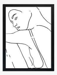
Elegant Minimalist Muse Art Print
Sale price From £11.95£19.95 -

Bold Minimal Muse Art Print
Sale price From £11.95£19.95 -

Elegant Minimalist Muse Canvas Print
Sale price From £49.95£74.95 -

Modernist Living: The Art of Living Art Print
Sale price From £11.95£19.95 -

One — Bold Typography Art Print
Sale price From £11.95£19.95 -
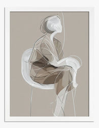
Poised Minimalist Muse Art Print
Sale price From £11.95£19.95 -

Modernist Living — The Art of Living Art Print
Sale price From £11.95£19.95 -
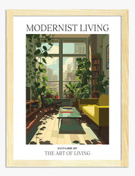
Modernist Living — The Art of Living Art Print
Sale price From £11.95£19.95 -

Single Black Brushstroke Art Print
Sale price From £11.95£19.95 -
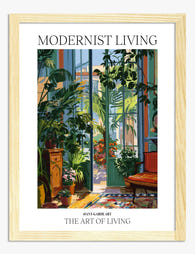
Modernist Living — The Art of Living Art Print
Sale price From £11.95£19.95 -

Bold Minimal Muse Canvas Print
Sale price From £49.95£74.95 -

Modernist Living, Miami Interior Poster Art Print
Sale price From £11.95£19.95 -

Modernist Living: The Art of Living Canvas Print
Sale price From £49.95£74.95 -

Modernist Living — The Art of Living Art Print
Sale price From £11.95£19.95 -

Modernist Living - The Art of Living Art Print
Sale price From £11.95£19.95 -

ART — Big Bold Typography Art Print
Sale price From £11.95£19.95 -

Modernist Living — Sunlit Room Poster Art Print
Sale price From £11.95£19.95 -

Modernist Living — The Art of Living Art Print
Sale price From £11.95£19.95 -

Soft Line Study I Art Print
Sale price From £11.95£19.95


More from The Frame

That Blank Wall Isn't Working: How Bold Graphic...
You've repainted. You've rearranged the sofa. The wall still looks like someone paused halfway through moving in. Graphic art is the fastest, cheapest and most reversible way to finish a...

What Is Graphic Art? A Visual Guide to Styles T...
Graphic art in 60 seconds: what makes it different from other art styles Graphic art is built on shapes, lines, flat colour, and composition rather than realistic rendering or painterly...

Best Graphic Art Prints for Your Living Room (a...
Graphic art has a different job to do than a landscape or a portrait. It brings shape, colour and a bit of attitude, which is exactly what most living rooms...