


 Order today for delivery by
That Blank Wall Isn't Working: How Bold Graphic Prints Fix It Fast
Room-by-room guidance for turning that empty expanse of plaster into the best thing in the house.


You've repainted. You've rearranged the sofa. The wall still looks like someone paused halfway through moving in. Graphic art is the fastest, cheapest and most reversible way to finish a room, and this is how to pick the right one for the wall you're actually staring at.
Why a blank wall makes a room feel unfinished
A blank wall acts like a visual full stop in the wrong place. Your eye scans the room, gathers up the sofa, the rug, the lamp, and then hits that empty space and stalls. Nothing resolves. The room reads as temporary, no matter how much you spent on the furniture.
Graphic art fixes this faster than any other single intervention. Unlike photography or fine painting, bold graphic prints work with strong shapes, high contrast and confident colour, which means they register from across the room and anchor the space immediately. You don't need to understand them to feel them, and that's the point.
There's a reason professional stylists reach for graphic work when a shoot isn't landing. It does the heavy lifting of colour, scale and focal point in one move. For a blank wall, that's exactly the trio you need.

The hallway: a narrow space that craves a bold vertical print
Hallways are the most overlooked walls in the house and the easiest to transform. Because you move through a hallway rather than sit in it, the art has to work at a glance. Subtle tonal pieces disappear here. You want something that announces itself.
Go vertical. A portrait-orientation print at 50x70cm or 70x100cm mirrors the shape of the wall itself and draws the eye down the corridor rather than stopping it. If your hallway has any length to it, a pair of matching verticals spaced evenly along one wall creates rhythm and makes the space feel intentional.
What style works
Bold typographic prints, abstract shape studies and high-contrast Bauhaus-inspired graphics all perform brilliantly in hallways. Think saturated blocks of mustard, cobalt, terracotta or black against cream. You're trying to punch through dim light and short viewing times, so avoid anything delicate or detailed.
How high to hang
Aim for the centre of the artwork to sit at around 145 to 150cm from the floor. That's roughly eye level for most adults, and it works whether you're walking past or pausing. If you're hanging above a console table or radiator cover, leave 15 to 25cm between the top of the furniture and the bottom of the frame.
A quick trick before you commit: cut a piece of newspaper to the exact frame size, tape it up, and live with it for 24 hours. You'll know immediately if the scale is right.
The home office: graphic art that energises without distracting
The home office is the room everyone gets wrong. Too bland and you feel like you're working in a waiting room. Too busy and you can't focus during a video call, let alone a deep-work session. Graphic prints solve this better than photography or illustration because they give you visual interest without narrative, which means your brain doesn't keep returning to them.
The sweet spot is abstract graphic work with a confident palette but a restrained composition. A single large shape study. A geometric grid in two or three colours. A print with lots of negative space. These give you something to rest your eyes on between tasks without pulling you out of flow.
Size it to the desk, not the wall
If your desk sits against the wall, treat the desk as the furniture to size against. The artwork above it should span roughly two-thirds to three-quarters of the desk's width. A 140cm desk wants a print somewhere around 90 to 100cm wide, including the frame. Remember that frames add real width, often 4 to 6cm on each side, so calculate with the frame on.
Hang the print 15 to 20cm above the desk surface. Any higher and it floats; any lower and your monitor starts to crash into it.
Colour choices that help you focus
Avoid red-heavy prints directly in your sightline. Research on colour and concentration consistently points to blues, greens and earthy neutrals as better for sustained attention. A deep navy and cream graphic, a sage and ochre abstract, or a black and off-white typographic piece all work. Keep anything high-stimulation on a side wall where it energises the room without fighting your laptop screen.
Browse the office art prints collection if you want to see how different palettes read in a working space.

The bedroom feature wall: going bold behind the bed
The wall behind the bed is the single biggest opportunity in most homes, and most people underuse it. A king bed is 150cm wide. A super king is 180cm. That's a lot of wall real estate above a piece of furniture you spend a third of your life next to. Timid art looks apologetic here.
This is where you go large. A single statement print at 70x100cm or, better, 100x150cm on canvas, hung centrally above the headboard, does more for a bedroom than any amount of cushion rearranging. The 2/3 rule applies: your artwork (frame included) should span at least two-thirds of the bed's width. For a king, that's a minimum of 100cm wide. Go to three-quarters and the room suddenly feels styled rather than furnished.
What to put there
Bedrooms reward slightly softer graphic work than hallways or offices. You're not trying to wake yourself up at 11pm. Look for abstract shape compositions in muted but confident palettes: dusty pink and burgundy, forest green and cream, terracotta and charcoal. Bold doesn't have to mean loud. A large-scale print in restrained colours still reads as a statement because of the sheer size.
Avoid faces and figures directly above the bed if you find them distracting at night. Abstract, botanical graphic work, or architectural line studies tend to feel calmer.
Hanging height above the bed
Leave 15 to 25cm between the top of the headboard and the bottom of the frame. If you don't have a headboard, treat the mattress top as your reference and leave around 50 to 60cm of breathing room above it. Centre the piece on the bed, not on the wall, especially if the bed sits off-centre in the room.
For more ideas tailored to this specific space, the bedroom wall art collection is organised by mood and palette rather than style, which helps when you're not sure what you're after.
Choosing the right scale: when to go XL and when to hold back
The single most common mistake in home styling is undersized art. A 30x40cm print floating above a three-seater sofa looks like a postage stamp on a billboard. Nine times out of ten, the answer is to go bigger than you think.
Graphic prints in particular can handle scale better than other categories. Because they rely on simple shapes and high contrast, they read cleanly at any size. A delicate watercolour at 100x150cm can feel overwhelming. A bold geometric at the same size feels resolved.
The quick sizing maths
Measure the furniture below the art. Multiply the width by 0.66 for a minimum print width and 0.75 for an ideal one. That's your target, frame included. Above a 180cm sofa, you want art between 120 and 135cm wide. That's genuinely large, and it's why we offer canvas prints up to 100x150cm and framed prints up to 70x100cm.
If a single piece at that scale feels too committal, a diptych of two 50x70cm prints hung with a 5 to 8cm gap reads as one large piece and is easier to hang.
When to hold back
Smaller prints have their place. A gallery wall of four to six prints at 30x40cm or 40x50cm works beautifully in stairwells, above desks or flanking a doorway. Small graphic prints also suit kitchens and bathrooms, where the walls are broken up by cabinetry and the viewing distance is short.
The rule of thumb: the further back you'll typically stand, the bigger the piece needs to be. A hallway you walk through at 2 metres needs scale. A loo you sit in at 1 metre doesn't.
Test before you commit
Before you buy, cut newspaper or brown paper to the exact dimensions of the framed print, including the frame, and tape it to the wall. Live with it for a day. You'll see immediately whether it's the right size, the right height, and the right wall. This single step prevents more returns than anything else.
If you're hunting at the larger end, the large wall art collection is filtered to pieces available at 70x100cm and above.

Why print and framing quality matters more than you think
Most people have had the experience of ordering a print online that looked great in the mock-up and arrived looking flat, grainy or weirdly washed out. Graphic work is especially unforgiving of poor printing. Those clean blocks of colour that make graphic art so striking also expose every flaw in the reproduction.
Three things actually matter.
Ink and paper. Giclée printing on thick matte paper gives you deep, saturated colour without the glare of gloss finishes. Matte paper also reads better from an angle, which matters in hallways and above beds. We print on museum-grade paper using water-based inks rated to last for hundreds of years, even in direct sunlight.
Frame construction. A frame made of solid FSC-certified wood holds its shape. MDF and veneer frames warp in humidity and dent easily in transit. The difference shows the moment you unbox it. We also use UV-protective acrylic glaze rather than glass, which means lighter weight, no shattering risk, and real protection against fading.
How it ships. The biggest failure in online art buying is a print that arrives unfitted, the frame in one box and the print in another, with fixtures you have to attach yourself. Our framed prints ship assembled, fitted, and ready to hang with the hardware already in place. You open the box and hang it. That's it.
Canvas has its own trade-offs worth being honest about. Hand-stretched canvas on solid wood stretcher bars is lighter than framed paper and holds up well in bathrooms, kitchens and other humid rooms. It also gives you that minimal, unframed look at XL sizes without the weight. The matte canvas finish reads well with graphic work because the texture is subtle rather than obvious. A framed paper print looks more polished and formal; canvas looks more relaxed and modern. Neither is better, they're just different.
Five graphic prints from our collection we'd hang right now
Rather than listing every option, here's how we'd approach five common blank-wall problems using work from the graphic edit.
Above a mid-century sofa in a neutral lounge. A large horizontal abstract in warm ochre, rust and cream at 70x100cm, framed in natural oak. The warmth pulls the whole room together and the scale finally matches the furniture.
In a narrow Victorian hallway. A pair of vertical Bauhaus-inspired prints in primary colours at 50x70cm each, hung at eye level with 40cm between them. Instant rhythm, instant intent.
Above a home office desk facing a window. A single restrained geometric print in sage and off-white at 60x80cm, framed in black. Enough interest to anchor the wall without competing with the view.
Behind a king bed with a simple linen headboard. A canvas at 100x150cm in a soft abstract shape study, dusty pink on a deep burgundy ground. Unframed canvas for that relaxed, modern feel.
In a small rented flat where you don't want to drill. A large graphic poster print at 70x100cm, framed and leaning against the wall on top of a sideboard or directly on the floor behind a sofa. No fixtures, no commitment, still a statement.
The one thing to do next
Stop scrolling and measure the wall. Width, height, and the width of whatever furniture sits below it. Take two minutes. Everything else, the style, the palette, the framing choice, becomes ten times easier the moment you know what size you're actually shopping for. That blank wall has been waiting long enough.


Fab products featured in this blog
-

If You're Waiting For A Sign, This Is It Art Print
Sale price From £11.95£19.95 -

If You're Waiting For A Sign, This Is It Canvas Print
Sale price From £49.95£74.95 -

ICON Bold Typography Art Print
Sale price From £11.95£19.95 -

Six — Bold Typography Art Print
Sale price From £11.95£19.95 -

Bold Black Typography Art Print
Sale price From £11.95£19.95 -
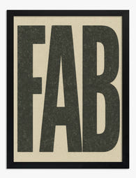
Fab Bold Typography Art Print
Sale price From £11.95£19.95 -

One — Bold Typography Art Print
Sale price From £11.95£19.95 -

ICON Bold Typography Canvas Print
Sale price From £49.95£74.95 -

ART — Big Bold Typography Art Print
Sale price From £11.95£19.95 -

Oh Yes Bold Typography Canvas Print
Sale price From £49.95£74.95 -

Fierce, Brave, Strong Art Print
Sale price From £11.95£19.95 -

Oh Yes Bold Typography Art Print
Sale price From £11.95£19.95 -

Bold Shapes No.1 Art Print
Sale price From £11.95£19.95 -

Poster — Bold Type Statement Art Print
Sale price From £11.95£19.95 -

Four — Bold Typography Art Print
Sale price From £11.95£19.95 -

Fab Bold Typography Canvas Print
Sale price From £49.95£74.95 -

Here — Bold Typography Art Print
Sale price From £11.95£19.95


More from The Frame

What Interior Stylists Know About Matisse Figur...
Matisse figure prints are having a decade-long moment, which means most people have seen the same Blue Nude II leaning against the same taupe wall roughly a thousand times. The...

The Biggest Orange Prints Mistake and What to D...
The mistake is almost always the same: buying orange prints in sets. A trio of tangerine abstracts, a matching pair of burnt orange landscapes, a cluster of citrus-toned botanicals. Orange...

The Chic Interior Style Guide: How to Use Wall ...
Chic is the hardest aesthetic to pull off because it looks effortless and isn't. The furniture matters, the lighting matters, but the single most visible decision in any chic room...