


 Order today for delivery by
Stylish Living Room Prints: How to Choose Art That Makes the Room
The practical rules behind art that actually makes a living room, from sofa proportions to lighting that flatters.


Living rooms are the hardest space to get art right. The furniture is bigger, the sightlines are longer, and the piece has to earn its keep from the sofa, the doorway, and the kitchen hatch. Get the proportions wrong and even an expensive print looks like an afterthought.
This guide covers the measurements, the aesthetic calls, and the mistakes worth avoiding, with specific guidance for sofas, mantels, and console tables.
The two-thirds rule: sizing a print relative to your sofa or mantel
The single most useful rule in wall art is this: your print (or arrangement of prints) should fill roughly two-thirds to three-quarters of the width of the furniture beneath it. Anything smaller looks marooned. Anything wider starts to feel top-heavy.
Here's what that looks like in practice.
- A standard two-seater sofa (around 160cm wide): aim for art that spans 105 to 120cm. A single 70x100cm landscape print works. So does a pair of 50x70cm prints hung 5cm apart.
- A three-seater sofa (around 210cm wide): you want 140 to 160cm of total art width. A single XL canvas at 100x150cm is ideal. Alternatively, three 50x70cm prints hung in a row.
- A large sectional or four-seater (240cm plus): a single piece rarely looks right. A diptych of two 70x100cm prints, or a considered gallery of three to five frames, carries the weight.
- A mantel (typically 120 to 150cm wide): the art above should be 80 to 110cm wide. A 70x100cm portrait-oriented print is the classic choice.
- A console table (usually 100 to 140cm): go for 70 to 95cm of width. One 50x70cm framed print or a pair of 40x50cm prints side by side.
On placement height: the centre of your artwork should sit around 145 to 150cm from the floor (roughly 57 to 60 inches) when it's on a standalone wall. Above furniture, forget the rule and use the furniture as your anchor. Leave 15 to 20cm between the top of the sofa back and the bottom of the frame. Any more and the art starts to float away from the room.
The most common mistake by a wide margin is hanging art too high and too small. If you're ever in doubt, go lower and go bigger.

Statement piece vs. gallery arrangement: which suits your living room
A single large print is calmer. A gallery wall is busier but more personal. Both can look brilliant. The question is what your room is already doing.
If your living room has a lot going on already (patterned rug, bold cushions, a feature wall, open shelving stuffed with books), a single statement print will settle the space. One considered image at scale reads as intentional. Five smaller ones fight for attention.
If your room is quieter (neutral sofa, plain walls, minimal accessories), a gallery arrangement adds the layered character the room is missing. This is where our Artfully Chic collection tends to land well. Mixed subjects, mixed frame sizes, held together by a tight colour palette.
For gallery walls specifically, three rules save you from the usual chaos:
- Pick two frame sizes maximum (for example, three 50x70cm and two 30x40cm).
- Keep spacing consistent at 5 to 8cm between frames.
- Decide on a visual anchor, usually the largest or boldest piece, and build outwards from it.
Formal lounges tend to want symmetry: a single piece centred above the sofa, or a matched pair. Family rooms where people actually live can carry more asymmetry and personality.
Subject and colour: what to lean into and what to avoid
"Match your furniture" is bad advice. Matching flattens a room. What you want is a relationship between the art and the space, which usually means either harmony (colours in the same family) or deliberate contrast (one bold accent that doesn't appear elsewhere).
A few working principles:
- Pull one colour from the room into the art, not three. If your sofa is navy and your rug is terracotta, you don't need both in the print. Pick one and let the art echo it.
- Warm rooms (south and west-facing) can take cooler art. Sage, slate, deep blue, soft stone. The warm light balances out the cool palette.
- Cool rooms (north and east-facing) benefit from warmer art. Burnt sienna, ochre, blush, soft terracotta. These warm the space up in daylight and glow under lamps in the evening.
- Formal spaces reward restraint. Architectural photography, abstract shapes, botanical studies in muted tones. Save the bright pop art for the kitchen or a child's bedroom.
- Casual lounges can handle more character. Figurative work, bold colour fields, photographic prints with personality.
What to avoid: anything that photographs beautifully but reads flat in person. Heavy black-and-white graphic prints, fashion illustrations, and typography-heavy pieces often look sharp on Instagram and strangely two-dimensional on your actual wall. Living rooms have depth and texture. Your art needs some too.
If you're drawn to clean and modern, our contemporary collection is the right place to start. Expect abstracts, muted palettes, and plenty of pieces that work in both formal and relaxed settings.

Current trends in living room art (and which ones have staying power)
Trends are useful as a shortlist, not a shopping list. Some of what's popular right now will look dated in two years. Some of it has been popular for a hundred years and will stay that way.
Trends with staying power:
- Abstract landscapes and colour fields. These never really go away. They flex with your furniture, don't lock you into a specific style, and look considered rather than literal.
- Architectural photography. Buildings, interiors, European streetscapes. Quietly sophisticated, works in almost any room.
- Botanical studies. Not the chintzy floral kind. The pared-back, single-stem, museum-collection kind. Timeless.
- Modernist line drawings. Simple, confident, difficult to grow tired of.
- Vintage travel and exhibition posters. When the design is strong, these age into classics.
Trends that will date quickly:
- Hyper-specific colour palettes (the exact shade of "millennial pink," the exact burnt orange of 2023).
- Slogan prints and motivational typography.
- Overly stylised fashion illustrations tied to a specific era.
- Anything that looks like it was generated to match a trending Pinterest board.
A useful test: if you can imagine the print still looking good in your parents' house, it probably has longevity. If it only works with your current rug, it's a trend piece.
Our living room art prints edit leans heavily into the staying-power side of this line. Pieces that look elegant now and in ten years.
Large format prints: when to go big and how big is too big
If your living room has a wall that's over 2.5 metres wide and currently empty, you almost certainly need a large format print. Small art on a big wall is the single most common mistake in British and American living rooms. It makes the whole space feel underfurnished.
A good rule: if the wall is wider than 3 metres, your art (single piece or grouped) should be at least 120cm wide. If the wall is wider than 4 metres, you're looking at 150cm or a well-planned gallery.
When to go up to the largest sizes (100x150cm and above):
- Behind a large sectional sofa.
- On a double-height wall or above a staircase visible from the lounge.
- As the single focal point in a minimalist room.
- Above a mantel in a period property with high ceilings.
When to hold back:
- In a room under 3.5 metres wide. A 150cm print will overwhelm it.
- On a wall that competes with a large window or doorway. The art will fight for attention.
- When your ceilings are under 2.4 metres. Scale down to 70x100cm so the room doesn't feel compressed.
Canvas works particularly well at the biggest sizes because it's lighter and easier to hang without professional help. Our XL canvas tops out at 100x150cm, with the image mirrored around the edges so nothing important gets lost in the wrap. For a more polished finish, a framed print at 70x100cm still reads as a statement without the weight concerns.
Browse the large wall art collection if you've got a serious wall to fill.

Framed vs. unframed: what looks more polished in a living room setting
Both work. They just work differently.
Framed prints look more polished. The frame does three things: it defines the artwork, adds depth and shadow against the wall, and signals considered rather than casual. In formal living rooms, above mantels, in period properties, and in rooms with traditional furniture, framed almost always looks better.
A few frame rules worth following:
- Black frames suit modern, minimalist, and monochrome rooms.
- Natural oak frames work with Scandi, mid-century, and warm neutral palettes.
- White frames disappear slightly, good for busy walls or when you want the image to do the talking.
- Match frames across a gallery wall. Mixing frame colours rarely looks as considered as you hope.
Our framed prints come with FSC-certified solid wood frames (not MDF, not veneer), a UV-protective acrylic glaze that stops fading in direct sunlight, and fixtures already attached. They ship in one box with the print fitted, which spares you the usual nightmare of warped frames and mismatched components arriving separately.
Canvas suits more relaxed, contemporary settings. It's lighter, has no reflection, and reads as more informal. It also handles humidity better, which matters if your lounge opens onto a kitchen. For abstract work and landscape photography, canvas can actually add to the texture of the piece.
If your living room sits somewhere between formal and casual, framed usually edges it. The polish is worth the slight extra weight.
Lighting and placement tips to make your prints look their best
Lighting is the step most people skip. It's also what separates art that looks good from art that looks expensive.
Daylight considerations:
- North-facing rooms get cool, even light all day. Darker, warmer-toned art lifts the space. Delicate pastels can look washed out.
- South-facing rooms get strong direct light. Choose prints with UV protection (our framed prints include this as standard) and avoid very dark art, which can look flat in harsh sun.
- East-facing rooms are bright in the morning, dim in the evening. Art should look good under both.
- West-facing rooms get warm golden evening light. Cooler palettes come alive at this time of day.
Artificial light:
- Avoid hanging art directly opposite a window. Glare and reflection ruin the view.
- Warm bulbs (2700K) flatter most art. Cool white lighting (4000K and up) makes prints look clinical.
- A floor lamp or wall light angled towards the piece transforms it in the evening. Picture lights look brilliant above a mantel.
Hanging practicalities:
- Use two hooks, not one. Prints stay level and are less likely to shift.
- For anything above 70x100cm, use proper wall fixings rated for the weight.
- Check the piece from across the room, from the sofa, and from the doorway before committing to the hole in the wall.
One last thing worth saying: art doesn't have to be permanent. Building a small collection and rotating pieces seasonally keeps a room feeling fresh without the expense of redecorating. Two or three elegant wall art prints you genuinely love will do more for your living room than a wall full of pieces you felt lukewarm about.
Buy for the room you have, not the room you wish you had. Measure your sofa before you browse. Pick one colour to echo, not three to match. And go bigger than feels comfortable. That's usually the piece that makes the room.


Fab products featured in this blog
-

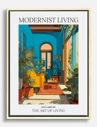
Modernist Living - The Art of Living Art Print
Sale price From £11.95£19.95 -

Modernist Living: The Art of Living Art Print
Sale price From £11.95£19.95 -

Modernist Living — The Art of Living Art Print
Sale price From £11.95£19.95 -

Modernist Living — Sunlit Room Poster Art Print
Sale price From £11.95£19.95 -
Modernist Living - The Art of Living Canvas Print
Sale price From £49.95£74.95 -
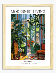
Modernist Living — The Art of Living Art Print
Sale price From £11.95£19.95 -

Modernist Living — The Art of Living Canvas Print
Sale price From £49.95£74.95 -
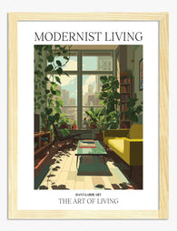
Modernist Living — The Art of Living Art Print
Sale price From £11.95£19.95 -

Modernist Living — The Art of Living Art Print
Sale price From £11.95£19.95 -

Modernist Living: The Art of Living Canvas Print
Sale price From £49.95£74.95 -
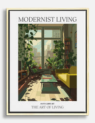
Modernist Living — The Art of Living Canvas Print
Sale price From £49.95£74.95 -
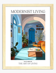
Modernist Living — The Art of Living Art Print
Sale price From £11.95£19.95 -

Modernist Living - The Art of Living Art Print
Sale price From £11.95£19.95 -

Modernist Living — The Art of Living Canvas Print
Sale price From £49.95£74.95 -

Modernist Living Sunlit Room Art Print
Sale price From £11.95£19.95 -

Modernist Living — The Art of Living Canvas Print
Sale price From £49.95£74.95 -

Modernist Living — Sunlit Room Poster Canvas Print
Sale price From £49.95£74.95 -

Modernist Living — The Art of Living Canvas Print
Sale price From £49.95£74.95 -

Modernist Living — The Art of Living Art Print
Sale price From £11.95£19.95 -

Modernist Living - The Art of Living Canvas Print
Sale price From £49.95£74.95


More from The Frame

Minimalist Chic Wall Art: Why One Perfect Print...
Minimalism in interiors has moved past the empty-white-box phase. The new version is warmer, more personal, and built around a handful of things chosen carefully. Nowhere does this matter more...

That Blank Wall Isn't Working: How Bold Graphic...
You've repainted. You've rearranged the sofa. The wall still looks like someone paused halfway through moving in. Graphic art is the fastest, cheapest and most reversible way to finish a...

What Is Graphic Art? A Visual Guide to Styles T...
Graphic art in 60 seconds: what makes it different from other art styles Graphic art is built on shapes, lines, flat colour, and composition rather than realistic rendering or painterly...