How to Choose Art as a Gift (Without Second-Guessing Yourself)
A practical framework for picking art people actually want, even when you have no idea where to start.

Giving art feels high-stakes. You want it to land, you want them to actually hang it, and you don't want to spend an hour staring at a checkout page wondering if you've got it horribly wrong. Here's how to choose with confidence, in roughly the time it takes to drink a coffee.
Why art is one of the most thoughtful gifts you can give
Most gifts get used up, eaten, worn out, or forgotten in a drawer. Art stays on the wall. Every time the recipient walks into the room, they see something you chose for them, which means a well-chosen print quietly outperforms almost any other gift in terms of longevity and presence.
It also signals effort in a way candles and wine simply don't. Choosing art means you thought about their home, their taste, and how they live. That's the actual gift. The print is just the delivery mechanism.
The catch is that "thoughtful" is exactly what makes people freeze. The fear of getting it wrong is real, but it's also overblown. With a sensible framework, art is one of the safest gifts you can give, not one of the riskiest.

How to read someone's taste when they haven't told you
You almost certainly know more about their taste than you think. You just haven't catalogued it. Spend five minutes running through this checklist before you shop, and the right print will start to feel obvious.
The taste tells checklist
- Their home's dominant colours. Walk through their lounge mentally. Are the walls white, warm cream, grey, or something bolder? Are the textiles muted (linen, beige, sage) or saturated (mustard, navy, terracotta)?
- The wood tones. Pale oak and birch lean Scandinavian. Dark walnut and mahogany lean traditional. Black metal and concrete lean modern industrial.
- What's already on their walls. Even one existing piece tells you whether they go figurative or abstract, busy or minimal, colourful or monochrome.
- Their coffee table books. A dead giveaway. Architecture monographs, fashion editorials, travel photography, or nature books all point in clear directions.
- Their Instagram saves and posts. Look at the aesthetic of what they share, not just the content. Warm and grainy? Crisp and graphic? Moody and dark?
- What they wear. Someone in head-to-toe neutrals rarely wants a neon pop print. Someone in vintage prints will love something with character.
- Where they holiday. Coastal Greece, Japanese cities, Scottish hills, Marrakech. Travel taste maps onto art taste with surprising accuracy.
- The restaurants and cafés they post about. People gravitate to interiors that feel like home to them.
- Their phone case, laptop stickers, kitchenware. Small choices reveal big preferences.
- What they've explicitly hated. If they've ever called something "too busy" or "twee," believe them.
You don't need every box ticked. Three or four observations are enough to point you in a direction.
The safe subjects: what works for almost anyone
Some subjects are nearly impossible to get wrong because they sit in the broad middle of taste, work in most rooms, and don't demand the recipient share a specific worldview. These are your gift-friendly categories.
Abstract landscapes. Soft horizons, washes of colour, suggestions of sea or hill or sky. They read as calm and considered without being literal. They suit traditional and modern homes equally well. Browse landscape prints for the broadest range.
Botanicals. Pressed-flower studies, single stems, palm leaves, foliage in muted tones. Botanicals have been hung in homes for 200 years for a reason: they're warm without being sentimental.
Architectural prints. Line drawings of buildings, arches, doorways, or city skylines. They feel intelligent and specific without being personal in a risky way.
Minimalist line art. Single-line figures, abstract shapes, ink studies. The minimal aesthetic is widely loved, and the visual quietness means it slots into almost any palette.
Abstract colour studies. If you know their colour palette, an abstract print in their tones is one of the highest-hit-rate gifts you can give. Match the wall colours or the sofa, and you're almost guaranteed a yes.
The "too risky" list
A few subjects are genuinely hard to gift well, even with the best intentions:
- Portraits and figurative faces. Hanging a stranger's face on your wall is a big ask.
- Religious or spiritual imagery, unless you know it aligns precisely with their beliefs.
- Inside jokes or niche humour. Funny in a card, awkward on a wall for years.
- Highly political or provocative work. Unless you know they want it.
- Anything featuring their pet, partner, or children, unless commissioned and discussed.
- Nudes. A minefield. Skip it.
When in doubt, default to the safe categories. You can always be braver if you know them well enough to take the risk.

Size matters: why 40x50cm and 50x70cm are the sweet spot for gifts
Size is where most gift-givers either go too small (looks like an afterthought) or too big (won't fit anywhere). The sweet spot for gifting is 40x50cm or 50x70cm, and here's the reasoning.
40x50cm is substantial enough to feel like a proper gift, but small enough that almost any wall in any home can take it. It works on a hallway wall, above a desk, beside a doorway, in a kitchen, or as part of a gallery wall. Frame availability at this size is universal.
50x70cm is the slightly more generous option, ideal if you know they have a feature wall, a sofa to hang above, or a bedroom that needs presence. It feels properly considered without committing them to a giant statement piece.
Anything smaller than 30x40cm risks looking lost on the wall and slightly tight-fisted. Anything larger than 70x100cm forces them to find a wall that can take it, which is a big assumption.
If you genuinely don't know their space, choose 40x50cm. It will fit somewhere.
Framed vs unframed: always go framed (here's why)
Always frame the gift. Always. This is the single biggest upgrade you can make to any art print purchase, and it's where most gift-givers leave value on the table.
An unframed print is, functionally, homework. The recipient has to find a frame that fits, order it, wait for it, and then hope it doesn't warp the print. Most people don't do it. The print stays in the tube, then in a drawer, then forgotten.
A framed print is a finished object. It arrives ready to hang on the wall that day. It signals that you went the extra step. It looks substantially more expensive than the same print unframed, even if the cost difference is modest.
The other thing worth knowing: poorly made framed prints are genuinely common. Frames shipped separately from the print, prints that bubble or warp inside the frame, MDF frames pretending to be wood, glass that catches every reflection in the room. If you're buying framed, buy from somewhere that ships the frame and print together, properly fitted, with solid wood and proper acrylic glazing rather than glass. Acrylic is lighter, doesn't shatter, and a UV-protective acrylic glaze stops the print fading even in a sunny room.
Quick answer to the question lurking at the back of your mind: yes, it's appropriate to give framed art as a gift. The framing isn't presumptuous. It's the entire point.
Frame colour cheat sheet: black, oak, or white for their space
Three frame colours cover roughly 95% of homes. Here's how to choose.
Black frame. The right call for modern, graphic, or design-led homes. Look for: white walls, dark wood floors, leather, metal, concrete, monochrome accessories, anything that reads minimalist or industrial. Black also works well for any print that's already graphic or high-contrast.
Oak frame. The safest universal choice. Suits warm, lived-in homes with natural materials, linen, ceramics, plants, and pale wood furniture. If you genuinely cannot decide, choose oak. It works in nine homes out of ten and feels intentionally warm rather than corporate.
White frame. Best for Scandinavian, coastal, or very airy interiors. White on white can disappear, which is sometimes what you want, but be careful in homes with cream or magnolia walls, where a stark white frame can clash.
A simple rule: match the frame to the wood tones already in the room, not to the print itself. The frame's job is to belong to the wall. The print's job is to be the print.

What to write on the card: making the gift personal
This is where art gifts pull ahead of everything else. A short, specific note transforms a print from "nice gift" into "the gift I will tell people about." Avoid generic. Avoid cheesy. Be specific about why you chose this piece for them.
A few formulas that work:
> "This reminded me of your kitchen the second I saw it. I hope it ends up there."
> "You once said your hallway was the saddest wall in the house. Consider this a small intervention."
> "Greece, 2019. The colours felt like that week."
> "I know you've been talking about doing something with the bedroom. Starting you off."
> "Saw it, thought of you immediately, didn't overthink it."
Three rules: name the room or wall you imagined it on, reference something specific to them, and keep it under three sentences. The note is part of the gift.
Our top picks for crowd-pleasing gift prints
If you're short on time and want a shortcut, these categories have the highest hit rate.
Abstract landscapes in muted tones. Soft horizons in sage, dusty pink, ochre, or grey-blue suit almost any palette. Pair with an oak frame at 50x70cm and you've got a gift that lands in roughly nine homes out of ten. The landscape collection is a sensible starting point.
Single-stem botanicals. A simple, well-printed botanical at 40x50cm in a black or oak frame is one of the most reliable gifts in the entire category. Works in kitchens, hallways, bathrooms, bedrooms, and offices.
Tonal abstracts. If you know their colour palette, even loosely, a tonal abstract is the highest-hit-rate option there is. Browse abstract prints and filter by the colours you've already seen in their home.
Architectural and city prints. Especially good for someone who travels, has lived abroad, or has clearly art-directed their flat.
For more curated options, Fab Favourites and the gifts collection are good places to browse pre-edited shortlists rather than the entire catalogue.
The last-minute shortcut
If you've got ten minutes: open their Instagram, scroll for one minute to absorb the aesthetic, then choose a 40x50cm framed print in either oak or black, in one of the safe subject categories above, in a colour you've seen in their home. Add a two-line card. Done.
What if they don't like it?
It happens, occasionally. The best framed-print retailers offer long returns windows (we run a 99-day policy, which is more than enough time for them to live with it before deciding). If you're worried, mention casually that it's exchangeable. Most of the time, they'll love it more in person than in the photo. Shoppers consistently say prints look better on the wall than on screen, partly because thick matte paper and proper framing genuinely improve in real life.
The bottom line
Pick a safe subject. Pick 40x50cm or 50x70cm. Pick framed, in oak if you're not sure. Match the frame to the wood tones in their home. Write two specific lines on the card. That's the entire framework, and it works for nearly anyone, in nearly any home, almost every time.
Stop second-guessing. Choose the print.


Fab products featured in this blog
-

Winter Walk with Books Art Print
Translation missing: en.products.product.sale_price From £11.95£19.95 -

Wake Up and Read — 1961 Library Poster Art Print
Translation missing: en.products.product.sale_price From £11.95£19.95 -

Striped Muse with Flower Art Print
Translation missing: en.products.product.sale_price From £11.95£19.95 -

Who We Have In Our Life Quote Art Print
Translation missing: en.products.product.sale_price From £11.95£19.95 -

Good At Hugs Art Print
Translation missing: en.products.product.sale_price From £11.95£19.95 -

Vintage Christmas Tree Glow Art Print
Translation missing: en.products.product.sale_price From £11.95£19.95 -

Wrapped in Calm Art Print
Translation missing: en.products.product.sale_price From £11.95£19.95 -

Thoughtful Morning Muse Art Print
Translation missing: en.products.product.sale_price From £11.95£19.95 -

Thoughtful in Stripes Art Print
Translation missing: en.products.product.sale_price From £11.95£19.95 -

The Thoughtful Pose Art Print
Translation missing: en.products.product.sale_price From £11.95£19.95 -

One Step Counts Art Print
Translation missing: en.products.product.sale_price From £11.95£19.95 -

Vintage Christmas Glow Art Print
Translation missing: en.products.product.sale_price From £11.95£19.95 -

Botanic Garden, Rio de Janeiro Art Print
Translation missing: en.products.product.sale_price From £11.95£19.95 -

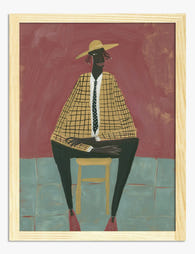
Thoughtful Figure in Green Canvas Print
Translation missing: en.products.product.sale_price From £49.95£74.95 -
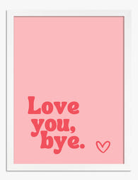
Love You, Bye Art Print
Translation missing: en.products.product.sale_price From £11.95£19.95 -

Seated Figure in White Art Print
Translation missing: en.products.product.sale_price From £11.95£19.95 -

My Energy is Pricey Art Print
Translation missing: en.products.product.sale_price From £11.95£19.95 -

Silent But Judging Art Print
Translation missing: en.products.product.sale_price From £11.95£19.95 -
The Modern Muse Art Print
Translation missing: en.products.product.sale_price From £11.95£19.95 -

La Berceuse by Vincent van Gogh Art Print
Translation missing: en.products.product.sale_price From £11.95£19.95


More from The Frame

Why Vintage Fish Prints Work in Modern Homes Wh...
Vintage fish prints have quietly become one of the most useful things you can put on a wall. Not because they're trendy, but because their scientific origins make them work...

Every Bird in William Morris's Designs: The Sto...
Why birds obsessed William Morris more than any other motif Morris designed acanthus leaves, willow boughs, strawberries, tulips and pomegranates, but he kept coming back to birds. Between the 1870s...

The Best Beige Art Prints for Bedrooms (And Exa...
Most guides tell you how to hang art, but not which beige prints actually suit a bedroom, or what size to buy for your specific bed. This one does both....