
 Order today for delivery by
 Styling William Morris Prints in Modern Homes Without Looking Like a National Trust Tearoom
How to style Morris botanicals in contemporary homes without the chintz, doilies, or whiff of stewed tea.


Morris prints carry baggage. Mention them and people picture floral wallpaper in a Cotswolds B&B, dark wood sideboards, and a doily under every lamp. That reputation is unfair, and easily fixed once you understand what actually makes a Morris print read "period" versus "modern."
The misconception: Morris is only for traditional homes
William Morris was not designing for grandmothers. In the 1860s and 70s he was a radical, rejecting the cluttered, factory-made decor of Victorian England in favour of pattern, craft, and nature. His designs were the modernist statement of their time.
What dates a Morris print today is rarely the print itself. It's everything around it: ornate gilt frames, busy patterned wallpaper behind the art, mahogany furniture, fringed lampshades. Strip those away and the same Strawberry Thief or Willow Bough that looks fusty in one room reads fresh and graphic in another.
Think of Morris designs as botanical illustration with serious compositional discipline. The repeats are tight, the linework is confident, and the palettes are tonal rather than gaudy. That's exactly the vocabulary a modern interior speaks. You just need to let the print breathe.

Pairing Morris botanicals with minimalist and Scandi interiors
This is the combination most people don't believe will work, and it's the one that works best. Minimalism gives Morris room to be the focal point. A pared-back room with a single Morris print becomes a room about that print, which is exactly the relationship the design deserves.
The trick is contrast in volume, not contrast in style. Keep your furniture quiet: pale oak, white-washed wood, undyed linen, boucle, ceramics in matte off-white. Then let one piece of William Morris wall art do all the talking. The botanical complexity reads as detail, not clutter, because everything else is calm.
Scandi interiors lean cool and slightly austere. Morris warms them up without the saccharine. A Pimpernel print in deep olive and ochre against a chalky white wall, hung above a low-slung pale wood bench, is the kind of pairing that looks effortless and considered. Avoid stacking too many soft furnishings in patterns. One pattern hero per wall is plenty.
If you already lean Japandi, Morris's flatter, more graphic prints (Marigold, Larkspur, Acanthus in tonal colourways) sit beautifully next to natural materials like rattan, raw linen, and unglazed stoneware. The botanical motifs echo the wabi-sabi sensibility without tipping into cottage core.
Colour matching: wall paint shades that make Morris prints sing
Most Morris prints fail in modern rooms because they're hung on the wrong colour wall. Stark builder's white can make the print look orphaned and slightly grubby. Heritage greens and clarets push everything straight back to 1890.
The shades that work best are warm off-whites and muted, complex neutrals. Farrow and Ball's Slipper Satin, Wimborne White, or School House White all sit beautifully behind Morris botanicals because they have enough warmth to flatter the natural tones in the print without competing. Little Greene's Slaked Lime and French Grey Pale do similar work.
If you want to push it further, try a soft sage or eucalyptus on the wall. Farrow and Ball's Mizzle, Pigeon, or Card Room Green work as backdrops to Morris because they pull out the foliage tones and create a tonal, layered effect rather than a "matchy" one. The print looks intentional, not decorative.
Avoid two things: gloss white (kills the warmth) and any dark, saturated heritage green or burgundy. Those colours don't make Morris prints look luxe, they make them look like they're hanging in a solicitor's waiting room.
The colour extraction technique is your other tool. Pick one accent shade from the print, the smallest one, and repeat it sparingly elsewhere in the room. A single mustard cushion, a terracotta vase, a thin brass picture light. Never the dominant green, and never more than two echoes. That restraint is the difference between curated and costumed.
Living room styling: single statement vs. curated sets
The living room is where most people overcommit. They buy four Morris prints, hang them in a 2x2 grid, and the room immediately reads "tea shop." Restraint is the entire game here.
When to go single and large
If your living room is open-plan, has tall ceilings, or is otherwise quite contemporary in its bones, one oversized Morris print is almost always the right answer. Go to 70x100cm or larger if you can, and hang it as you would a painting: centred on the wall behind the sofa, with the midpoint roughly 145cm from the floor.
A single statement print is also the smarter choice when your sofa is a strong shape (chesterfield, modular, deep curved silhouette). Two strong elements need negative space between them. Crowding a sculptural sofa with multiple smaller prints flattens both.
When a curated set works
Sets work in three scenarios: long horizontal walls above a sideboard or console, narrow alcoves either side of a chimney breast, and rooms with very simple furniture that need a bit more visual rhythm.
For a set, pick two or three prints from the same family rather than the same colourway, and frame them identically. A trio of floral art prints hung in a horizontal line, evenly spaced, with 5 to 8cm between frames, looks deliberate and gallery-like. Avoid the diagonal staircase layout. It always reads dated.

Bedroom and hallway ideas for smaller Morris prints
Bedrooms are where Morris's softer, prettier designs come into their own. Honeysuckle, Jasmine, and Willow Bough in lighter colourways suit the calmer mood without sliding into chocolate-box territory.
Above a bed, resist the temptation to hang a print that's too small. The print should be at least two-thirds the width of the headboard, ideally three-quarters. A 50x70cm print above a king-size bed looks marooned. Go to 70x100cm or use a pair side by side.
Hallways are an underrated home for Morris-style botanical prints. Narrow walls suit portrait orientation, and hallways tend to be transitional spaces where a bit of pattern feels like a welcome punctuation rather than a commitment. A vertical run of three smaller prints (40x50cm each) up a staircase wall, evenly spaced and aligned to the stair pitch, looks brilliant and is the easiest gallery layout to get right.
For a downstairs loo or a small landing, lean into the unexpected placement strategy. Morris in a tiny room reads modern precisely because nobody expects it. A single botanical print, framed in slim black, above a wall-mounted basin in a small WC is the kind of detail people remember.
Framing choices that shift Morris from period to modern
Frame choice is doing more work than you think. The same print in two different frames is two completely different objects.
What to avoid
Ornate gilt. Heavy carved wood. Anything that mimics a Victorian frame profile. These automatically push the print into "antique" territory and undo all your other styling decisions.
What works
Slim profiles in matte black, raw oak, white, or warm walnut are the contemporary defaults. The frame moulding should be no more than around 2cm wide. Anything chunkier and you're back to traditional territory.
A wide white mat board around the print is the single most effective modernising trick available. It creates breathing room between the dense Morris pattern and the frame, and it forces the eye to read the print as a graphic object rather than a piece of wallpaper. A mat of 5 to 8cm on all sides is the sweet spot.
Glazing matters too, particularly if your room gets a lot of light. UV-protective acrylic glaze keeps the colours from fading over time, which is non-negotiable for archival-quality botanical prints, and it cuts glare in a way standard glass doesn't. It's also lighter, which matters when you're hanging larger pieces on plasterboard walls.
If you order framed, check that the framing is fitted properly before it ships. The most common disappointment with framed art bought online is poor finishing: warped backings, prints that bubble, frames shipped separately to assemble yourself. Print and frame should arrive in one box, fitted, with fixtures attached, ready to go on the wall.
Three complete room schemes built around a Morris botanical print
Scheme one: the calm modern living room
- Print: Willow Bough in sage and cream, 70x100cm, framed in slim matte black with a wide white mat
- Wall colour: Farrow and Ball Slipper Satin
- Sofa: low-profile cream boucle, three-seater
- Coffee table: round travertine or pale oak
- Accents: one terracotta ceramic vase, a single linen throw in undyed flax, a brass arc floor lamp
- Floor: pale oak boards, a cream wool rug with a low pile
The Morris print does the decorative heavy lifting. Everything else is texture and form.
Scheme two: the moody, modern bedroom
- Print: Strawberry Thief in indigo and rust, 70x100cm, framed in raw oak with a narrow mat
- Wall colour: Farrow and Ball Pigeon (a soft blue-grey)
- Bed: low platform in walnut or dark oak, white linen bedding
- Bedside: matching black metal sconces with linen shades
- Accents: one rust-coloured throw pulled from the print's accent tone, ceramic table lamp in matte black
- Floor: dark stained boards, a vintage Turkish rug with worn warm tones
This is where Morris's richer colourways shine. The wall colour echoes the indigo, the rust accent extracts a single tone, and the dark furniture stops the room from feeling fussy.

Scheme three: the contemporary home office
- Prints: a pair of smaller Morris botanicals (Marigold and Larkspur), 50x70cm each, framed in slim white with wide mats
- Wall colour: Little Greene Slaked Lime
- Desk: pale oak, simple silhouette, no ornament
- Chair: black leather or cane-backed wooden chair
- Accents: a single trailing plant (a real one, not silk), one ceramic desk tidy in unglazed stoneware
- Floor: natural sisal or jute rug
The pair of prints, identically framed and hung at the same height roughly 5 to 8cm apart, brings just enough pattern to a working space without becoming a distraction.
For more options in this colour family, the green art prints collection has plenty of botanical-leaning pieces that pair well with sage walls and natural materials.
A few final principles
Morris prints are not the problem. The styling around them is. Keep walls warm and quiet, frames slim and modern, and accessories restrained. Pull one accent colour from the print and repeat it sparingly. Choose one statement piece over four small ones whenever you can.
If you're nervous, start with a single print in a hallway or home office. Lower-stakes rooms are where you'll see most quickly that Morris and modern aren't opposites. They're a pairing waiting for someone to take the doily off the table.


Fab products featured in this blog
-

William Morris Cotton Prints Exhibition Art Print
Sale price From £11.95£19.95 -

William Morris Cotton Prints Exhibition Art Print
Sale price From £11.95£19.95 -

William Morris Cotton Prints Exhibition Poster Art Print
Sale price From £11.95£19.95 -
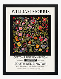
William Morris Cotton Prints Exhibition Art Print
Sale price From £11.95£19.95 -

William Morris Exhibition Poster Art Print
Sale price From £11.95£19.95 -

Morris Botanical Vase, Fig. 08 Art Print
Sale price From £11.95£19.95 -

Wallflower Pattern by William Morris Art Print
Sale price From £11.95£19.95 -
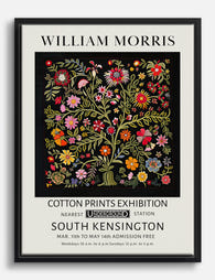
William Morris Cotton Prints Exhibition Canvas Print
Sale price From £49.95£74.95 -

Liberty London Roses Exhibition Poster Art Print
Sale price From £11.95£19.95 -

William Morris Botanical Cats Exhibition Poster Art Print
Sale price From £11.95£19.95 -

Kennet by William Morris Art Print
Sale price From £11.95£19.95 -

Kennet by William Morris Canvas Print
Sale price From £49.95£74.95 -

Studies in Botanical Ornament Art Print
Sale price From £11.95£19.95 -

William Morris British Design Exhibition Poster Art Print
Sale price From £11.95£19.95 -

Vine by William Morris Art Print
Sale price From £11.95£19.95 -

William Morris Tulip Liberty London Poster Art Print
Sale price From £11.95£19.95 -

William Morris Exhibition Poster Art Print
Sale price From £11.95£19.95 -

Artful Nature by William Morris Art Print
Sale price From £11.95£19.95 -

Daisy by William Morris – Liberty London Art Print
Sale price From £11.95£19.95


More from The Frame

Three Framing Choices That Make Floral Prints L...
Most floral prints don't look cheap because of the print itself. They look cheap because of what's around them: a mat that's too skinny, a frame that fights the artwork,...

The Complete Guide to Rome Wall Art Gallery Walls
Rome is one of the few cities that gives you three completely different visual languages to work with: monumental ancient architecture, warm terracotta rooftops, and the graphic punch of mid-century...

The Complete Guide to Building a William Morris...
A William Morris gallery wall lives or dies on restraint. The patterns are already doing a lot of work, so your job is to give them space, structure, and a...