


 Order today for delivery by
The Complete Guide to Building a William Morris Gallery Wall
How to mix his busiest botanicals with breathing room, so pattern-on-pattern still feels considered rather than chaotic.


A William Morris gallery wall lives or dies on restraint. The patterns are already doing a lot of work, so your job is to give them space, structure, and a consistent frame around them. Get the ratios right and even three busy botanicals will feel calm.
Why William Morris is different from a standard gallery wall
Most gallery wall advice assumes you're working with a mix of photography, typography, and quiet illustration. Morris designs behave differently because every print is a repeating pattern, which means your eye never really "rests" on any single print the way it would on a landscape or a portrait.
That has two consequences. First, you need more negative space between prints than you would with a conventional gallery wall. Second, the frame becomes structural, not decorative. It's the pause between patterns.
Once you accept those two things, the rest of the guide is just tactics.

The 60/40 pattern principle
The single most useful rule for a Morris gallery wall is the 60/40 split. In any three-print arrangement, roughly 60% of the visual weight should sit in the patterns themselves, and 40% should be "quiet" space, whether that's plainer prints, generous mounts, or the wall around the frames.
In practice, this usually means one of two setups:
- Two busy, one calm. Two dense Morris repeats (say, Strawberry Thief and Acanthus) balanced by one calmer print (a single botanical study, a solid colourway, or a Willow Bough in a soft palette).
- One busy, two calm. A single hero pattern like Snakeshead or Pimpernel, flanked by two quieter Morris pieces or plain botanical illustrations.
Three equally busy prints hung together will always read as chaos, no matter how well you frame them. The pattern needs somewhere to breathe.
Pattern density: which Morris designs are busy and which are calm
Not all Morris designs carry the same visual weight. Sorting them into rough tiers makes it much easier to build a balanced set.
Busier designs (dense repeats, high contrast, lots of small detail):
- Strawberry Thief
- Acanthus
- Snakeshead
- Blackthorn
- Pimpernel
Mid-density designs (recognisable repeats but more open):
- Honeysuckle
- Marigold
- Compton
- Golden Lily
Calmer designs (larger motifs, more negative space, softer contrast):
- Willow Bough
- Fruit (also known as Pomegranate)
- Larkspur
- Standalone botanical studies from his sketchbooks
A good set of three usually pulls from at least two of these tiers. Pairing Strawberry Thief with Willow Bough works because the density drops off; pairing Strawberry Thief with Acanthus rarely does, because your eye has nowhere to land.
You'll find most of these across our William Morris pattern art prints and the broader William Morris art prints collection.
Colour palette cohesion
Even when you mix different patterns, the palette has to feel like one conversation. The simplest way to achieve that is to pick a two-colour anchor and make sure it appears in all three prints.
For a set of three, we'd suggest one of these approaches:
- Same pattern, different colourways. Three Strawberry Thief prints in indigo, ochre, and sage. This is the safest option and reads instantly as intentional.
- Different patterns, shared colourway. Willow Bough, Fruit, and Blackthorn all rendered in muted greens and creams. The patterns differ but the palette unifies them.
- Different patterns, one shared accent colour. Three completely different Morris designs, all containing a specific tone (a dusty rose, a mustard yellow) that appears clearly in each.
Avoid mixing warm and cool colourways in the same set. A print with terracotta and mustard sitting next to one with slate blue and forest green will always look like two arguments happening on the same wall.
Frame selection
Frames are where most Morris gallery walls go wrong. The prints are already doing so much that any inconsistency in framing reads as noise. A few firm rules:
- Use the same frame finish across all three prints. Not "similar." The same. Mixed timber tones (oak and walnut, say) fight the pattern.
- Go narrower than you think. A thin 15-20mm frame profile lets the pattern lead. Chunky frames compete.
- Choose your finish based on the room, not the print. Black frames feel graphic and modern. Natural oak feels warm and unfussy. White frames disappear into pale walls and let the pattern do everything.
- Use a mount (mat board) if you can. A 4-6cm cream or off-white mount adds the "quiet" that Morris pattern needs. It's the single biggest upgrade you can make.
Our framed prints use solid FSC-certified wood (no MDF, no veneer) with a UV-protective acrylic glaze rather than glass, which matters more than it sounds. Morris palettes fade badly in direct sunlight when they're not properly protected, and glass on three frames above a sofa is a lot of weight to trust to picture hooks.

Set-of-3 layouts with exact measurements
Here are three layouts we come back to constantly. All assume 50x70cm portrait prints in matching frames unless stated otherwise. Adjust proportionally for smaller or larger sizes.
The linear layout
Three prints in a horizontal row, ideal above a sofa, sideboard, or bed.
- Print size: 50x70cm portrait, or 40x50cm for narrower walls
- Spacing between frames: 5-8cm (Morris pattern needs the wider end of this range)
- Total width for three 50x70cm frames with 8cm gaps: roughly 166cm
- Height above furniture: bottom of frames sits 20-25cm above the top of the sofa back or sideboard
- Centre the whole arrangement, not each individual print, on the furniture below
The linear layout is the easiest to hang and the easiest to expand later. Leave 30cm of wall on either side and you can grow to five prints without re-hanging the middle three.
The triangle layout
One print centred and higher, two prints below and either side. Good for square-ish walls, awkward corners, or above a round table.
- Top print: 50x70cm portrait
- Bottom two prints: 40x50cm portrait (slightly smaller balances the composition)
- Vertical gap between top print and bottom row: 6-8cm
- Horizontal gap between bottom two prints: 8-10cm
- The bottom two prints should sit symmetrically either side of the top print's centre line
The triangle works best when the top print is your busiest pattern and the two below are calmer, or when the top print is a hero colourway that the bottom two echo.
The stacked layout
Three prints in a vertical column, ideal for narrow walls, staircases, or between two doorways.
- Print size: 40x50cm portrait, or 30x40cm for very narrow spaces
- Vertical spacing: 6-8cm between frames
- Bottom print: eye level (around 145-150cm from floor to centre) or 25cm above furniture
- Alignment: centre each print on the same vertical axis
Stacked layouts are surprisingly forgiving with mixed patterns because your eye reads them one at a time rather than all at once. This is the layout to try if you're nervous about mixing two busy designs.
Breathing room: why Morris needs more space
A conventional gallery wall might use 3-4cm between frames. Morris walls need 5-10cm between frames and 20cm+ of clear wall on either side of the whole arrangement.
The reason is simple. Repeating patterns don't have edges the way a photograph does; the eye keeps tracing the motif outward. Without generous negative space, the patterns bleed into each other and the wall stops feeling composed.
If your wall isn't big enough to give the arrangement 20cm of breathing room on either side, go smaller with your prints. Three 30x40cm prints with proper spacing will always look better than three 50x70cm prints crammed edge to edge.
Placement height for different rooms
- Above a sofa: bottom of frames 20-25cm above the top of the sofa back. Any higher and the art floats; any lower and it looks cramped.
- Above a console or sideboard: bottom of frames 15-20cm above the surface. Furniture with objects on top needs less gap.
- Freestanding wall (no furniture below): centre of the whole arrangement at 145-150cm from the floor. This is standard gallery hanging height.
- Above a bed: bottom of frames 25-30cm above the headboard. More clearance than a sofa because you view it from further away.
- Staircase: follow the angle of the stairs. Bottom of each frame sits roughly 145cm above the tread directly beneath it.

How lighting changes everything
Morris designs shift dramatically between daylight and evening light. The deep indigos and greens in Strawberry Thief read almost black in warm lamplight; the ochres and reds in Acanthus glow at sunset and go muddy under cool LEDs.
Two things help. First, view a set of prints in the room at both times of day before you commit, if you can. Second, favour warm-toned bulbs (2700K or lower) over cool ones. Morris palettes were designed in an era of gaslight and firelight, and they still look best with a warm colour temperature behind them.
If your wall is opposite a window, our matte paper and UV-protective glaze do the heavy lifting on fade resistance. Traditional prints under glass in south-facing rooms can lose their reds within a few years. Ours are rated to hold their colour for centuries even in direct sunlight, which is the kind of claim we'd rather over-deliver on than skirt around.
Curated sets vs building your own
Buying a curated william morris prints set of 3 is the quicker route and guarantees palette cohesion. It's the right choice if you want something on the wall this month, not this quarter, and if you're not confident yet in mixing patterns.
Building your own gives you more control and lets you pull from across different collections, our William Morris botanical art prints alongside a pattern piece, for example, or a William Morris flowers art print as the calm anchor in a busier set. Give yourself a week to sit with digital mockups before ordering. Print out A4 versions and blu-tack them to the wall for a few days. What looks good on a screen doesn't always survive contact with your actual light and paint colour.
The growth plan: starting with three, expanding to five
If you suspect you'll want more art on the wall eventually, plan for it now. Start with a linear layout of three prints, but hang them slightly off-centre on the wall (say, 40% from the left rather than dead centre). Leave enough clear wall to the right for two more prints of the same size with matching spacing.
When you add prints later, you won't need to move the original three. You just extend the row. This is the single easiest way to build a gallery wall without committing to the final composition on day one.
Budget framing that still looks considered
If you're framing prints yourself rather than buying framed:
- Buy all three frames from the same range at the same time. Different production runs of "the same" frame often differ subtly.
- Prioritise a consistent finish over expensive materials. Three matching budget frames beat three mismatched premium ones every time.
- Add mounts even if the frame didn't come with them. Pre-cut cream mount board is inexpensive and transforms cheaper frames.
- Skip glass on very large prints if weight is an issue. Acrylic glazing is lighter, doesn't shatter, and reduces glare.
A final word on trusting the process
Morris gallery walls almost always look worse in the planning stage than they do once hung. The patterns are so dense on paper that you'll second-guess yourself. Trust the spacing, trust the shared palette, and give it 48 hours on the wall before you decide it isn't working.
If after two days it still feels busy, the fix is almost always more space between frames or swapping one print for something calmer, not changing all three.


Fab products featured in this blog
-

William Morris Floral Exhibition Canvas Print
Sale price From £49.95£74.95 -

William Morris Floral Exhibition Art Print
Sale price From £11.95£19.95 -

William Morris Exhibition Poster Canvas Print
Sale price From £49.95£74.95 -

William Morris Exhibition Poster Art Print
Sale price From £11.95£19.95 -

William Morris Cotton Prints Exhibition Art Print
Sale price From £11.95£19.95 -

William Morris Cotton Prints Exhibition Art Print
Sale price From £11.95£19.95 -

Studies in Botanical Ornament by William Morris Art Print
Sale price From £11.95£19.95 -

Wallflower Pattern by William Morris Art Print
Sale price From £11.95£19.95 -

William Morris Exhibition Poster Art Print
Sale price From £11.95£19.95 -

Wallflower Pattern by William Morris Canvas Print
Sale price From £49.95£74.95 -

Studies in Botanical Ornament by William Morris Canvas Print
Sale price From £49.95£74.95 -

William Morris Cotton Prints Exhibition Canvas Print
Sale price From £49.95£74.95 -

William Morris Exhibition Poster Art Print
Sale price From £11.95£19.95 -

William Morris Exhibition Poster Canvas Print
Sale price From £49.95£74.95 -

Studies in Botanical Ornament by William Morris Art Print
Sale price From £11.95£19.95 -

William Morris Cotton Prints Exhibition Canvas Print
Sale price From £49.95£74.95 -
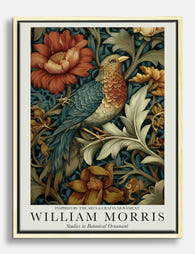
Studies in Botanical Ornament by William Morris Canvas Print
Sale price From £49.95£74.95 -

Flower Garden Textile by William Morris Art Print
Sale price From £11.95£19.95 -

Wallflower Pattern by William Morris Art Print
Sale price From £11.95£19.95 -

Wallflower Pattern by William Morris Art Print
Sale price From £11.95£19.95


More from The Frame

What Interior Stylists Know About Matisse Figur...
Matisse figure prints are having a decade-long moment, which means most people have seen the same Blue Nude II leaning against the same taupe wall roughly a thousand times. The...

The Biggest Orange Prints Mistake and What to D...
The mistake is almost always the same: buying orange prints in sets. A trio of tangerine abstracts, a matching pair of burnt orange landscapes, a cluster of citrus-toned botanicals. Orange...

The Chic Interior Style Guide: How to Use Wall ...
Chic is the hardest aesthetic to pull off because it looks effortless and isn't. The furniture matters, the lighting matters, but the single most visible decision in any chic room...