How to Style William Morris Prints in Every Room of Your Home
A room-by-room guide to making Strawberry Thief feel modern, intentional, and nothing like a Victorian tea room.

Morris prints are having a moment, but the line between "considered" and "costumey" is thinner than people admit. Get the framing, scale, or pairing wrong and your living room starts to feel like a National Trust gift shop. This guide walks you through how to style William Morris prints room by room, with the specifics most articles skip.
Why William Morris prints work in modern homes (and when they don't)
Morris designs work in modern interiors because the patterns are dense, rhythmic, and built around natural forms. That density gives them weight on a wall, which is why a single 60x80cm print can hold its own against a big sofa or a tall headboard. The botanical palettes (sage, ochre, indigo, terracotta) also slot neatly into the muted, earthy colour schemes most people are decorating with right now.
Where they stop working: rooms already heavy with traditional cues. If you've got a chesterfield, a Persian rug, dark wood furniture, and tasselled lampshades, adding Strawberry Thief above the mantle tips the room from "lived-in" to "themed." Morris needs at least one or two modern anchors in the room to feel current. A linen sofa, a flat-weave rug, an unfussy floor lamp, anything that isn't trying to match the era.
The other place to be careful is small, low-light rooms with busy wallpaper. Morris prints reward visibility. If they're competing with a patterned wall and there's no daylight to pick out the detail, they'll read as visual noise.

Living room: choosing the right size and placement above a sofa or fireplace
The living room is where most people hang their first Morris print, and it's where size mistakes are most visible. The rule we use: your art should span roughly two-thirds the width of the furniture below it.
For a standard three-seater sofa (around 200cm wide), that means 60x80cm portrait or 70x100cm landscape as a single piece. For a two-seater (around 150cm), drop to 50x70cm. Hang the centre of the print 145 to 150cm from the floor, or about 20 to 25cm above the sofa back. Any higher and it floats. Any lower and it looks like it's been knocked askew.
Above a fireplace, the calculation changes. The mantel becomes your baseline, not the floor. Leave 15 to 20cm of breathing room between the mantel and the bottom of the frame, and aim for a print that's slightly narrower than the fireplace opening itself. Strawberry Thief, Pimpernel, and Acanthus all work here because their compositions have a clear central focus that reads well from across the room.
For William Morris prints for living room walls, lean towards the busier patterns. Open-plan spaces and tall ceilings can absorb the detail without feeling crowded.
Bedroom: creating a calm, layered feel with Morris's botanical palettes
Bedrooms call for a different Morris. The dense, high-contrast designs that work above a sofa can feel restless above a bed. Look for the softer, more open patterns: Willow Bough, Fruit, Honeysuckle, the quieter colourways of Blackthorn.
Above a standard king-size headboard (150cm wide), a single 60x80cm print centred above works beautifully. For a super king (180cm), go up to 70x100cm or use a pair of 40x50cm prints spaced about 10cm apart. Pairs read as more restful than a single bold piece because the eye moves between them rather than landing on one focal point.
Hang lower than you would in a living room. Around 15 to 20cm above the headboard is the sweet spot. The print should feel connected to the bed, not floating above it.
Layering matters more here than anywhere else. A linen bedspread in oatmeal, a textured throw in the same green tone as the print's foliage, two table lamps with warm bulbs (2700K, not the blue 4000K hospital light). The Morris print becomes one element in a quiet composition, not the only thing happening.
Hallways and staircases: making the most of narrow or awkward walls
Hallways are where Morris really earns his place. The patterns are designed for sustained close looking, and a hallway is the one place in your home where you walk past art at arm's length, day after day.
For narrow hallways under 1m wide, go vertical and go small. A 30x40cm or 40x50cm print sits well at eye level (around 150cm to centre). Three or four spaced evenly along the wall, all the same size, creates a rhythm that lengthens the space.
Up a staircase, follow the line of the steps. Each print's centre should sit at roughly 150cm above the stair tread directly below it, which means each one steps up with the staircase. Mix sizes here for interest: 30x40cm and 40x50cm together, all in matching frames, looks intentional rather than haphazard.

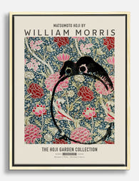
This is also the right setting for the more unusual Morris pieces. The William Morris cats art prints collection (his lesser-known animal studies and the much-loved cat illustrations) gives a hallway personality without the formality of the famous wallpaper patterns.
Gallery wall or single statement piece? Our honest recommendation
For Morris specifically, we lean towards the single statement piece. The patterns are already busy. Hang five of them together and you create a wall of competing detail that gives the eye nowhere to rest.
That said, gallery walls do work for Morris if you follow one rule: stay in a single colour family. A gallery of green-and-cream Morris prints (Willow Bough, Acanthus, Trellis) reads as cohesive. A gallery mixing the red Strawberry Thief, the blue Pimpernel, and the gold Honeysuckle reads as a souvenir shop.
If you do want a gallery wall, here's what works:
- Three to five prints maximum, not seven or nine
- Matching frames throughout (we'd pick black or natural oak, not gold)
- Consistent matting (a 4 to 5cm white mat around each print calms the composition)
- A 5 to 8cm gap between frames, no more
- Mix one or two non-Morris pieces in: a botanical line drawing, a quiet abstract, a piece of typography. This is the most underused trick for William Morris print gallery wall ideas, and it's the difference between a wall that feels curated and one that feels themed.
For most rooms, a single 70x100cm print does more work than a gallery of six smaller ones. It's the more confident choice and it's harder to get wrong.
Colour matching: the specific paint tones and fabrics that complement Morris designs
Generic advice says "warm neutrals." Here's what actually works.
For green-dominant Morris prints (Willow Bough, Acanthus, Trellis): Farrow & Ball Pigeon, Little Greene French Grey, Dulux Tranquil Dawn. These cool, soft greys and green-greys let the foliage tones in the print breathe.
For red and pink Morris prints (Strawberry Thief in the classic colourway, Pink and Rose): Farrow & Ball Setting Plaster, Little Greene Rolling Fog, or a deep contrast like Farrow & Ball Hague Blue if you're feeling bold. Avoid pure white. It makes the reds look orange.
For blue Morris prints (Pimpernel, the indigo Strawberry Thief): Farrow & Ball Skimming Stone, Dulux Natural Hessian, or any warm off-white in the cream-to-buff range. The warmth balances the blue's coolness.
For gold and ochre Morris prints (Honeysuckle, Marigold): Farrow & Ball Stiffkey Blue or Card Room Green for drama, or Slipper Satin for something quieter.
For fabrics, stick to natural fibres in solid colours. Linen in oatmeal, undyed wool, raw cotton, brushed flax. Anything synthetic or shiny next to a Morris print kills the texture conversation. A jute or sisal rug almost always works. A high-pile polyester rug almost never does.
Framed vs canvas: which finish suits which room style
Morris's intricate detail is the deciding factor here, and we have a strong preference.
For most rooms, framed prints win. The reason is detail. Morris's patterns rely on the precision of the line work (the veining on a leaf, the tiny eye of a bird), and giclée printing on matte paper picks up that detail more cleanly than canvas weave. A framed William Morris wall art print under a UV-protective acrylic glaze keeps the colours stable for decades, even on a sunny wall, without the glare you'd get from glass.
The frame finish matters. Natural oak feels modern and warm. Black feels graphic and grounds the busier patterns. We'd avoid ornate gold or carved frames, which push the whole arrangement towards pastiche.
Canvas works better in three specific situations:
- Bathrooms and kitchens, where humidity is a factor and you want something more forgiving than paper behind glazing
- Rooms with very high ceilings where you need scale (canvas goes up to 100x150cm, framed prints stop at 70x100cm)
- Modern, minimal interiors where the unframed edge of a stretched canvas reads as more contemporary
For canvas specifically, the William Morris canvas prints work best in the larger sizes. At 80x120cm or above, the slight texture of the canvas adds something to the foliage. At smaller sizes, you lose detail without gaining much in return.

One thing worth flagging: the most common complaint about Morris prints from any source is poorly fitted framing (warped boards, prints not properly mounted, frames arriving separately from the print). This is the bit to scrutinise when you're buying. A print that ships ready-fitted, in one box, with the fixtures already attached, saves you a weekend of swearing.
Three real styling combinations we love right now
1. The modern country living room. Strawberry Thief in the classic indigo colourway, 70x100cm, in a black frame, hung above a pale grey linen sofa. Walls in Farrow & Ball Skimming Stone. A jute rug, a single brass floor lamp, a low oak coffee table. One trailing houseplant (a pothos or string of hearts) on a side table. The Morris print is the only pattern in the room, which is exactly why it works.
2. The layered bedroom. A pair of 40x50cm Willow Bough prints in natural oak frames, hung 10cm apart above a king-size bed. Walls in Little Greene French Grey. Bed linen in undyed linen with a single ochre throw folded at the foot. Two ceramic bedside lamps with cream pleated shades, warm bulbs. Nothing else on the wall. The repetition of the pair, plus the calm palette, stops the room reading as fussy.
3. The unexpected hallway. Three botanical art prints in matching black frames, alternating one Morris (Acanthus) with two contemporary line-drawn botanicals. All 30x40cm, hung in a horizontal line at 150cm centre. Walls in a deep colour like Farrow & Ball Studio Green. A small brass picture light above the centre print. The mix of old and new is what makes it modern. Morris on his own here would feel period drama. With the line drawings, it feels like someone's actual collection.

A few last things worth knowing
Light your Morris prints. The detail is the whole point, and a print on a dim wall is a print you stop noticing. A picture light, a wall sconce nearby, or a floor lamp angled towards it transforms how the piece reads after dark.
Don't hang Morris in every room. Two or three rooms in a house, maximum. The patterns are distinctive enough that more than that starts to feel like a theme rather than a choice.
And when in doubt, go bigger and quieter. One large print in a soft colourway will almost always look more confident than three small ones in the boldest pattern you could find.

Fab products featured in this blog
-

William Morris Floral Elegance Canvas Print
Translation missing: en.products.product.sale_price From £44.95£74.95 -

William Morris Roses Art Print
Translation missing: en.products.product.sale_price From £11.95£19.95 -

William Morris Floral Canvas Print
Translation missing: en.products.product.sale_price From £44.95£74.95 -

William Morris, Original Floral Pattern Art Print
Translation missing: en.products.product.sale_price From £11.95£19.95 -

William Morris Wallflower Canvas Print
Translation missing: en.products.product.sale_price From £44.95£74.95 -

William Morris Countryside Art Print
Translation missing: en.products.product.sale_price From £11.95£19.95 -
William Morris Garden Blooms Canvas Print
Translation missing: en.products.product.sale_price From £44.95£74.95 -

William Morris Floral Elegance Art Print
Translation missing: en.products.product.sale_price From £11.95£19.95 -

William Morris Birds Art Print
Translation missing: en.products.product.sale_price From £11.95£19.95 -

William Morris, Original Flower Garden Art Print
Translation missing: en.products.product.sale_price From £11.95£19.95 -

William Morris Original Willow Art Print
Translation missing: en.products.product.sale_price From £11.95£19.95 -

William Morris Floral Bird Art Print
Translation missing: en.products.product.sale_price From £11.95£19.95 -

William Morris Floral Pattern Canvas Print
Translation missing: en.products.product.sale_price From £44.95£74.95 -

William Morris Floral Elegance Canvas Print
Translation missing: en.products.product.sale_price From £44.95£74.95 -
William Morris Floral Elegance Canvas Print
Translation missing: en.products.product.sale_price From £44.95£74.95 -

William Morris Floral Cray Red Pink Art Print
Translation missing: en.products.product.sale_price From £11.95£19.95 -

William Morris Original Lodden FlowersArt Print
Translation missing: en.products.product.sale_price From £11.95£19.95 -

William Morris Jasmine Canvas Print
Translation missing: en.products.product.sale_price From £44.95£74.95


More from The Frame

Are Floral Prints Still in Style? What's Actual...
Floral wall art is having a moment, but calling it a "trend" misses the point. Botanicals have been hung on walls since the 17th century, and the current resurgence is...

Why Floral Prints Work Better in Bedrooms Than ...
Floral prints carry baggage. Mention them in the context of a bedroom and most people picture chintz curtains, brass headboards, and a potpourri bowl on the dresser. That reputation is...

Vintage Dog Art: From Victorian Kennel Portrait...
Dogs have been painted, etched, lithographed and screen-printed for as long as people have made images of the things they love. The vintage dog art you can buy today draws...