Klimt Landscape Prints: Classic or Contemporary Styling?
A room-by-room guide to styling Klimt's lakes, forests and gardens in homes built a century after he painted them.

Gustav Klimt is famous for gold leaf and gilded portraits, but his landscapes are the quieter, weirder, more wearable half of his output. Painted mostly during summers at Lake Attersee between 1900 and 1916, they're dense, square, almost abstract, and they slot into modern interiors with a confidence that more traditional landscape painting simply doesn't have. This guide takes you through which works belong where, how to frame them, and which colour schemes already in your home are quietly waiting for a Klimt.
Why early 20th-century landscapes work in 21st-century rooms
Klimt's landscapes look contemporary because they almost aren't landscapes at all. The Beech Forest paintings dissolve into vertical stripes. The Attersee water studies become flat planes of broken turquoise. Garden with Sunflowers reads more like a textile pattern than a painted scene. He was working with pointillism, Symbolism, and a strong Japanese woodblock influence, and the result is a body of work that behaves like abstract art with a recognisable subject buried inside it.
That near-abstract quality is the key. Traditional landscape painting (think misty Romantic valleys) tends to dictate the mood of a room. Klimt landscapes don't. They function more like a richly textured rug or a hand-glazed tile, adding pattern and depth without insisting on a narrative.
The other detail worth knowing: from around 1900, Klimt painted his landscapes almost exclusively on square canvases. He used an opera glass to crop scenes into tight, flattened compositions. This matters for your wall, because a square print sits differently to a portrait or landscape format. It's calmer above sofas, more deliberate above beds, and far easier to hang in a series.

Living rooms: Klimt's lake and meadow scenes as focal points
Living rooms want a single, generous focal piece, and Klimt's Attersee paintings are made for the job. Island in the Attersee (1901) and Attersee I (1900) reduce the lake to almost pure turquoise with the faintest suggestion of shoreline. Schloss Kammer on the Attersee III (1910) gives you the same water tones with a pale yellow building anchoring the composition. These are calm, mineral, contemporary paintings.
A klimt attersee print works best above a sofa at proper scale. For a three-seater (around 210cm wide), aim for a square print at 70x70cm framed, or push it to 100x100cm on canvas if your ceilings allow. Hang the centre of the artwork at roughly 145 to 150cm from the floor, or about 20cm above the back of the sofa, whichever feels more generous.
The lake scenes pair beautifully with mid-century walnut, oatmeal upholstery, terracotta accents, and any room that already leans into blue-green tones (sage, eucalyptus, dusty teal). They clash, in our opinion, with high-contrast monochrome rooms. The palette is too soft for that.
If you'd rather have a meadow than a lake, Poppy Field (1907) brings warmer reds and greens and reads more as a textile. It suits softer, more bohemian rooms: rust velvet, layered rugs, brass lamps. Browse the broader Klimt landscape collection to see how the meadow and lake works sit side by side; you'll quickly notice they belong in quite different rooms.
For more focal-piece guidance, our wider edit of living room art covers other formats that work above sofas if a square doesn't suit your wall.
Bedrooms: the calming case for Klimt's forest prints
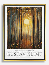
Klimt forest prints are the most underrated thing in his back catalogue. Beech Forest I (1902), Birch Forest (1903), and Pine Forest II (1901) are vertical compositions of repeating trunks against carpets of fallen leaves. They're meditative in a way the gilded portraits never are, and they're ideal for bedrooms.
Two reasons. First, the colour palettes (russet, ochre, mossy green, soft white birch) are warm without being stimulating. Second, the repeating vertical rhythm of the trunks is genuinely soothing to look at, the same way watching rain or a fire is soothing. These are paintings to wake up to.
Above a standard double bed (140cm wide), a single 70x70cm framed forest print centred above the headboard works beautifully. For a king or super king, scale up to 80x80cm framed or go for a canvas at 100x100cm to fill the wall properly. Centre the artwork at around 15 to 20cm above the headboard.
If you have the wall space, two forest prints flanking the bed (one Birch, one Beech, for instance) create a quietly immersive effect, like the bed is set in a clearing. Keep both prints the same size and the same framing for the trick to work.
Bedroom palettes that flatter Klimt forests: cream walls, oak furniture, linen bedding in stone or clay tones. Avoid anything too cool. The forests have a golden undertone that fights against grey-blue rooms.

Kitchens and dining spaces: garden paintings that bring warmth
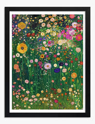
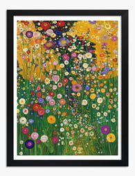
The garden paintings are Klimt at his most decorative, and they're a gift for kitchens and dining rooms. Garden with Sunflowers (1907), Farm Garden with Sunflowers (1907), and Cottage Garden (1907) are dense, joyful, almost wallpaper-like compositions that hold their own against the visual noise of a working kitchen.
Why these rooms specifically? Kitchens have hard surfaces, cabinetry, appliances, and a lot of straight lines. They need art that pushes back with texture and warmth rather than something subtle that gets drowned out. The Cottage Garden's chaos of red, white and yellow blooms does exactly that.
In a dining room, hang a garden print on the wall opposite the main seating position, so guests are looking into the painting across the table. A 50x50cm framed print works in smaller dining nooks; go to 70x70cm for a proper six-seater. The square format sits well above sideboards and credenzas, where rectangular prints often look stranded.
A practical note: kitchens get steam and temperature swings. Canvas prints handle humidity better than paper, and a hand-stretched canvas on a solid wood frame won't warp the way a poorly mounted framed print can. If your dining space connects directly to a busy kitchen, lean canvas. If it's a separate, drier room, framed paper gives you a more polished, slightly more formal finish.
Hallways and stairwells: building a Klimt landscape series
Hallways are where the square format becomes properly useful. Most landscape paintings (in the traditional horizontal sense) are awkward in narrow spaces. Square prints aren't. They sit comfortably above radiators, between doorways, and up the rise of a staircase.
A three-piece Klimt series is the easiest win. Try Birch Forest, Beech Forest I, and Pine Forest II together: three forest scenes, same format, slightly different palettes. Hang them in a horizontal row with 8 to 10cm between frames, centred at eye level (around 150cm).
For staircases, follow the line of the stairs. Hang each print so its centre is 150cm above the tread directly below it. This keeps the artwork at a consistent viewing height as you move up. Five prints in a row is the sweet spot for a typical staircase. Use a mix of Klimt's lake, forest, and garden works if you want variety, but keep all frames identical (same wood, same width, same mount) so the eclectic content reads as a deliberate set.
A gallery of klimt landscape prints is also a smart way to introduce Klimt to a home without committing to one giant focal piece. Hallways are low-stakes. You can be braver with colour and density there than you can in a living room.

Framed vs. canvas: which finish suits which room
Both finishes have their place, and the choice should be driven by the room rather than budget.
When to go framed
Framed prints look more considered. The matte paper, the white mount, the solid wood frame, and the UV-protective acrylic glaze (which doesn't reflect like glass) give you a finish that reads as gallery-quality. Choose framed for:
- Living rooms where the piece is a clear focal point
- Bedrooms, where the softer matte paper feels more intimate
- Dining rooms with traditional or transitional decor
- Any room with good, controlled lighting
The acrylic glaze matters more than people think. Standard glass reflects every lamp and window in the room, which is a particular problem with Klimt's textural surfaces. You want to see the brushwork, not your own ceiling lights.
When to go canvas
Canvas prints have a softer, more painterly presence. The mirrored edge wrap means the image isn't cropped, and the hand-stretched poly-cotton over a solid wood frame gives you something tactile and slightly informal. Choose canvas for:
- Kitchens and dining spaces near cooking zones (humidity tolerance)
- Larger statements above 100x100cm where framing adds significant weight
- Modern, minimalist rooms where a frame would feel fussy
- Rooms with direct sunlight, where you want zero glare
Klimt's near-abstract surfaces (the Beech Forest leaf-litter, the dappled Attersee water) translate particularly well to canvas. The texture of the weave amplifies the painted texture in a way that feels honest to the original.
The trade-off, honestly, is presence. Framed prints look more finished. Canvas looks more relaxed. Neither is better. It's about the room.
Colour palettes in your home that pair naturally with Klimt landscapes
Klimt's landscapes split into three rough palette families, and matching them to your existing scheme is the fastest way to make a print look like it was always meant to be there.
Turquoise and cool blues (the Attersee works)
Island in the Attersee, Attersee I, Schloss Kammer III. Pair with: oatmeal linen, pale oak, warm white walls, brass fixtures, terracotta or rust accents. The turquoise wants something warm to balance it. Avoid pairing with cool grey or stark white modernism, where it can read as cold.
Gold, ochre and russet (the forest and autumn works)
Beech Forest I, Birch Forest, Poppy Field. Pair with: cream, clay, sage green, walnut wood, leather, ceramic. These are the easiest palettes to place because they're already neutral-adjacent. They flatter almost any room that uses natural materials.
Saturated red, green and white (the garden works)
Garden with Sunflowers, Cottage Garden, Farm Garden. Pair with: simpler, quieter rooms. The painting brings the colour. Hang against off-white or soft green walls, with restrained furniture. Don't compete.
A useful exercise: pull the dominant colour out of the Klimt print you're considering and find it somewhere in your room (a cushion, a lamp base, a rug edge). One repetition is enough. More than that and it starts to feel themed.

If you're still narrowing down, browsing the broader landscape art prints edit alongside the Klimt selection helps you see how his work sits next to other landscape traditions. It's often the contrast that confirms why you want a Klimt specifically.
A note on seasonal rotation
One quiet pleasure of collecting Klimt landscapes is rotating them with the seasons. Hang the Attersee works through summer, swap to Beech Forest I or Birch Forest in autumn, and bring the garden paintings out in late spring. Klimt himself painted these works during specific summer holidays at Attersee, so the seasonal logic is built into the catalogue.
If you go this route, invest in two or three pieces at the same framing and dimensions so the swap is genuinely a swap, not a rearrangement. Store the off-season print flat, wrapped, somewhere dry.
Final thoughts
Klimt landscapes are more flexible than their age suggests. The square format, the near-abstract surfaces, and the three distinct palette families mean there's a Klimt for almost every room, provided you match the work to the space rather than the other way around. Start with the room's existing palette, pick the Klimt family that flatters it, then decide framed or canvas based on lighting and humidity. Get those three decisions right and the painting will look like it has always lived there.

Fab products featured in this blog
-

Gustav Klimt Night Butterflies Blue Art Print
Translation missing: en.products.product.sale_price From £11.95£19.95 -

Klimts Lush Landscape Canvas Print
Translation missing: en.products.product.sale_price From £44.95£74.95 -

Gustav Klimt Vibrant Landscape Art Print
Translation missing: en.products.product.sale_price From £11.95£19.95 -

Gustav Klimt Pink Floral Garden Art Print
Translation missing: en.products.product.sale_price From £11.95£19.95 -

Klimts Serene Landscape Canvas Print
Translation missing: en.products.product.sale_price From £44.95£74.95 -

Klimts Floral Garden Art Print
Translation missing: en.products.product.sale_price From £11.95£19.95 -

Gustav Klimt Forest Trees Art Print
Translation missing: en.products.product.sale_price From £11.95£19.95 -

Golden Forest Abstract Art Print
Translation missing: en.products.product.sale_price From £11.95£19.95 -
Klimts Floral Garden Art Print
Translation missing: en.products.product.sale_price From £11.95£19.95 -

Klimts Sunlit Forest Art Print
Translation missing: en.products.product.sale_price From £11.95£19.95 -

Gustav Klimt Blue Door Garden Art Print
Translation missing: en.products.product.sale_price From £11.95£19.95 -

Gustav Klimt Sunset Forest Art Print
Translation missing: en.products.product.sale_price From £11.95£19.95 -

Klimts Enchanted Forest Art Print
Translation missing: en.products.product.sale_price From £11.95£19.95 -

Gustav Klimt Golden Forest Trees Art Print
Translation missing: en.products.product.sale_price From £11.95£19.95 -

Klimts Wild Garden Art Print
Translation missing: en.products.product.sale_price From £11.95£19.95 -

Gustav Klimt Floral Garden Art Print
Translation missing: en.products.product.sale_price From £11.95£19.95 -
Klimt Sunlit Forest Canvas Print
Translation missing: en.products.product.sale_price From £44.95£74.95 -

Klimts Sunlit Forest Art Print
Translation missing: en.products.product.sale_price From £11.95£19.95 -
Klimts Wild Garden Art Print
Translation missing: en.products.product.sale_price From £11.95£19.95


More from The Frame

Klimt's Beech Forest and Birch Forest Paintings...
Klimt's forests are having a moment, and the search results are a mess. People type in "beech forest poster" and end up looking at three different paintings with overlapping German...

The Story Behind Klimt's Woman in Gold: Adele B...
She has been called the Mona Lisa of Austria, looted by Nazis, fought over in court for decades, and sold for $135 million. The painting is dazzling, but the woman...

Klimt's Golden Phase Portraits: The Story Behin...
Gustav Klimt's Golden Phase lasted less than a decade, but it produced the most recognisable portraits in modern art. Before you hang one on your wall, it's worth knowing what...