


 Order today for delivery by
Spring Home Decor Trends 2025: The Wall Art That Interior Designers Are Actually Using
The specific prints, palettes and placements that connect this season's biggest interior movements to actual walls.


Spring 2025 isn't about pastel overload or a sudden explosion of tulip prints. The interiors conversation has shifted toward quieter, more considered choices, and your walls are where that shift shows up fastest. Here's how designers are translating this season's biggest movements into art you'd actually want to live with.
The three interior trends shaping spring 2025
Three movements are doing most of the heavy lifting this season, and they overlap more than you'd think.
Quiet luxury has moved from fashion into interiors, which in practice means fewer statement objects, better materials, and art that reads expensive without shouting. Think solid wood frames, matte finishes, no gloss or glare.
Warm minimalism is the correction to the stark white box era. The palette has shifted toward cream, oat, soft clay and muted olive. Negative space still matters, but it should feel inviting rather than clinical.
Countryside modern is the biggest surprise. Rural references are back (landscapes, botanicals, pastoral scenes) but reinterpreted through a contemporary lens. No chintz, no horse brass. Clean compositions with earthy soul.
What ties them together is a rejection of trend-chasing for its own sake. The art should look like it's been there a while, even when it's new.

Warm minimalism: why muted spring botanicals are everywhere right now
The botanical print has done more lifecycles than almost any other category, and the latest version looks nothing like the saturated tropical leaves of five years ago. Spring 2025 botanicals are soft, almost washed out, and often rendered in a single tonal palette.
The key word is muted. Instead of chartreuse or kelly green, designers are reaching for sage, celadon, dried eucalyptus and pale olive. Instead of bright florals, you're seeing fern fronds, grasses, pressed flowers and loose botanical studies on cream or oatmeal grounds.
Choosing the right green
Not all greens behave the same way. Sage has grey undertones and sits quietly against warm whites. Celadon leans blue and works beautifully with cooler stone and plaster walls. Olive carries yellow warmth and plays well with terracotta, oak and clay. If your room already has warm wood or brass, go olive. If it's cooler (concrete, linen, pale grey), celadon or sage will feel more cohesive.
Abstract or realistic?
Both work, but they do different jobs. Abstract botanicals (loose washes, suggested leaf shapes) feel more contemporary and recede into the room. Realistic botanical studies and vintage-style illustrations feel more collected and tend to anchor a wall. In a bedroom or quiet corner, we think the abstract route wins. Above a sideboard or in a dining room, the detailed botanical study holds its own better.
For either direction, the botanical art prints collection is the obvious starting point. Look for ones with plenty of breathing room around the subject rather than edge-to-edge pattern.
Countryside modern: landscape prints that feel fresh, not twee
Countryside modern is where this season gets interesting. The temptation with rural references is to tip into cottage pastiche, and most people overcorrect by avoiding landscape entirely. The actual move is to lean in, but with discipline.
A fresh countryside landscape print has three qualities. The composition is simple (one horizon, maybe one tree, sometimes just a field of light). The palette is restrained (two or three colours, no more). And the mood is atmospheric rather than illustrative.
What to look for
Hazy, early-morning light. Fog over a hillside. A single stone wall across a pale sky. The kind of image that could be an oil painting or a long-exposure photograph. Avoid anything with cottages, livestock or overworked detail.
Colour-wise, think bleached straw, soft stone, pale sky blue, and the muted greens we talked about earlier. These sit beautifully with natural linen, limewash walls and solid wood furniture.
Scale is doing a lot of work here
A small countryside print looks like a souvenir. A large one, say 70x100cm, looks like a considered design choice. If you're going landscape, go bigger than you think. One generous print on a wall will always feel more intentional than three small ones trying to form a group.
Browse the landscape collection with this filter in mind: would a stylist put this in a quietly expensive country house? If yes, it works. If it feels like a greetings card, skip it.

Colour drenching with pastels: how to commit to a spring palette on your walls
Colour drenching (painting walls, trim and sometimes ceilings in a single tone) was last year's bold move. This spring, the technique has softened into pastels, and your art is how you make the whole thing feel grown up rather than nursery-adjacent.
The trick is tonal matching with a slight shift. If your walls are a pale butter yellow, a print with cream, soft terracotta and a hit of warm brown will blend in and lift the room at the same time. If your walls are powder pink, look for prints with dusty rose, oxblood and chalky white. The art should sit a half-step away from the wall colour, never identical, never contrasting hard.
Pastels that don't look juvenile
- Butter yellow instead of lemon
- Dusty rose instead of bubblegum pink
- Powder blue with grey undertones instead of baby blue
- Pale clay instead of peach
- Soft lilac with a hint of grey instead of lavender
Abstract art is your friend here. A composition with washes of colour, soft shapes and no obvious subject will do more for a drenched room than any representational image. The abstract art prints collection is where to look, specifically pieces with gentle colour fields rather than sharp geometric contrast.
A note on framing
In a drenched room, frame choice matters more than usual. A black frame will punch a hole in your soft palette. White can look stark against a coloured wall. Natural oak or a warm walnut tends to be the quietest, most flattering choice. If you want the art to disappear slightly into the wall, consider going unframed on canvas, which has no hard edge to fight the drenched effect.
The sizes and formats that work for each trend
Scale is where most spring refreshes go wrong. Here's how to get it right for each movement.
Warm minimalism
One large piece, not a cluster. For warm minimalist rooms, we'd recommend 60x80cm or 70x100cm as a single statement above a sofa, bed or console. Framed in solid oak or a natural wood tone. The negative space around the print is part of the design.
Avoid gallery walls here. Three or more frames immediately pushes the room out of minimalist territory.
Countryside modern
This trend takes scale well. A single 70x100cm landscape above a dining table or sofa is the strongest move. Alternatively, two medium prints (50x70cm each) can work side by side if they share a palette and feel like a pair rather than a collection.
Canvas works particularly well here. The slight texture of the canvas surface suits the pastoral mood, and the unframed option feels less formal, which fits the trend.
Colour drenching
Pairs and trios make sense when the wall colour is doing so much work. Three 30x40cm or 40x50cm prints in a loose row let you build a palette story. Alternatively, one oversized 100x70cm abstract will anchor a drenched wall beautifully if you prefer the single-piece look.

Above a sofa
The standard rule still applies: your art should span roughly two-thirds the width of the furniture below it. For a three-seater, that's usually a 70x100cm print or a pair of 50x70cm prints hung close together.
In a hallway
Longer, narrower walls want vertical formats. A single tall botanical or landscape at 50x70cm or 70x100cm in portrait orientation beats a horizontal gallery wall almost every time.
Quick spring refresh: one print swap that changes a whole room
If you only do one thing this season, swap the largest piece of art in your main living space. Not the small prints in the hallway, not the bedroom. The biggest, most visible piece.
Here's why it works. Your eye registers the dominant piece of art before anything else in the room. Change it, and the colour story of the whole space shifts, which in turn makes everything else (your existing cushions, rugs, throws) feel like they're responding to a new mood. You get the sense of a full seasonal refresh from a single swap.
How to choose the swap
Pick a print that pulls out one accent colour already in your room (a cushion, a book spine, the stem of a houseplant) and amplifies it. If your sofa has a sage throw you only started using in autumn, a spring print that nods to that sage will suddenly make the throw look intentional for spring too.
The spring edit is curated specifically with this in mind: pieces that function as the anchor swap rather than requiring you to rebuild the rest of the room.
What to do with the winter piece
Don't shove it in a cupboard. Move it to a lower-traffic room (a bedroom, a study, a landing) where it can carry on doing its job without being the centrepiece. The rotation is the point.
How to make a trend feel personal (not like a catalogue)
The catalogue look happens when every piece in a room is from the same visual family at the same saturation. You can follow every trend in this article and still end up with a room that feels like a showroom if you don't break the pattern somewhere.
Mix one era in
Alongside your new spring print, keep at least one piece that doesn't match. A vintage portrait, a souvenir print from a trip, something inherited. The anchor of something older, slightly off-palette, or personally meaningful is what stops a trend-forward room from reading as styled by committee.
Vary the frame finishes
If your main spring piece is in natural oak, let another piece elsewhere in the room be in black, brass or unframed canvas. Perfect frame matching is one of the fastest ways to make a space look like a shop display.
Hang slightly off-centre
Centring art precisely above furniture is correct and also slightly boring. Shift a print 10-15cm to one side of the sofa and let a lamp or plant balance the composition. The room will feel composed rather than installed.
Choose one piece that doesn't photograph well
Trend-driven art is often selected for how it looks in a photograph. The pieces that make a room feel genuinely yours tend to be the ones that need to be seen in person, where texture, detail and matte finish do the work. Giclée prints on thick matte paper reward being looked at up close, which is exactly the quality that doesn't survive a scroll on your phone. Lean into that.

Trust your eye on scale, not the trend
If a trend calls for oversized art and your wall won't take it, don't force it. A well-chosen medium print in the right spot will always outperform an oversized one that overwhelms the room. The trends are a direction, not a rulebook.
Where to start
Walk into your main room this weekend and identify the single piece of art that your eye lands on first. If it still feels right for how you want to live over the next six months, leave it. If it doesn't, that's your swap. Everything else in this article is detail around that one decision.

Fab products featured in this blog
-

Spring in the City Art Print
Sale price From £11.95£19.95 -

Spring in the City Canvas Print
Sale price From £49.95£74.95 -

Spring Bunny and Pastel Eggs Art Print
Sale price From £11.95£19.95 -

Spring Garden in Bloom Art Print
Sale price From £11.95£19.95 -

Klimt-Inspired Spring Flower Garden Art Print
Sale price From £11.95£19.95 -

Coast in Spring Art Print
Sale price From £11.95£19.95 -

Spring Greenside Glow Art Print
Sale price From £11.95£19.95 -

Spring Bunny and Pastel Eggs Canvas Print
Sale price From £49.95£74.95 -

Spring Garden in Bloom Canvas Print
Sale price From £49.95£74.95 -
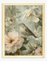
Spring Songbird & Blossoms Art Print
Sale price From £11.95£19.95 -

Spring Meadow Blooms Art Print
Sale price From £11.95£19.95 -

Spring Meadow Serenity Art Print
Sale price From £11.95£19.95 -

Blossom Hillside in Spring Light Art Print
Sale price From £29.95£49.95 -

Le Paysage — Spring Garden In Bloom Art Print
Sale price From £11.95£19.95 -

Gardeners in Spring Art Print
Sale price From £11.95£19.95 -

Spring Stroll Gathering Art Print
Sale price From £11.95£19.95 -

Klimt-Inspired Spring Flower Garden Canvas Print
Sale price From £49.95£74.95


More from The Frame

The Complete Guide to Home Office Art Prints
Your home office has to pull off something strange. It needs to look composed on a Tuesday morning video call and still feel like somewhere you actually want to spend...

The Only Kitchen Art Guide Food Lovers Need
Most kitchen art advice sends you straight toward pasta cartoons, "EAT" signs, and cursive coffee quotes. If you actually care about food, you probably want something more considered on your...

Spring Botanical Prints: From Victorian Specime...
Botanical prints have been quietly running the interior design world for 300 years. The reason is simple: flowers and foliage sit comfortably in almost any room, pull colour from the...