
 Order today for delivery by
 Trending Art Prints: What People Are Actually Buying Right Now
The art prints filling real homes right now, not the ones racking up likes on a feed.


Trend reports and actual purchase behaviour rarely tell the same story. We've spent the last year watching what gets added to baskets, what gets reordered, and what people quietly take down after six months. This is the honest version of what's selling, why it's selling, and how to buy something current that still looks good in 2027.
What's actually trending vs. what Instagram says is trending
Open any design feed and you'll see a wall of saturated maximalism: clashing colour, oversized typography, glossy 90s revival posters, dopamine-bright florals stacked floor to ceiling. It looks fantastic in a 15-second reel. It sells in much smaller numbers than you'd think.
What people actually buy, when they're spending their own money on something that needs to live above their sofa for years, is calmer, quieter, and more considered. Soft abstracts. Botanical line drawings. Earthy landscapes. Neutral palettes with one or two warm accents. The gap between "trending content" and "trending purchase" is wide, and it's worth understanding before you commit.
This isn't because people have boring taste. It's because the maths of a wall print is different from the maths of a feed. A poster on Instagram has to grab you in a second. A poster on your wall has to not annoy you on a Tuesday morning when you're tired and hungover and the light is grey. Those are very different jobs.

The top 5 art print styles selling right now
1. Soft abstracts in muted earth tones
The clear winner. Think shapes rather than scenes, washes of clay, ochre, terracotta and bone, with enough ambiguity that they don't dictate the mood of a room. They're the genuine top sellers across our abstract art prints collection, and they've been climbing steadily for two years.
2. Botanical line drawings and pressed-flower studies
Single-stem ferns, eucalyptus branches, monstera leaves rendered in fine ink lines on cream backgrounds. They've been consistent best-sellers for so long they've graduated from "trend" to "design staple." If a style has been selling steadily for five years, it's not going to suddenly look dated in two.
3. Moody landscapes and minimalist horizons
Foggy mountains, lone trees, empty beaches at low tide. Lots of negative space, limited palette, often shot or painted in a way that feels almost monochrome. They suit Scandi-leaning interiors but also work in older homes with darker woodwork.
4. Mid-century inspired graphics
Geometric shapes, blocky figurative work, the kind of thing that nods to Matisse cut-outs without actually copying them. These tend to sell in pairs or threes because they layer well in gallery walls.
5. Black and white photography
Architectural detail, figures in motion, urban street scenes. This is the quiet workhorse of the print world. It almost never goes out of fashion, it works in any room, and a well-printed black and white image looks genuinely expensive when it arrives properly framed.
Colour palettes driving purchases in 2024-2025
The dominant palette right now is what we'd loosely call "warm neutral with a pulse." Cream, oat, mushroom, soft taupe and bone, lifted with one accent that gives the print energy. The accent colours doing the heavy lifting are:
- Burnt sienna and terracotta: warm, earthy, looks particularly good against white walls and oak furniture.
- Clay and rust: slightly more orange than terracotta, brilliant in north-facing rooms because it warms the cool light.
- Ochre and mustard: harder to pull off but very effective in small doses, especially in hallways.
- Sage green and olive: the green of the moment, less aggressive than emerald, calmer than mint.
- Charcoal and ink black: doing a lot of work in graphic prints and photography.
What isn't selling, despite getting a lot of airtime online, is the high-saturation maximalist palette. Hot pink, electric blue and acid yellow get plenty of attention but rarely make it onto walls. The exception is children's rooms and the occasional brave downstairs loo.
If you want a quiet bet, anything that pairs cream with a single warm earth tone will look current now and probably still look current in 2027. That's the boring truth.

Why abstract and botanical prints keep topping the charts
These two categories have led wall art sales for years, and they don't show any sign of slowing down. There are practical reasons for that.
Abstract prints are emotionally versatile. A landscape forces a mood: melancholy, dramatic, pastoral. An abstract piece lets you bring your own. That flexibility means it works whether you're hosting a dinner or working from home with a hangover, and it doesn't fight whatever furniture you bring in next year.
Botanical prints have a measurable calming effect. The professional design consensus is that biophilic imagery, anything that references plants and natural forms, lowers visual stress in a room. Whether you buy that or not, the practical outcome is that botanical prints look at home almost everywhere. Bathrooms, bedrooms, kitchens, hallways. They're the easiest "first print" to buy.
Both styles are also forgiving of bad lighting, awkward wall colours, and the general chaos of real homes. A bold figurative print needs a clean, well-considered space around it. A soft abstract or a fern study works above a radiator with a pile of shoes underneath it.
You can browse the full botanical art prints range if that's the direction you're leaning. It's where most people start, and there's a reason.
How to buy a trending print without your home looking like a showroom
The risk with anything currently popular is that you end up with a room that reads as "catalogue page." Here's how to avoid that.
Buy one trend-forward piece, not a set. If you're going for a current style, make it the focal print and let everything else be older, more personal, or more unusual. A trending abstract above the sofa works. Three trending abstracts, a trending rug and a trending lamp does not.
Mix in something genuinely yours. A photograph you took. A print from a holiday. A small framed piece your kid drew. Showrooms don't have personal objects, so adding one immediately breaks the catalogue effect.
Avoid matching everything to the print. If you buy a terracotta-toned abstract, don't then buy terracotta cushions, a terracotta throw and a terracotta vase. One warm accent in a print, plus a different warm accent in your textiles, looks layered. Three matching accents look styled.
Resist the urge to buy in pairs of identical prints. Two of the same print framed identically reads as hotel lobby. Two different prints by the same artist, or two prints from the same palette in different sizes, reads as collected.
Frame matters more than you think. A trending print in a cheap frame looks generic immediately. A simple solid wood frame in oak, walnut or black makes the same print feel considered. We use FSC-certified solid wood with a UV-protective acrylic glaze, partly because it lasts and partly because it's the difference between art and decoration.
The prints our customers are buying on repeat
When we look at what people order more than once, either the same print in a different size for another room, or the same artist's other work after the first arrives, a clear pattern emerges.
Soft abstract diptychs and triptychs. People buy one, hang it, like it, then come back for the matching pair to put in the bedroom or hallway. Earthy palettes lead by a wide margin.
Single-stem botanicals at A2 size. The 42x59.4cm size is the most reordered in this category. Big enough to feel intentional, small enough to fit above a console table or in a narrow gallery wall slot.
Oversized landscape prints. Anything 70x100cm or larger in a moody, minimal landscape style. The oversized trend isn't slowing down. A single very large piece above a bed or sofa keeps outperforming small clusters in most living spaces.
Black and white architectural photography. This is the quiet repeat-buy category. People order one for the hallway, then come back for one for the office or bathroom.
You can see the current rotation in Fab Favourites, which we update based on actual sales rather than what looks good in marketing photography.

How to style trending art prints in a living room, bedroom, and hallway
Different rooms have different rules. A print that works above a sofa will look wrong above a bed, and vice versa.
Living room
The sofa wall is the most visible wall in your home, and the print that goes above it sets the tone for the entire space. Go bigger than feels comfortable. The most common mistake is buying a print that's too small, which makes the wall look unfinished.
A good rule: the print (or arrangement of prints) should be roughly two-thirds the width of the sofa. For a standard 220cm sofa, that's around 140-150cm of art width. A single 100x70cm framed print, or a pair of 60x80cm prints hung 5cm apart, both work.
Hang the centre of the print 145-150cm from the floor, not from the top of the sofa. That's gallery height, and it's the height your eye expects.
For style, this is where soft abstracts and oversized landscapes earn their reputation. They give the room a centre of gravity without demanding attention. If your sofa is bold, go quiet on the print. If your sofa is neutral, the print can carry more colour.
Bedroom
The bedroom is where botanical prints, soft figurative work, and gentle abstracts thrive. You want something restful, which rules out anything graphic or high contrast.
Above the bed, go for one large piece (70x100cm above a double, larger above a king) or a balanced pair. Avoid hanging anything heavy directly above where your head goes, both for practical reasons and because it creates visual pressure.
For framing, modern art prints in slim oak or black frames suit most bedrooms. Canvas works particularly well here too because it's lighter, has no glare, and doesn't reflect bedside lamps at 11pm. Hand-stretched canvas with mirrored edges gives you a softer presence than glass-front framed work.
Hallway
Hallways are the most underused walls in most homes, and they're forgiving. Narrow, often poorly lit, usually walked through rather than sat in. This is where you can take more risks.
Vertical formats work best because hallways are typically taller than they are wide. A single tall print, or a vertical run of three smaller prints stacked, draws the eye through the space.
Hallways also handle bolder palettes well because you don't live with them all day. A burnt sienna or deep ochre print that would dominate a living room can be a small jolt of warmth as you pass through.
If your hallway gets direct sunlight from a glass front door, fading is a real concern. Print quality matters here. Museum-grade giclée with proper UV protection holds its colour for decades. Cheaper prints fade visibly within a year.

A final, useful rule
If you're nervous about buying something that'll look dated, ask one question: has this style been selling for at least three years? If yes, it's a category, not a trend. If it appeared on your feed last month and everyone suddenly has one, wait six months and see if you still want it.
Soft abstracts, botanicals, moody landscapes, mid-century graphics, and black and white photography have all passed the three-year test repeatedly. Anything inside those categories, in a warm neutral palette, is a safe bet. Buy one piece bigger than feels right, frame it properly, and resist the urge to coordinate the rest of the room around it. That's how trending art ends up looking timeless.

Fab products featured in this blog
-

Modernist Living — The Art of Living Art Print
Sale price From £11.95£19.95 -

Madhubani Blue Goddess Folk Portrait Art Print
Sale price From £11.95£19.95 -

Folk Face in Blue and Green Art Print
Sale price From £11.95£19.95 -
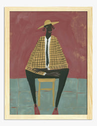
The Modern Muse Art Print
Sale price From £11.95£19.95 -

It Comes and Goes in Waves Art Print
Sale price From £11.95£19.95 -

Folk Bird Totem in Blue and Pink Art Print
Sale price From £11.95£19.95 -

Folk Modern Face with Leaves and Bird Art Print
Sale price From £11.95£19.95 -

Soft Shapes, Quiet Landscape Art Print
Sale price From £11.95£19.95 -

Colour Flow Abstraction (1962) Art Print
Sale price From £11.95£19.95 -

Disco Orange Ball Art Print
Sale price From £11.95£19.95 -

Colour Block Face Art Print
Sale price From £11.95£19.95 -

Quiet Curve in Green and Teal Art Print
Sale price From £11.95£19.95 -
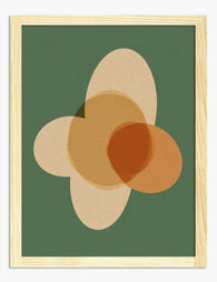
Earthy Overlap Shapes Art Print
Sale price From £11.95£19.95 -

Fresh Finds, Everyday Joy Art Print
Sale price From £11.95£19.95 -

Modern Muse Portrait Art Print
Sale price From £11.95£19.95 -

Modern Balance Shapes Art Print
Sale price From £11.95£19.95 -

Who We Have In Our Life Quote Art Print
Sale price From £11.95£19.95 -

Modernist Living Colour Pop Room Art Print
Sale price From £11.95£19.95 -

Contemporary Dutch Faces by Leo Gestel Art Print
Sale price From £11.95£19.95


More from The Frame

Citrus Prints for Kitchen Walls: Where to Hang ...
Citrus art in kitchens has a bad reputation, and mostly it's deserved. Too many cartoon lemons, too many chalkboard-style oranges, too many prints that look lifted from a chain restaurant....

Why Does Water Lily Art Work in Every Room of Y...
Water lilies sit in a rare category of art: soft enough for a bedroom, structured enough for a hallway, humid-tolerant enough for a bathroom. This guide tells you exactly where...

Van Gogh Botanical Prints vs Traditional Botani...
Both traditions put plants on your wall, but they do wildly different things once they get there. Traditional botanical illustration is quiet, precise, and pattern-friendly. Van Gogh's flowers and gardens...