


 Order today for delivery by
Vintage or Modern Peony Prints? How to Choose the Right Style for Your Home
Three distinct peony art styles, three very different rooms. Here's how to match the right one to yours.


Peonies have been a muse for botanical artists for centuries, which means you can hang them in almost any interior and make it work. The trick is knowing which style of peony print belongs in which room. This guide breaks down the three dominant schools, the interiors they suit, and the quality details that make or break each one.
Three schools of peony art: vintage botanical, watercolour, and modern minimal
There are hundreds of peony prints out there, but almost all of them fall into one of three camps.
Vintage botanical prints are the illustrated, scientifically-accurate studies you'd find in a 19th century encyclopedia. Think dense detail, labelled stems, muted parchment backgrounds, and a palette that leans towards dusty rose, ochre, and sage green. They feel considered and collected.
Watercolour peonies are looser, softer, and more emotional. Pigment bleeds into pigment. Petals suggest themselves rather than announce themselves. The best examples have real texture, visible brush strokes, and the kind of pale wash backgrounds that make a bedroom feel calm.
Modern minimalist peonies strip the flower back to its essentials. A single bloom in flat colour. A line drawing on a cream background. A photographic close-up with heavy negative space. The palette is often restricted to two or three colours, and the composition does the heavy lifting.
Each style has its own technical demands when printed, which we'll come back to.
Vintage peony prints: where they work and the interiors they suit
Vintage botanical prints suit interiors with layers. Rooms that already contain older furniture, patterned textiles, warm metals, and a sense of accumulated taste. If your lounge has a Chesterfield, a Persian rug, and a bookcase full of hardbacks, vintage peonies will slot in without effort.
They also work beautifully in cottagecore and country interiors. Panelled walls, aged brass hardware, floral upholstery, Belfast sinks. The slightly faded quality of a good vintage print mirrors the slightly faded quality of lived-in rural rooms, and the two feed each other.
Where vintage prints struggle is in genuinely contemporary spaces with hard edges, cool greys, and chrome. The warmth of the parchment background can clash with cool paint, and the detail can feel fussy next to clean architecture. If your flat is all polished concrete and black kitchen cabinets, vintage probably isn't your route in.
Frame choice matters enormously here. A thin black modern frame undermines the whole mood. You want solid wood, ideally in a warm oak or walnut, or an antique gold if you're leaning more decorative. A generous mat border adds to the museum-study feel. Browse the full vintage art prints collection to see how framing shifts the character.
Size and placement for vintage
Vintage botanicals look best in sets of two, three, or four. A single vintage peony print on a large wall can feel marooned. Hang a trio of 40x50cm prints above a sideboard, or four 30x40cm prints in a 2x2 grid above a bed. If you want a solo statement piece, go large: 70x100cm at minimum, framed, with real presence.
Watercolour peony prints: soft, expressive, and surprisingly versatile
Watercolour is the diplomat of the three styles. It gets on with almost everyone. The soft edges and gentle palette mean it doesn't fight with existing art, patterns, or furniture, which is why it's the most forgiving choice if you're not sure what your interior "is" yet.
Bedrooms are the obvious home for watercolour peony prints. The quietness of the medium matches the function of the room. A single large watercolour peony above the headboard, in pale blush or soft coral, does more for a bedroom's atmosphere than almost any other piece of art you could choose.
They also work well in bathrooms, nurseries, and reading nooks. Any space where you want softness rather than statement. The one place to avoid them is a formal dining room or a dark masculine study, where their lightness can read as insubstantial.
What to look for in watercolour reproduction
Watercolour is the hardest of the three styles to print well. The whole point of the medium is subtle gradations and visible paper texture, and cheap printing flattens both. You want giclée printing on thick matte paper, which holds the softness of the wash without going glossy or losing the pale tones at the edges.
Canvas can also work beautifully for watercolour peonies. The slight weave of poly-cotton canvas picks up the painterly quality and gives the image a tactile depth that paper can't quite replicate. If you're going large (90x120cm or above), a hand-stretched canvas often feels more appropriate than a framed print.
Frame choice for watercolour
Keep it quiet. A natural oak frame with a wide white mat is almost always the right answer. Black can work if the rest of your room is monochromatic, but gold tends to compete with the softness of the artwork. Many people hang watercolour prints unframed on canvas for exactly this reason, letting the image breathe without any border at all.
Modern and minimalist peony artwork: clean lines for contemporary spaces
Modern peony prints are what you want when your interior has restraint. Scandi apartments, Japandi kitchens, minimalist new-builds, and anywhere the walls are mostly white and the furniture is mostly linear. A single-line drawing of a peony on a cream background, or a flat-colour illustration with heavy negative space, extends the architectural logic rather than fighting it.
The best modern peony prints use composition as the main tool. A bloom placed off-centre. A stem cropped at the edge of the frame. A photograph taken so close that only two petals fill the image. These compositional choices give the print graphic weight without requiring colour or detail to do the work.
Modern prints are also the easiest to scale up. Because the composition is simple, large sizes don't become overwhelming. A 100x150cm canvas of a single pale pink peony on cream can anchor an entire living room without crowding anything else.
Where modern struggles
Modern peonies can feel cold in warm, layered rooms. If your interior has rugs, cushions, patterned curtains, and multiple throws, a minimalist line drawing can look like it wandered in from a different flat. In that scenario, watercolour will serve you better.
Frame choice for modern
A thin black metal or black-stained wood frame, no mat, print pushed right to the edge of the glazing. Or no frame at all, with the image stretched on canvas for a floating, gallery-wall effect. Thick ornate frames completely undo the point of a minimalist image.
Why print quality matters more with florals (and what to look for)
Florals are unforgiving. Faces and landscapes have the advantage of being familiar, so your eye forgives small inaccuracies. Flowers are more abstract to the brain, so when the colour is off or the detail is mushy, you notice immediately.
Each of the three styles has its own technical requirements.
Vintage botanical prints live or die by sharp detail. The whole appeal is the illustrator's precision: fine linework, labelled anatomy, delicate stippling. Any softness in the printing kills it. You need high-resolution giclée printing on thick matte paper that holds fine lines without bleed. Thin paper or inkjet reproduction will make a vintage print look like a photocopy of a photocopy.
Watercolour prints need the opposite virtue. You're reproducing subtle washes and the faint texture of watercolour paper, and poor printing either flattens the gradations into visible banding or shifts the pale colours into something muddier. Giclée on thick matte paper handles this well because the matte surface doesn't throw glare across the softest tones.
Modern minimalist prints seem easy to reproduce because the images are simple. In practice, they're the most ruthless of the three. Any speck of dust, any colour inaccuracy, any uneven ink coverage is visible across the vast expanse of flat background. For modern prints, consistent ink coverage and accurate colour calibration matter more than resolution.
Across all three, the thing that ruins most florals is poor framing. Prints shipped separately from frames tend to arrive misaligned, warped, or bubbling behind the glazing. Prints should arrive properly fitted inside the frame, with UV-protective glazing that prevents the pale pinks and sages fading in a sunny room. If your print lives on a wall that gets direct afternoon sun, this isn't optional.
Mixing styles: can you combine vintage and modern peony prints on one wall?
Yes, but there are rules.
The successful version of this is almost always a gallery wall where peonies are the connective thread but the styles vary. A vintage botanical peony print next to a minimalist line drawing next to a watercolour wash can look brilliant, because the subject matter unifies them and the stylistic variation keeps the wall interesting.
What doesn't work is a symmetrical pairing: a vintage print on the left of a sofa and a modern print on the right. That reads as a mistake rather than a choice. The asymmetry of a proper gallery wall gives you permission to mix. The symmetry of a pair demands they match.
If you're going to mix, use frame choice to pull everything together. Even if the artwork is wildly different, a shared frame colour (all black, or all natural oak) makes the arrangement feel curated rather than chaotic. Alternatively, use the same mat border across all pieces.
The one combination to avoid is vintage and modern of equal size, hung next to each other with no third element. The eye wants either a clear hierarchy or a clear collection. Two prints of equal weight in opposing styles just argue.
Our recommendations: which style for which room
Here's where we take a position.
Bedrooms: watercolour, every time. A single large watercolour peony above the headboard, 70x100cm framed in oak with a white mat, or 100x150cm as an unframed canvas. Soft palette, soft medium, soft room.
Living rooms: depends on the room. Period property or layered interior, vintage botanical in a set of three or four, framed in warm wood. Contemporary flat, a single large modern peony in cream and pale pink, framed thinly in black or stretched on canvas.
Dining rooms: vintage botanical. The density of detail rewards closer inspection, which is exactly what people do when they sit at a dining table. Hang a trio at eye level above a sideboard.
Hallways and stairwells: modern or vintage depending on the architecture. For narrow hallways, a vertical set of three works brilliantly. Don't use watercolour here. Hallways are usually dim and the pale tones get lost.
Kitchens: modern minimalist. Kitchens have a lot of visual noise already (appliances, tiles, utensils), so a single clean line-drawing of a peony above a shelf gives the eye somewhere to rest.
Bathrooms: watercolour on canvas, which handles humidity better than framed paper prints. Keep it small, 30x40cm or 40x50cm, and position it well away from direct shower spray.
Nurseries and children's rooms: watercolour again, in the softest palette you can find. Pale blush, cream, dove grey.
The one thing that applies to every room is scale. Most people buy peony prints too small. If you're hanging above a sofa, the artwork should fill roughly two-thirds of the sofa's width. Above a bed, the same rule applies to the headboard. If you're torn between two sizes, go up. For more options across all three styles, the full botanical art prints collection is a good place to start narrowing down.
Pick the style that matches the room you actually have, not the room you wish you had. A watercolour peony won't rescue a cluttered lounge, and a vintage botanical won't warm up a minimalist flat. Match style to space, invest in a print that holds up to close inspection, and buy it a size bigger than feels safe.
Fab products featured in this blog
-

Peony Floral Collection Art Print
Sale price From £11.95£19.95 -

Peony Garden by Claude Monet Art Print
Sale price From £11.95£19.95 -

Peony Reverie Bouquet Art Print
Sale price From £11.95£19.95 -

Vintage Ivory Peonies Art Print
Sale price From £11.95£19.95 -

Bright Pink Peonies in Bloom Art Print
Sale price From £11.95£19.95 -

Peony Floral Collection Canvas Print
Sale price From £49.95£74.95 -

Artful Nature Peonies by William Morris Art Print
Sale price From £11.95£19.95 -

Bright Pink Peonies in Bloom Art Print
Sale price From £11.95£19.95 -
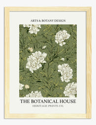
The Botanical House — Heritage Peonies Art Print
Sale price From £11.95£19.95 -

William Morris Peony Exhibition Poster Art Print
Sale price From £11.95£19.95 -

Peony Garden by Claude Monet Canvas Print
Sale price From £49.95£74.95 -

Tree Peony by Bijutsu Sekai Art Print
Sale price From £11.95£19.95 -

Vintage Bee and Blooms Art Print
Sale price From £11.95£19.95 -

Peony Reverie Bouquet Canvas Print
Sale price From £49.95£74.95 -

Peonies on Blue Art Print
Sale price From £11.95£19.95 -

Artful Nature Peonies, Morris-Inspired Canvas Print
Sale price From £49.95£74.95 -

Artful Nature Peonies, Morris-Inspired Art Print
Sale price From £11.95£19.95 -

Bright Pink Peonies in Bloom Art Print
Sale price From £11.95£19.95 -

Vintage Ivory Peonies Art Print
Sale price From £11.95£19.95 -

Peony in Bloom Art Print
Sale price From £19.95£34.95


More from The Frame

Transform Your Bedroom with Botanical Art: A Cu...
Botanical prints are the easiest art to buy and the hardest to style. One print looks considered; four looks like a garden centre gift shop. This guide is about restraint:...

Why Botanical Art Works Better in Small Living ...
Botanical art does something strange to small rooms: it softens them without crowding them. In large rooms, it often gets lost, floating on a wall that needs more weight. This...

Blending Vintage and Modern Décor? Start With Y...
Your furniture is already a mix. A mid-century sideboard here, a modern bouclé chair there, maybe your grandmother's wingback holding court in the corner. The walls are where you make...