


 Order today for delivery by
 Why Food Lover Wall Art Works Best When It Doesn't Match Your Plates
The designer's framework for gallery walls that feel curated and grown-up, not like a themed café.


A wall full of croissants, espresso cups and vintage pasta posters doesn't look like a gallery. It looks like a menu. The trick to displaying food art well is treating it the same way you'd treat any other still life: as one strong voice in a wider conversation.
This guide gives you a paint-by-numbers approach to building food-themed gallery walls that feel collected, intentional and grown-up. Layouts, ratios, frame rules, the lot.
The golden rule: food prints as anchors, not the entire wall
Aim for a 1:2 ratio. For every food print on the wall, you want roughly two non-food pieces that share a visual language with it. So a five-piece wall might be one or two strong food prints plus three or four complementary subjects.
This is the single most important rule, and it's the one almost every food-themed wall breaks. The moment you go above 50% food, the wall stops reading as art and starts reading as theme. Restaurants do that on purpose. You probably don't want to.
The food prints become anchors: the loudest pieces, the ones that draw the eye first. Everything else exists to give them context, breathing room and a sense that someone with taste assembled this over time.

Choosing your anchor pieces: still life, photography, or illustration
Your anchor sets the entire mood, so pick a lane before you buy anything else.
Painterly still life
Think oils, gouache, soft brushwork, fruit in bowls, bread on linen. This is the most timeless option and the easiest to mix with other subjects because it already feels like fine art. Best for dining rooms and hallways where you want the space to feel considered rather than playful.
Food photography
Sharp, modern, often high-contrast. A close-up of a halved pomegranate or a moody shot of olive oil pouring onto a plate. Photography reads as crisp and contemporary, but it's harder to mix because it can make adjacent illustrations look fussy. Pair photography with other photography, or with very minimal line work.
Illustration and graphic prints
Vintage market posters, line-drawn lemons, retro coffee branding. Charming, but the trap is volume: three or more illustrated food prints together start to feel like a gift shop. Use illustration sparingly, ideally as a single accent within a wall built mostly of still life or photography.
If you're not sure where to start, painterly still life is the most forgiving anchor. Browse our still life prints to get a feel for the difference between an anchor that pulls a wall together and one that sits flat.
Complementary subjects that pair beautifully with food art
This is the part competitors miss entirely. Food art rarely works on its own. It needs companions that share a tone or palette without repeating the subject. Some pairings that consistently work:
- Fruit still lifes + botanical line drawings. The botanicals echo the organic shapes of the fruit without competing for attention.
- Coffee photography + vintage travel prints from coffee-growing regions like Ethiopia, Colombia or Italy. The implied story does the heavy lifting.
- Wine and cheese still lifes + abstract neutrals in cream, ochre and burnt umber. The abstracts give the wall somewhere quiet to rest.
- Bread and pastry illustrations + architectural sketches of European bakeries, markets or cafés.
- Citrus prints + Mediterranean landscape photography. Lemon yellows pull beautifully against blue skies and white plaster.
- Herb prints + minimalist typography in muted tones, single words in serif fonts.
The thread running through all of these: shared palette, shared era, or shared place. You're not matching subjects, you're matching atmosphere. Our botanical art prints are the most reliable supporting cast for almost any food anchor.
Three gallery wall layouts for dining rooms, kitchens, and hallways
Pick the layout that fits your wall, then plug in your anchor and supporting prints using the 1:2 ratio above.
Layout 1: The dining room six-piece grid
Best above a sideboard or long dining table. Total wall span: roughly 180cm wide by 100cm tall.
- Two 50x70cm pieces on the top row, side by side, with a 30x40cm piece between them
- Three 30x40cm pieces on the bottom row, evenly spaced
- 5cm gap between all frames
- One large food still life as anchor (top left or top right), one smaller food piece on the bottom row, four complementary prints
Hang the centre of the arrangement 145 to 155cm from the floor, or roughly 20 to 25cm above the sideboard.
Layout 2: The kitchen vertical stack
Best for a narrow wall between cabinets and a window, or beside a doorway. Total wall span: roughly 50cm wide by 180cm tall.
- Three 40x50cm prints stacked vertically with 5cm between them
- Top print: anchor food piece
- Middle: botanical or abstract neutral
- Bottom: smaller food accent or typography
This is the lowest-commitment way to introduce food art to a kitchen without it dominating. Skip this layout if you have open shelving nearby, the visual noise will compete.
Layout 3: The hallway salon wall
Best for long hallways or stairwells where you want a slow reveal as someone walks past. Total wall span: roughly 220cm wide by 130cm tall.
- One 70x100cm anchor (large still life) positioned slightly left of centre
- Five to seven smaller pieces ranging from 30x40cm to 50x70cm arranged around it
- Mix orientations: portrait, landscape, square
- Keep 5 to 7cm spacing throughout
Salon walls are forgiving because they're meant to feel collected. This is where you can break the grid, but keep the frame rule (next section) absolutely consistent or it falls apart.

Frame consistency: the single decision that holds everything together
If you remember nothing else from this article, remember this: identical framing is what turns a random collection into a gallery wall.
Same frame colour. Same frame profile (the thickness and style of the moulding). Same mount style (either all with mounts or all without). When the frames match, the eye reads the wall as one composition and forgives almost anything you do with the prints inside. When they don't, no amount of clever curation will save it.
The three frame finishes that work hardest for food-themed walls:
- Black solid wood. Sharp, modern, makes colour pop. Best for photography-led walls.
- Natural oak. Warm, organic, makes still life feel softer. Best for painterly anchors.
- White solid wood. Quiet, gallery-like. Best for very colourful prints where you want the art to do all the talking.
Avoid mixing finishes within one wall. You can mix sizes, orientations and subjects freely, but the frames are non-negotiable. Our framed prints arrive ready to hang with the print already fitted properly inside the frame, which matters because the most common gallery wall failure is frames and prints arriving separately, then warping or sitting unevenly once you assemble them yourself.
How many prints you actually need (fewer than you think)
People consistently buy too many prints and end up with walls that feel cluttered. Here are the actual numbers:
- Small wall (under 120cm wide): 3 prints
- Medium wall (120 to 200cm wide): 5 to 6 prints
- Large wall (200 to 280cm wide): 6 to 8 prints
- Statement wall (over 280cm wide): 8 to 12 prints maximum
Notice the ceiling. Above twelve, the wall starts to look busy regardless of how good the curation is. If you have a huge wall, consider going bigger with fewer pieces rather than smaller with more. A single 100x150cm canvas anchor with three 50x70cm framed prints often beats a fifteen-piece grid.
If you're new to gallery walls, start with three. A trio of well-chosen pieces almost always looks more sophisticated than nine pieces you're not sure about. Pre-curated wall art sets take the guesswork out of this if you'd rather skip the trial and error.
Spacing, height, and alignment: a quick-reference cheat sheet
Most gallery wall mistakes are spacing mistakes, not curation mistakes.
Frame-to-frame spacing: 5 to 7cm between frames is the sweet spot. Less than 4cm feels cramped. More than 10cm and the wall reads as separate pieces rather than one composition.
Centre height: The vertical centre of your gallery wall should sit at 145 to 155cm from the floor. This is gallery standard and it works because it puts the visual centre at average eye level for someone standing.
Above furniture: Leave 15 to 25cm between the top of a sofa, sideboard or console and the bottom of the lowest frame. Closer than 15cm feels like the art is sitting on the furniture. Further than 25cm and it floats untethered.
Above a dining table: The bottom of the lowest frame should sit 25 to 30cm above the tabletop. Slightly higher than over a sideboard because dining chairs and people's heads need clearance.
The paper template trick: Cut newspaper or kraft paper to the exact size of each framed print. Tape them to the wall with masking tape. Move them around for a day or two before you commit. This is the single best way to avoid hole-filler regret, and yes, it's worth the faff.
Lay it out on the floor first. Arrange the actual frames on the floor in front of the wall before any hammering. Photograph the layout from directly above, then use that photo as your reference.

Common mistakes that make food walls fail
Quick hit list of things to avoid:
- All the same size. A grid of nine identical 30x40cm prints feels like a stock-photo display. Mix at least two sizes.
- Too much typography. One word-based print per wall is plenty. Three turns it into a Pinterest board.
- Clashing colour temperatures. Warm-toned food prints (golds, terracottas, ochres) fight with cool-toned complementary pieces (greys, icy blues). Pick a temperature and stick to it across all the prints, food and non-food alike. Hold the prints next to each other in daylight before you buy.
- Too literal. Don't put a coffee print above the coffee machine and a wine print above the wine fridge. Let the art breathe somewhere unexpected.
- Matching the plates. Cobalt-rimmed dinnerware does not need a cobalt food print above it. The wall should complement the room, not echo it.
Our favourite food print combinations right now
Some specific pairings worth stealing, all built on the 1:2 ratio:
The Tuscan kitchen wall. One large painterly still life of lemons and olives, two botanical line drawings of olive branches, two small architectural sketches of stone farmhouses. Natural oak frames throughout.
The modern coffee corner. One moody black-and-white photograph of an espresso pull, two abstract neutrals in cream and burnt umber, one minimalist typography print of a single Italian word. Black solid wood frames.
The dinner party dining room. Two painterly fruit still lifes (pears in one, figs in the other), three botanical prints of culinary herbs (rosemary, thyme, sage), one small landscape of vineyards. Natural oak frames.
The Sunday brunch hallway. One large still life of bread and butter, two soft botanicals of wheat and barley, one abstract in oat tones, one vintage market sketch. White solid wood frames.
If you're buying for someone else, our gifts for food lovers edit pulls together pieces designed to anchor exactly these kinds of walls without veering into novelty.

Where to start
Buy your anchor first. Live with it on the wall for a week before you order anything else. The right supporting prints will become obvious once you've seen what the anchor actually does to the room in morning light, evening light, and with the lamps on. Build outwards from there, slowly, and resist the urge to fill every gap on the first weekend.

Fab products featured in this blog
-

Steak, Eggs and Red Wine Feast Art Print
Sale price From £11.95£19.95 -
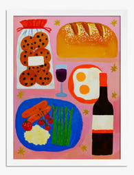
Supper Spread on Pink Art Print
Sale price From £11.95£19.95 -

Whimsical Kitchen Essentials Art Print
Sale price From £11.95£19.95 -

Supper Spread on Pink Canvas Print
Sale price From £49.95£74.95 -

Pasta or Nada Art Print
Sale price From £11.95£19.95 -

Whimsical Kitchen Essentials Canvas Print
Sale price From £49.95£74.95 -

Whimsical Kitchen Essentials Canvas Print
Sale price From £49.95£74.95 -

Supper and Stars Canvas Print
Sale price From £49.95£74.95 -

Botanic Garden, Rio de Janeiro Art Print
Sale price From £11.95£19.95 -

Say Yes to Pasta Art Print
Sale price From £11.95£19.95 -

Hot Girls Eat Pasta Art Print
Sale price From £11.95£19.95 -

Shinjuku Gyoen Garden, Tokyo Art Print
Sale price From £11.95£19.95 -

Italian Kitchen Doodles Art Print
Sale price From £11.95£19.95 -

Whimsical Kitchen Essentials Art Print
Sale price From £11.95£19.95 -

Blue Kitchen Sketches Canvas Print
Sale price From £49.95£74.95 -
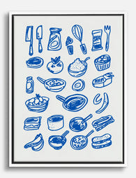
Playful Kitchen Sketches Canvas Print
Sale price From £49.95£74.95 -

Playful Kitchen Sketches Art Print
Sale price From £11.95£19.95 -

Good Food, Good Mood Canvas Print
Sale price From £49.95£74.95 -

The Kitchen Objects Exhibition Print Canvas Print
Sale price From £49.95£74.95


More from The Frame

The Best Art for an Entryway: What to Hang, Whe...
Your entryway is the first thing you see when you come home and the first thing guests see when they arrive. It's also, for most people, the last wall in...

Beatrix Potter Prints Beyond the Nursery: 5 Roo...
Beatrix Potter was a trained mycologist whose scientific fungi illustrations are held in the Armitt Museum, and whose original watercolours sell for six-figure sums at auction. Treating her work as...

You're Overthinking Parrot Wall Decor: A Style-...
Parrots have a reputation problem. Most people assume a parrot print means committing to banana leaves, rattan furniture and a full tropical fantasy. That's a shame, because parrot art is...