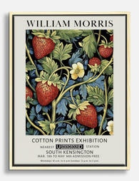
Strawberry Thief: The Story Behind William Morris's Most Loved Design (and How to Hang It)
The garden thieves that became a textile revolution, and how to actually live with the design today.

Of all the patterns William Morris designed across his career, Strawberry Thief is the one that has refused to age. It started as a domestic annoyance in a Cotswolds garden and ended up as one of the most technically ambitious textiles ever printed in Britain. Here's the full story, and what to actually do if you want to put it on your wall.
The real story: thrushes stealing strawberries at Kelmscott Manor
Morris designed Strawberry Thief in 1883 at Kelmscott Manor, his country house on the upper Thames. The garden there had a kitchen plot full of soft fruit, and every summer the song thrushes worked their way through the strawberries before the household could.
The gardener wanted to net the beds or scare the birds off. Morris, by every account from his daughter May, refused. She later recalled her father's instruction that no bird in the garden was to be touched, and that he found the thieving thrushes more delightful than infuriating. Where most people saw vermin, Morris saw a pattern.
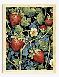
You can still feel that affection in the design. The thrushes are not stylised into abstraction, they're observed. Two birds face each other across a strawberry, beaks closing around the fruit, surrounded by a dense lattice of leaves and flowers. It is a portrait of a small crime, drawn by someone who clearly took the thieves' side.

Why Strawberry Thief was a technical breakthrough in textile printing
The pattern itself was finished quickly. The printing was the hard part, and it took Morris nearly seven years to solve.
Morris had been obsessed since the mid-1870s with reviving indigo discharge printing, an old technique that had largely been abandoned in favour of cheaper synthetic processes. The idea is counterintuitive. Instead of printing colour onto white cloth, you dye the entire cloth deep indigo first, then use a bleaching paste to "discharge" the dye in specific areas, leaving white shapes. Those white shapes are then overprinted with other colours.
For Strawberry Thief, Morris wanted four colours sitting cleanly on an indigo ground: red strawberries, yellow accents, and two tones of green for the foliage. To achieve this on a single piece of cotton required dyeing the cloth in indigo, discharging the pattern with a precise paste, then overdyeing with madder for the reds and weld for the yellows. Each stage took days. The cloth had to be washed, dried, and re-registered between each pass, and any error meant starting again.
His first attempts in 1875 failed. By 1881, working with the Merton Abbey print works, he finally got it right. The result was the most expensive printed cotton Morris & Co. had ever sold, and it sold out anyway. Customers queued for it. Morris, who often complained about making things only the rich could afford, had this time produced something whose cost was a direct consequence of the craft, not the marketing.
That commitment to the slow way of doing things is part of why the design still feels alive on the page. The original was never flat. It had depth because every colour had been worked into the cloth in sequence.
Original vs. modern colourways: indigo, charcoal, and slate
The original Strawberry Thief is indigo and cream with red, yellow and green accents. That deep blue ground is the version most people picture, and it remains the most faithful to Morris's intent. Modern reproductions have introduced a handful of alternative colourways, and each suits a different kind of room.
Indigo (the original). Rich navy blue ground with cream, red and ochre. This is the warmest and most traditional version. It works beautifully in rooms with wood furniture, painted panelling, deep wall colours, or anywhere with a slightly Victorian or cottage sensibility.
Charcoal. A near-black ground with the same botanical detailing. More graphic, more contemporary, and a good choice for modern interiors where indigo would feel too period. Charcoal also reads as a neutral, so it sits comfortably on a gallery wall with photography or contemporary art.
Slate. A muted grey-blue, much softer than indigo, with the colour palette dialled down. This is the version for calmer rooms, pale schemes, bedrooms, anywhere you want the pattern present but not loud.
Crimson. Less common, but produced as a Morris & Co. variation. A deep red ground with cream birds and dark foliage. Confident, slightly maximalist, and excellent in dining rooms.
If you're choosing in the abstract and not sure which suits your space, the indigo is the safest bet. It is the version Morris signed off on, and it has a hundred and forty years of evidence behind it.
What makes Strawberry Thief so endlessly popular as wall art
Plenty of Morris designs are beautiful. Strawberry Thief is the one that has translated most successfully from textile to wall, and the reasons are worth understanding before you buy.
The first is its structure. Strawberry Thief uses a "turnover" repeat, meaning each motif mirrors itself across a vertical axis. That symmetry gives it visual stability, which is why it works framed, even at small sizes, where less structured patterns can look like a random crop. You can hang a 40x50cm Strawberry Thief on a narrow wall and it still feels composed.
The second is the narrative. There is something happening in the image. Birds, fruit, theft. Guests will lean in to look, and the closer they look, the more they find. This is rare in decorative pattern, which is usually designed to be seen at a glance.
The third is its versatility. The botanical density makes it feel cottage-appropriate, but the disciplined symmetry keeps it from tipping into twee. You can hang it in a panelled Victorian sitting room or a white-walled new-build flat, and it adapts. It belongs to neither era exclusively.
You'll find Strawberry Thief alongside other William Morris animal prints like Bird and Anemone or Peacock and Dragon, but it remains the one most people reach for first.

Best sizes for Strawberry Thief prints in different rooms
This is where most guides give up and tell you "it depends on personal taste." It doesn't, really. Pattern density dictates scale, and Strawberry Thief is a dense pattern that needs room to breathe.
Hallway or entrance. 30x40cm or 40x50cm. A smaller scale works because hallways are seen at close range and you want the detail readable. Hang at eye level, around 145cm from the floor to centre.
Bedroom side wall or above a bedside table. 40x50cm or 50x70cm. Either size sits comfortably above a standard bedside without dominating. Go for slate or indigo here. Charcoal can feel heavy in a sleeping space.
Bedroom above the bed. 70x100cm in portrait orientation, or 60x80cm if your headboard is narrower. The pattern's symmetry makes it ideal for centring above a bed.
Living room as a focal point. 70x100cm at minimum if it's hanging alone above a sofa or fireplace. Anything smaller will look like a postage stamp on a feature wall. If you have the space, this is the design that earns the larger format.
Living room as part of a gallery wall. 40x50cm or 50x70cm, paired with two or three other Morris prints at similar scale. More on this below.
Dining room. 60x80cm or larger, hung centrally on the longest unbroken wall. Crimson or indigo work especially well here.
Kitchen. 30x40cm or 40x50cm, ideally framed and glazed. Kitchens get steam and grease, and a framed print under acrylic is far easier to wipe down than canvas.
A common mistake is buying too small. Strawberry Thief loses its impact below A3 size in a large room. If you're torn between two sizes, go up.
Framed or canvas: which works better for this design
Strawberry Thief lives or dies on detail. The thrushes' feathers, the veining on the strawberry leaves, the fine cross-hatching in the foliage. All of this is what makes the design feel handmade rather than printed, and the format you choose determines how much of that detail survives.
Framed prints are the better choice for most rooms. A giclée print on thick matte paper holds the fine line work without any softening, and the UV-protective acrylic glaze means colours stay true even in a sunny room. A framed Strawberry Thief in solid wood looks like something you'd find in a serious print collection, and the symmetry of the design pairs naturally with a clean rectangular frame. A william morris strawberry thief framed print in oak or black at 50x70cm is probably the single most reliable choice for a first Morris purchase.
Canvas prints make sense at larger sizes, particularly above 80cm on the longest edge, where you want a softer, more textile-like presence. The poly-cotton canvas surface picks up the botanical density nicely, and the mirrored edge wrap means the birds and strawberries aren't cropped. Canvas is also lighter than a framed print of the same size, which matters if you're hanging on plasterboard or in a rented flat.
Where canvas is less ideal: small sizes. Below 50x70cm, canvas can muddy the fine detail that makes Strawberry Thief worth hanging in the first place. Stick to framed at smaller scales.
A note on the framing pitfalls people run into elsewhere. Cheaply made prints often arrive with the print and frame shipped separately, asking you to fit it yourself, which is where warping and bubbling start. A properly fitted frame, assembled and glazed before it leaves the workshop, is the difference between something that looks museum-grade and something that looks like a kit.

Pairing Strawberry Thief with other Morris prints on the same wall
Strawberry Thief is a strong centrepiece, which means anything you pair it with needs to either complement its colour palette or deliberately quiet down beside it.
The classic Morris pairings are the other bird art prints from his catalogue. Bird and Anemone has a similar density and palette, and works as a partner at the same scale. Peacock and Dragon is more theatrical and tends to dominate, so use it as the larger anchor with Strawberry Thief as a smaller satellite. Strawberry Thief and Bird (the doublecloth design) make a particularly good pair because both feature confronted birds and share the same compositional logic.
For a three-print gallery wall, here is a layout that works:
- One large Strawberry Thief at 50x70cm in indigo, centred
- One smaller botanical to the left, 30x40cm, something like Pimpernel or Willow Bough
- One smaller bird design to the right, 30x40cm, in a complementary colourway
Keep the frames identical. Mixing frame styles with Morris designs almost always looks chaotic, because the patterns are already busy. Solid wood in oak, walnut or black across the whole wall lets the prints do the work.
If you want a quieter pairing, combine Strawberry Thief with Morris's floral art prints like Honeysuckle or Chrysanthemum. The flowers give the eye somewhere to rest between the denser bird patterns.
The mistake to avoid is pairing Strawberry Thief with non-Morris prints in radically different styles. Modern abstract work, photography, and Morris together tend to fight rather than converse. If you want a mixed gallery wall, build it around a single Strawberry Thief as the only patterned piece, with everything else in muted tones or simple line work.

A few last things worth knowing
Buy the largest size your wall will take without crowding the surrounding furniture. Strawberry Thief rewards scale.
Choose indigo if you're not sure. It is the version Morris approved, and it has aged better than any of the modern recolourings.
Frame it properly. The fine line work is the whole point of the design, and a print that arrives flat, glazed and fitted will outlast almost anything else you put on a wall.
And if you ever visit Kelmscott Manor in summer, watch the garden for thrushes. They are still there, still working through whatever is ripe.

Fab products featured in this blog
-

William Morris Strawberry Thief Art Print
Translation missing: en.products.product.sale_price From £11.95£19.95 -

William Morris, Original Strawberry Thief Art Print
Translation missing: en.products.product.sale_price From £11.95£19.95 -

William Morris Strawberry Thief Canvas Print
Translation missing: en.products.product.sale_price From £44.95£74.95 -

William Morris Strawberry Thief Bird Art Print
Translation missing: en.products.product.sale_price From £11.95£19.95 -

William Morris Strawberry Thief Canvas Print
Translation missing: en.products.product.sale_price From £44.95£74.95 -

William Morris Strawberry Thief Canvas Print
Translation missing: en.products.product.sale_price From £44.95£74.95 -

William Morris Strawberry Vintage Art Print
Translation missing: en.products.product.sale_price From £11.95£19.95 -

Morris Strawberry Bird Canvas Print
Translation missing: en.products.product.sale_price From £44.95£74.95 -
William Morris Strawberry Vintage Art Print
Translation missing: en.products.product.sale_price From £11.95£19.95 -

William Morris Strawberry Fields Art Print
Translation missing: en.products.product.sale_price From £11.95£19.95 -
William Morris Strawberry Botanicals Canvas Print
Translation missing: en.products.product.sale_price From £44.95£74.95 -

William Morris Strawberry Botanical Canvas Print
Translation missing: en.products.product.sale_price From £44.95£74.95 -

William Morris Strawberry Garden Canvas Print
Translation missing: en.products.product.sale_price From £44.95£74.95 -

William Morris Bird with Strawberries Art Print
Translation missing: en.products.product.sale_price From £11.95£19.95 -

Morris Bird & Berries Canvas Print
Translation missing: en.products.product.sale_price From £44.95£74.95 -

William Morris Bird & Berries Art Print
Translation missing: en.products.product.sale_price From £11.95£19.95 -

Morris Bird & Berry Art Print
Translation missing: en.products.product.sale_price From £11.95£19.95 -

Morris Botanical Birds Art Print
Translation missing: en.products.product.sale_price From £11.95£19.95 -

William Morris Botanical Bird Art Print
Translation missing: en.products.product.sale_price From £11.95£19.95 -

William Morris Fruit Pattern Art Print
Translation missing: en.products.product.sale_price From £11.95£19.95


More from The Frame

What Interior Designers Know About Styling Japa...
Japanese bird prints are quietly the most versatile art you can buy. They sit happily in a modernist flat, a Victorian terrace, or a beige rental, and they rarely fight...

Botanical Prints vs. Floral Art: What's the Dif...
If you've searched for "botanical art prints" and ended up scrolling through everything from Victorian fern studies to neon abstract peonies, you're not imagining the chaos. The two categories get...

Modern Floral Prints That Don't Look Dated: 7 S...
Floral prints have a reputation problem. Mention them to anyone under 40 and they picture chintz curtains, peach watercolour bouquets in oval frames, or those identical rose prints that haunted...