Solid wood. Professionally framed. Arrives ready to hang.
Make your print ready to hang.
Vase Art Prints
4.8
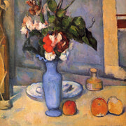
A vase can carry a whole picture on its own, the curve of the neck, the shadow it casts, the colour it lends a wall. Here you'll find bare ceramics in quiet line work, bold graphic shapes and looser painterly still life studies. If you'd rather have blooms in the frame, flowers in a vase prints and bouquet art take the same shape somewhere warmer.
I'm really happy with this print!.....it encapsulates the personality of one of my cats so perfectly! I'm also very happy with the frame, the workmanship is excellent. I will continue to shop Fab for the perfect wall statements.
Kitchens get the worst of it. They're the hardest-working room in the house and somehow end up with the least considered walls. A vase print fixes that faster than almost...
Vase prints are the most underrated anchor subject in wall art. The vertical shape gives a gallery wall a built-in compositional spine, and the painterly subject matter sits comfortably alongside...
A blank wall can be intimidating. You know you want art, but where do you even start? You scroll through endless options online, walk through galleries feeling lost, or stare...
Choosing a vase print: your questions

Short answers on framing choices, picking a size, hanging spots and what happens if it doesn't work
The best-known examples are Van Gogh's sunflower and iris studies, along with the lavish Dutch Golden Age bouquets of tulips, roses and peonies that made flowers-in-a-vase a genre of its own. Tulips in particular remain a favorite subject for contemporary still life prints. If you want a reproduction that reads as classic rather than trend-led, look for those familiar blooms in soft, painterly color.
What are the latest vase trends, and do vase prints follow them?
Vase design in 2026 leans toward biomorphic and sculptural silhouettes: rounded profiles, asymmetrical curves and organic contours that feel more expressive than symmetrical classical shapes. Wall art tends to echo that, with speckled ceramic forms, amphora outlines and dried-flower arrangements appearing across still life prints. Choosing a print with a soft, curved vase shape is an easy way to keep decor current without buying new ceramics.
What does vase art stand for?
Historically, vases and the scenes painted on them were one of the main ways decorative art was carried through everyday life, and painted flower-filled vases came to symbolize abundance, hospitality and the passing of time. In a modern interior that meaning is quieter: a vase print signals calm, domestic order and a bit of nature indoors, which is why it suits hallways, kitchens and bedrooms.
What is the 2/3 rule for sizing a vase print above furniture?
The 2/3 rule suggests your artwork spans roughly two-thirds the width of the furniture below it, whether that's one piece or a grouped arrangement. Vase prints are usually vertical, so a single one can look undersized above a wide sideboard or console. Either size up to a large print, or hang two or three vertical prints side by side until the group reaches about two-thirds of the furniture width.
Do vase art prints actually work in a kitchen?
They're one of the best choices you can make for a kitchen wall. A still life vase print brings colour and personality without competing with the visual chaos of open shelving and appliances. We'd suggest a single framed vase print (around 40x50cm) on the wall between upper cabinets, or a larger 50x70cm piece on a blank wall opposite your worktop. Our frames use UV-protective acrylic glazing, so even a sun-drenched kitchen window won't fade the print over time. Go for a ceramic vase illustration with warm tones if your kitchen has wood or neutral cabinetry.
How should I style vase wall art in a living room that feels unfinished?
If you've got a blank wall above your sofa that's making the whole room feel empty, a single large vase art print (60x80cm or 70x100cm framed) is the fastest way to fix it. The 2/3 rule is your friend here: the print should be roughly two-thirds the width of the sofa beneath it, so it feels proportional rather than lost. For a living room, we love botanical vase art in muted greens or earthy terracotta tones, which anchor a space without overwhelming it. Our framed prints arrive ready to hang with fixtures already attached, so you can go from delivery to "finished room" in about ten minutes.
What's the difference between minimalist vase prints and vintage vase wall art?
Minimalist vase art prints tend to feature clean lines, simple silhouettes, and a limited palette, often just one or two colours on a neutral background. They're perfect for modern or Scandi-inspired rooms where you want the art to feel calm rather than busy. Vintage vase wall art, on the other hand, draws from historical still life traditions with richer colour, decorative ceramic patterns, and more detail. If your room already has lots of texture (think linen cushions, rattan, patterned rugs), go minimalist. If your space is fairly plain, a vintage-style vase print adds warmth and character you can't get from a clean-lined piece.
Can I pair a vase print with real vases on a shelf or mantelpiece?
Absolutely, and honestly this is one of the most satisfying ways to decorate. Hang a flower vase print above a shelf or mantelpiece, then place one or two real vases below it. The trick is contrast: if your print features an ornate, colourful ceramic vase, keep the real ones simple and muted (plain white or terracotta). This creates a layered, curated look without the whole arrangement feeling like a ceramics museum. A 40x50cm or 50x70cm framed print sits perfectly above a standard mantelpiece.
What artwork subjects pair well with vase prints in a gallery wall?
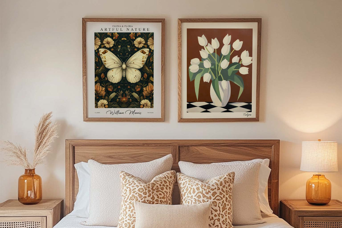
Vase art prints are incredibly versatile gallery wall anchors. They pair naturally with botanical prints, still life compositions, and abstract art in a similar colour family. For a cohesive gallery wall, we'd recommend mixing two or three vase illustration prints with a couple of floral close-ups and one abstract piece, keeping all frames in the same finish (our natural oak or black frames work brilliantly for this). Stick to odd numbers of prints and keep spacing consistent at around 5cm between frames. This gives you a collected, intentional look rather than a random jumble.
Choosing a selection results in a full page refresh.