


 Order today for delivery by
 Botanical Prints in the Bathroom: What Actually Works (and What Doesn't)
Everything you need to know about choosing, sizing, and hanging botanical art in bathrooms without the moisture panic.


Bathrooms are the most overlooked room for art, and botanicals are the most forgiving subject you can hang in one. The combination of green leaves, soft florals, and tiled surfaces is close to foolproof if you get the practical details right. This guide covers the details most articles skip: humidity, sizing by bathroom type, placement distances from the shower, and which frames actually suit which tiles.
Why botanical prints and bathrooms are a natural pairing
Botanical art works in bathrooms because it echoes what the room already does well. Bathrooms are the one space in the house dedicated to water, steam, and freshness, and botanical imagery doubles down on that sensory logic. A fern print above the bath feels like it belongs in a way that an abstract or portrait rarely does.
There is also a practical reason. Bathrooms tend to have cool palettes (white tiles, chrome, pale stone, grey grout), which means they can feel clinical. Botanicals bring in the green, cream and ochre tones that break up all that hard surface without clashing with it. Botanical art prints are also one of the few subjects that look equally at home in a Victorian terrace cloakroom and a minimalist new build en-suite.
The last reason is scale flexibility. Botanical compositions work at any size, from a tiny A5 pressed-leaf study beside a mirror to a 100x70cm palm print opposite the bath. Few other subjects stretch that comfortably across formats.

Bold leaves vs soft florals: which botanical style suits your bathroom
The decision between bold foliage (monstera, banana leaf, palm, fern) and soft florals (pressed flowers, watercolour wildflowers, vintage plates) is not just taste. It changes how big the room feels and how the light reads.
Choose bold leaves if
Your bathroom is small, low-light, or lacking in architectural interest. Large-scale leaf prints with high contrast draw the eye to a single focal point, which makes a small room feel more intentional rather than cramped. A single 50x70cm monstera print on a plain wall will do more for a windowless downstairs loo than three small prints ever will.
Bold leaves also hold up under harsh overhead lighting, which most bathrooms have. The strong shapes read clearly even when the lighting is flat and unflattering.
Choose soft florals if
Your bathroom has good natural light, period features, or an existing colour story you want to extend. Soft watercolour florals, vintage botanical plates, and pressed flower studies reward close viewing, which suits bathrooms where you spend time at the sink or in the bath. They layer beautifully in a gallery wall above a vanity.
The trade-off: delicate florals can get washed out under cool LED strip lighting. If your bathroom has 6000K spotlights, warmer-toned prints (cream backgrounds, ochre and dusty pink florals) will hold their colour better than cool-toned ones.
If you can't decide
Pick based on the biggest wall. A wall over 1.2m wide can carry bold leaves. Anything under that benefits from the finer detail of a floral or a tighter botanical study.
Size guide: small cloakrooms, family bathrooms, and en-suites
The single biggest sizing mistake in bathrooms is going too small. People instinctively pick A4 or A5 prints for bathrooms because the room is small, but a tiny print on a big tiled wall looks accidental.
Downstairs loos and cloakrooms (walls under 1.5m wide)
One print, framed, 30x40cm or 40x50cm. Hung as the single feature of the room, usually opposite the door so it is the first thing you see on entering. Avoid gallery walls here. The space is too tight to read multiple frames and the proportions never feel resolved.
Family bathrooms (walls 1.5m to 2.5m wide)
Go bigger than you think. A 50x70cm or 60x80cm framed print above the toilet or on the wall opposite the bath will anchor the room. If you want a pair, two 40x50cm prints spaced 5-8cm apart look balanced over a double vanity.
En-suites and larger bathrooms (walls over 2.5m wide)
This is where you can go large: 70x100cm framed, or a canvas up to 100x150cm if the room has the ceiling height. En-suites often feel like afterthoughts in a bedroom, and a properly scaled piece of art is what makes them feel like a designed room rather than a utility space.
Hanging height
Centre the print at eye level, which for most people means the centre of the image sits 145-150cm from the floor. In bathrooms with high splashbacks or wainscoting, hang 15-20cm above the top of the panelling, not from the floor.

Where to hang prints in a bathroom (and where not to)
The three best spots for botanical wall art in a bathroom are consistent across almost every layout.
Opposite the bath
The best spot in the house. You spend time looking at this wall, the light is usually good, and the wall is far enough from the shower to avoid direct spray. Centre a single large print here, or a tight pair.
Above the toilet
The classic for a reason. Hang 20-25cm above the cistern. A vertical (portrait) print works better than landscape because it echoes the proportions of the wall space.
Beside the mirror
Underrated. A narrow vertical print beside a round or oval mirror creates a vanity moment that feels considered. Keep it small (30x40cm or 40x50cm) and align the top of the frame with the top of the mirror.
Where not to hang prints
Avoid the wall directly inside the shower enclosure, obviously, but also avoid the wall within 60cm of the shower opening if you have an open walk-in shower. Spray carries further than you think.
Avoid the wall directly opposite a steamy mirror where condensation builds up (usually the wall facing the sink). And avoid hanging anything on the ceiling-adjacent zone above a bath without a shower screen, where splash can still travel upward.
If your bathroom has no window and no extractor fan, be more conservative with placement generally and treat every wall as a potential moisture zone.
Will humidity damage framed prints? What to look for
This is the question that stops most people from putting art in bathrooms at all. The honest answer: in a normally ventilated bathroom with an extractor fan or a window, properly made framed prints are fine. In a sealed, poorly ventilated bathroom with no airflow, they can warp over time. The variables that matter are ventilation, frame construction, and glazing material.
Ventilation is the single biggest factor
If your extractor fan runs during and after showers, or you open a window, humidity drops back to normal within 20-30 minutes. Prints only suffer damage from sustained high humidity, not short spikes.
Frame construction matters
Cheap framed prints fail in bathrooms because they are made from MDF or veneer, which swells when it absorbs moisture, warping the frame and buckling the print inside. Solid wood frames are far more stable. Our frames are solid FSC-certified wood with no MDF or veneers, which is the main reason they hold up in bathrooms where lesser frames don't.
Glazing: acrylic beats glass
Most framed prints use glass. In a bathroom, glass is a liability: it fogs easily, condensation runs down the inside, and if it breaks it is a hazard above a bath. Acrylic glazing is lighter, shatter-resistant, and (crucially) comes with UV protection that prevents fading in sunny bathrooms. Our framed prints use UV-protective acrylic as standard.
Canvas is the other good option
Canvas prints with a smooth matte finish, hand-stretched over a solid wood frame, cope with humidity well because there is no sealed glass surface for condensation to collect behind. If your bathroom is particularly steamy (small, no window, weak fan), a canvas is often the safer choice than a traditional framed print.
Signs of moisture damage to watch for
Slight bowing of the frame edges, dimpling or waviness in the paper, foxing (small brown spots), or condensation visible between the glazing and the print. If you spot any of these, move the print to a drier wall and improve ventilation.

Frame colours that work with tiles: a quick decision guide
Match the frame to the room's existing hard surfaces, not to the print.
White subway tiles
White frames or very pale natural oak. Black frames also work if you have black grout or black tapware, but avoid dark walnut or warm woods which fight the cool white.
Natural stone, travertine, or marble
Warm wood frames (oak, ash) are the obvious match. Black can look striking against pale travertine but feels heavy. Avoid cool-toned white frames which look dingy next to warm stone.
Dark tiles (navy, forest green, charcoal)
Black frames or deep walnut. Natural oak also works if the rest of the room has warm wood elements. White frames can work for high contrast but need to be clean matte white, not off-white.
Patterned or encaustic tiles
Keep the frame plain and quiet: thin black or natural oak. The tile is already doing the decorative work.
Pink, terracotta, or warm plaster walls
Warm wood or black. Avoid white frames which disappear against pale warm walls.
Three bathroom botanical schemes to steal
Three complete schemes that work. Steal any element.
1. The green cloakroom
Walls painted in a deep sage or forest green. A single 50x70cm framed botanical print in a black frame, hung opposite the door. Subject: a bold monstera or banana leaf on a cream background, which pops against the dark wall. Brass fixtures to tie in the warmth. Works in windowless downstairs loos where you want drama rather than brightness.
2. The light family bathroom
White subway tiles to half height, warm white walls above. Two 40x50cm framed botanical prints in natural oak, hung as a pair above the toilet with 5cm between them. Subject: a matching pair of pressed fern studies, or two watercolour wildflowers from the same series. Soft, calm, and family-friendly. Explore green art prints for pairs that work together.
3. The spa en-suite
Travertine or warm stone tiles, walk-in shower, freestanding bath. One large 70x100cm framed botanical print in a thin white or pale oak frame, hung on the wall opposite the bath. Subject: a large-scale single-leaf study (palm, elephant ear) or a vintage botanical plate blown up large. The oversized scale is what makes the room feel considered rather than catalogue.

A few final rules
Ventilation first. If your fan is weak or non-existent, upgrade it before you worry about the art.
Go bigger than you think. The most common bathroom art mistake is a print that's too small for its wall. If in doubt, size up one step.
Choose canvas for the steamiest rooms, framed with acrylic glazing for everywhere else. Both options in our bathroom wall art edit are made to handle normal bathroom conditions without warping or fading.
And trust the room. Botanicals and bathrooms belong together. Pick the print you actually like looking at, hang it at the right height, keep it out of the splash zone, and it will outlast the tiles.

Fab products featured in this blog
-

Plants in the Sink Bathroom Art Print
Sale price From £11.95£19.95 -

Botanical Bath Retreat Art Print
Sale price From £11.95£19.95 -

Blue Cyanotype Botanical Study Art Print
Sale price From £11.95£19.95 -

Plants in the Sink Bathroom Canvas Print
Sale price From £49.95£74.95 -

Everyday Bath Rituals Art Print
Sale price From £11.95£19.95 -
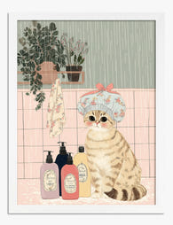
Cat in the Bath Ritual Art Print
Sale price From £11.95£19.95 -

Blue Cyanotype Botanical Study Canvas Print
Sale price From £49.95£74.95 -

Botanical Bath Retreat Canvas Print
Sale price From £49.95£74.95 -

Cat in the Bath Ritual Canvas Print
Sale price From £49.95£74.95 -

Everyday Bath Rituals Canvas Print
Sale price From £49.95£74.95 -
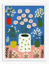
Cheerful Botanical Gathering Art Print
Sale price From £11.95£19.95 -
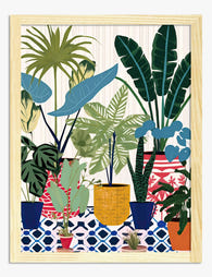
Lush Botanical Haven Art Print
Sale price From £11.95£19.95 -

Black Cat in the Bathroom Art Print
Sale price From £11.95£19.95 -
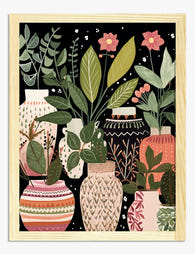
Boho Vases and House Plants Art Print
Sale price From £11.95£19.95 -

Soft Botanical Flow in Green Art Print
Sale price From £11.95£19.95 -

Diplodocus in the Bathtub Art Print
Sale price From £11.95£19.95 -

The Botanical House — Heritage Blooms Art Print
Sale price From £11.95£19.95 -

William Morris Studies in Botanical Ornament Art Print
Sale price From £11.95£19.95 -

Cheerful Botanical Gathering Canvas Print
Sale price From £49.95£74.95 -
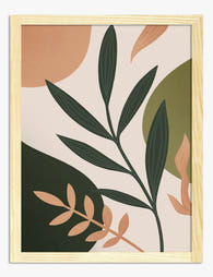
Modern Boho Botanicals Art Print
Sale price From £11.95£19.95


More from The Frame

What Colour Goes with Pink Wall Art? The Pairin...
Pink wall art has a reputation problem. People assume it's loud, girly, or stuck in a specific aesthetic, when in reality it's one of the most flexible colours you can...

Functional or Decorative? Choosing the Right 20...
A good wall calendar does two jobs. It tells you what day it is, and it earns its place on your wall for twelve months straight. Most calendars manage one...

The Best Art Prints for Every Room in Your Home...
Most room-by-room guides tell you to "choose what you love" and call it a day. That's not advice, that's a shrug. This guide gives you specific styles, subjects, sizes, and...