
 Order today for delivery by
 Japandi Bedroom Wall Art: How to Create a Space That Feels Like a Deep Breath
The technical guide to selecting, sizing and placing calm, considered art in the one room that demands the most restraint.


Bedrooms are the hardest room to decorate well because the goal isn't to impress anyone. It's to help you sleep, wake up gently, and spend quiet hours in a space that doesn't demand anything from you. Japandi, the meeting point of Japanese wabi-sabi and Scandinavian functionality, might be the most honest design language ever invented for a bedroom, and the art you hang has more to do with whether it works than almost any other decision.
Why bedrooms demand more restraint than any other room
A living room can absorb a bold print. A hallway can carry a saturated colour block. A bedroom cannot, because you're not decorating for guests, you're decorating for the version of yourself that closes the door at 11pm and doesn't want to be visually shouted at.
Japandi as a style is already restrained: natural materials, muted palettes, generous negative space, honest craftsmanship. In a bedroom, you have to pull that restraint further. Anything that reads as "busy" in a lounge will read as "loud" above a bed. Anything that reads as "graphic" in a hallway will read as "distracting" when you're trying to switch off.
The core rule: your bedroom art should be something you barely notice on a bad day, and something you're quietly grateful for on a good one. That's a high bar, and it rules out roughly 80% of what gets sold as Japandi wall art.

Subjects that soothe: botanical, abstract, and quiet landscape prints
Three categories reliably work in a Japandi bedroom. Everything else is a gamble.
Botanical prints
Single-stem studies, pressed leaves, ink-drawn grasses, ikebana-style arrangements against off-white backgrounds. The key word is single. One branch, one flower, one repeated shape. Dense floral compositions belong in kitchens and dining rooms, not above your pillow.
Look for prints where the plant is the entire subject and the background is almost nothing. Sumi-e ink work, botanical line drawings, and photographic studies of dried grasses all sit comfortably in this bracket. Our botanical print collection leans heavily into this quiet, single-subject approach for exactly this reason.
Abstract prints
Japandi abstract is not gestural, expressive, or high-contrast. It's tonal. Think soft blocks of colour, one shape resolving into another, brushwork that suggests a landscape without committing to one. The palette should stay within two or three closely related tones: sand and bone, oat and clay, mist and stone.
Avoid anything with black in it unless the black is a thin ink line. Solid black rectangles or heavy geometric shapes will pull your eye across the room every time you glance up. Browse abstract art prints with a specific filter in mind: does this look like weather, or does it look like a design?
Quiet landscapes
Fog on water, distant mountains, an empty horizon, snow on a field. The best Japandi landscapes are the ones where nothing is happening. No people, no buildings, no dramatic light. If the image would work as the last shot of a slow film, it will work above your bed.
What to actively avoid: high-contrast graphic prints, typography, faces, anything with more than three colours, retro patterns, and literal representational art (a detailed painting of a specific city, for instance). None of it is bad art. It just doesn't belong in a room designed for sleeping.
One print or two? Placement rules for above the bed
The single most useful sizing rule for art above a bed is the two-thirds rule: your art (or the combined width of multiple pieces including the gap between them) should be roughly two-thirds the width of your bed frame. For a standard UK double (135cm wide), that means art around 90cm wide. For a king (150cm), around 100cm.
Japandi bends this rule slightly. Because the style relies on negative space, you can go closer to half the bed width and it will still look intentional. What you cannot do is go smaller than half, or the print will look stranded.
The single-print approach
One larger piece, centred above the headboard, is the calmer choice. A 70x100cm framed print in portrait orientation, or a 100x70cm in landscape, hung so the bottom edge sits roughly 15 to 20cm above the top of your headboard. Any higher and it floats. Any lower and it crowds.
The diptych approach
Two prints work when your bed is against a wide wall and a single piece would look lonely, or when you want gentle symmetry. Use two identical sizes (50x70cm each is a reliable pairing), space them 5 to 10cm apart, and centre the pair over the bed. Two different sizes almost never work in a bedroom. Save that trick for the lounge.
The eye-level-when-lying-down rule
Most hanging guides tell you to hang art at 145 to 150cm from the floor to the centre of the piece. That's the museum standard, calibrated for a standing viewer. In a bedroom, you spend more time horizontal than vertical, so hang slightly lower than you would elsewhere. Aim for the bottom edge of the frame to sit 15 to 20cm above the headboard rather than obsessing over centre height. You'll thank yourself every morning.

Why matte paper and no-glare glazing are non-negotiable in a sleep space
Bedrooms have the most variable lighting of any room in the house. Morning sun rakes in low. Bedside lamps throw warm yellow pools. Overhead lights, if you use them, sit almost directly above the bed. Every one of those light sources will bounce off a glossy print or standard glass frame and turn your art into a mirror.
Matte paper solves half the problem. Museum-grade giclée printing on thick matte paper (which is what we use for all our art prints) absorbs light rather than reflecting it, so you see the print itself, not the light source. Colours look softer, blacks look richer, and nothing glares back at you when you switch on the lamp.
The other half is the glazing. Standard picture-frame glass is essentially a mirror in low light. UV-protective acrylic with a matte or anti-reflective finish (which is what ships on every framed print we make) removes the glare entirely, and as a bonus prevents fading from the morning sun that would otherwise wash out a print over years. Acrylic is also lighter and safer above a bed than glass, which matters more than most people admit.
If you take one technical decision seriously in a bedroom, make it this one. A beautiful print behind glossy glass in a sunny east-facing bedroom will disappoint you by month three.
Warm whites vs. cool whites: matching your art to your linen and walls
This is the single detail that separates a Japandi bedroom that works from one that feels vaguely off, and almost no one talks about it. White is not white. Everything you own has an undertone, and the undertones need to agree.
Warm-white bedrooms
If your walls are painted in something like Farrow & Ball's Wimborne White, School House White, or any off-white with a yellow, pink, or clay undertone, and your bed linen is oatmeal, ecru, natural flax, or warm cream, you're in a warm palette. Your art should follow: sand tones, terracotta, warm greys with brown in them, ink drawings on cream backgrounds, botanical prints with brown or ochre elements.
A cool-toned abstract with grey-blue undertones will fight this room. Even if the piece is beautiful, it will look imported from a different house.
Cool-white bedrooms
If your walls are a true white or something with a blue-grey undertone, and your linen leans toward optic white, pale grey, or soft blue, you're in a cool palette. Choose art with grey undertones, misty landscapes, silver-green botanicals, cool abstract washes, and ink work on bright white paper.
How to test
Hold a piece of your bed linen next to the print on screen before you buy. If they look like they could sit on the same shelf without anyone commenting, you're right. If one makes the other look slightly dirty or slightly blue, they're fighting.
Frame wood matters too
Oak reads warm and slightly yellow. Walnut reads warm and slightly red. Ash reads cool and neutral. Black reads as a graphic element regardless of undertone. Match your frame wood to the dominant wood in your bedroom (headboard, nightstand, wardrobe) and the whole room will feel considered. All our frames are solid FSC-certified wood, not veneer, so the tone is honest and consistent across the piece.

The nightstand area: an overlooked spot for a smaller Japandi print
Everyone hangs something above the bed. Almost nobody thinks about the wall above the nightstand, which is a shame because it's one of the most rewarding spots in the room.
A small vertical print (30x40cm is ideal, 21x30cm works if your nightstand is narrow) hung above the lamp gives you something quiet to look at when you're reading, and it fills what would otherwise be dead wall space next to the bed. Because it's small and off-centre from the main sightline, you can be slightly more expressive here. A single ink-drawn branch, a small abstract wash, a minimalist landscape.
Hang it so the bottom edge sits 20 to 30cm above the top of the lamp. If you have matching nightstands on both sides, you can hang matching prints, but two different (but tonally related) prints often look more considered and less catalogue-like.
This is also a good place to test whether you like a subject before committing to a larger piece above the bed. Buy the small version first. Live with it for a fortnight. If you find yourself looking at it fondly, size up.
Our favourite Japandi bedroom art picks at every size
A few reliable formats, sized to work in most UK bedrooms.
Small (21x30cm or 30x40cm)
Best for above a nightstand, or as part of a small gallery pairing on a narrow wall. Single-stem botanicals, small ink washes, or minimalist landscapes work here. A framed print at this size is light enough to hang on a single picture hook and gives you a low-commitment way to test a subject in the room.
Medium (50x70cm)
The workhorse size for Japandi bedrooms. Big enough to hold the wall above a single bed or as half of a diptych above a double or king. Portrait orientation almost always beats landscape in this size because it echoes the vertical proportions of a person standing beside the bed.
Large (70x100cm)
The single-piece answer for above a double, king, or super king. In Japandi, this is the size that lets you commit to real negative space around the print without it looking stranded. A soft abstract or a foggy landscape at this scale can define the entire room.
Extra large (canvas up to 100x150cm)
If your bed sits against a wide, tall wall (a loft conversion, a converted warehouse, a vaulted ceiling), a large canvas print in a mirrored-edge wrap is one of the calmest ways to fill it. Canvas has a softer, less formal presence than framed paper, which suits a bedroom where you want the art to recede rather than announce itself. It's also lighter than an equivalent framed piece, which matters when you're hanging something 150cm wide above a headboard.
Whatever size you land on, browse the full bedroom wall art edit with your linen swatch and a tape measure in hand. Both will save you more grief than any style advice.

The decision, in one sentence
Pick one quiet subject, size it to two-thirds the width of your bed or slightly under, match its undertone to your linen, hang it low enough to see from the pillow, and make sure the paper is matte and the glazing doesn't glare. Do that, and the room will do the rest.

Fab products featured in this blog
-

Tokyo Japan Illustrated Cityscape Art Print
Sale price From £11.95£19.95 -
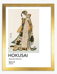
Japanese Woman by Hokusai Art Print
Sale price From £11.95£19.95 -

Takayama Travel Poster Art Print
Sale price From £11.95£19.95 -

Pine, Cliff and Waterfall Art Print
Sale price From £11.95£19.95 -

Bamboo Brushwork Study Art Print
Sale price From £11.95£19.95 -

Mount Fuji by Kamisaka Sekka Art Print
Sale price From £11.95£19.95 -

Tokyo Dreamscape Art Print
Sale price From £11.95£19.95 -

Infinity Japan Tokyo Exhibition Poster Art Print
Sale price From £11.95£19.95 -

Takayama Travel Poster Canvas Print
Sale price From £49.95£74.95 -
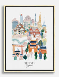
Tokyo Japan Illustrated Cityscape Canvas Print
Sale price From £49.95£74.95 -

Tokyo Exploration Vibes Art Print
Sale price From £11.95£19.95 -

Japanese Woman by Hokusai Canvas Print
Sale price From £49.95£74.95 -

Tranquil Balance Study Art Print
Sale price From £11.95£19.95 -

Quiet Bamboo Grove Art Print
Sale price From £11.95£19.95 -

Bamboo Brushwork Study Canvas Print
Sale price From £49.95£74.95 -

Arashiyama Bamboo Path Art Print
Sale price From £11.95£19.95 -

Indigo Drift by Taguchi Tomoki Art Print
Sale price From £11.95£19.95 -

Infinity Japan Tokyo Exhibition Poster Canvas Print
Sale price From £49.95£74.95 -

Woman by Kamisaka Sekka Art Print
Sale price From £11.95£19.95 -

Bamboo Grove, Kyoto Art Print
Sale price From £11.95£19.95


More from The Frame

Matisse Botanical Art vs Modern Botanical Print...
Both trends promise to bring nature indoors, but they do it in almost opposite ways. Matisse throws colour at the wall like a jazz solo. Modern botanical prints whisper in...

Why Do Matisse Tree Prints Work in Every Room?
Matisse's trees and gardens sit in a strange sweet spot: recognisable enough to feel considered, quiet enough to live with. Unlike his cut-outs, which shout, his tree work whispers. That's...

Farmhouse Wall Decor Ideas That Don't Look Like...
Farmhouse decor has a reputation problem. Somewhere between the shiplap boom and the "Live Laugh Love" invasion, it stopped meaning "warm, rustic, layered" and started meaning "coordinated set of three...